Special thanks to Prof. Dr. Georg Feulner who compiled data from many different studies into a single time series. Without the work of climate scientists, we wouldn't be able to do this!
Gregor Aisch
Senior Visual Data Journalist at Zeit Online. Co-founder and former CTO of @datawrapper. NYT graphics alumni #jitter4life #ddj #datavis (he/him)
I don't know how many climate scientists where involved in collecting all these samples and turning them into models of past surface temperatures, but here are the studies the data is based on:
- Liesicki & Raymo, 2005 (https://agupubs.onlinelibrary.wiley.com/doi/10.1029/2004PA001071)
- Jouzel et al., 2007 (https://www.science.org/doi/10.1126/science.1141038)
- Hansen et al., 2013 (https://royalsocietypublishing.org/doi/10.1098/rsta.2012.0294)
- Westerhold et al., 2020 (https://www.science.org/doi/10.1126/science.aba6853)
- Judd et al., 2024 (https://www.science.org/doi/10.1126/science.adk3705)
It's crazy to think about where this data is coming from. To recover temperatures over such long time periods, samples where taken from over 5,100 trees, 2,300 ocean sediments, 800 boreholes, 351 coral reefs, and 170 ice cores, historical paper records, and more. You can access the raw data at NOAA/NCEI https://www.ncei.noaa.gov/products/paleoclimatology
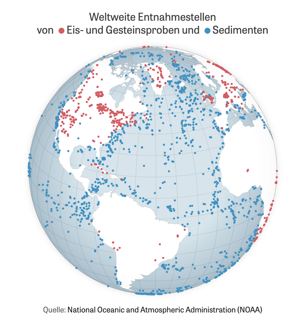
People tell me nobody wants to look at climate curves anymore, yet here we are!!! Please enjoy our interactive journey through 485 million years of climate history and dive into the fascinating and important work of paleoclimate scientists.
Remember when I discussed the idea for a new data visualization framework for Svelte? It is time to get excited! I’ve been secretly working on making SveltePlot possible and will finally share the current state next week at Svelte Summit 2025!!! Stay tuned... https://www.vis4.net/blog/2024/01/svelteplot/ https://www.sveltesummit.com/
@medienbaecker Great article, thanks a lot for putting these tipps together! But I think you missed one no-brainer: Every time we publish an article with an "enforced dark mode" (light text on dark background with no way for readers to to switch) we get feedback from readers who have trouble reading the text. Ironically, your blog theme also does not seem to support a light mode theme 😅
Gregor Aisch boosted:
New article: my favourite accessibility improvements that require little to no effort. Simple habits for more inclusive websites.
https://medienbaecker.com/articles/accessibility-no-brainers
@wahlatlas yes, finally back to the important matters!
Arguments I’ve heard so far from viZ defenders:
- Data visualization is like magic, so we must be viZards (I disagree, it’s more like craft and science).
- Look Google says it’s more popular (a million flies can’t be wrong).
- it’s more fun and soundz like the cool kidz (hard to argue with that)
But nothing changes the fact that it’s wrong. Any other takes?
I’m viSualizing data, not viZualizing! I studied InfoVis, not InfoViZ. Our fields main scientific conferences are IEEE VIS and EuroVIS, not IEEE VIZ and EuroVIZ. It all comes from visum: Latin for “sight”.
this was the thread I was referring to, btw. There was a problem with my Bsky/Mastodon crossposting... https://vis.social/@gka/114078579028822219
Here's the entire process outlined in a Observable notebook if you want to tweak the parameters or try to create your own for other countries. https://observablehq.com/@gka/zon-btw-cartogram-2025-82nsjs9s3
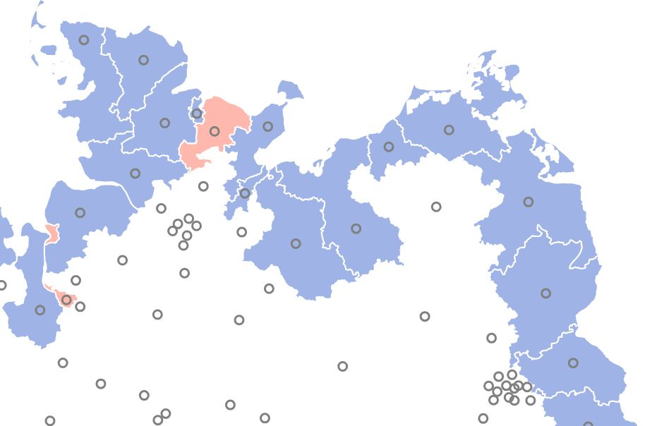
Of course, no cartogram comes without distortion. The western states like North-Rhine-Westphalia are heavily populated and push the lesser populated districts to the East. But the final layout worked well during election night, I think.
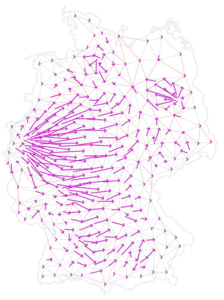
To compute the final layout we use a force simulation with 3 forces: one of them keeps neighboring districts together while another pushes districts away from each other if they are too close. Coloring the nodes helped to identify problems during the process.
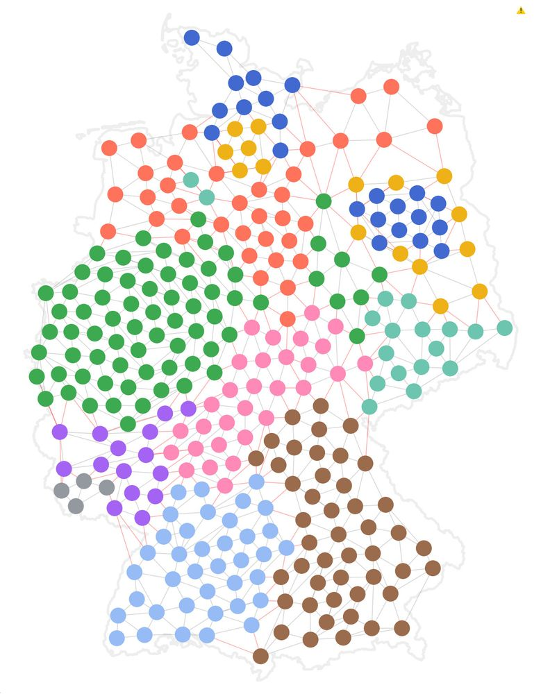
Some of these fixed districts turned out to be too close to each other, so we defined a few exceptions for border districts we want to be free, and also a few custom positions that prevent the nodes to "leave" the country.
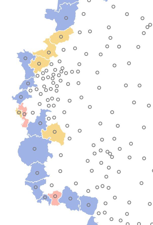
Before running the network layout simulation on this, we marked all the outer districts as fixed. This allows the final layout to stay "in shape" of the country as a whole, which is important for readers to recognize their country.
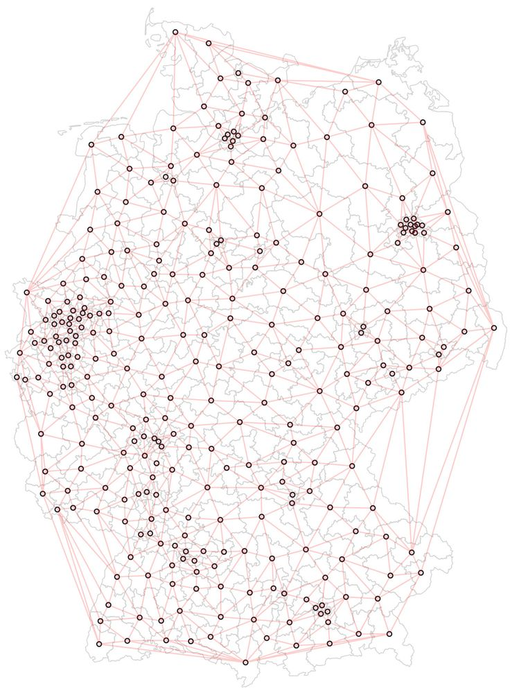
We used the TopoJSON arcs to automatically find these districts.
Due to Germany's convex outer shape we removed edges longer than a certain threshold and ended up with this final "network" of nodes and links.
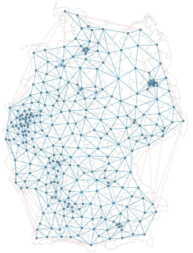
Then we used a Delaunay tessellation of the district centroids. This later helps the districts to stay close to their geographical neighbors.
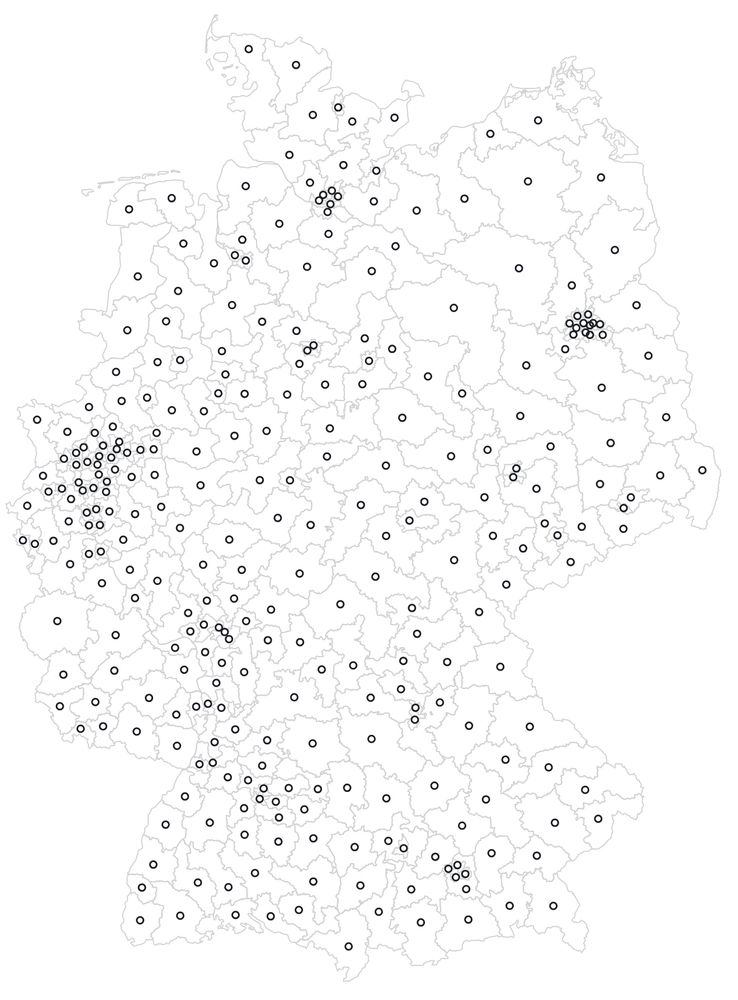
As input for the cartogram we use a pre-projected TopoJSON basemap of election districts with baked-in centroids (inner points). We used Mapshaper to generate the file.
Client Info
Server: https://mastodon.social
Version: 2025.04
Repository: https://github.com/cyevgeniy/lmst