
In the Lab: Astros First Base BPO https://www.rawchili.com/mlb/466496/ #Astros #AstrosHotStove #Baseball #Houston #HoustonAstros #HoustonAstrosAnalysisCommentary #HoustonAstrosNews #HoustonAstrosRumors #HoustonAstros #infographics #MLB #StatGeeky
#Infographics


I have an irrational love for #discworld #infographics
Sources: https://www.epicreads.com/blog/the-official-discworld-infographic/
and https://www.reddit.com/r/coolguides/comments/g5x2io/the_discworld_reading_guide/


In the Lab: A primer on bases per out https://www.rawchili.com/mlb/460780/ #Astros #Baseball #Houston #HoustonAstros #HoustonAstrosAnalysisCommentary #HoustonAstros #infographics #MLB #StatGeeky


Beyond Infographics: How to Use Nano Banana to *Actually* Support Learning drphilippahardman.substack.com/p/beyond-infog… (good ideas) #AI #infographics #NanoBanana #education
Beyond Infographics: How to Us...

Beyond Infographics: How to Use Nano Banana to *Actually* Support Learning https://drphilippahardman.substack.com/p/beyond-infographics-how-to-use-nano (good ideas) #AI #infographics #NanoBanana #education
Gemini Goes Bananas: The Ultimate Guide to AI Infographics www.controlaltachieve.com/2025/11/infogr… #AI #infographics #NanoBanana (lots of ideas)
Gemini Goes Bananas: The Ultim...
Gemini Goes Bananas: The Ultimate Guide to AI Infographics https://www.controlaltachieve.com/2025/11/infographics.html #AI #infographics #NanoBanana (lots of ideas)

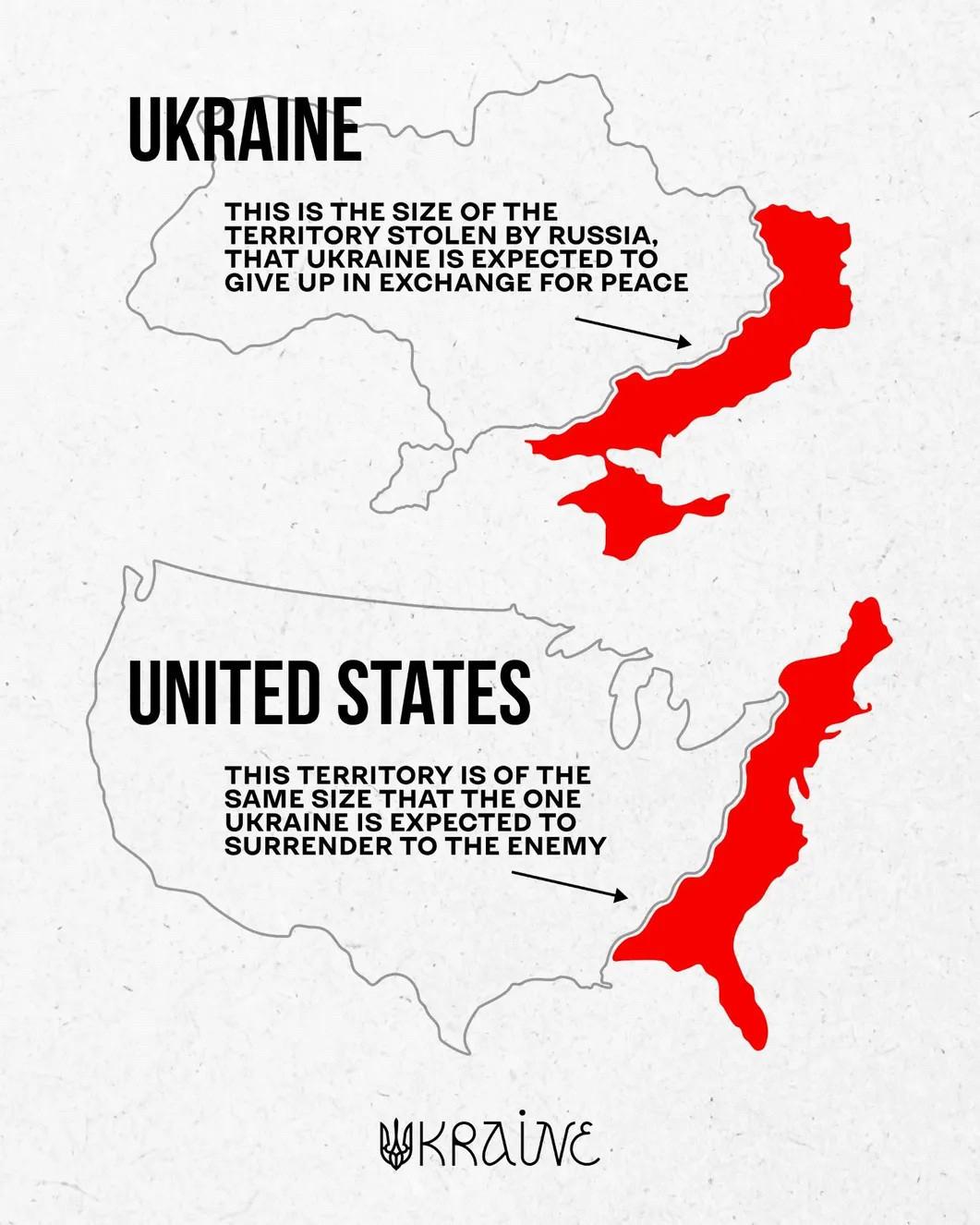
Well, this puts things in a bit of perspective. Holy hell.
EDIT: Well, this blew up! Lots of comments and the image, while compelling, is definitely misleading. Need to dig in if these are intended to be proportionally the same size, or just represent “what if an eastern portion of the USA was occupied”.
Either way, worthy to consider in either context to get folks (including myself) thinking.
And yeah, don’t give ab inch either way.

#Infographics: A Logarithmic Map of the Entire Observable Universe
This graphic by Pablo Carlos Budassi provides a logarithmic map of the entire known universe, using data by researchers at Princeton University and updated as of May 2022.
https://www.visualcapitalist.com/cp/map-of-the-entire-known-universe/


Gandal explains Hydargos what happens on Earth during a solar #eclipse 😄 #goldrake #infographics @pomarede

#justknow #InformativeRead #historical #infographics #knowledgeispower #generalknowledge #papyrus #interestingreads


Behind the scenes of “beautiful scientific graphics”
If you think that clean, elegant visuals in scientific reports are produced in a couple of clicks — I’m here to disappoint you. 🙂
Here’s one of many failed attempts to visualize results based on thermodynamic modeling of geochemical processes.
Turning raw multidimensional data into something that a human reader can intuitively grasp is a separate challenge — with dozens of input parameters and only a few truly useful outcomes.
Good science is not only about computation, but also about communication.
#Geochemistry #DataViz #Rstats #Clustering #EnvironmentalModelling #ScienceCommunication #PHREEQC #WaterPollution #SvystunovaGully #Contamimation #Groundwater #Infographics #PCA #Thermodynamics


Still a chance to join our next Create Impactful #Infographics training
11th & 12th Nov 🇬🇧 UK/EU/AUS
Deets: https://bit.ly/IIBWAB
Reviews: https://geni.us/WABreviews

Learn how to turn ideas, stories, numbers into impactful #infographics & data-visuals with Information is Beautiful. Details: https://bit.ly/IIBWAB
2 x virtual half days:
11th & 12th Nov 🇬🇧 UK/EU/AUS
Reviews: https://geni.us/WABreviews

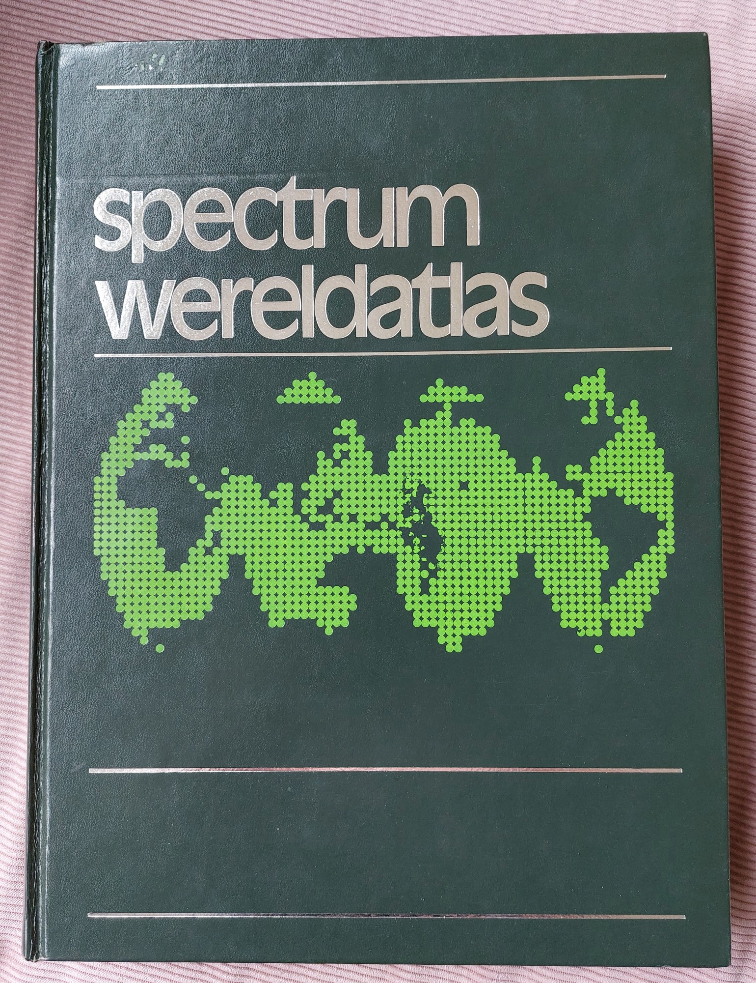
Few weeks ago I bought this #atlas from a secondhand bookstall for just 2 euros. The seller said he was glad to get rid of it because of the size and weight. Now I am the owner of a 1973 (Total design) Spectrum Wereldatlas. Most #infographics and super cool #dataviz were originally from
It's fun to learn how to create impactful #infographics & data-visuals. Discover how to create images like these at our next workshops
2 x virtual half days:
11th & 12th Nov 🇬🇧 UK/EU/AUS
Details: https://geni.us/WAB2024
Reviews: https://geni.us/WABreviews
Discounts available
#justknow #filmshooting #InformativeRead #knowledgeispower #generalknowledge #infographics #gujarati #filmcommunity


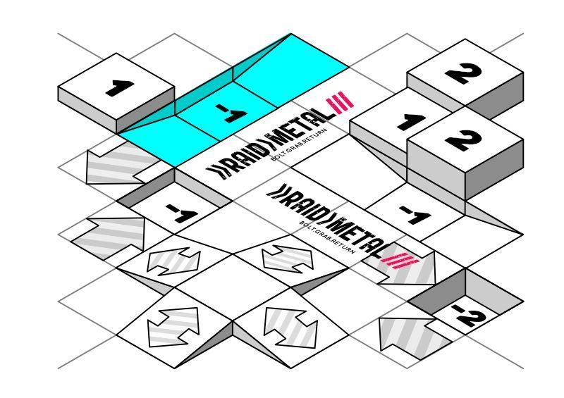
One of the things I've been working on is a dynamic map board system for the #RaidMetal arenas that not only gives modifier info but is also 3D in appearance, for those that don't want to create terrain but want a very visual experience. The isographic grid idea stemmed from the style of #infographics I used in the rule book, and these will become available as arena map packs that can be mixed and matched
#TTG #TableTopGaming #TTRPG #BoardGaming #BoardGames #SciFi #SciFiGaming #tanks #wargaming
Så denne superfine grafiske visualisering af hvordan vores land overflade udnyttes i forskellige lande i Europa
https://onsland.koenvangilst.nl/
Det gør det ret tydeligt hvor meget f.eks. skov fylder i forhold til landbrug i forhold til byer.
Sidens system er forøvrigt opensource og kan findes på github
#visuals #nature #infographics #inspiring #opebsource
Client Info
Server: https://mastodon.social
Version: 2025.07
Repository: https://github.com/cyevgeniy/lmst