Cédric Scherer

🧙‍♂️✨📊 Independent #DataViz Designer, Consultant & Instructor ♢ PhD in Computational Ecology ♢ #rstats #ggplot2 #figma#graphics #maps #ddj #design ♢ he/him

Cédric SchererCedScherer@vis.social
2025-06-06

Working on the latest lesson for our interactive online workshop "ggplot2 [un]charted", I let loose a bit...

The sections ended up fun — yes, and maybe a bit silly at times 🤡

My personal highlight:
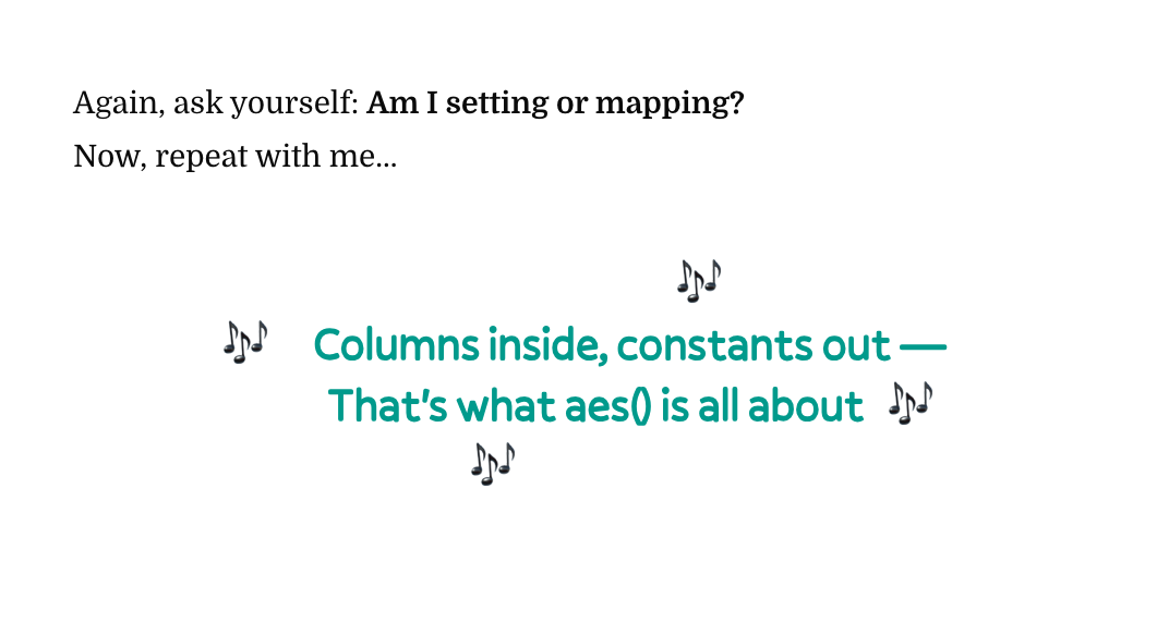
our very own #aesthetics anthem as a memorable mnemonic to recall the most important — and likely most frustrating — concept of #ggplot2 ✨🎶✨

New lesson out now 👉 ggplot2-uncharted.com/module1/

A screenshot of the anthem (and the introductory text to understand the context):

Again, ask yourself: Am I setting or mapping?
Now, repeat with me...


    🎶
🎶 Columns inside, constants out — 
 That's what aes() is all about 🎶
🎶
Cédric SchererCedScherer@vis.social
2024-04-02

@Herover Moderating all platforms is too much and none of the organizers is active here. Looking at the posts so far it seems not worth it as, as usual, interaction levels are super low here 😔

Cédric SchererCedScherer@vis.social
2024-03-07

@alessandro_a Btw, the "switched" order of wins and losses is also reflected in the title phrasing and coloring to provide guidance. At least that was the idea.

Cédric SchererCedScherer@vis.social
2024-03-07

@alessandro_a Thanks! Maybe that impression comes from the labels placed close to the top dots?

Cédric SchererCedScherer@vis.social
2024-03-07

@alessandro_a Flipping the x scale in the dumbbell chart wouldn't make sense but one could flip the stack order in the bar chart. However, the idea was to emphasize the wins and allow for a common baseline for those stacks. But a reversed order might be a good option if the goal is to align the order of the two colors across these two graphics.

Cédric SchererCedScherer@vis.social
2024-03-07

@alessandro_a And what do you mean with the Bayern line is off? Do you mean it looks different? The color is brighter, in line with the headline and the bold labels, to highlight their shares.

Cédric SchererCedScherer@vis.social
2024-03-07

@alessandro_a Thanks for the feedback! Why do you think wins and losses get inverted? The color is consistent across graphs. They are *not* showing the same thing as (1) -- as you've noted -- one shows absolute values and one percentages (so it aligns them) and (2) the stacked bars also show ties while the dumbbell only compares matches lost and won.

Cédric SchererCedScherer@vis.social
2024-03-07

#BayernMunich played their 2.000 #Bundesliga match last weekend! 🎊

The stats are incredible:

⚽ Among the 10 teams with the most matches, they won the most and lost the fewest—in both absolute and relative numbers!

⚽ In those 2.000 Bundesliga matches, Bayern scored at least five goals in 200 of them (10%), but most often conceded only one or even no goal—and 4+ goals only in 71 matches (3.6%).

All #dataviz'es created in
#rstats with
#ggplot2 and the help of ggtext and a few others.

A simple bar chart for the ten teams that played the most Bundesliga matches. The top bar, encoding Bayern Munich's 2.000 matches, is colored in bayern-red while all other bars are grey.The same bar chart of Bundesliga matches as a stacked version with green stacks indicating the number of matches won, grey stacks those ended with a tie, and yellow stacks indicating matches that have been lost.A horizontal dumbbell graph of share of matches won (green) and matches lost (yellow) for the 10 teams that have played the most Bundesliga matches ever. Bayern Munich has by a long shot the lowest loss and highest win shares among them.Matches by number of goals shot and conceded as a dumbbell chart. In addition the red and blue points, representing conceded and shot gorals respectively, are connected to indicate the shape of the distribution.
Cédric SchererCedScherer@vis.social
2024-02-15

@eagereyes @maarten I brought up the white Christmas example because the initial criticism was not about the topic though but the (potentially problematically surveyed) data and the promotion of its provider. So I'd expect the same level of criticism with regard to the data instead of an endorsement if it's all about values and blsck and white.

BTW, the original graphic is endorsing stereotypes not only with the data but also by using blue and pink :|

Cédric SchererCedScherer@vis.social
2024-02-15

@eagereyes @maarten Yes, you have a valid point here Robert. For me it remains a fun topic and all interactions outside of Mastodon have been with a glimpse of humor. But of course, there might be others that don't comment and take it for granted. I still want to highlight that I never made the impression that it is a general pattern.

Cédric SchererCedScherer@vis.social
2024-02-15

@maarten Is it? The main criticism was that I share bad data that misleads viewers and motivates them to reuse the data, plus the advertisement of the (bad) source. No clue why the same logic doesn't apply here.

Cédric SchererCedScherer@vis.social
2024-02-15

@maarten So I am not saying that e should adhere to this behavior and I will for sure learn from this. I also agreed back when you noted that the title might not be in line with the message of the chart. And since then I am more careful when picking titles.

But also I remember that discussion back than as an awful experience as people were jumping on my back as I'd have done it on purpose to mislead. However, it was "just" a not-that-precise title phrasing of a chart that got ~30 likes.

Cédric SchererCedScherer@vis.social
2024-02-15

@maarten However, I never see any discussion below these kind of charts. Thousands of likes and (mostly) no one chimes in to correct the authors.

As another example: Why did you share a map about the chances of white Christmas, even though the calculation of those chances is not meaningful at all as they should include temporal autocorrelation? Well, because it is a fun map that fits the Christmas topic.

Cédric SchererCedScherer@vis.social
2024-02-15

@maarten I am nto sure how much it is about different values. I totally see your point but this is obciously a fun topic. And again, I am not generalizing the findings in the headline or anywhere else.

The problem I see with these discussions is that there are that many charts out there that (often intentionally) mislead, have erroneous labels, and use titles that are overly simplified and/or generalize the findings.

Cédric SchererCedScherer@vis.social
2024-02-14

@maarten I'm also convinced that using made-up data is rarely a good idea. How do you ensure that people get its fake? That people do not remove the caption from that chart and reshare it because they want it to be true or pretend it's facts? That's more problematic IMO than sharing the original data and listing the source and the fact that it was a survey.

Cédric SchererCedScherer@vis.social
2024-02-14

@maarten @maarten yeah, feel free to forward that to the Statista team as well. It was a survey, it is a data source, the numbers are credible, I am not stating or suggesting that these numbers are representative of the whole population. So while I hear you, that criticism seems a bit too much. Not going to have the same thread with you again but I'd argue graphic and the topic will hurt no lives at all. No one is going to make any decisions based on this or change their political position.

Cédric SchererCedScherer@vis.social
2024-02-14

@ColinWilding The data and charts on are floating around for years. Not sure there is much information on the survey itself, but honestly I read it more as a fun take than as facts that represent all humans.

Cédric SchererCedScherer@vis.social
2024-02-14

For 25% of surveyed men in the #UK, the point of Valentine's Day is to "get laid" according to a survey from 2015.

More than the half of women responded "show how much you care"—22 percentage points more than men!

Happy Valentine's Day ❤️

Made in #rstats with #ggplot2 💙

#dataviz #datavisualization #tidyverse

A dumbbell chart showing the results of a survey byy chilisauce.co.uk asking "Hat is the point of Valentine's Day?". The most popular answer was "show how much you care" (51% of women and 29% of men), "get laid" (8%of women and 25% of men), and "go out for dinner" (6% of women and 18% of men). The other statements were "treat yourself" (14% and 4%), "impress someone" (3% and 14%), "buy someone gifts" (12% and 3%), and "receive gifts" (6% and 7%).
Cédric SchererCedScherer@vis.social
2024-02-06

@smach sounds interesting. Does it recognize different speakers or is it simply turning the audio into text?

Cédric SchererCedScherer@vis.social
2024-02-06

@mikebrondbjerg @kristinHenry I am there as well. And kinda not as I am not very active lately.

With regard to trust I see your point Kristin. For me it's not so much of an ideological decision but based on where to get (most of my relevant) news from the comminities. And sadly my Mastodon timeline can't serve this purpose :(

Client Info

Server: https://mastodon.social
Version: 2025.04
Repository: https://github.com/cyevgeniy/lmst