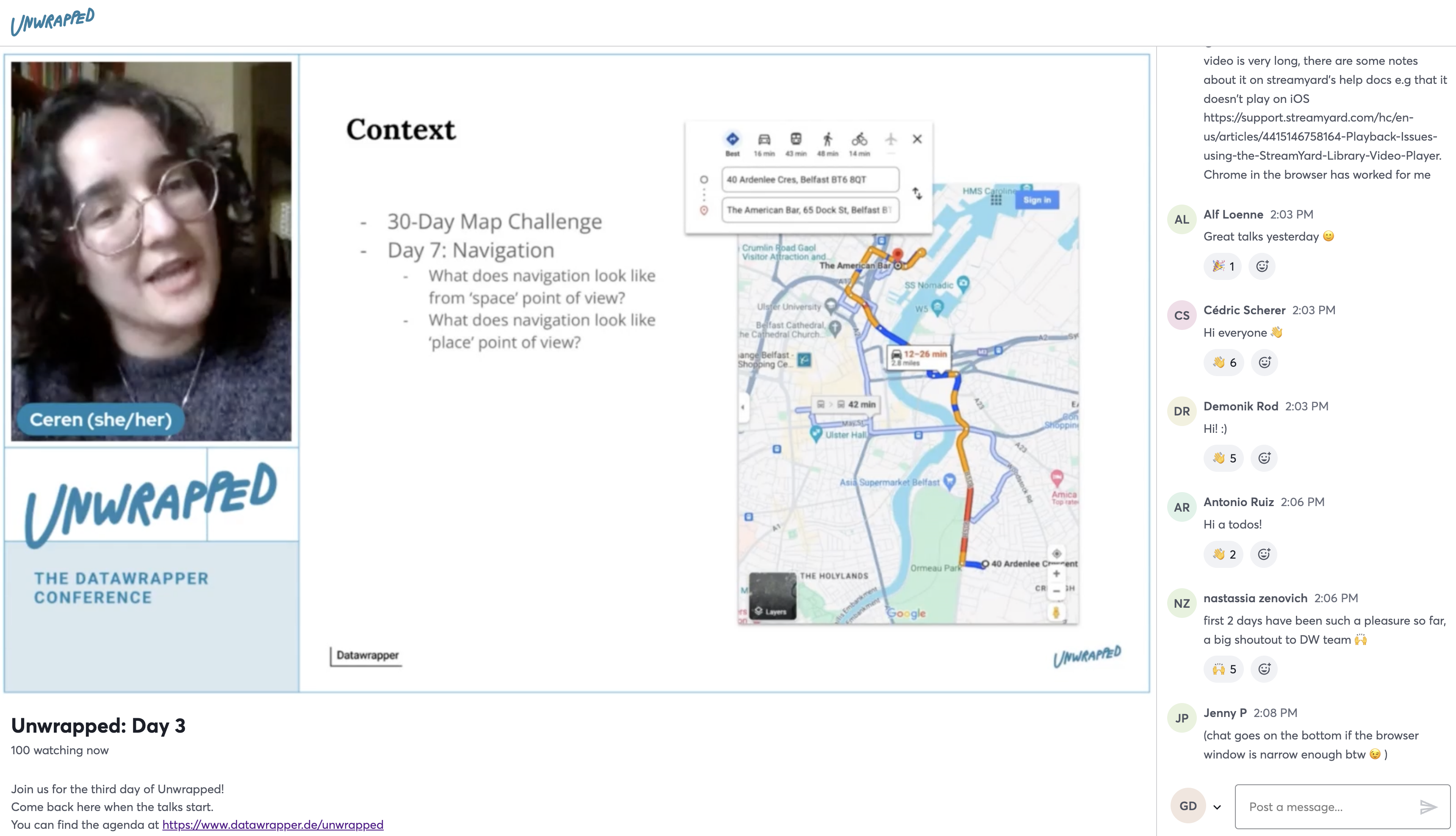
And we are live again! 🤩
Freelance cartographer Ceren Dolma is our first speaker for this third and last day of Unwrapped.
Join us directly here, without signing up: https://datawrapper.de/unwrapped/watch
data visualization developer @datawrapper — 🏃 — He or They 🏳️🌈 📍Berlin
And we are live again! 🤩
Freelance cartographer Ceren Dolma is our first speaker for this third and last day of Unwrapped.
Join us directly here, without signing up: https://datawrapper.de/unwrapped/watch
🎉🎉🎉 Big news: You can now create small multiple line charts with our new chart type “Multiple Lines”! Give each line its own panel, then sort, style, annotate, show lines on independent scales, and more.
See what’s possible in our announcement post: https://blog.datawrapper.de/small-multiple-line-charts/
New Weekly Chart! Germany might never have as many people as it did in 2022. Our visualization developer @Luc looks at the past decades in German history to see how it hit that peak — with the help of a certain controversial chart type 👀
https://blog.datawrapper.de/germany-population-connected-scatterplot/
We're excited to announce 🎁 Unwrapped, the Datawrapper conference! Unwrapped will happen virtually on March 14th and 15th, 2024.
Are you using Datawrapper in an unusual, creative, or simply successful way? Become a speaker & give a 5, 10, or 20 min talk: https://blog.datawrapper.de/call-for-speakers-unwrapped-datawrapper-conference/
New Weekly Chart! The artist Christian Boltanski once said that Swiss people "have no reason to die." And yet... This week, our visualization engineer @Luc looks into the reasons they do anyway.
https://blog.datawrapper.de/why-do-swiss-people-die/
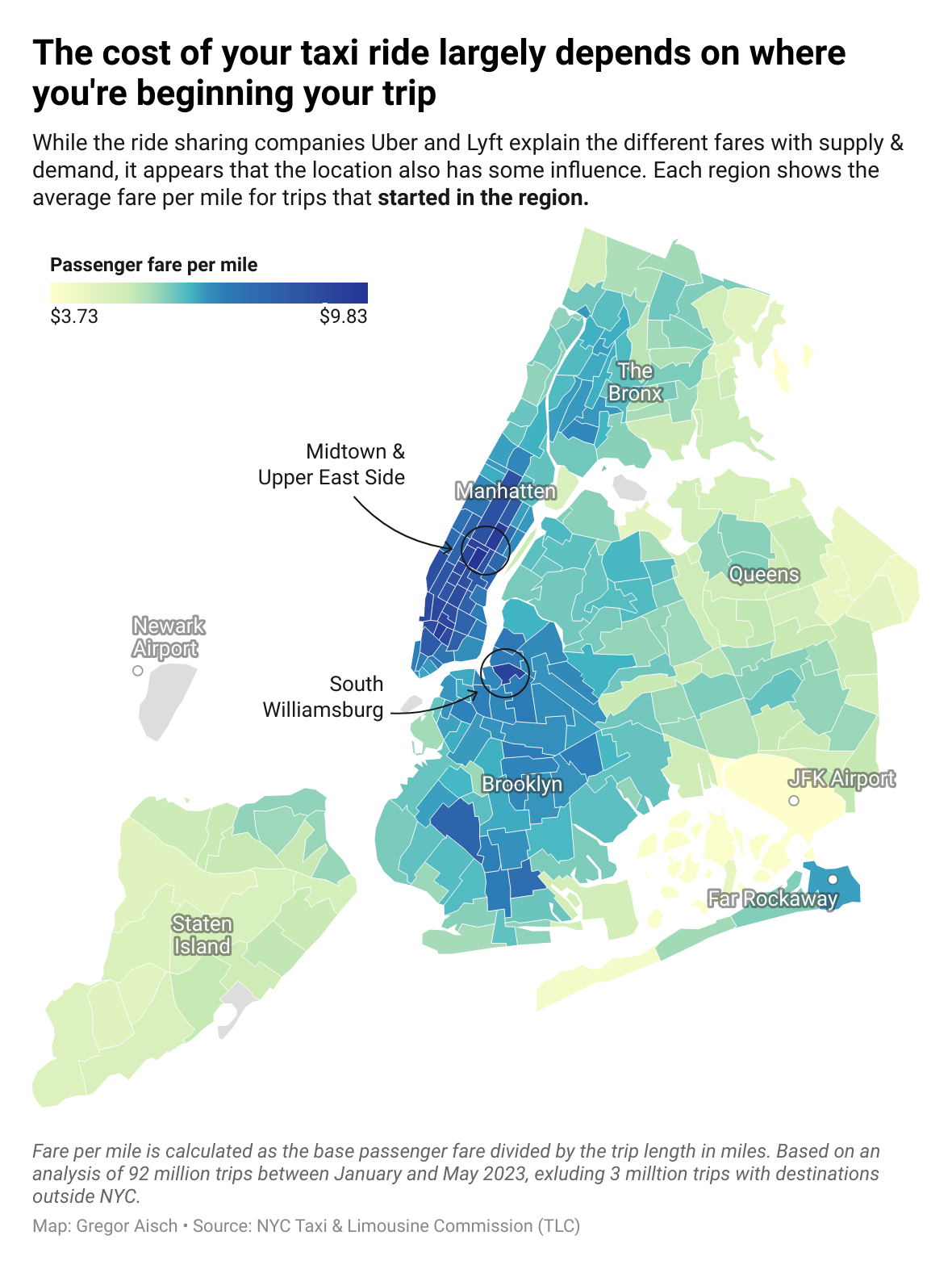
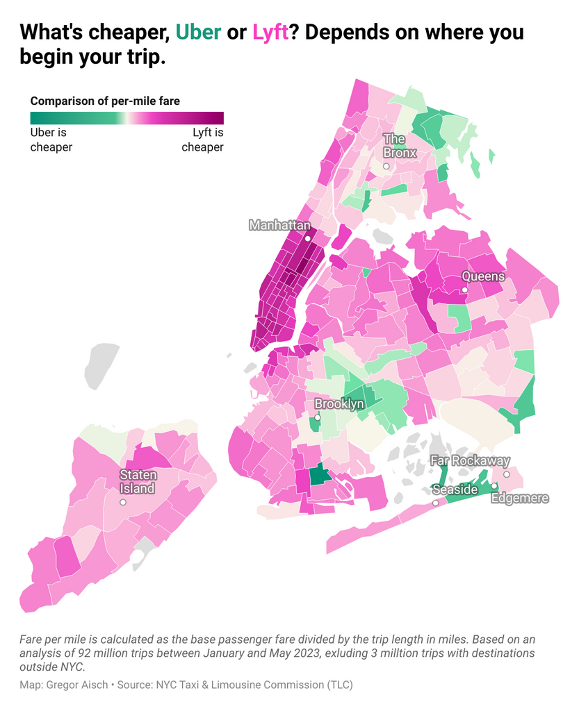
New Weekly Chart! Our head of data visualization @gka not only shows you two maps (scroll down to interact with the second one about Lyft vs. Uber prices!), but also gives a primer on databases and explains what's great about @duckdb.
Find the full story here:
➡️ https://blog.datawrapper.de/using-duckdb-to-analyze-over-95-million-car-sharing-rides/
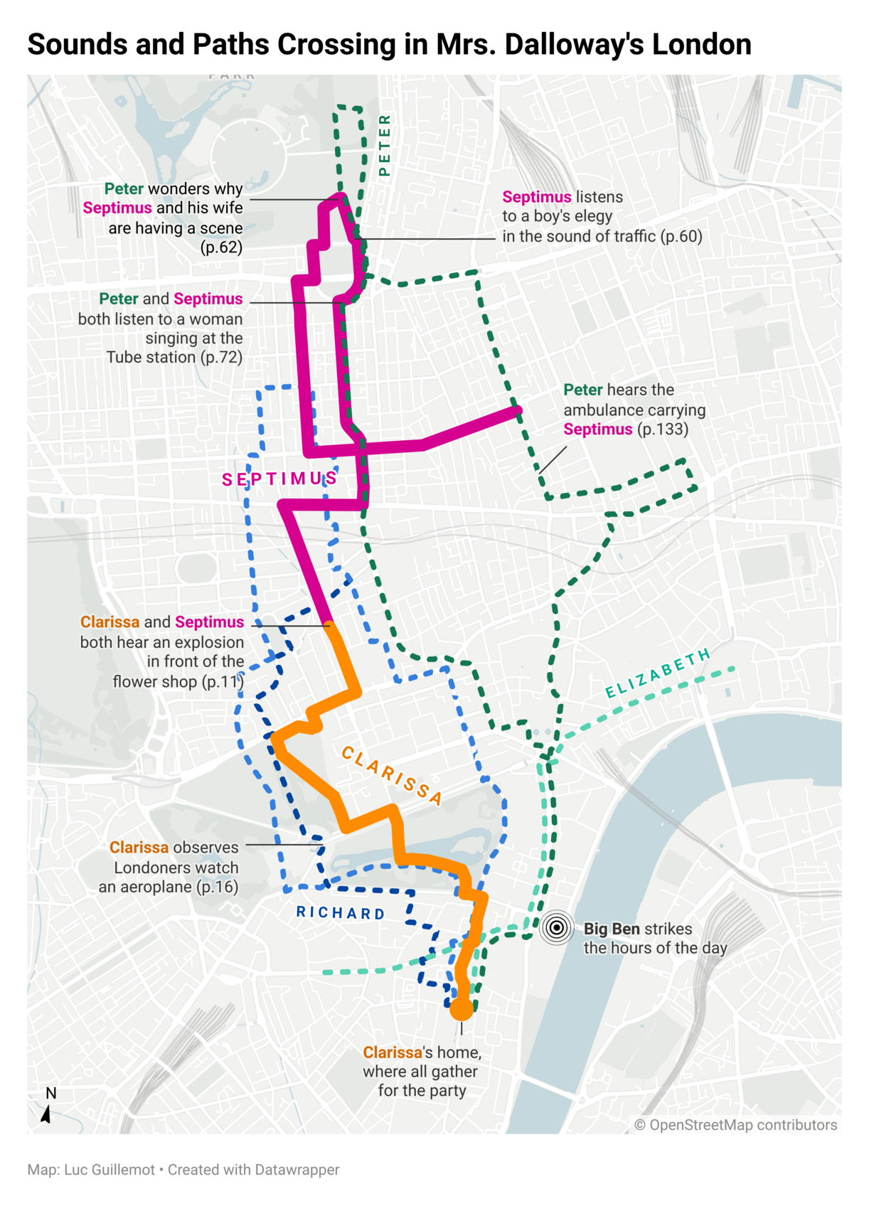
New Weekly Chart! Mrs. Dalloway goes for a walk in London — meets friends and strangers — hears the sounds of the city — thinks about her life...
Our visualization developer, @Luc, with a tribute to his favorite novel:
➡️ https://blog.datawrapper.de/mrs-dalloway-london-map/
We're thrilled to introduce the newest member of Datawrapper's visualization team: Luc Guillemot! @Luc filled us in on his experiences with data vis in academia, interaction design, and journalism — and the moment he first discovered the power of "representing things on a flat surface" 🗺️
https://blog.datawrapper.de/luc-guillemot-datawrapper-new-hire/
@ljegou @datawrapper Thanks Laurent! Maybe you recognized yourself in my teacher recommending Semiology of Graphics ;)
Crossing the border from Germany to France in TGV is like jumping into hyperdrive.
Die Funke Mediengruppe sucht eine*n Frontend-Entwickler*in und eine*n Interaction-Designer*in für die Erstellung von Visualisierungen, interaktiven Infografiken und Storytelling-Formaten.
https://interaktiv.morgenpost.de/stellenanzeige/
@datagrazing congrats!
@yetzt ich bin wieder da 😄
@jeremystucki Thanks 😊
Yes... The suspense between die Grünen and the SPD is really spannend! 😄
Live results for the election in Berlin!
https://interaktiv.morgenpost.de/berlin-wahl-2023-umfragen-ergebnisse-wahlkarte/
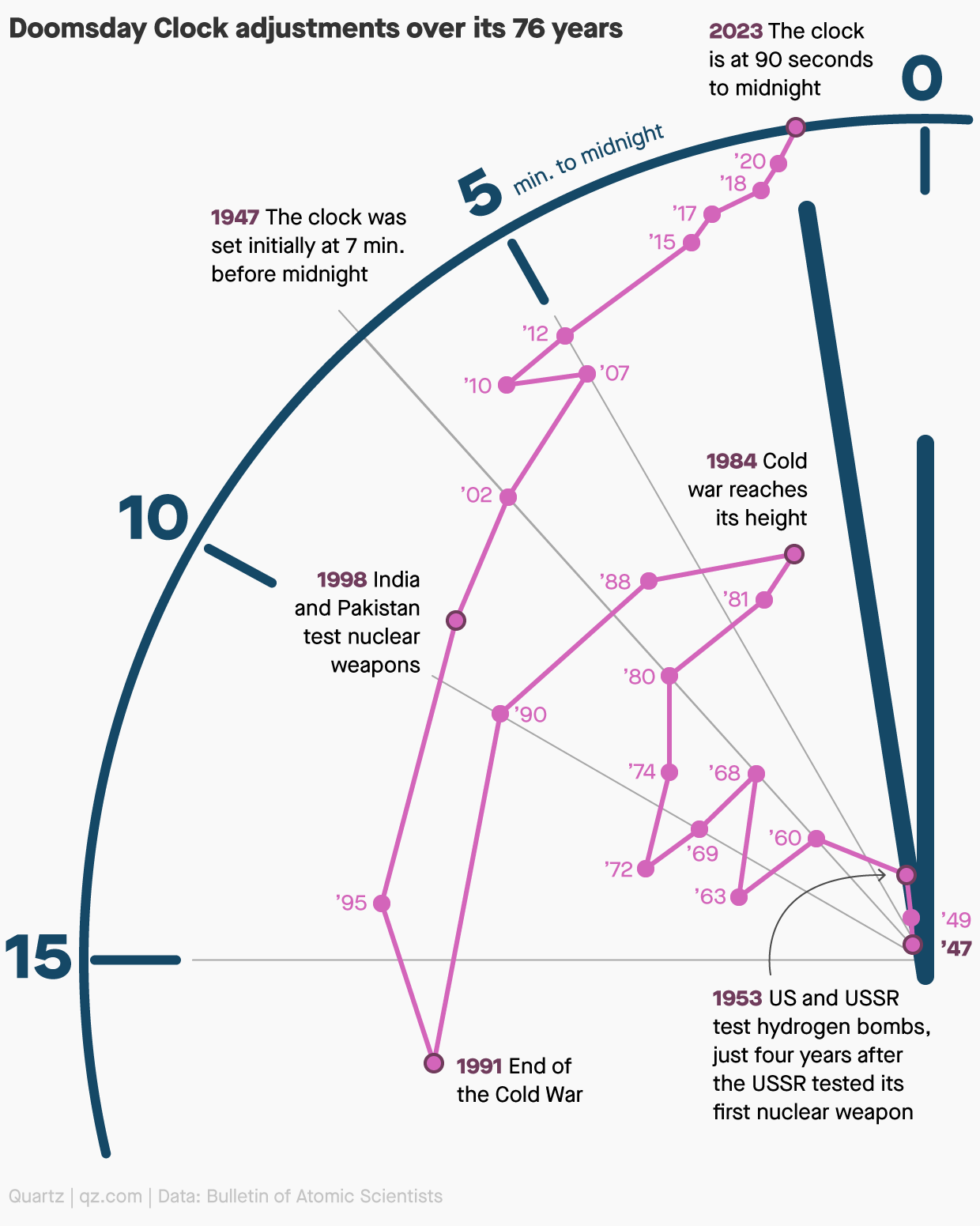
This is sort of a connected scatterplot, and either way a really well-done chart IMHO. It combines the data – where the Doomsday Clock has been over the years – with an illustration that gives you a pretty good idea what it's about.
From today's Quartz Daily Brief, https://qz.com/emails/daily-brief/1850028395/spotlight-on-the-worlds-third-richest-man
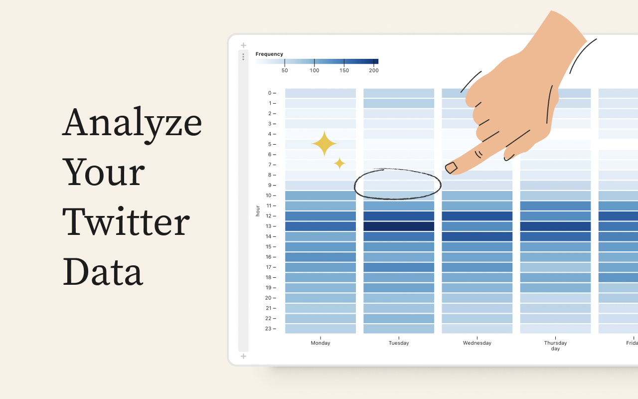
We created the free #dataviz tool below to illustrate how data visualization can help better inform users before they delete their Twitter accounts and abandon years of valuable data.
Save & analyze your trove of data before it is gone forever.