Do you want to live a long and healthy life but walking 10,000 steps a day feels too hard? In this Weekly Chart, our designer Alex takes a closer look at the data behind this number. 🔍 Will he convince you to go for a walk? 🚶 🍃
Datawrapper
Enrich your stories with charts, maps, and tables – interactive, responsive, and on brand.
🎓 Want to dive into Datawrapper? Join our intro webinar *today* at 6pm CET /
12pm EST!
Learn how to create stunning visualizations and see if Datawrapper is the right
tool for your projects. 📊
There's still time to register here 👉 https://streamyard.com/watch/ZCiaeZc6W4gS
Another week of warfare in the Middle East, rising temperatures and heatwaves, and energy reports from all over the world — all this and more in the new Data Vis Dispatch! 📊
https://www.datawrapper.de/blog/data-vis-dispatch-june-24-2025
@MartinVuilleme Thank you for the notice Martin, we'll adjust things accordingly.
A spiritual practice with ancient roots and some very modern additions. This week, our returning writer and yoga teacher-in-training Veronika looks at what we (don't) know about the history of yoga poses. 🧘
⏰ Don’t forget! Our Getting started with Datawrapper webinar is happening on June 25 at 6pm CET / 12pm EDT.
There are still spots open—join us and start creating beautiful visualizations!
You can register here 👉 https://streamyard.com/watch/ZCiaeZc6W4gS
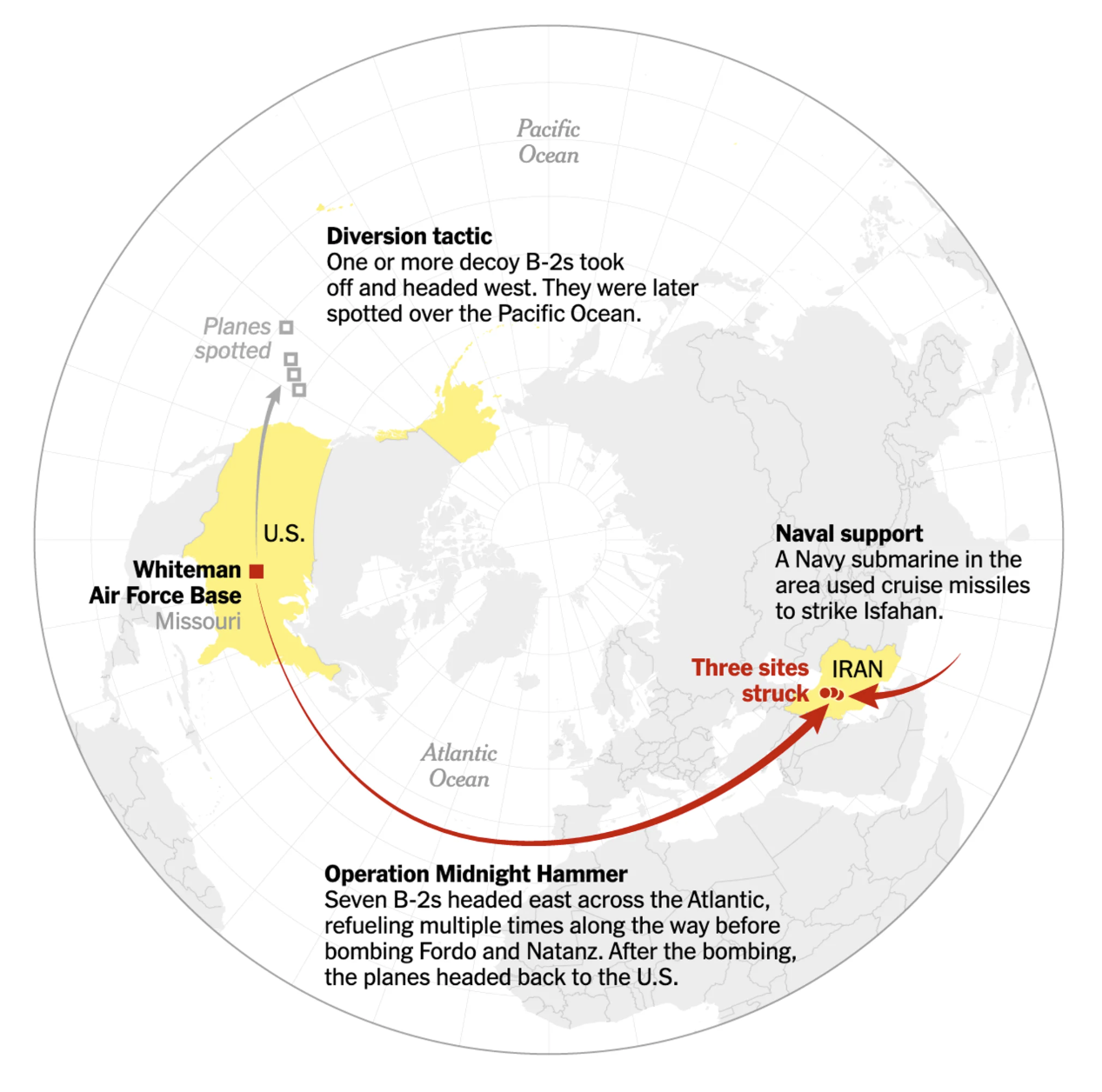
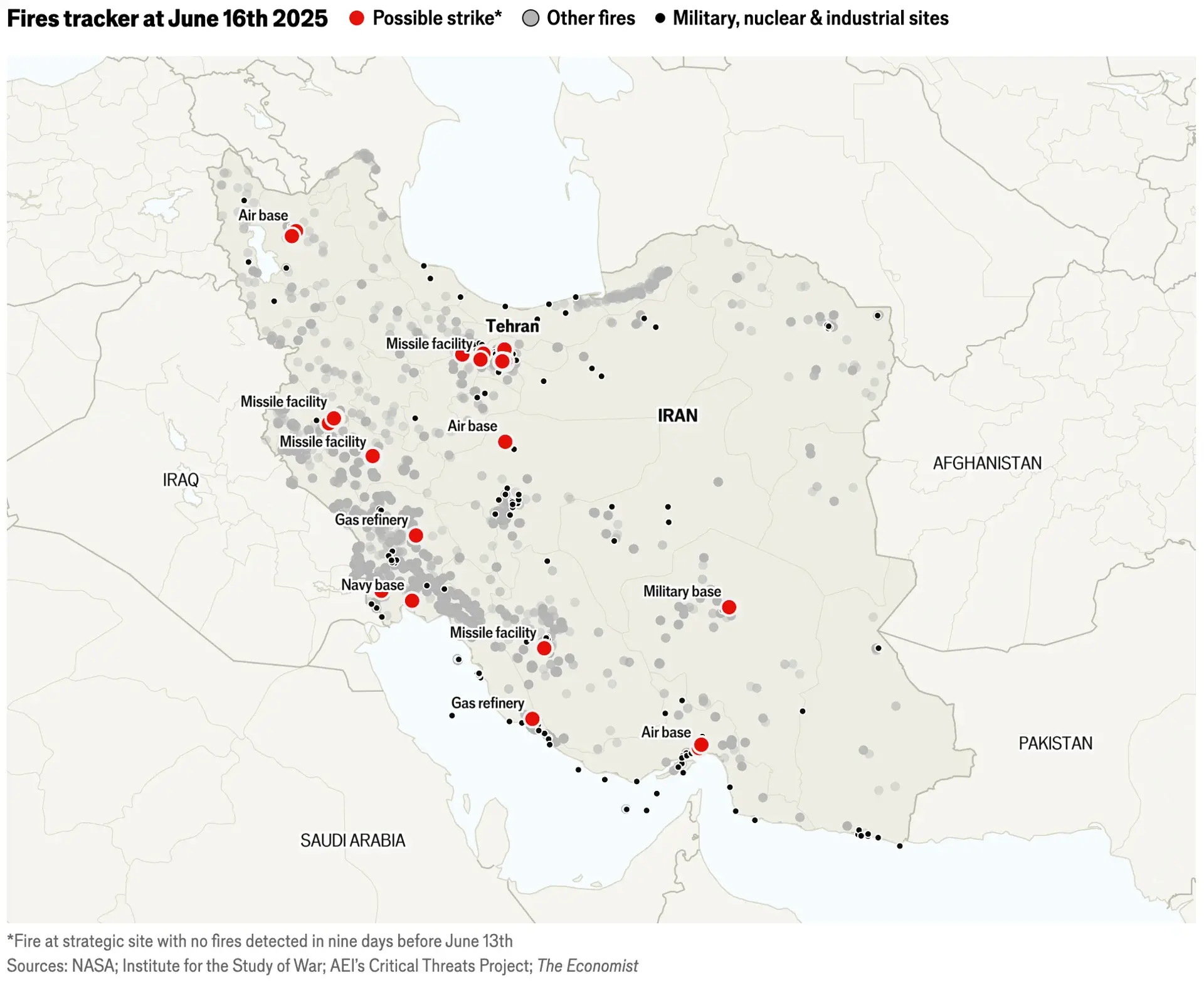
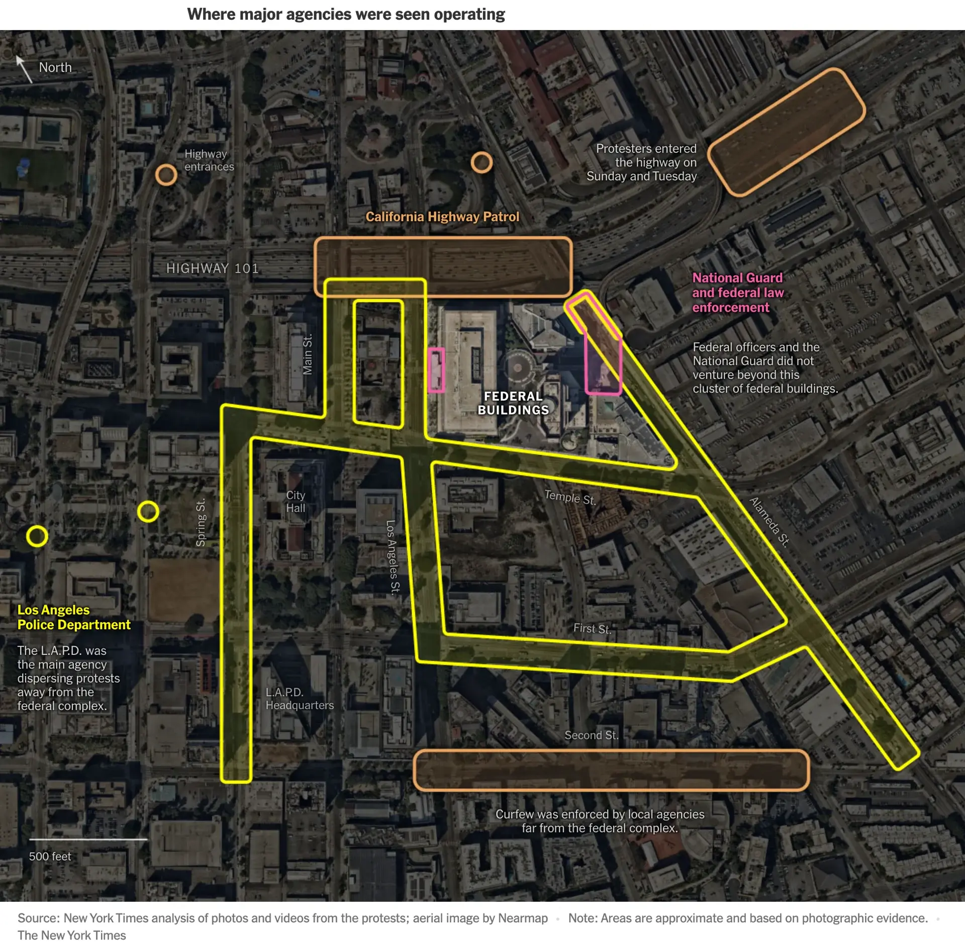
In the news this week: Demonstrations in the U.S., a tragic plane crash in India, and an Israeli attack on Iranian nuclear facilities.
Explore these topics and more in the latest Data Vis Dispatch:
https://www.datawrapper.de/blog/data-vis-dispatch-june-17-2025


New blog post! Arrow plots, waffle charts, alluvial diagrams, choropleth maps — when you’re just starting out, the number (and names!) of viz types can be overwhelming.
Our writer @lisacmuth put together a guide and poster to help you choose the right one: https://www.datawrapper.de/blog/chart-types-guide
You probably already know our scatter plots can do a lot. But just how much?
We just published a whole collection of scatter plots that show data over time; all built by different Datawrapper employees. Take a look, get inspired for your next chart, and open every visualization to see how it’s built: https://academy.datawrapper.de/article/414-examples-of-datawrapper-scatter-plots-time
🔥 Our forests are burning, our oceans are dying, but at least solar energy is still on the rise! Dive into each topic and many more with the latest Data Vis Dispatch.
📊 https://www.datawrapper.de/blog/data-vis-dispatch-june-10-2025
📆 Last chance to join us for today's webinar at 12pm EDT / 6pm CET!
We're diving into everything tables—from creation to stunning design using Datawrapper. Don't miss out on tips to make your data shine. 🪄
Register now 👉 https://streamyard.com/watch/ScHakHZQfAJX
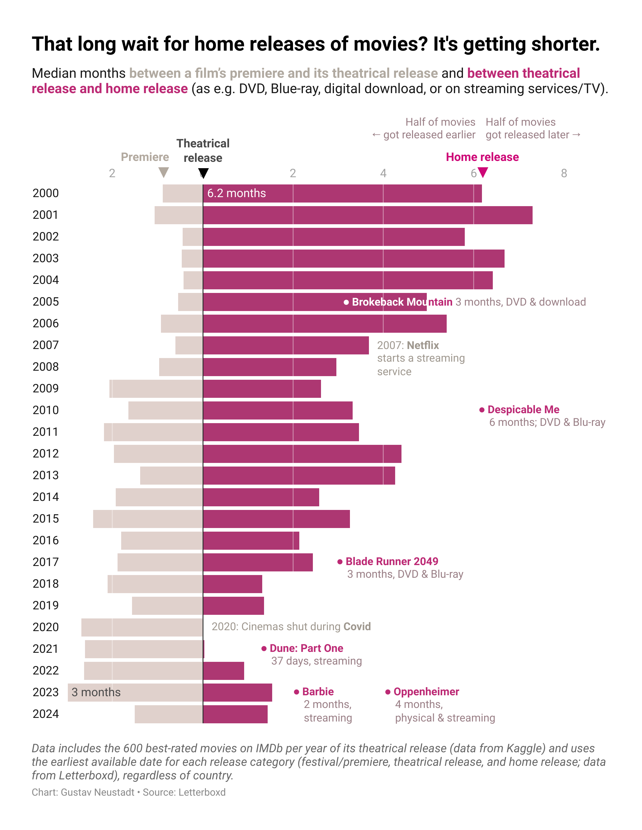
Can't find the time to go watch a new movie in the cinema? You can cosy up under your own blanket and watch it at home – but you'll have to wait. How long? Our designer Gustav might have good news for you. 🍿 👀
https://www.datawrapper.de/blog/movie-home-release-dates
📅 June webinars are here! Join us for:
June 10 ➡️ Datawrapper tables: Deep dive
June 25 ➡️ Getting started with Datawrapper
Learn how you can create insightful visualizations with Datawrapper! Reserve your spot now 👇 https://www.datawrapper.de/webinars
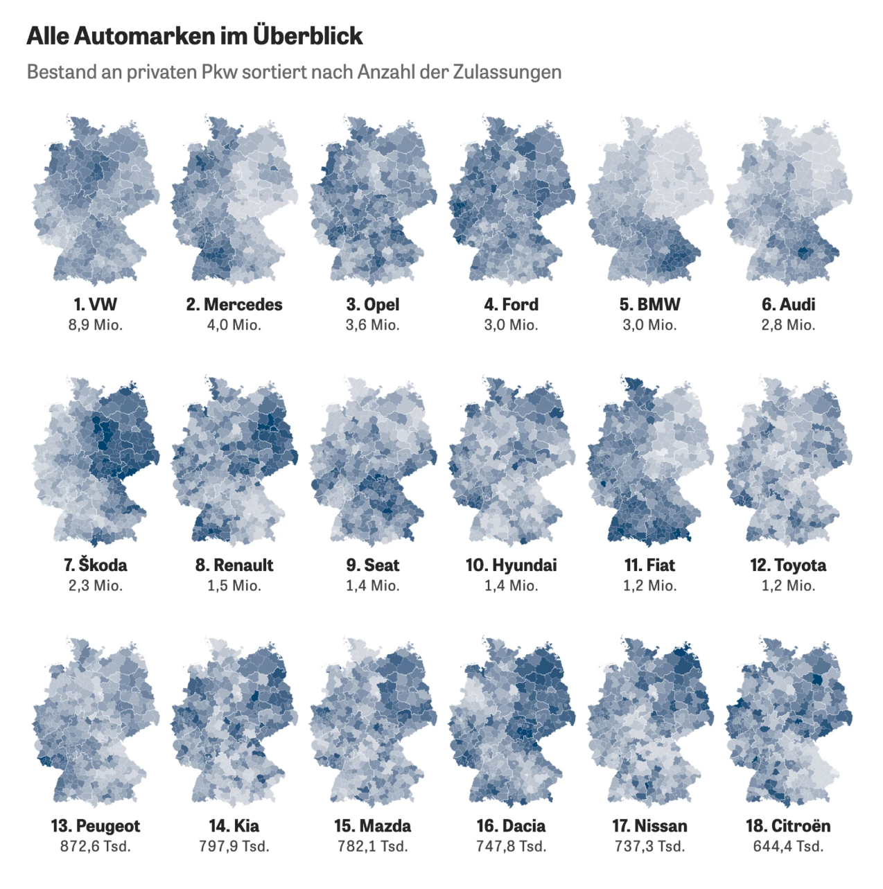
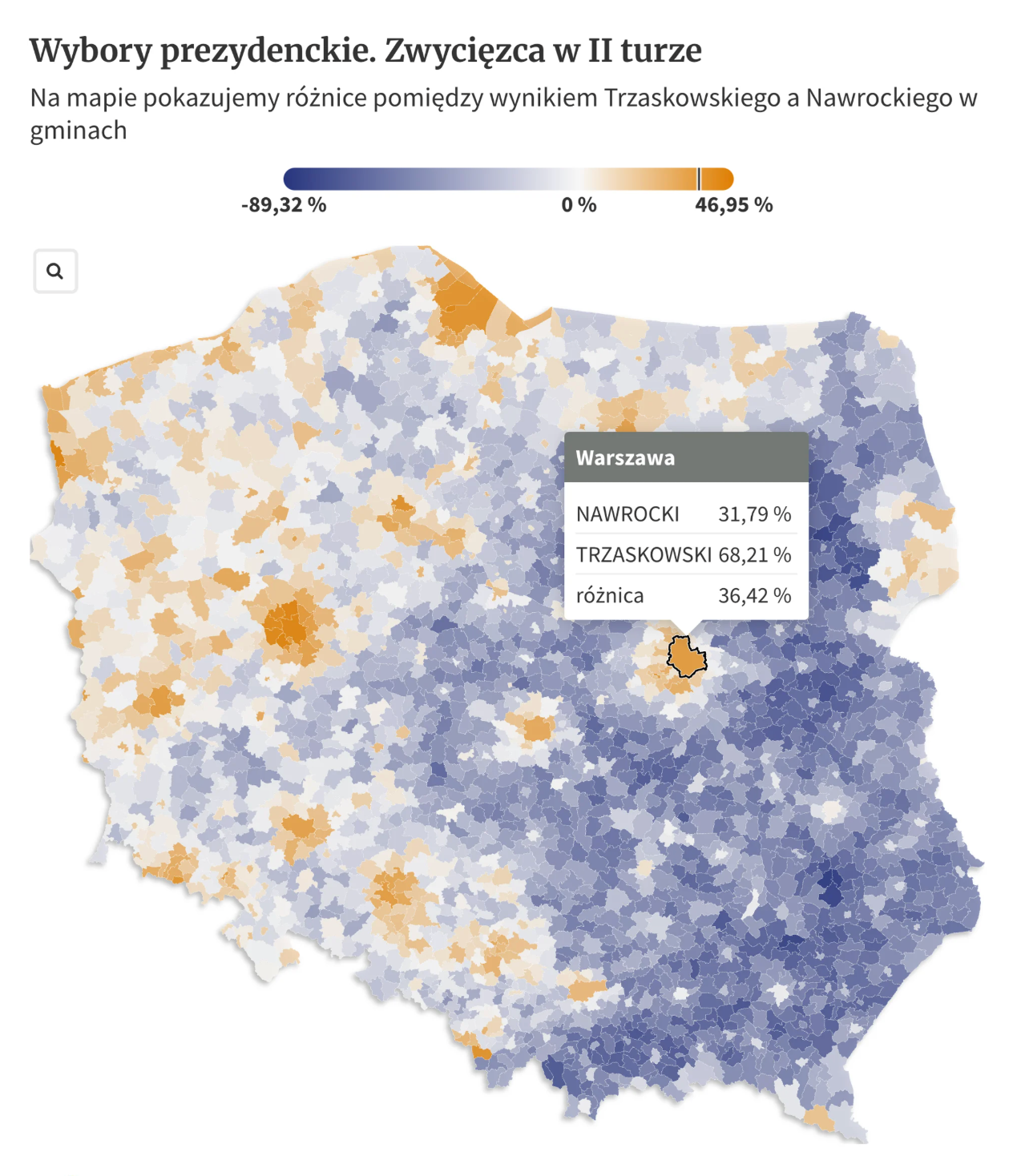
🍎 In our latest Data Vis Dispatch, look at AI use in education, which regions shifted the Polish presidential election, and what car brands the Germans like to drive in which city. That’s not all of course — discover the full content on our blog! 🚗
https://www.datawrapper.de/blog/data-vis-dispatch-june-3-2025
🎉 Exciting webinars coming up! Perfect for all skill levels.
June 10 ➡️ Datawrapper tables: Deep dive
June 25 ➡️ Getting started with Datawrapper
Seats are filling up fast— you can sign up here 👇
https://www.datawrapper.de/webinars
What do you do when your favorite weather app gets killed? If you're our website developer Jonathan Muth, you think deeply about what made its one-chart design so great — and then rebuild that in Datawrapper 🌦️
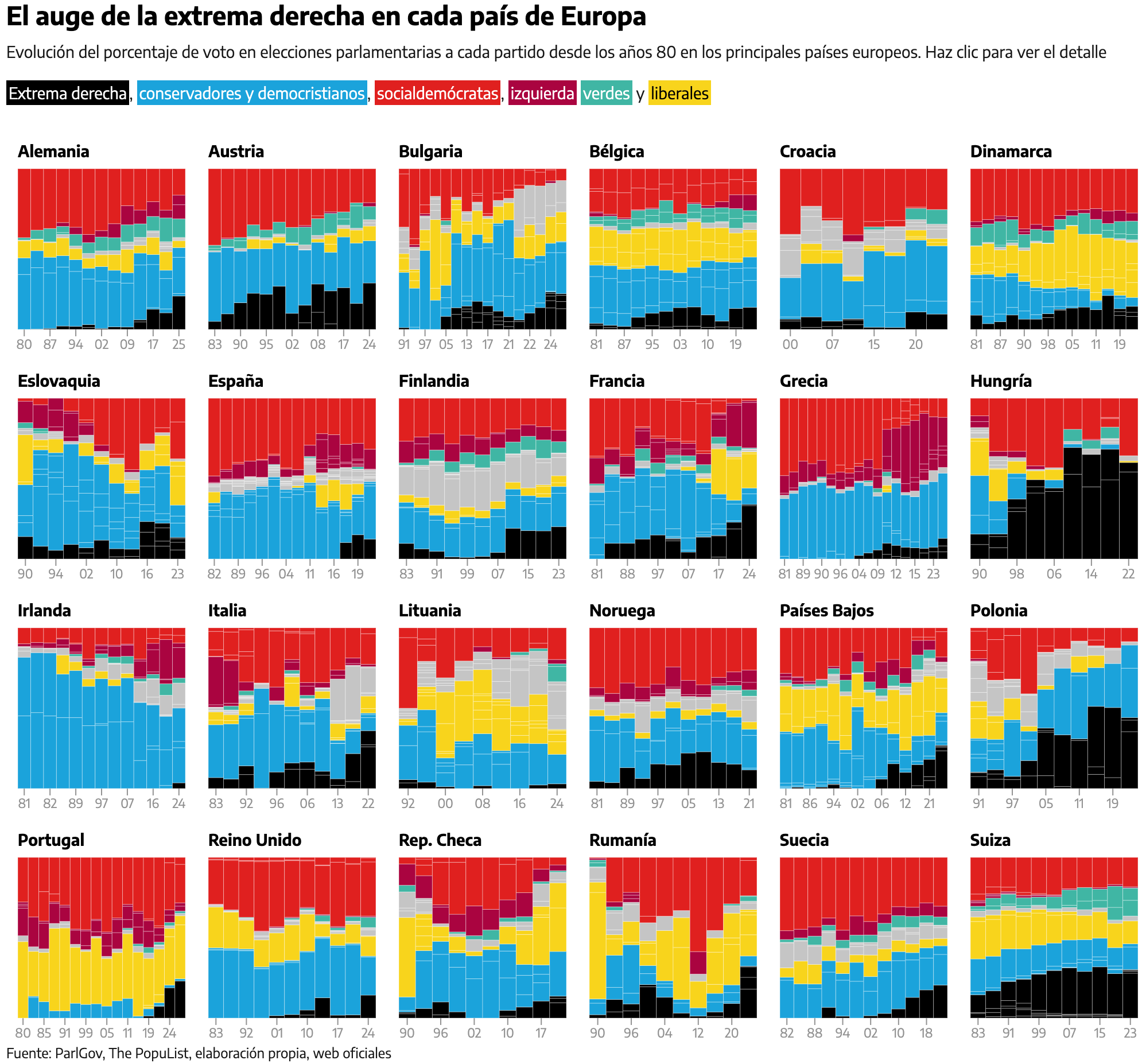
❤️🩹 How is everyone feeling? Where are far-right politics gaining traction? How many more ways of self-sabotage is the Trump administration going to discover?
📨 All this and more in our latest Data Vis Dispatch!
https://www.datawrapper.de/blog/data-vis-dispatch-may-27-2025
Your office-mates are clicking and clacking away at top speed. But who can clack the fastest? This week, Elliot declares a Datawrapper speed typing champion (and sees how we stack up against 168,000 strangers) 🏁
📣 We have some spots left for today's webinar at 12pm EST/6pm CET about maps! 🌎
Learn how to create them with Datawrapper, how to make them beautiful, and more.
You can register here 👇 https://streamyard.com/watch/vKMT6ZCZcShZ

Client Info
Server: https://mastodon.social
Version: 2025.04
Repository: https://github.com/cyevgeniy/lmst