@temochka that was 2020 BD (Before Daniel).
Eugene Fedorenko
Principal Product Designer at Privy. Ex Wildbit and Postmark. Writing @figmalion, building AccessiblePalette.com, tinkering with design/dev tools.
@temochka I agree!
@temochka Did not expect 15.
Eugene Fedorenko boosted:
Considering switching from WordPress to Craft? Here’s everything you need to know: https://craftcms.com/vs-wordpress #CraftCMS #WordPress
Eugene Fedorenko boosted:
Setting UI font metrics to ensure text appears vertically centered is a core principle at Yep! Type.
All my fonts follow this rule and will continue to do so. This ensures that text labels are balanced within containers like buttons and list items, and align perfectly with icons.
It’s a small detail that makes a big difference in digital design.
Check out this must-read article from @nikitonsky.
https://tonsky.me/blog/centering/
@jabronus oh wait that’s me!
Eugene Fedorenko boosted:
#Config2024 is next week, so here’s a little sneak peak at something you might see at the Figma Creator Fund booth 😉
@mwichary considering how sturdy they are, I’d build a coffee table or some furniture!
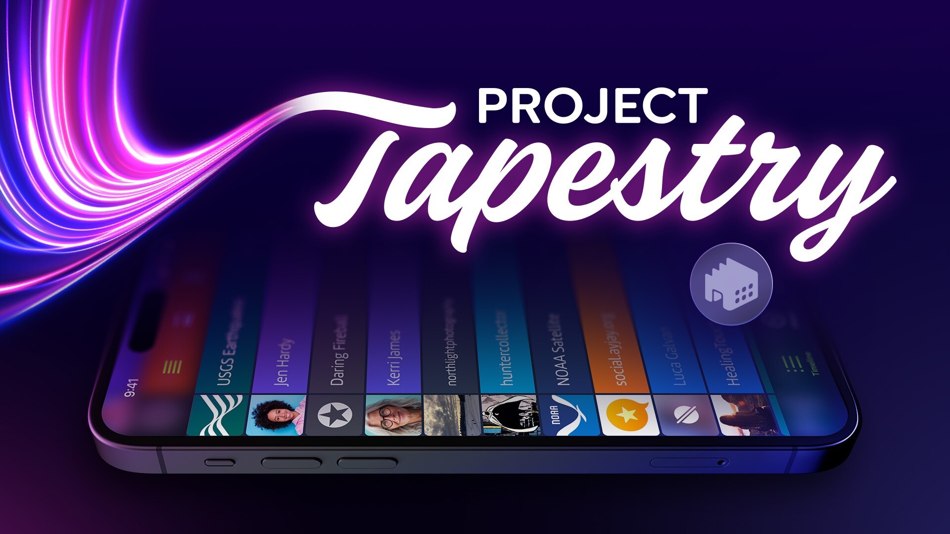
Eugene Fedorenko boosted:
Online media can be overwhelming. It's fragmented between countless services, websites, social networks, and apps.
You need an app that weaves together an overview of nearly everything that’s happening across all the different services you follow.
That’s our vision for Project Tapestry, the new Kickstarter we're launching today.
https://www.kickstarter.com/projects/iconfactory/project-tapestry
@temochka by the time I finish my last cup of coffee it’s time for tea.
Eugene Fedorenko boosted:
My friends! The #Harmony color palette is now live on Product Hunt.
We’re thrilled to contribute to the community. There aren’t many products that prioritize accessibility, streamline the experiences of designers and developers, and are available for free.
Support Harmony on PH: https://www.producthunt.com/posts/harmony-accessible-ui-color-palette
Eugene Fedorenko boosted:
I've finally managed to get #ImageOptim notarized!
Try the beta build v1.9.1. It supports ARM fully now.
Eugene Fedorenko boosted:
Introducing Harmony, a new UI color palette for product designers.
Harmony combines cutting-edge color technology, providing precise UI element contrast control, extremely consistent color shades, and P3 gamut support.
It’s free and available in Figma Community.
https://www.figma.com/community/file/1287828769207775946/harmony-accessible-ui-color-palette
@rianvdm had the same thought in the past: https://x.com/efedorenko/status/1264758002441125888
Eugene Fedorenko boosted:
📨 Issue #127
🛠️ Maker Week
📎 Clippy plugin (@rogie)
🗄️ UI2 refresh (@Disco_lu)
#️⃣ Hex colors
🌈 P3 in CSS and Figma (@sitnik_en)
🎛️ Strategies for variables
🎨 Color best practices
@nikitonsky That’s exactly what happens with “normal weight” in population.
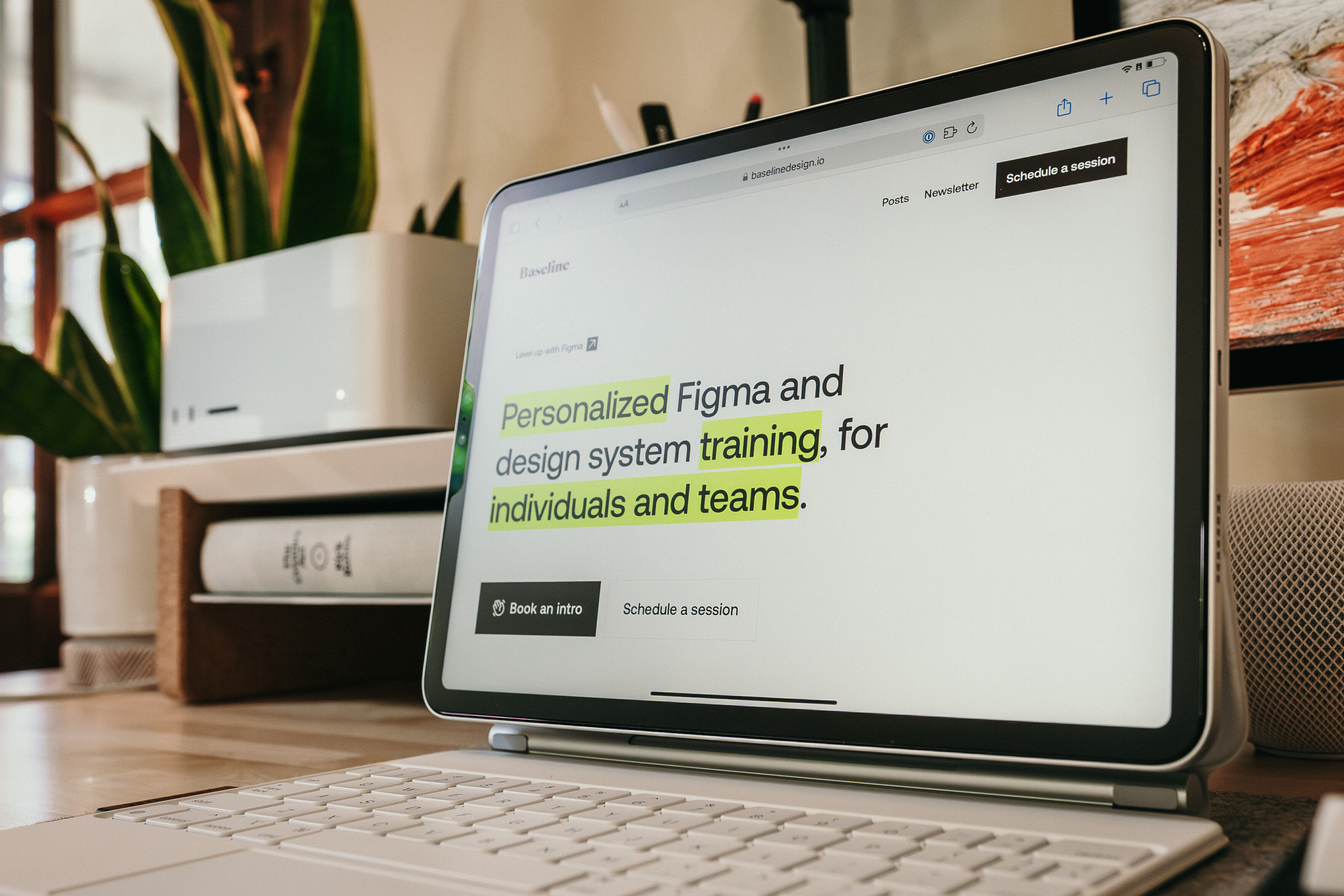
Eugene Fedorenko boosted:
Baseline Design is a little company I started a few years ago to help anyone and everyone become more comfortable and confident with Figma and with the world of design systems. Feeling excited to share a new site and logo today! ✨
@mwichary I’m probably not the first to share it with you today, but just in case you haven’t seen it yet: https://github.com/bartobri/no-more-secrets
@derek I’d insta-subscribe.
Eugene Fedorenko boosted:
Phew, I'm so excited to share this post! Here's absolutely everything I've learned about variables in Figma so far, with as many tips and shortcuts as I could share to help you make the most of the tool's newest feature. 🎛️✨
https://joeyabanks.substack.com/p/baseline-14-a-guide-to-variables
Client Info
Server: https://mastodon.social
Version: 2025.04
Repository: https://github.com/cyevgeniy/lmst