Ensemble perception is part of the power behind strikingly detailed visualization's like Fernanda Viegas + Martin Wattenberg's wind maps, Periscopic's US Gun Deaths, and Nadieh Bremer's Wars.. as well as more utilitarian charts like jitter plots.
Eli Holder
Maker / geek! ❤️ Data, design, dataviz, product, systems, clojure, feedback & mischief. He/him.
This week's Effect+Affect: What can dinner parties teach us about dataviz 📊? Thanks to ensemble perception, your brain is weirdly good at parallel processing faces, grass, and zillions of lines on charts.
Is Taylor Swift a CIA psyop? No? Don't think so? What if you hear about it four more times? In our second post for Effect+Affect, Gabby and I unpack how "Truth by Repetition" can make absurd information seem more plausible and what it means for data communication.
https://effaff.com/repeat-after-me-truth-by-repetition-effect/
Our first post is here. We look at how contrast effects in information design can convince college students that a disease with an 11% risk is more likely than one with 12% risk.
How did this happen? What does it mean for dataviz design?
...and overstate _everything_ in a way that's academically questionable, but hopefully exciting? And, of course, we'll invite the research community to call us on our bullshit and share any discussions that pop up as we go! Hooray science!
...something more approachable. So every week(ish) we'll pull one of our favorite studies from the stack, unpack the findings and relate them back to data design, and maybe turn some of the results into a hopefully not-too-reductive postcard.
Along the way we'll sensationalize, editorialize...
Gabby Merite and I are doing a newsletter! We're calling it Effect+Affect. You can sign up at https://effaff.com
The idea: We think data design research is super cool. We use it in our own design work. But academic papers are Zzz and intimidating. So we're attempting to translate our favorites into...
New Nightingale post!
Political polls in the news are like reality TV for people who like spreadsheets. They’re a fun guilty-pleasure, but they’re not exactly a public service and shouldn’t be taken too seriously. They’re also low-key toxic.
In this research roundup, I unpack three recent dataviz 📊 studies and consider how cliches in political data journalism can subtly undermine the democratic process.
https://nightingaledvs.com/divisive-dataviz-how-political-data-journalism-divides-our-democracy/
@mduvekot ha, I guess surprise is relative?! I think it's non-trivial (or at least not widely understood) that these takeaways are relative and and not necessarily responsive to the absolute values. Also unclear why people on the left half _reduce_ their perceived risk but it doesn't seem to affect people on the right half? Like why isn't the influence symmetric? If they were using an exponential curve as their mental model then you'd expect people on the right to increase their perceived risk.
@mduvekot yeah I suspect there are tweaks to charts / annotations that might influence some of the issues here. There are a few different studies that suggest social comparisons are independently distortive though, which was the interesting part for me.
Of course, that isn't to say the other studies weren't _all_ using weird charts 😂, but the effect is at least independent of the way it's presented in this particular screenshot.
Group-vs-group comparisons like these can be sketchy in other ways too, particularly for race / ethnicity.
Susana Peinado + others at the CDC did an _epic_ review of these social comparison effects. Absolutely worth a look for health / equity 📊 designers:
https://www.frontiersin.org/articles/10.3389/fcomm.2020.539174/full
These contrast effects are a big deal for equity-viz. Disaggregating health risks by race/age/etc might backfire similarly. e.g. early Covid news reports, highlighting risk disparities for essential workers or older people, may have convinced everyone else that the pandemic wasn't their problem.
The study highlights an interesting contrast effect. Non-smokers anchored their risk to smokers' relatively high risk, mistaking their lower relative risk for low absolute risk.
This invincibility effect matters because lower perceived risk invites more risky behavior.
Joshua Gold + Iowa researchers show..
For smokers (intended audience) the chart had no real effect on risk perception or testing intent. So at best it's ineffective.
For non-smokers (majority) it actually backfires, convincing them they're invincible to radon.
A chart from a 2018 dataviz 📊 study. This has melted my brain a bit.
The chart is meant to raise awareness about radon exposure and nudge people to get their homes tested. Specifically, it's meant to show smokers that they're at increased risk.
What effect do you think it actually has?!
And @albertocairo captured one of our main themes quite well: "Think about Holder and Xiong's research and of Alli's illustrations next time you hear anyone suggest that 'data speaks for itself' or that visualization designers should worry only about the correctness of their decisions and not the consequences of those decisions..."
For context, you can learn more about the research AND see Alli's illustrations in action here: https://3iap.com/unfair-comparisons
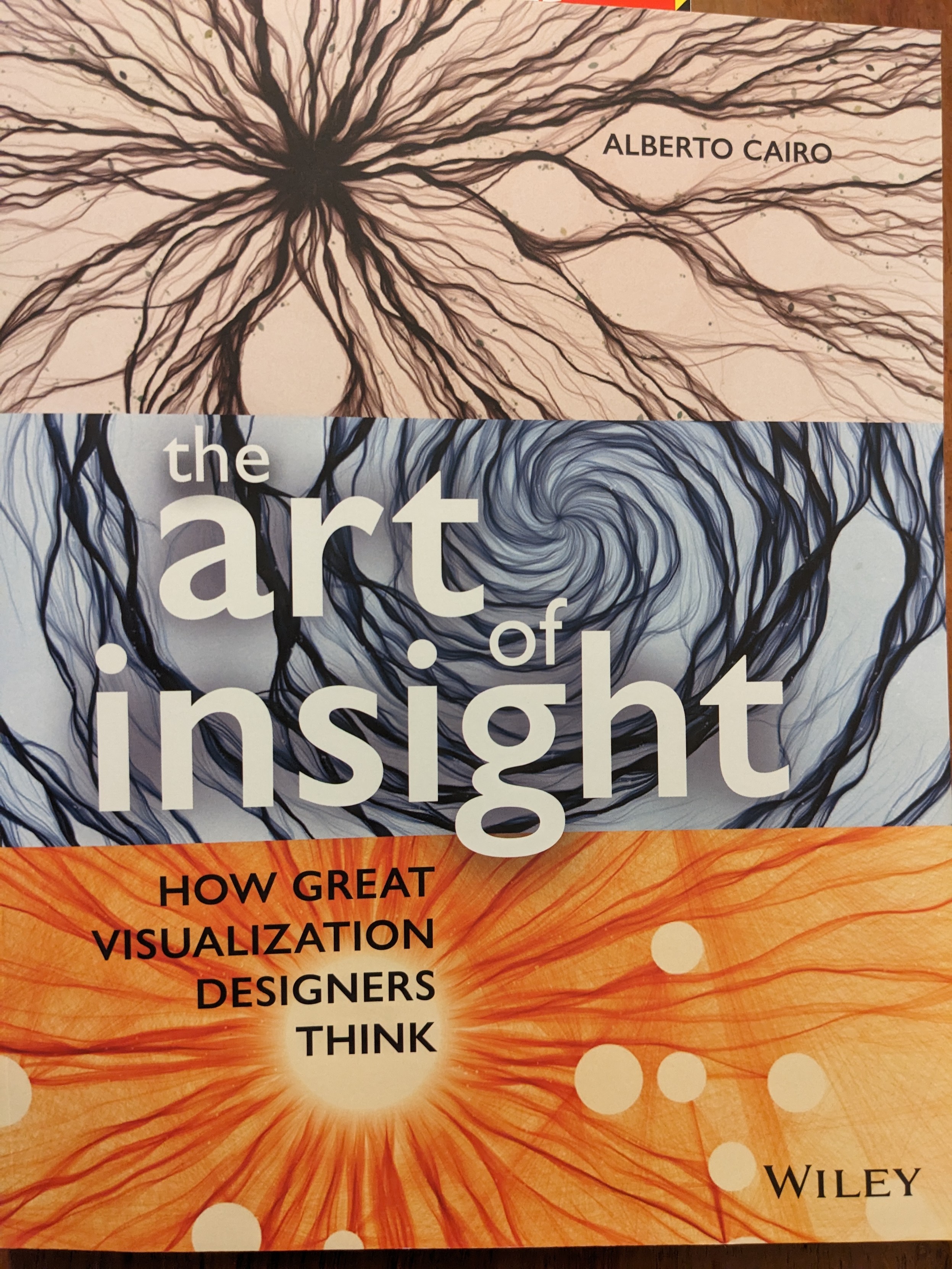
So cool! My "Dispersion vs Disparity" research with Cindy Xiong Bearfield made it into @albertocairo's new "Art of Insight" book. We snuck into @Allitorban's inspiring chapter on "Making Data Friendly." I'm so proud to see equity-focused dataviz make it into print.
This is icing on the cake though, because collaborating with Alli was such a wonderful experience. She's one of the most visually articulate people in the field and absolutely brought the research to life.
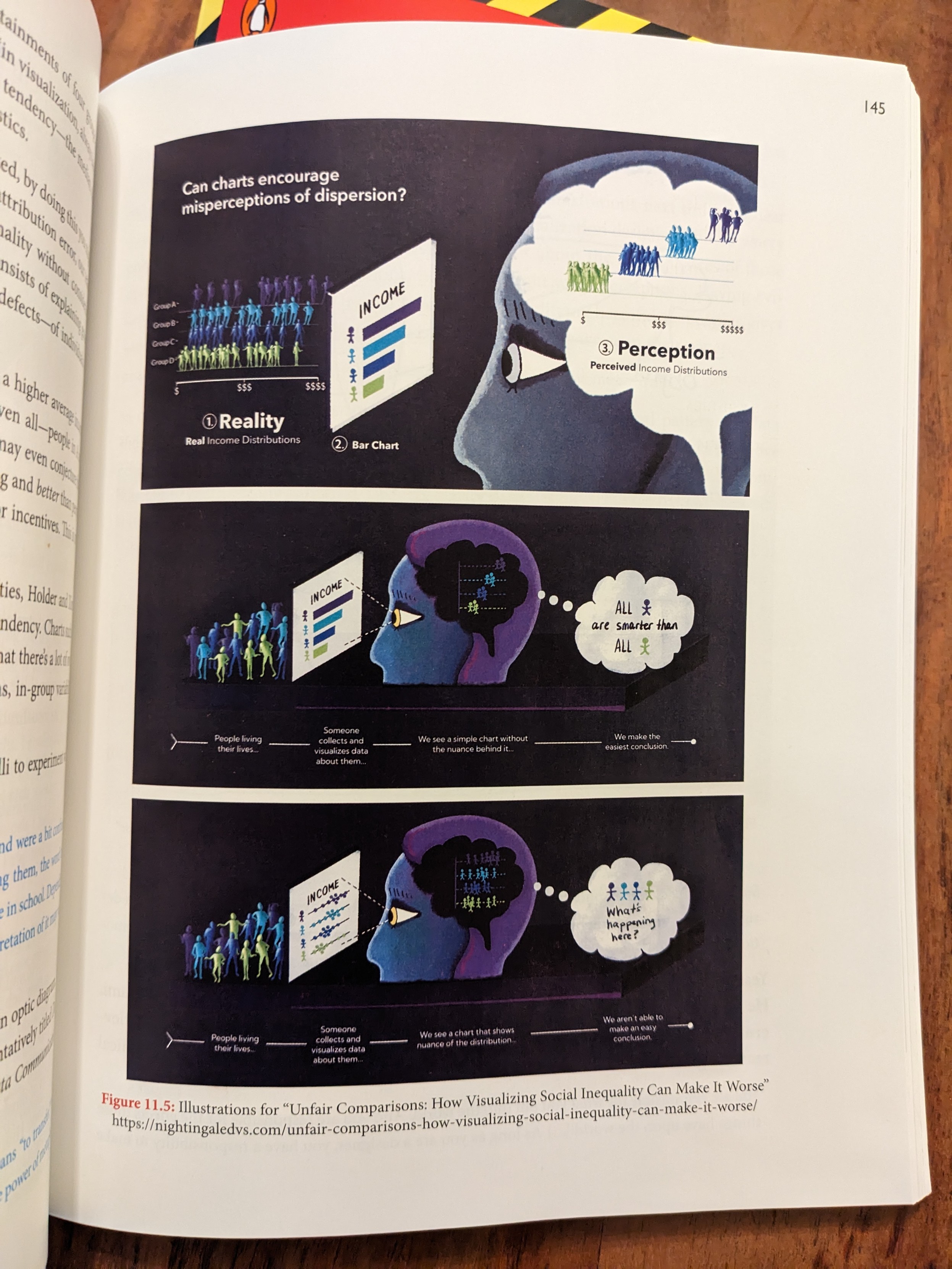
TLDR: "Imagine an interest group called 'Dirty Handed Doctors of America' surveys their unhygienic-but-medically-credentialed members. They find: '94% of MDs in our esteemed org. strongly agree we should stop washing our hands before treating patients.' That finding may be accurate. Their opinion is wrong, but it could be true that 94% of them support it. Our research suggests visualizing extreme attitudes like these might help them spread (like the germs on their filthy, filthy hands)."
New Nightingale article! As we're careening into U.S. election season, we should consider the bizzaro world of political information psychology, where data absolutely can't "speak for itself."
In our polarized culture, data will be viewed through a partisan lens. It can also have partisan side-effects, such as distorting viewers' attitudes on important issues.
So this is a quick primer for designing political dataviz without accidentally sabotaging our democracy.
https://nightingaledvs.com/political-psychology-in-data-viz/
@dangrsmind agreed! It actually didn't fully click for me until well after the paper was submitted, but it's seeming more and more like social comparisons are generally kinda sketchy... And from a design perspective not really necessary - for the use cases I've looked at so far, it seems like there are generally better ways to show the data.
Client Info
Server: https://mastodon.social
Version: 2025.04
Repository: https://github.com/cyevgeniy/lmst