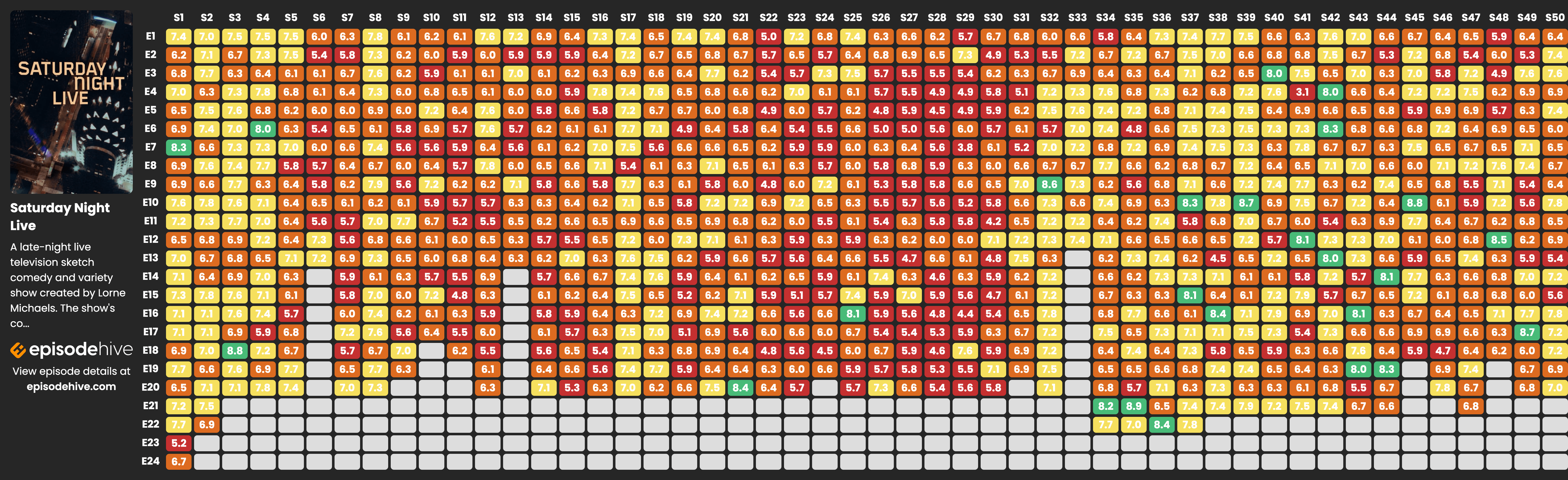
SNL Episode Guide
In case you’re wondering…
S46 E17 - Ryan Gosling
S48 E12 - Pedro Pascal
S45 E10 - Eddie Murphy
S44 E14 - John Mulaney
S44 E19 - Adam Sandler
S49 E17 - Ryan Gosling (again)
https://episodehive.com/tv-shows/saturday-night-live
Information Is Beautiful
Data visualizations & information graphics by David McCandless. Plus favourite finds from around the web. Making sense of the world - well, trying to - since 2009.
#InformationIsBeautiful #KnowledgeIsBeautiful #DataViz #iiblive #davidmccandless
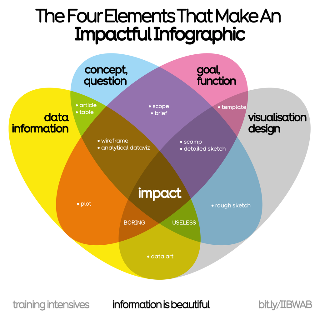
We use this prism in our workshops to help create an impactful, communicable, beautiful #infographic
Learn more in our forthcoming seminars:
2 x virtual half days:
24th & 25th Jun 🇬🇧 UK/EU/AUS
17th & 18th Jul 🇺🇸 USA
https://bit.ly/IIBWAB #iibwab
Reviews: https://geni.us/WABreviews
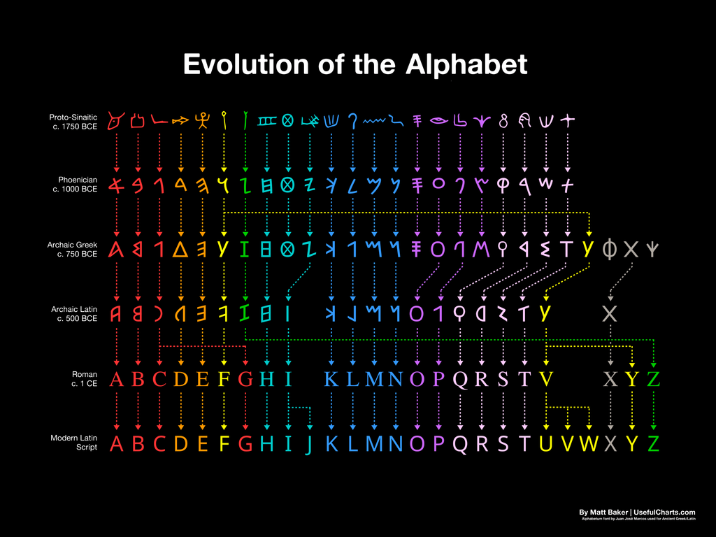
Evolution of the Alphabet via https://usefulcharts.com/
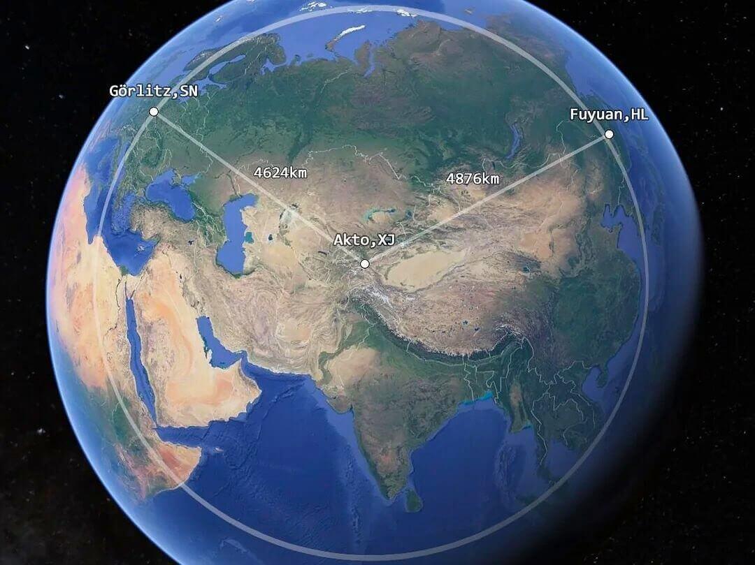
China’s westernmost point is closer to Germany than to its easternmost point!
(by @amazingmap)
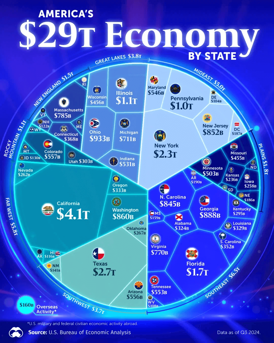
Visualizing the USA's $29 TR economy by state
https://www.voronoiapp.com/economy/Visualizing-Americas-29-Trillion-Economy--4103
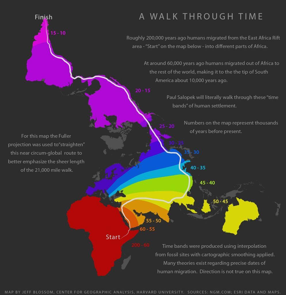
Charting human migration over deep time
(via https://outofedenwalk.nationalgeographic.org/media/2013-01-a-walk-through-time)

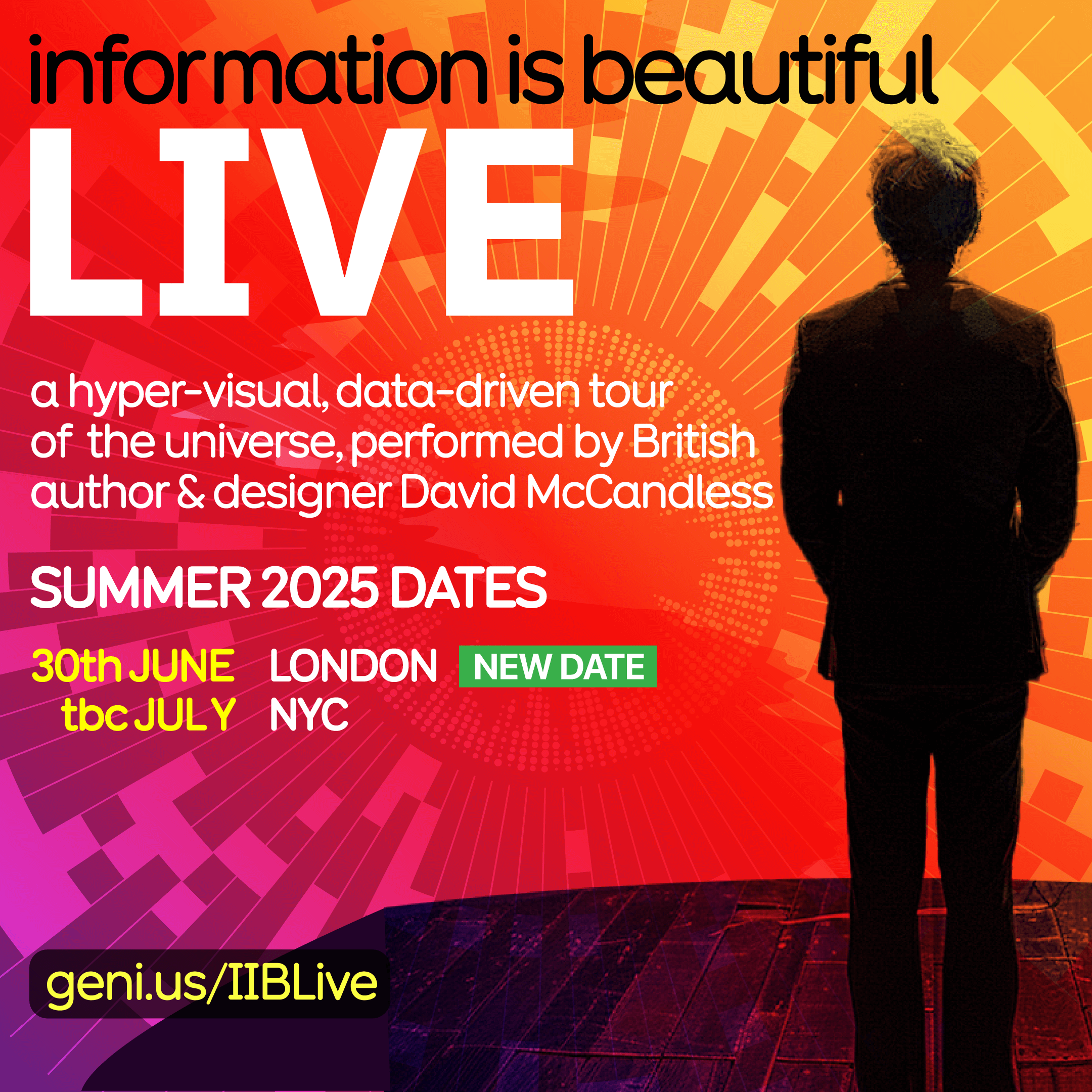
NEW DATE: Join me for another London Information is Beautiful LIVE show Mon 30th Jun. I'll be hosting a rare night of ‘performance journalism’ - full of graphics, numbers, knowledge and jokes https://geni.us/IIBLive

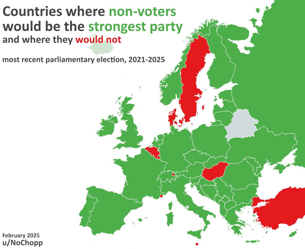
Countries where non-voters would be the strongest voting bloc / party
Learn how to turn ideas, stories, numbers into impactful #infographics & data-visuals with Information is Beautiful. Details: https://bit.ly/IIBWAB
2 x virtual half days:
24th & 25th Jun 🇬🇧 UK/EU/AUS
17th & 18th Jul 🇺🇸 USA
Reviews: https://geni.us/WABreviews

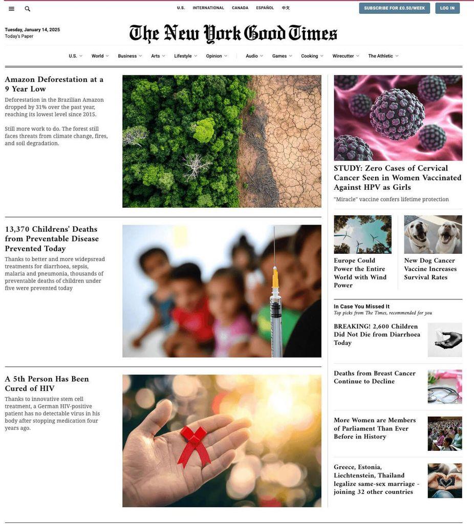
“What a wonderful world it could be”… wait, CORRECTION: *is kinda already*
A different way of seeing the news
https://informationisbeautiful.net/beautifulnews/news/nygoodtimes/
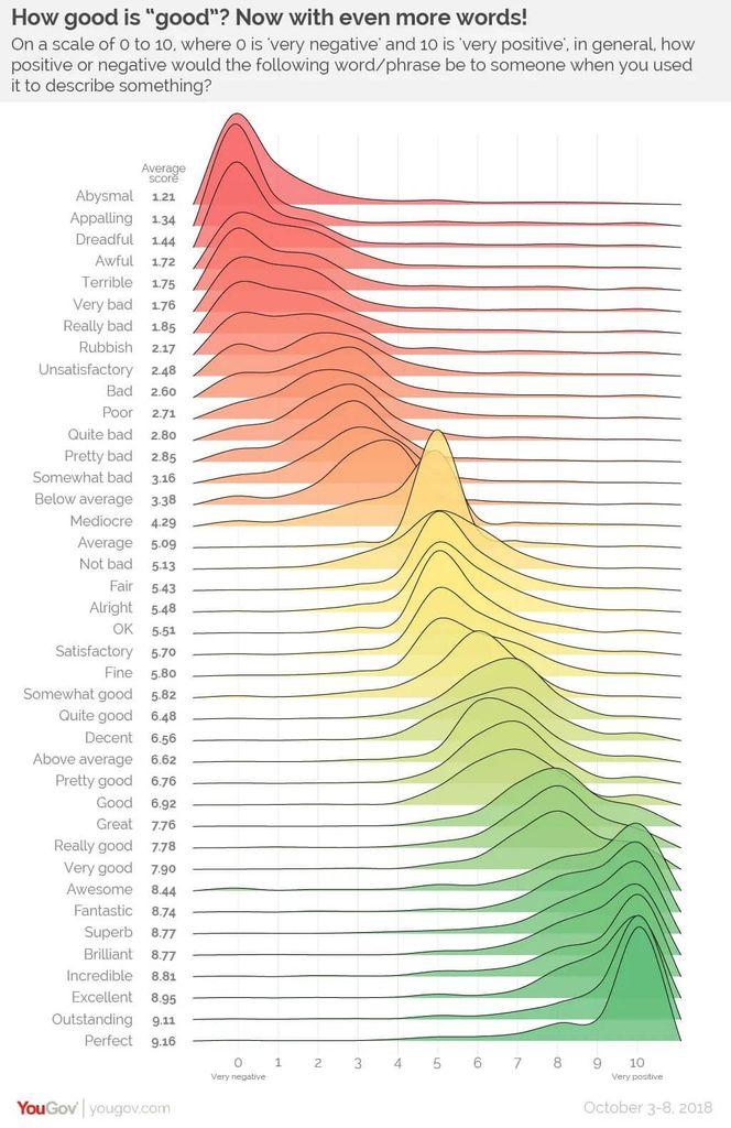
Rubbish? Fine? Brilliant? British superlatives graded and ranked.
https://yougov.co.uk/society/articles/21568-how-good-good
US version here ('quite' interesting comparison)
https://today.yougov.com/society/articles/21717-how-good-good-1
Information Is Beautiful boosted:
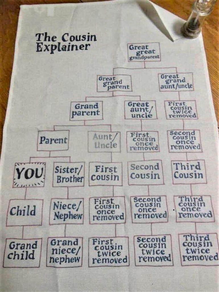
Wait, who is my third cousin twice removed? Oh
Join us for another funny & unique Information is Beautiful LIVE show in London Mon 30th Jun. IIB founder David McCandless will host a rare night of ‘performance journalism’ - full of graphics, numbers, knowledge and jokes https://geni.us/IIBLive
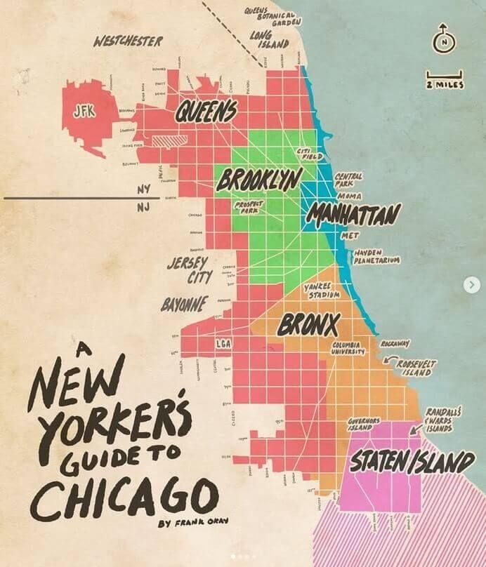
Love this idea for quick reference travelling
(By Frank Okay https://www.frankokay.com/ @frankokay)
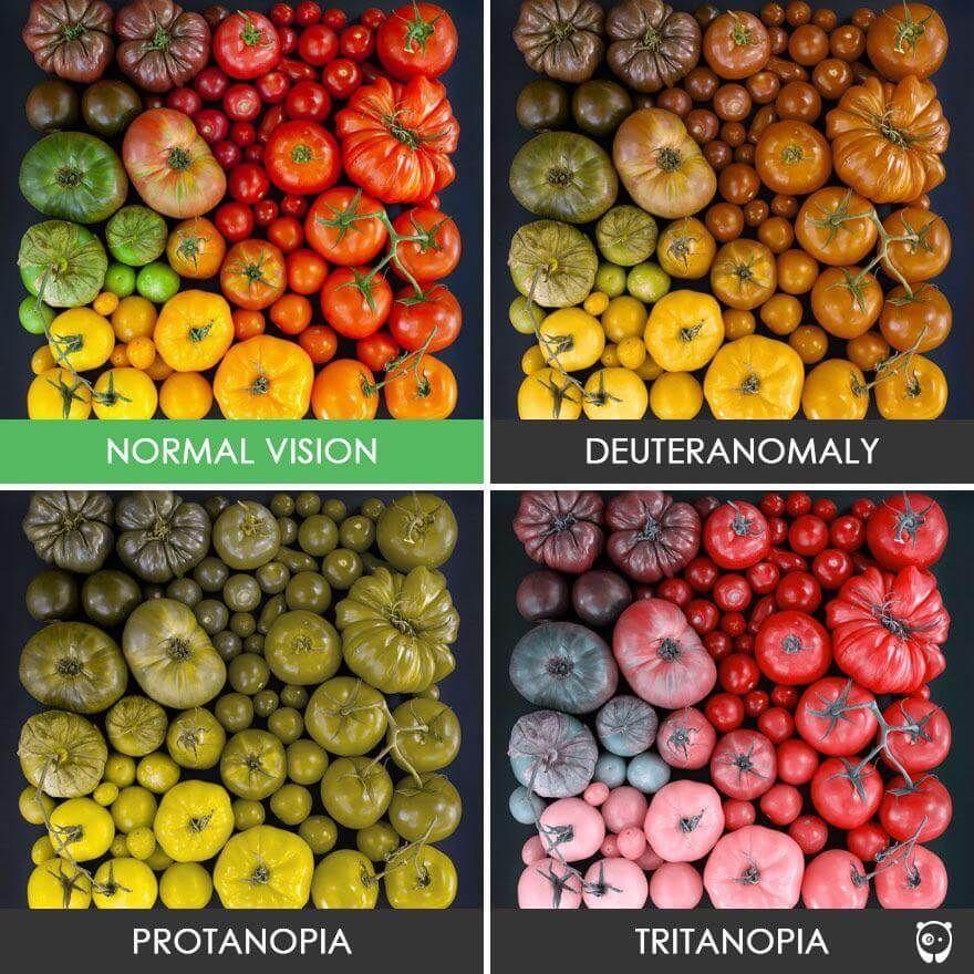
% of world population with colour-blindness:
Deuteranomaly (green-weak) 4.6%
Deuteranopia (green-blind) 1.3%
Protoanomaly (red-weak) 1%
Protanopia (red-blind) 1%
Tritanopia (blue-blind) ~rare
This condition affects 1 in 12 men, 1 in 200 women, so more than 350m worldwide. 1 in 22 people.
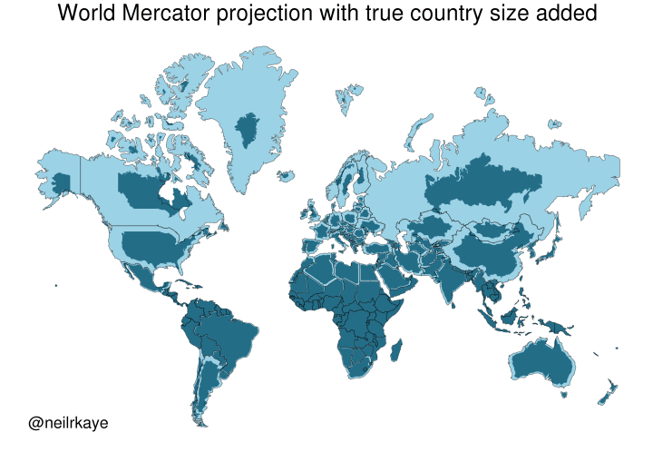
Yet another reason to tut at the Mercator map projection
https://brilliantmaps.com/mercator-vs-true-size/
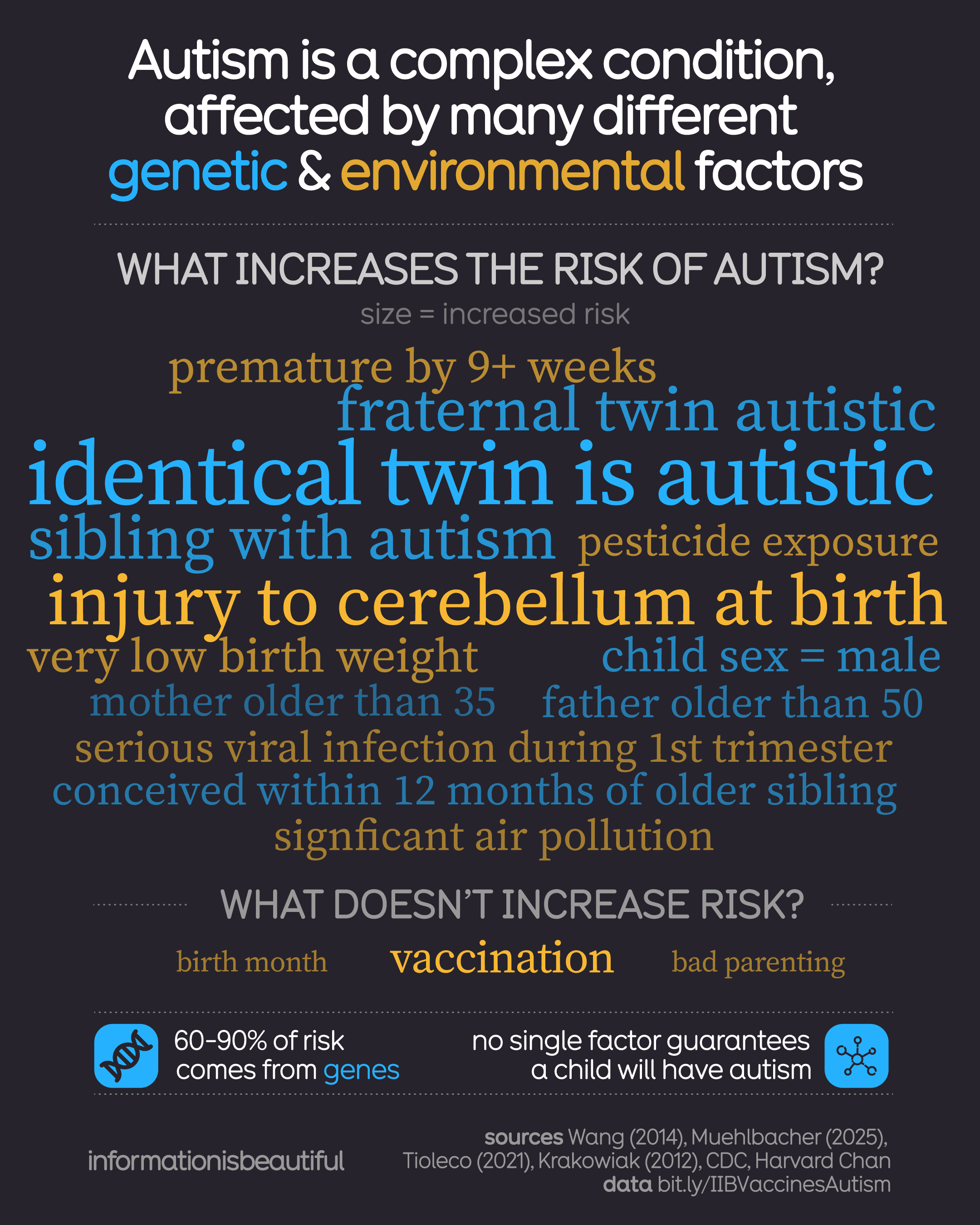
Risk factors for autism, according to evidence.
all data & sources
https://bit.ly/AutismRisks
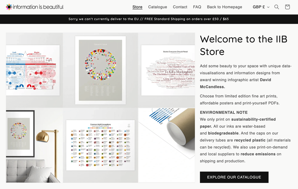
INTRODUCING: our new online store where you can buy high-quality art prints of our most popular infographics & visualisations
https://bit.ly/IIBStore
Client Info
Server: https://mastodon.social
Version: 2025.04
Repository: https://github.com/cyevgeniy/lmst