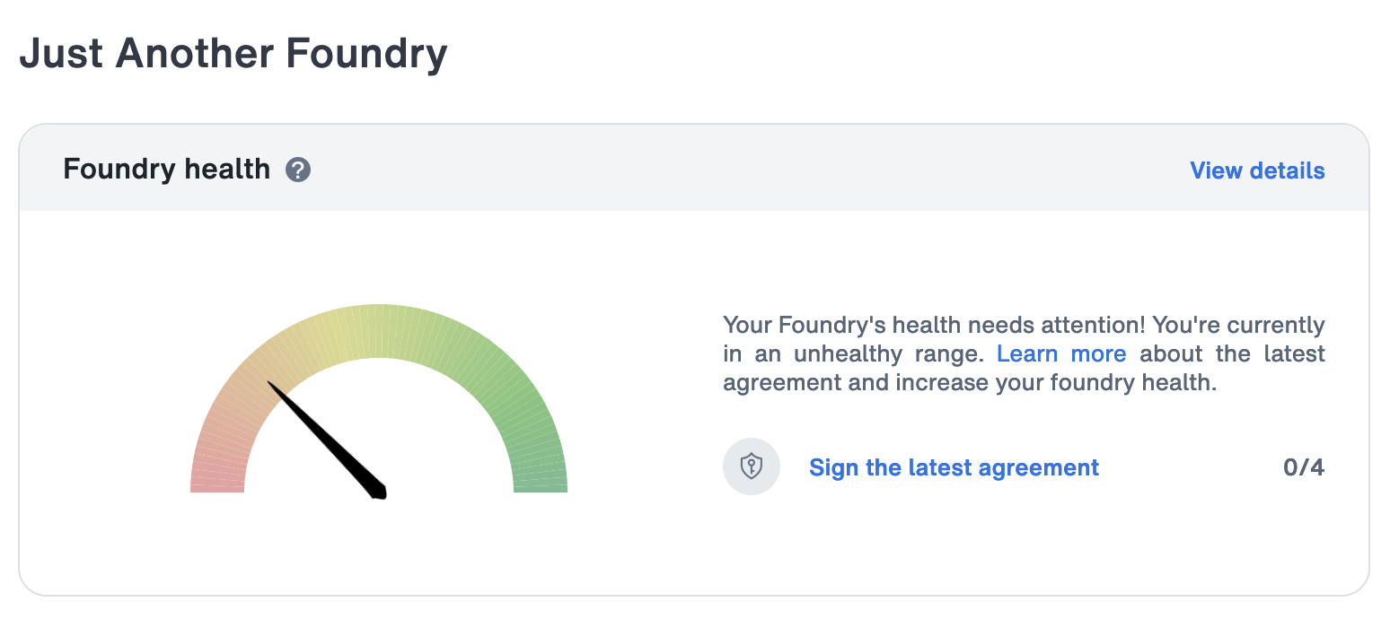
Oh no! JAF is currently in an unhealthy range. Our foundry’s health needs attention! Even though we thought we were doing very well. Thanks for letting us know, MT.
Just Another Foundry
JAF is Tim Ahrens and Shoko Mugikura. We design and produce fonts for print and screen. https://justanotherfoundry.com
20 years after its first release, JAF Lapture gets updated and expanded! The new version includes Black and Condensed styles, as well as Cyrillics. #ad
Just Another Foundry boosted:
@jaf One of the best books on type. https://typographica.org/typography-books/size-specific-adjustments-to-type-designs/
Just Another Foundry boosted:
@typographica @jaf
Might have been the most important book right before and during my #EsadType studies. It still wears an additional dust jacket I made from paper to protect it.
Hopefully all the libraries of universities with type design programmes have multiple copies stocked, now that it’s out of print.
✨Bernini Sans in safety cans for flammable liquids✨
Discovering our fonts in heavy duty industrial products is as thrilling as finding them in museums or bookshops!!

After 10 years, our book “Size-specific adjustments to type designs” has gone out of print. If you would like to receive a notification in case of a reprint or a revised edition becomes available, please send us an email: https://justanotherfoundry.com/size-specific-adjustments-to-type-designs
Just Another Foundry boosted:
Hybrid-Vortrag, 10.10.2023
»Unsichtbare Probleme« mit @ShokoMugikura :languages:
(Vorband: Keanu Bohatsch & Tobias Fannrich, ICD-10).
Infos & Anmeldung: https://tgm-online.de/programm/veranstaltungen/unsichtbare-probleme
In der heutigen vernetzten Welt arbeiten immer mehr Designer an Projekten mit verschiedenen Schriftsystemen. Doch der Umgang mit einer fremden Schrift ist keine leichte Aufgabe. Es gibt viele Fallstricke. Viele davon sind unsichtbar – es sei denn, man hat gelernt, sie zu sehen.
Just Another Foundry boosted:
For the design of this year’s Typographics festival, we’re using several complementary typefaces:
➽ Mayonnaise from Spaghetype for decorative settings, overlaid with its Shadow and Shine layers
https://www.futurefonts.xyz/spaghetype/mayonnaise
➽ Anchor from Process Type for most other headings
https://processtypefoundry.com/fonts/anchor/
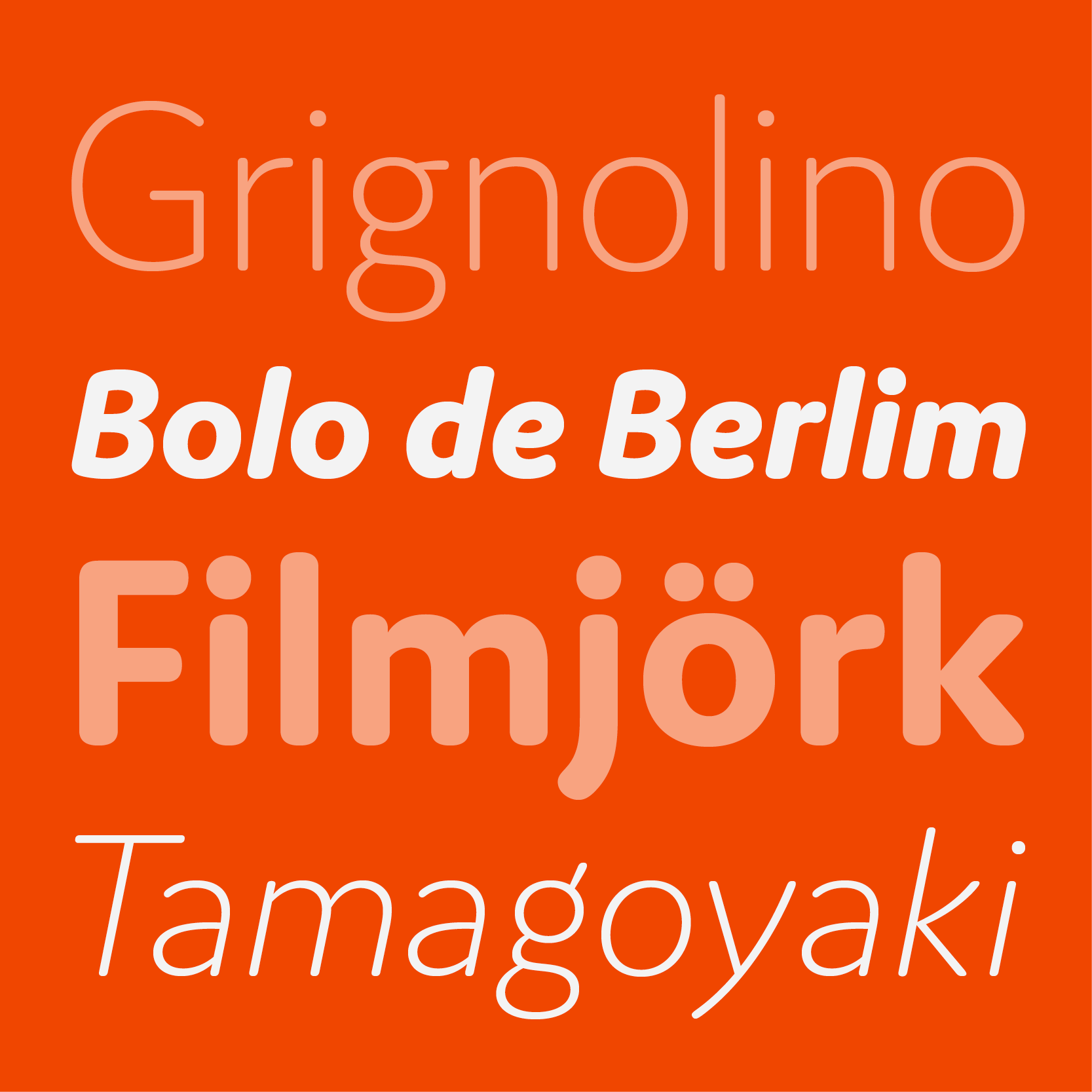
➽ Cupidus & Cupidus Text from @jaf for subheadings, deks, body text, captions, etc.
https://justanotherfoundry.com/cupidus
➽ Crackly from Emigre for various ornamental background patterns
https://www.emigre.com/Fonts/Crackly
Just Another Foundry boosted:
@jaf Nice! JAF Cupidus was kerned with Kern On.
Did you know? The Cupidus italics are entirely autokerned (and partly autospaced) on the basis of the uprights, without any additional manual input. 😎
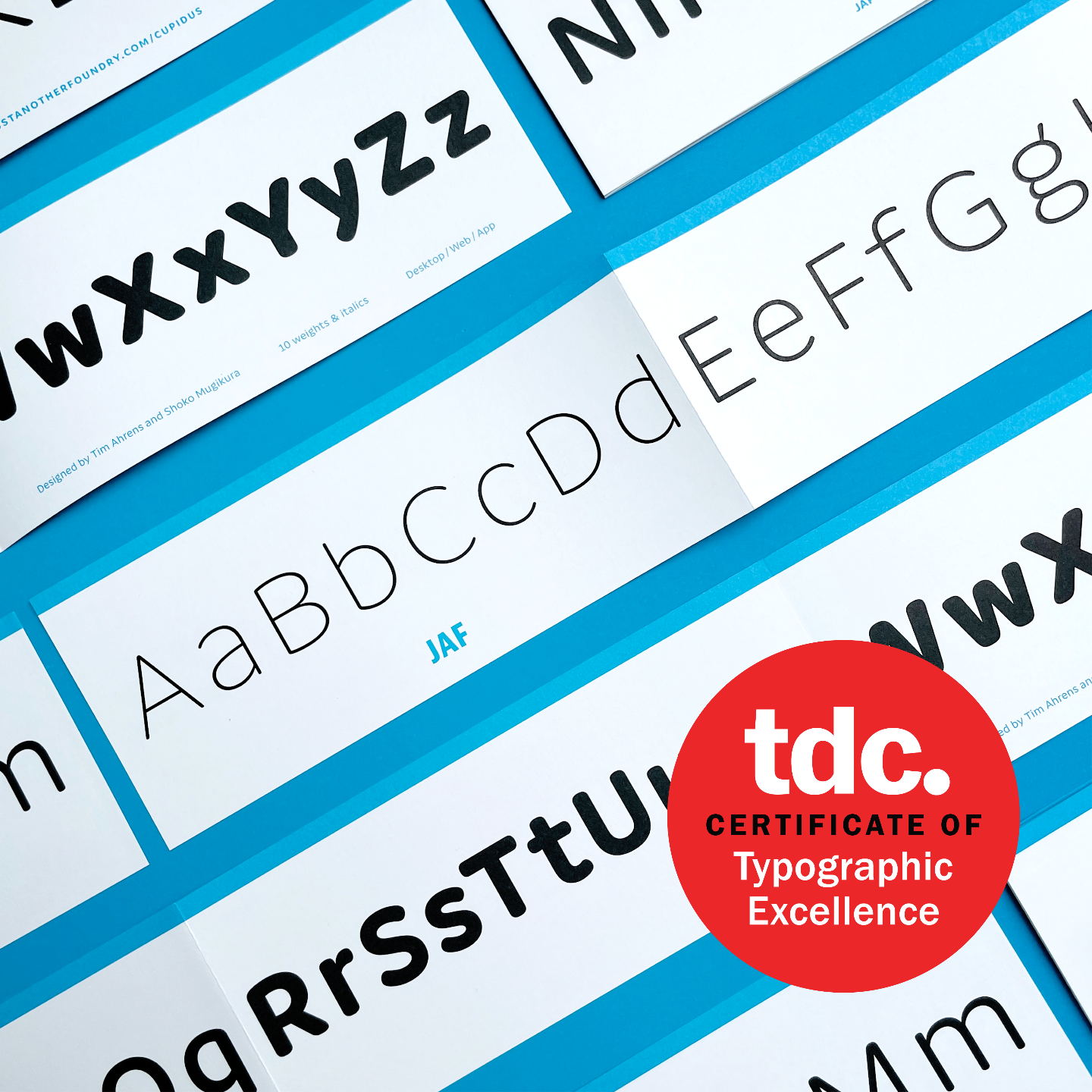
Great news! JAF Cupidus received a Certificate of Typographic Excellence from the New York TDC! #TDC69
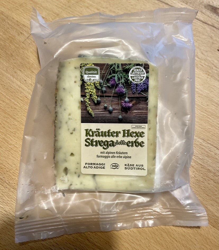
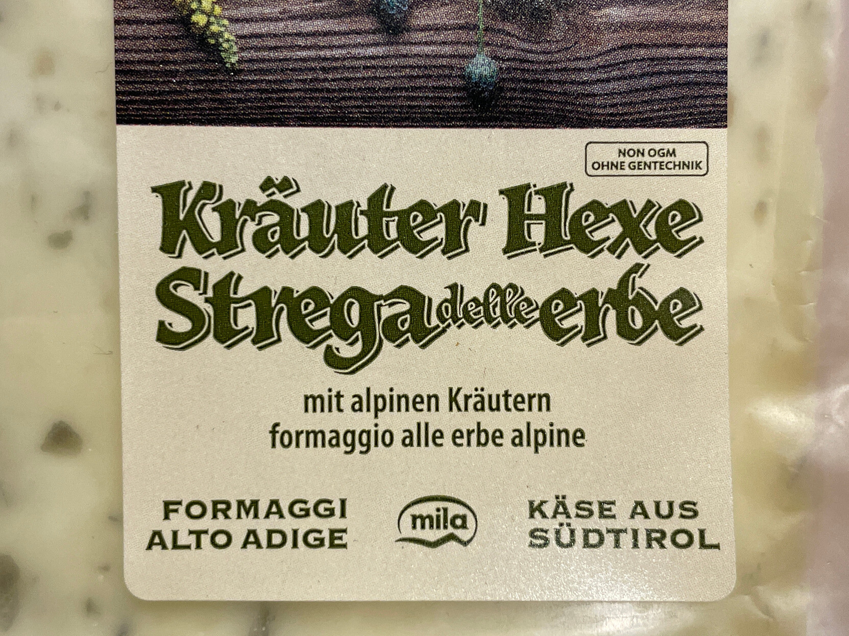
Does this count as a case for LTypI? Herb (Kräuter in German) cheese found in the local supermarket! #JAFHerb
Client Info
Server: https://mastodon.social
Version: 2025.04
Repository: https://github.com/cyevgeniy/lmst