If you're overwhelmed as a designer right now, let's break it down to: What can *you* do?
Johannes López Ayala
Drawing type at Tipogris Fonts and Friends ⦿ Nudging letters at Tipogris Books and Brands ⦿ Creating conceptual art ⦿ Writing on art history, philosophy, jazz, and fonts ⦿ Teaching at Rhine-Waal University of Applied Sciences ⦿ Expert class Type design alumnus 21/22
Johannes López Ayala boosted:
@timesnewboman on font piracy https://www.youtube.com/watch?v=altfwRMXG4A
Download Lotte’s two booklets on design for mental health (in Dutch) here:
https://www.redesigningpsychiatry.org/tools/redesigning-psychiatry-publicatie-1
https://www.redesigningpsychiatry.org/tools/redesigning-psychiatry-publicatie-2
Lotte Jacobse presenting the Reframing design method at KRUPA design conference right now. Live stream: https://www.youtube.com/live/iwOnoc_rQJA
@burningTyger There are no crimes in type, only happy little accidents.
Is this late 1950s logotype lettering or typeset? Can anyone ID the typeface?
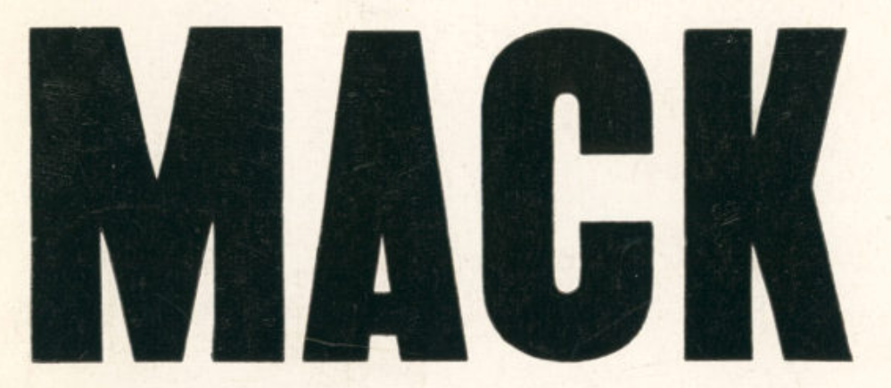
@embes @letterformarchive I’ve found out that’s actually “Minstrel”: https://typo.social/deck/@jla/114449922993376328
@koeberlin Oh, I know.
🤜🤛
@koeberlin You know this, but maybe someone else doesn’t:
The “man in business suit levitating” emoji was adapted from Microsoft’s 1997 symbol font “Webdings”, designed by Vincent Connare (of Comic Sans fame). Connare modeled the symbol (intended to visualize jumping) on an LP cover of—you guessed it—The Specials, which displayed a graphic, black & white illustration of raggae musician, Peter Tosh, in a black suit with tie.
This toot is probably the most appropriate use for 🕴️.
@pixelambacht I always wondered whether it’s just not possible to avoid those squeaks, even for a very skilled guitar player, or whether they’re intentionally employed as a means of expression (like, say, visible brushstrokes in oil painting).
@djrrb Thanks for this issue, David! I’m sure those more ‘incremental’ releases make much less of a buzz online than the novelty fonts we all love in our inbox, but it’s additions like this that make FotM really valuable to active designers.
Johannes López Ayala boosted:
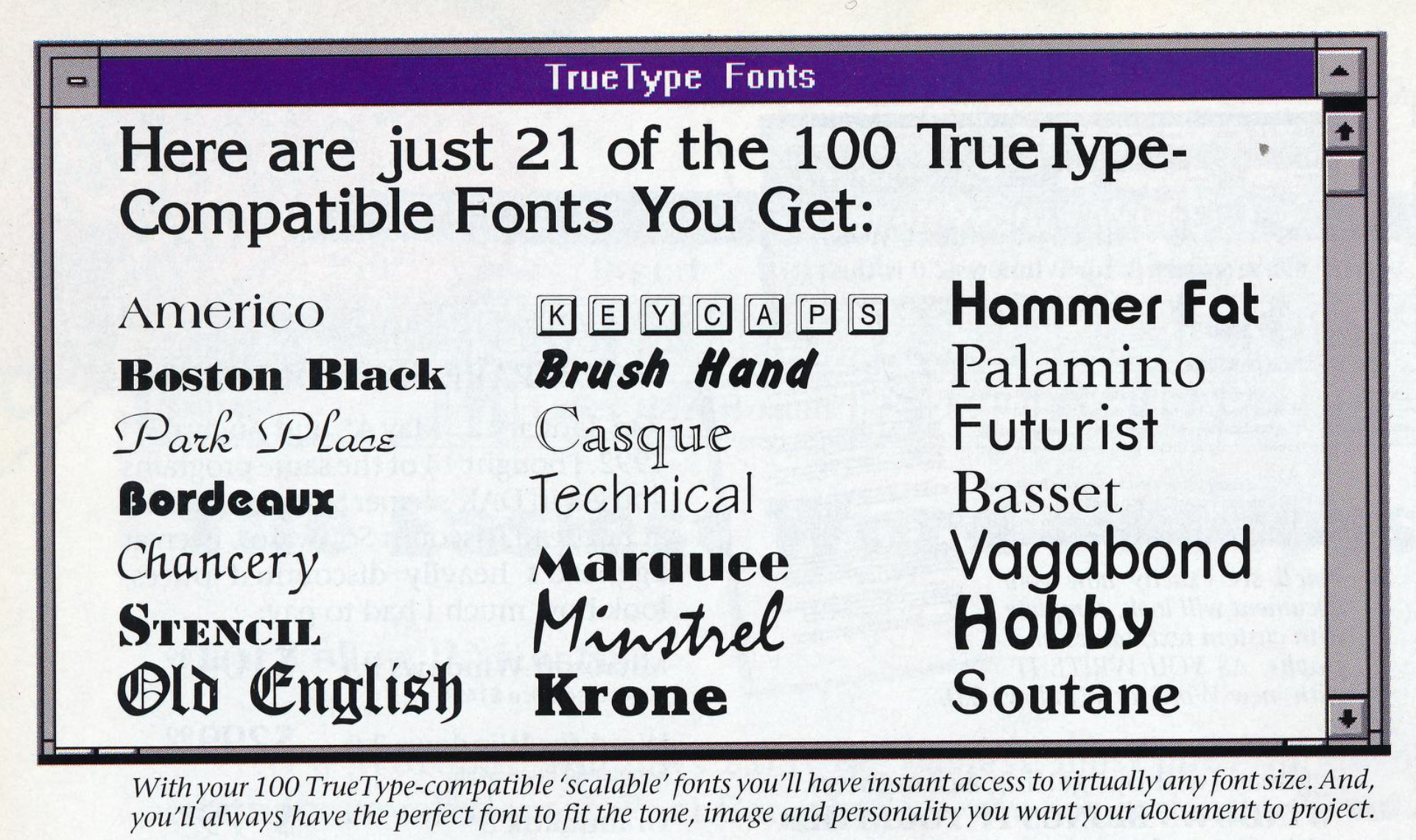
Gosh, I’d certainly like to do some rad layout work with my 1993 selection of classic fonts like “Palamino”, “Minstrel”, “Hobby”, or—who doesn’t love it?—“Soutane”.
@florian At least it was good for something, then.
@florian Like many others on this server, I’m probably just too used to comparing letterforms presented next to each other.
If your only tool is a hammer, any problem will look like a nail.
@florian You had me looking cluelessly at the large outline letters for a few minutes here before I realized this is about the sampleTextLabels.
Gosh, I’d certainly like to do some rad layout work with my 1993 selection of classic fonts like “Palamino”, “Minstrel”, “Hobby”, or—who doesn’t love it?—“Soutane”.
@tosche_e It is very difficult. I never got this across on an intellectual level. People’s first reaction was a hard no based on a feeling or intuition alone, and they wouldn’t move away from that first impression even when presented with a ton of design-related and context-related arguments. I think it’s a great typeface and I would’ve loved to use it more often.
Client Info
Server: https://mastodon.social
Version: 2025.04
Repository: https://github.com/cyevgeniy/lmst