A beautiful timelapse of the Milky Way galaxy over the ESO 3.6-metre telescope at La Silla in Chile.
Credit: ESO/S. Brunier
Type design & font engineering. Designer of Whitman, Haffner, and Clarimo type families. Have worked with Font Bureau, Carter & Cone, and Morisawa.
A beautiful timelapse of the Milky Way galaxy over the ESO 3.6-metre telescope at La Silla in Chile.
Credit: ESO/S. Brunier
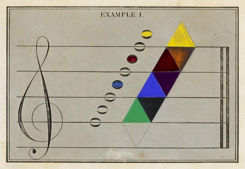
David Ramsay Hay’s mapping of colour onto musical notes, a diagram from his The Laws of Harmonious Colouring (1838).⠀More in @carmelrazmusic's essay “Music of the Squares” on a Hay's attempt to use music theory to evaluate visual beauty — https://publicdomainreview.org/essay/music-of-the-squares-david-ramsay-hay-and-the-reinvention-of-pythagorean-aesthetics
@TiroTypeworks But I think perhaps @klim’s examples are more akin to your framework of operating within established modes (e.g. set chord changes) and established materials (i.e. ingredients) while finding expression, sometimes rote and sometimes innovative, but all more or less create-ive.
@TiroTypeworks @klim For me it’s a meditation on points along the spectrum between influence and plagiarism, which has its fuzzy realm in the middle.
@TiroTypeworks @klim To clarify, I was not referring to performances, but to compositions.
But I like your genre fiction as well. It has much to offer re: analogous framework.
@klim @TiroTypeworks Similarly, I’ve often reflected on the classical music tradition of “variations on a theme by X” — Beethoven’s (and many others’) variations on Là ci darem la mano. Or Rachmaninoff’s variations on Paganini. Or Brahms’ variations on a theme “by Haydn”, which had itself been borrowed from an older chorale. Et alia. Plenty of gray area, not always black & white.
@drj I think type designers are by nature word collectors. 😝
[*cough nerds cough*]
@drj But of course; doesn’t everyone?
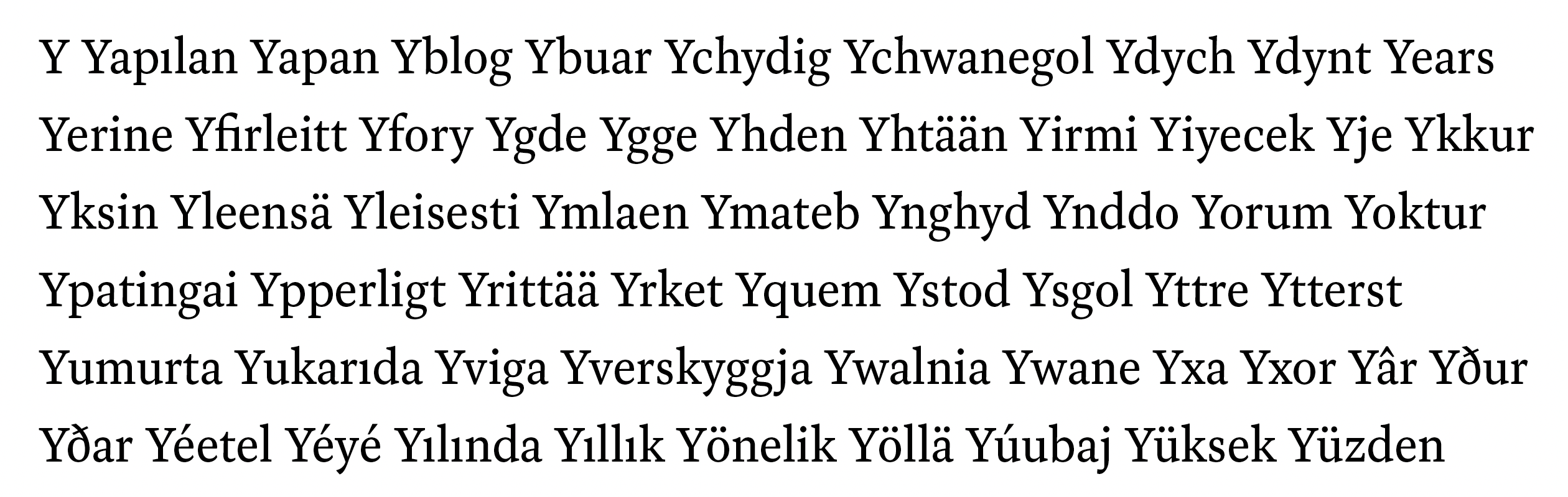
Welsh provides more of a workout for diagonals than English speakers are accustomed to. 😉
Okay, yeah: /ʔaːt/
but that doesn’t mean I know how to put those sounds together with any confidence!
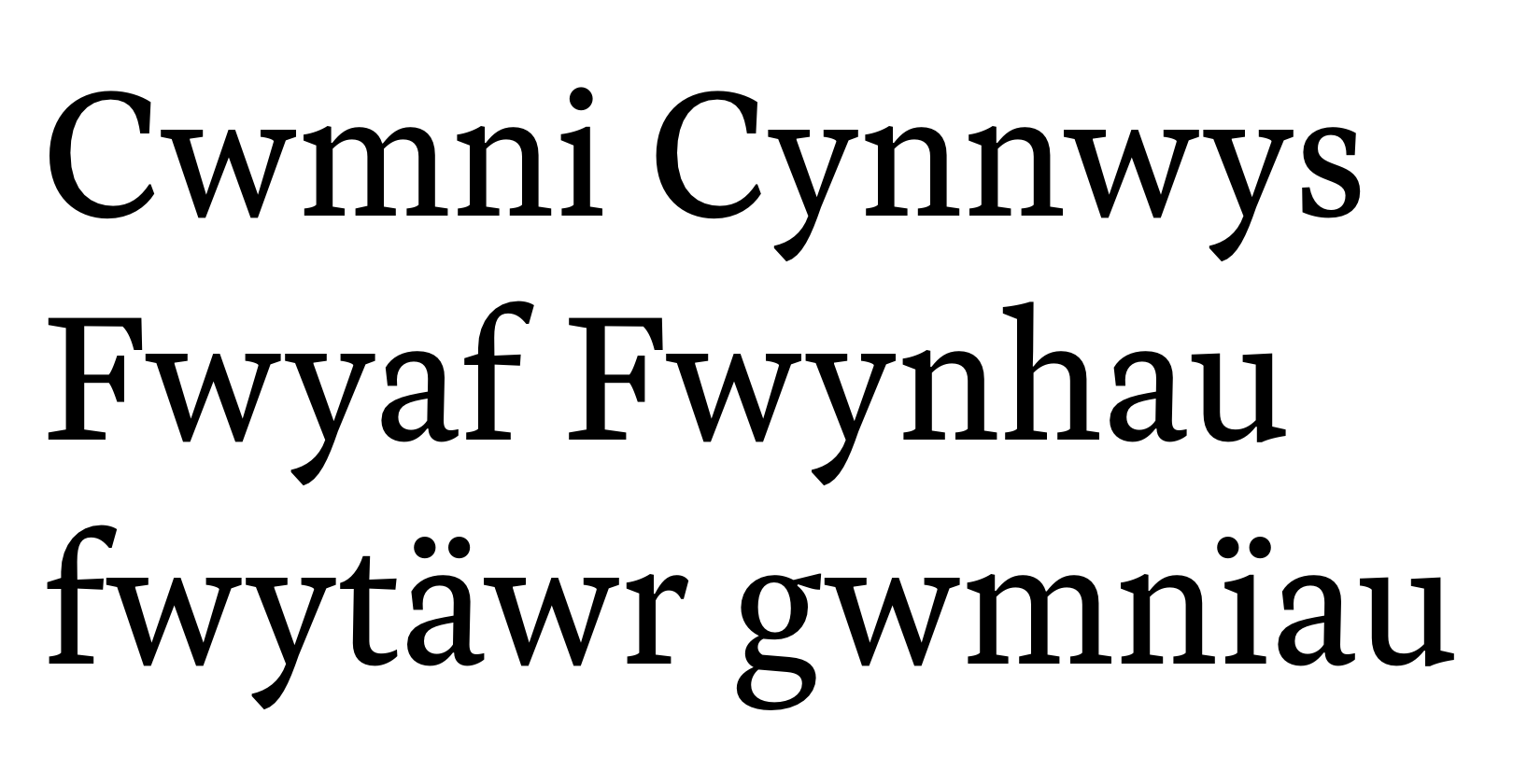
As a type designer, I get a kick out of certain Maltese words. Like this one: “Qgħadt”, from my proofing set.
I don’t read Maltese, and I’d be really hard pressed to pronounce this anywhere close to accurate; but I really love the way it looks.
Just makes me happy for some reason. 🙂 🤷♂️
@letterror @justvanrossum @timesnewboman So supportive! ☺️
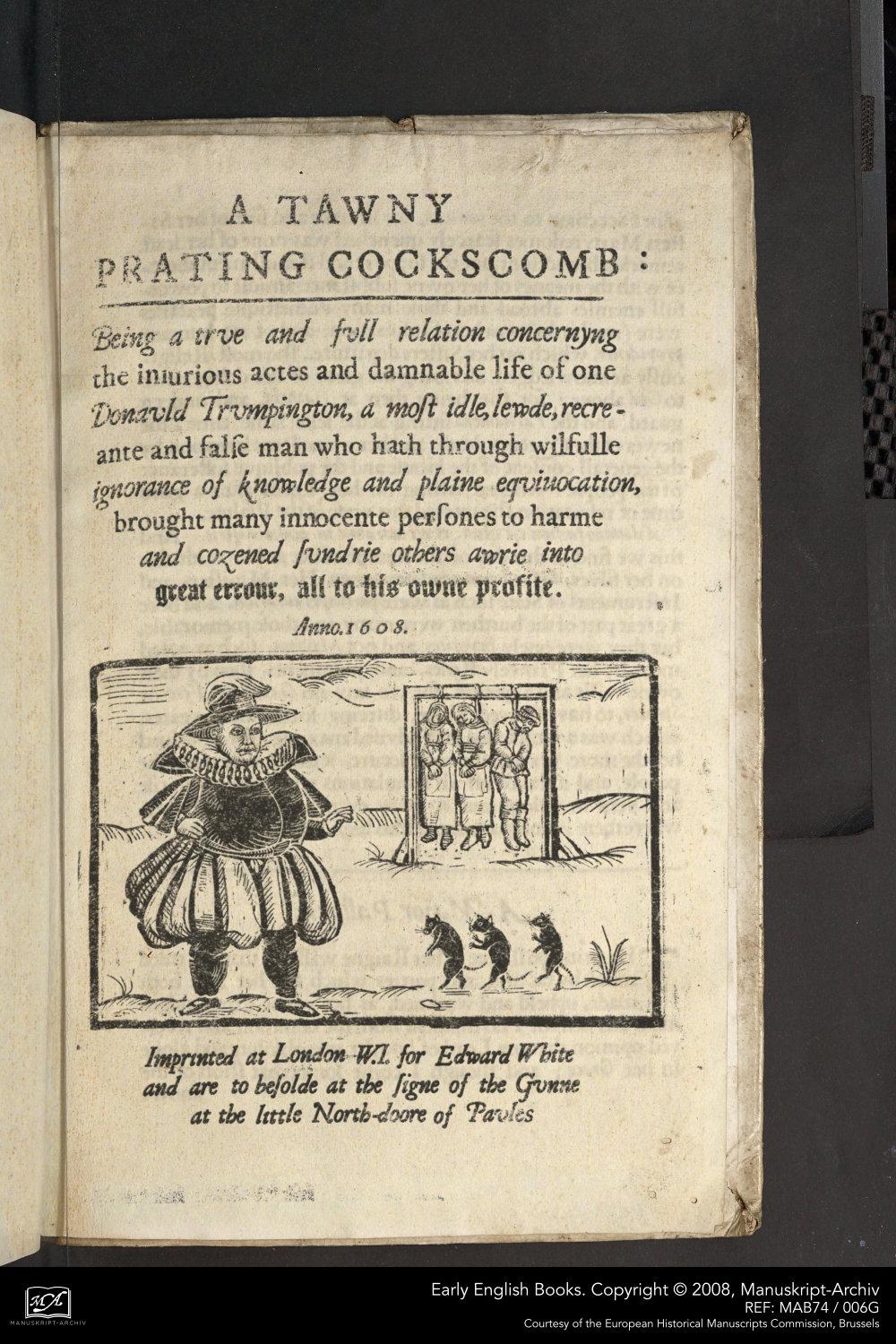
Holy shit. How long has Donald #Trump/ Donauld Trumpington been alive? Is he a vampire?
I pasted a translation from 17th century English to modern English in the ALT text.
I also looked up 'Trumpington'. Apparently, it's a village near Cambridge and was mentioned in Chaucer's Canterbury Tales.
@jenskutilek @jaf 🤒 🙄
@TiroTypeworks That sounds frustrating. Tools that you can’t be sure you can rely on are less-than-helpful tools. 🤨
(diagnostic font is good trick, but unfortunate to have to need.)
@korolevtseva Congrats! Well-deserved.
@letterror @db Like a real-life B. Kliban qat drawing. 🙃
@Typeface @justvanrossum Thanks for the quick fix. Awesome!
@justvanrossum @jmsole Glad to help. In my case, it was easy to rule out font & code because I was reading in several text files and some runs featured ligs while others did not.
First I thought there might be some control char gremlin in affected text. Then I noticed inconsistency within a single text. I made up the repetitive control text, and noticed the break point kept shifting as I changed length. That’s how I narrowed down.
I was bouncing off @djrrb. He urged me to file the issue. 👍
@TiroTypeworks Crazy-making! 🤪