@DavidDarnes So excited for this! Congrats Dave!
Kevin Clark
UX Director, Shopify. Co-host of the Layout Podcast. Montréal based.
I find Apple’s next-gen CarPlay UI to be really beautiful. In comparison, every car’s UI is atrocious (maybe except Tesla)…
BUT I genuinely don’t know how Apple can convince automakers to adopt it. It seems so much work to build for something entirely platform specific, purely additive to work they already have to do, and takes away software as a differentiating factor for them.
I really hope they can convince some more brands to do this, but it seems so unlikely.
https://duck.haus/@joesteel/112623361695448248
@bradellis I had the exact same reaction as you
A fun trip down memory lane.
https://mastodon.social/@lickability/112293994180604838
Kevin Clark boosted:
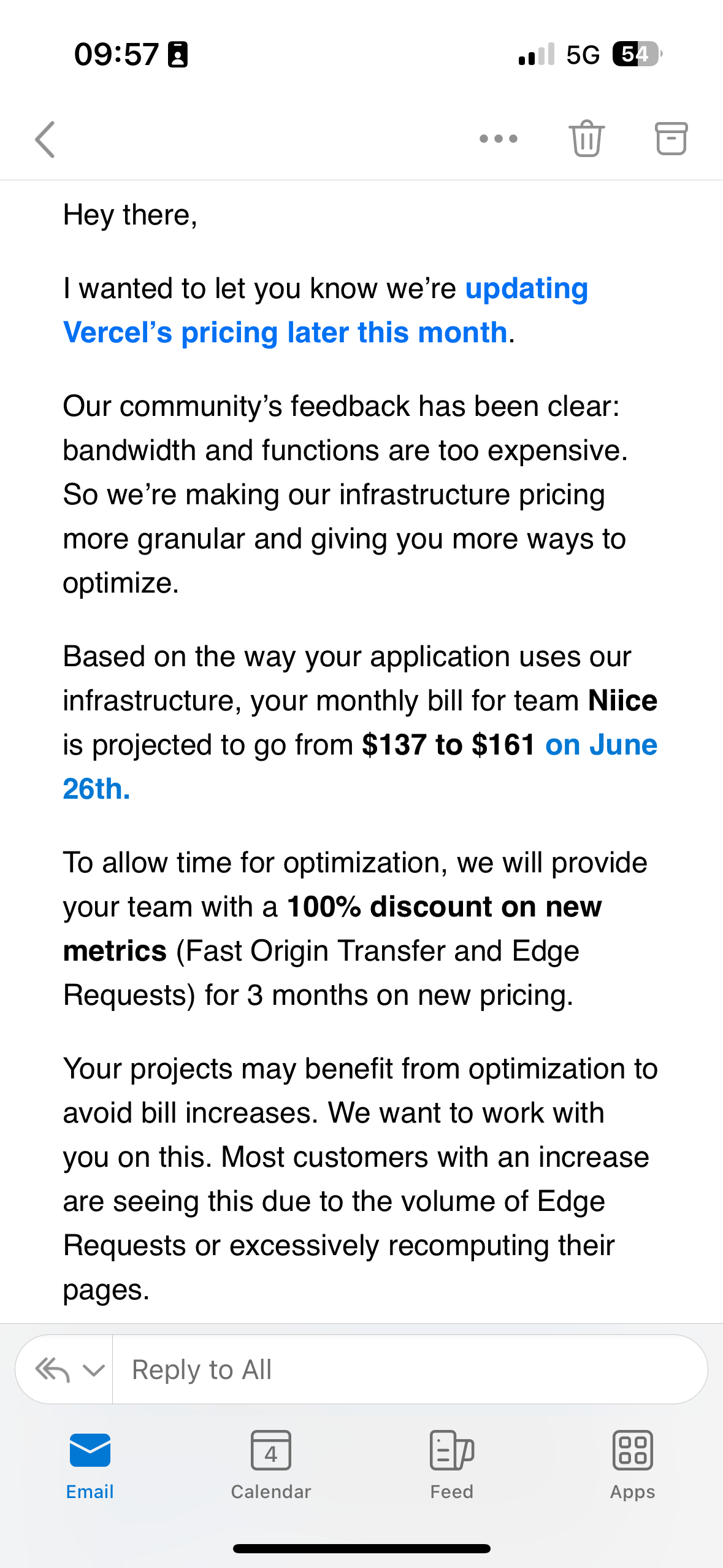
Email from Vercel: “Our community have told us we’re too expensive, so we’re changing our pricing. Your bill will increase by 17.5%”
@rafa Hope you get in!
@nileane @matt Hmm, very odd! Cc @jensimmons
@matt I think a slightly better way to handle this would be with a safe-area-inset in CSS: https://webkit.org/blog/7929/designing-websites-for-iphone-x/
(Unless for some reason this doesn’t work with web apps? 🤔😄)
@samhenrigold Mhi’ya 😂
@samhenrigold Love it! 👏
@MuseumShuffle Haha! Thank god it’s not 😅
@stairjoke The official Mastodon logo is pointing this way so I wanted to keep it the same.

@JeroenSchaper Yeah haha! I feel like it always looks a bit like that no matter what.
@jblake But also... let's be honest you're not using Mastodon unless you're a nerd (like me 😄)

Working on a new thing and I'm trying to make the Mastodon icon play nice with the others. Which option do you like best?

@gn Whatever feels best for you is the right answer! Personal websites are the perfect place to try ideas and experiment. For me personally though, your entire site feels so smooth and fluid that having to press the back button kind of felt like hitting an unexpected speed bump?
Client Info
Server: https://mastodon.social
Version: 2025.04
Repository: https://github.com/cyevgeniy/lmst