Rutherford

Mass–Driver is an independent type foundry based in The Hague, Netherlands.

(Posts by Rutherford Craze, designer.)

2023-03-18

@roma Start it! And then, once the urge has faded, go back to what you were doing before with fresh eyes.

Trying out a whole bunch of different styles is a great way to improve your drawing skills, and leaving a project alone for a bit is almost always a good thing — the distance helps you figure out which aspects of a design are worth keeping, and which were actually just trends/mistakes/etc.
2023-03-17

@moyogo Thank you! That’s a super useful analogy. B causes the fewest design compromises in the bold/italic styles for me, but it’s good to know I wouldn’t be letting down a particular set of users by not including both forms

2023-03-14

@TiroTypeworks That makes sense, thanks!

I’m aiming to use @koeberlin’s Latin S character set as a baseline — hence looking into the n-like default — although my specific “must 100% support these languages” list doesn’t include either form. The N-like variant will stay in the glyph set either way.

2023-03-14

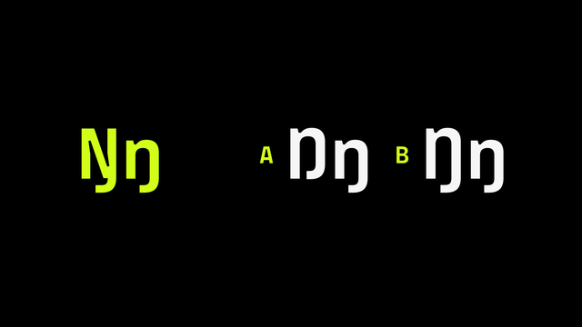
I’m looking at changing the default form of Ŋ in MD IO, to reflect the greater number of speakers using the ‘lowercase-like’ form. Does anyone have more info about whether the descending variant (B) is preferred over one which sits on the baseline?

Three different options for the construction of the uppercase letter Ŋ:  on the left, for reference, is the form based on the uppercase Latin N, which is used in Saami languages; on the right, marked ‘A’ is the form based on the Latin lowercase n, and marked ‘B’ is the same form with a descending tail.
2023-03-13

@onpaperwings I once genuinely encountered the error message, “Windows Update was unable to update Windows because it is out of date. Please update Windows Update.”

Rutherford boosted:
Thomas Phinney, Font Detectivetphinney@typo.social
2023-03-10

Pet peeve: type foundries (and users) who use “weights” when they mean “styles.” Look, “weight” already has a meaning in typography, _and there is no obvious English word we can substitute for that_. If your font family has 9 weights from Thin to Black, and then matching italics, then the typeface has 9 weights and 18 styles. Not 18 weights. And if it comes in two widths, that does *not* give it 36 weights. Still 9.

Looking especially at you, MyFonts.

2023-03-07

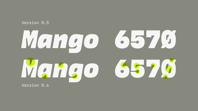
I’m still making progress on IO’s next update, which includes a significant number of drawing improvements across the glyph set.

To be released when it’s ready — I’m hoping these will be the last drawing changes to the basic character set, so I’m taking my time to get them right.

Sample glyphs in MD IO version 0.5 and 0.6. Key differences are highlighted in the newer version, like simplified ink trap shapes and smoothed curves.
2023-03-07

Super nice to see @astro using MD IO in their updated type system!
astro.build/blog/welcome-world

2023-03-07

@molly0xfff Chrome/Firefox/Safari all treat ’ and ' as interchangeable for me. (There’s maybe also an argument that the “if MOS doesn't need a rule [...], then it needs to not have a rule” logic applies.)

But ultimately, as someone with zero Wikipedia edits to my name, I don’t think I should be the one to stir the pot. For what I actually need, client-side substitution (error-prone as it is) will be fine.

2023-03-06

@typographica if enough of us here made a concerted effort, I wonder if we could get it changed? But I wouldn’t know where to start (or if it would break any lobbying/bias rules)

2023-03-06

@klim the reason they give in the Manual of Style is “because some browsers’ Cmd+F search doesn’t find apostrophes when the user types a straight quote”.

(From what I can tell, the original reason is “because that’s what we were using in 2005, and no one wants to update all the articles”.)

en.wikipedia.org/wiki/Wikipedi

2023-03-05

cool idea: an exact clone of Wikipedia but where the bizarre “straight quotes only” rule doesn’t apply

2023-03-04

@brian_dove_online AlWaYs HaPpY tO HeLp!

(I agree though, I added it as a joke but then discovered it’s pretty useful for checking kerning)

2023-03-02

@typographica I have a vague hunch that readers are less tolerant of unconventional forms for rarer glyphs (although Amplitude’s design, spacing aside, puts that theory to rest somewhat). Still, with certain shapes I’d rather finesse the clog than look for a new solution.

2023-03-02

A good morning is one where I get to draw interrobangs

An interrobang (a combination question–exclamation mark) in three weights, with a regular question mark and exclamation mark for reference.
2023-03-01

@Kowfm I appreciate the kind words! Just stuck tidying up details on a serif, which has never been my strongest skill

2023-03-01

@JTDType Fun, but also the reason I still haven’t finished my TypeMedia graduation project 🙃

2023-03-01

@JTDType it was worth it for those superellipse counters in the Text size alone!

Rutherford boosted:
2023-03-01

New Type Day!

Parabolica is a hard working neo-grotesk family with two optical sizes.

Based on utilitarian application-specific typefaces of the past, Parabolica is designed to work anywhere.

Check it out: jtdtype.com/typeface/Parabolic

Parabolica Sample TextParabolica Text SampleParabolica Italic SampleParabolica Italic Sample
2023-03-01

Sometimes I think I’ve made a nice typeface, and then I look at Freight again and realise I have not.

Client Info

Server: https://mastodon.social
Version: 2025.04
Repository: https://github.com/cyevgeniy/lmst