Dozens of screens. One year.

Sabri Hakuli
Recently, I’ve been switching back to light mode.
In the pic: Designinf Publer Threads

If you want a solid foundation instead of vibes-based design,
start here → https://lawsofux.com/
This is because products should look alike.
Familiar patterns reduce thinking.
If users do not recognize how your product works, they won’t learn it, they will quit!

If you’re still on WordPress, you should be planning your migration ASAP.
Most “cheap” WordPress websites end up being the most expensive ones.
Plugins everywhere.
Updates that break everything.
Small changes that suddenly need a developer.
We’ve built the entire Publer website in Framer.

Small update in my portfolio today.
I removed the email
Why?
Everybody contacted me either thru Social Media or somehow found my Whatsapp Number
They want 30 minutes face-to-face to see if we click.
Faster for them, faster for me, fewer back-and-forths.
One click → we talk

Most teams think they only need two roles: someone who sells and someone who builds.
AI made building faster and selling louder. Everyone moves at the same speed.
What sets products apart is the person who shapes how they feel and how people use them:
the designer with real product taste.
The designer:
✅ turns ideas into something people understand
✅ keeps things simple instead of confusing
✅ knows what matters and what doesn’t
Design isn’t extra. It’s why people stay and trust the product.


You can’t hire a graphic designer and expect a full website.
You can’t hire a UI/UX designer and expect motion videos.
Design isn’t one big soup of “creativity.” It’s made of specialties, each with their own skills, mindset, and tools.
Once you figure out what you need, go one layer deeper:
Find the style that fits.
Don’t hire a minimalist designer for a brutalist website.
Don’t hire a corporate designer for a Gen-Z brand.
Every designer has a niche, a voice, a taste.
The best results come w
A link cant be styled like a button and expect users to magically understand what it does.
Buttons do something.
Links go somewhere.
Different roles, different expectations, different behaviors.
Breaking this rule users will get confused, miss clicks, or get lost in the interface.
If a screen reader says “link,” the user expects navigation.
If it says “button,” the user expects an action.

Why Red Buttons Convert Better And Sometimes Destroy UX
1. 🔵 Blue buttons
Blue buttons tend to outperform every other color in conversion tests. They whisper trust me.
That’s why they dominate in finance, tech, and healthcare.
It’s not urgency that drives clicks here, it’s confidence.
People click what feels safe, not what screams at them.
2. 🔴 Red buttons, urgency and panic?
Red buttons trigger action. Studies show they 𝗹𝗶𝗳𝘁 𝗰𝗼𝗻𝘃𝗲𝗿𝘀𝗶𝗼𝗻𝘀 𝗯𝘆 𝟯𝟬%+.
But here’s the catch: red doesn’t just create u


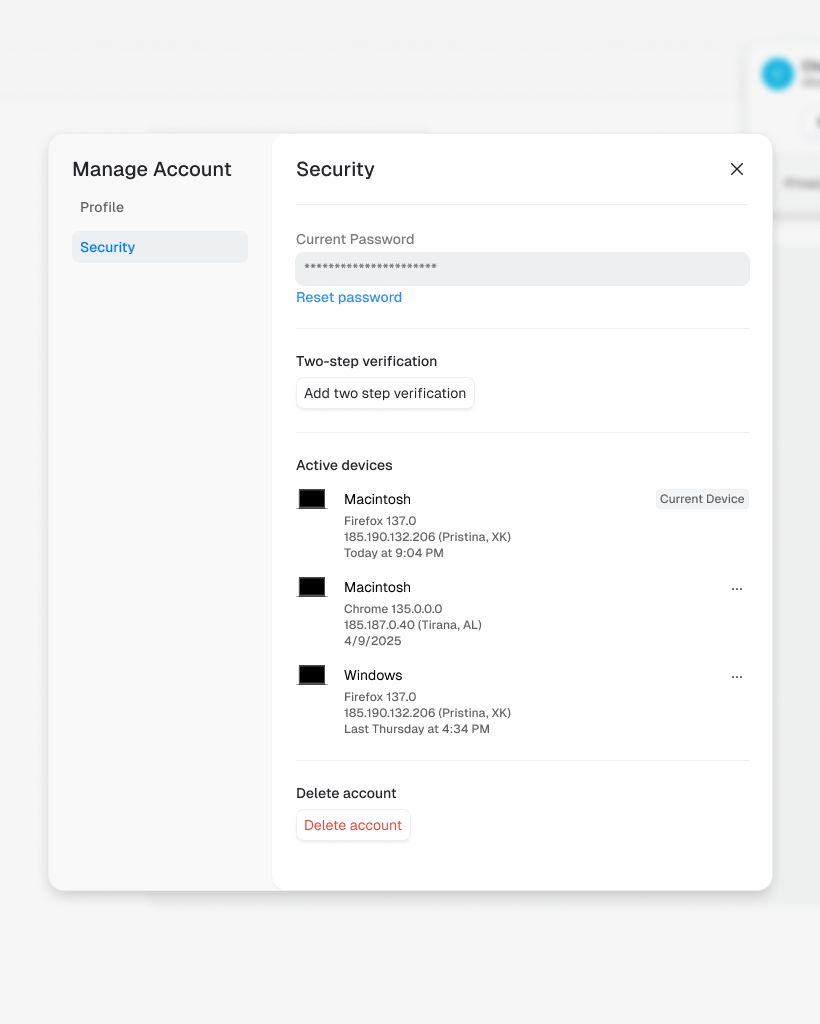
When the options can only be true or false, enabled or disabled, 1 or 2. Which toggle selector is the right one?
The wrong choice can confuse users the right one feels effortless.


I always design dropdowns with a built-in search.
When you’re designing for hundreds of options, like languages, countries, or phone codes, a simple dropdown won’t do its job. Users end up scrolling forever, and frustration grows.
Adding a search bar inside the dropdown makes it effortless to jump straight to the right option. It saves time and creates a smoother experience for everyone.
It’s a small UX detail, but it makes a huge difference when scale meets usability.

Design is in the details.
This dropdown isn’t just "black with a shadow." It’s carefully crafted to feel like a floating, focused component and not a flat box.
And yes, all of this for a component that disappears when you click outside of it.
This is where UX hides

While working on a recent project, I started using "dark" dropdowns/popups.
Here’s why:
✅ It follows the “popover” visual language.
Floating layers should feel separate from the main UI.
A darker tone makes it clear: this is a temporary action, not permanent content.
✅ It increases focus.
The dropdown stands out; your eyes know where to go.
No distractions, just action.
✅ It just looks sharp.
A light UI with darker floating elements creates contrast and hierarchy without needing borders or n

🤌 Took the @theiconicapp icon and shaped it into a tiny logo for the Language Assist Chat feature.

Client Info
Server: https://mastodon.social
Version: 2025.07
Repository: https://github.com/cyevgeniy/lmst