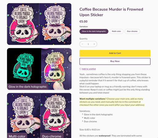
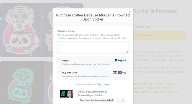
Due to payhip limitation, the only way to let people order multiple variants is to have them manually specify other ones in the comments at checkout. I hate it, but, here we are.
Folks, is this page clear for you?
https://shop.stephaniewalter.design/b/coffee-because-murder-is-frowned-upon-sticker
UX Researcher & Strategist, Inclusive Product Designer in Enterprise UX. Speaker, Author, Mentor & Teacher. Chaotic neutral tea & CSS lover. 🌈
I talk about #design, #UXResearch, #accessibility and #InclusiveDesign mostly
I also draw #illustrations for fun, so you might get drawings, food and plants here.
Here are notes and questions on interacting with me and social media content: https://stephaniewalter.design/faq-frequently-asked-questions/#social-media
And yes the contrast is crap in the checkout and text is small, I need to figure out how to change that with custom CSS at some point. This tool is so frustrating at the moment.
@nith0u oui bonjour comment on souscrit a la newsletter qui envoie une photo de chaton par jours ? 😁
@FeralRobots I'm also a big fan of the whole "batch cooking" trend, that is just a rebrand of what my busy mum was doing when we were kids. She just called it cooking 😆
Again, sounds like we mostly rebrand existing things, to make them fit into some categories to sell things on social media. The batch cooking trend is to sell you appliance to freeze your cooking (mum used to repurpose ice cream boxes hahaa)
Capitalism I guess?
@FeralRobots I think there's a trend of creating everything carnivore. So I've seen carnivore chips (that is just thin slide of chicken grilled), carnivore bites (which is brown butter, that's it).
So the bread is because you can cut slides of it (like a meatloaaaaf) and put things on top of it. Mostly, butter.
I mean, you eat what you want, but the need to rebrand things is kind of, a fun strange marketing gimmick.
Wait, did I miss something, I just stumbled upon a "carnivore bread" recipe. And, well, hum, isn't this basically meatloaf?!!?
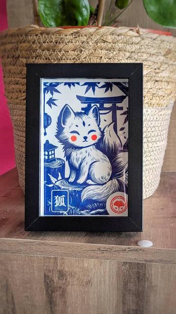
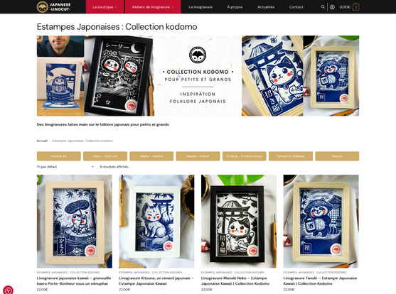
If you like Japan, kawaii and linocuts, I highly recommend you take a look at Japanese Linocuts. Of course, I got the Kitsune!
https://japanese-linocut.com/categorie-produit/linogravure-japonaise-collection-kodomo/
Also, their Instagram account is also quite nice: for example, here's the behind the scene of the Kitsune: https://www.instagram.com/p/DIzIXh6AK_x/
Exploring AI's Role in Accessibility...
We often talk about the bad side of AI (ethics, perpetuating biases, content theft), but AI has a huge potential to also help improve the lives of many people, from generative alternative text for images, voice preservation, voice recognition, and more. (warning: the video extract on voice synthesis is quite emotional)
The 1 hour video on YouTube: https://www.youtube.com/watch?v=7ObB4jM-QXU
https://www.youtube.com/watch?v=7ObB4jM-QXU
@heades the toxic green owl company said no more wireframes and people are eating it up.
I would avoid taking advice from a company who wants to replace most of their contractors by AI but, yeah, that's just me.
Oh my ... They brought the wireframe topic back on the table.
But the truth is that there is no perfect process, tool, deliverables you can copy paste from one company to another. You will always need to adapt. So, don't just follow whatever wanna be thought leader said this week. Check what YOU need, for YOUR team, to make things happen, to communicate better and build the product.
I think this is my new favorite online contrast checker tool. It's called "Contrast Report", and includes a lot of features I need (or didn't know I needed but like).
The tool (by Adam Chaboryk) https://contrast.report/
List of nice features:
- check for AA and AA
- option to check for normal, large text and graphics and UI elements (the 3:1 rule)
- option to "fix", that will automatically recommend a color combination that is as close as possible to the original.
- a picture in picture mode (not supported in Firefox) that gives you an eyedropper, in an overlay to select any color on screen
- PWA, aka, you can "install" it on Chrome/ Edge
Also, for more contrast tools and contrast checking tips, check my full article (I just added it to the list): https://stephaniewalter.design/blog/color-accessibility-tools-resources-to-design-inclusive-products/
Also, combine qualitative with quantitative to explain the what and the why.
For example:
- Quantitative shows what's happening: 72% abandon the goal-setting flow at account connection.
- Qualitative reveals why: Users worry about security, are confused about account selection, and fear they can't reverse connections.
Stakeholders often focus on “how many” when presented qualitative research. Which is the wrong question to ask.
Qualitative is about understanding the H (human) in HCI. The goal is to understand why they behave like that. When presenting research results: focus on showing clear patterns, supporting findings with evidence like quotes or observations, and connecting everything back to user behaviors and business goals, not sample sizes.
https://uxpsychology.substack.com/p/beyond-numbers-how-to-properly-evaluate
- The powerful combination: "Our drop-off problem stems from specific trust concerns and mental model mismatches. By redesigning to address these specific issues, we can reduce the 72% abandonment rate."
Beyond Numbers: How to Properly Evaluate Qualitative UX Research (9min) By Dr Maria Panagiotidi https://uxpsychology.substack.com/p/beyond-numbers-how-to-properly-evaluate
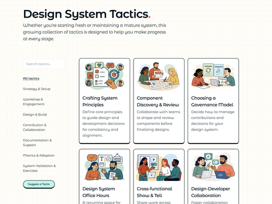
Redesigning Design Systems Tactics is a collection of tactics designed to help you make progress in creating and maintaining a mature design system. I love how they are presented as small little cards, with some when to use it, and a step by step for each when you expand them.
Here you go: https://redesigningdesign.systems/tactics/all-tactics
Joke aside it was quite efficient since I asked it to parse the web and it was able to bring together most used solutions from different forums, GitHub threads, etc.
@SergeyChe hahaha VibeDevOps because we also need a VibeDesignOps and VibeResearchOps 😁
If I debug my SSH issues in WordOps using AI, am I vibe-sysadmining? 😁
Good error messages help users recover and stay on track, not frustrate them.
To write better error messages:
- consider all types of errors
- write like a human and avoid technical jargon
- avoid whimsy even when it's tempting, it can be perceived as dismissive
- use active voice
- give a clear way forward
- use consistent patterns.
How to write error messages that actually help users rather than frustrate them (8min) by Amy Hupe https://piccalil.li/blog/how-to-write-error-messages-that-actually-help-users-rather-than-frustrate-them/
