Theo Rosendorf

Author of the Typographic Desk Reference, future editor of Daily Quadrat

Theo Rosendorftheo@typo.social
2025-07-01

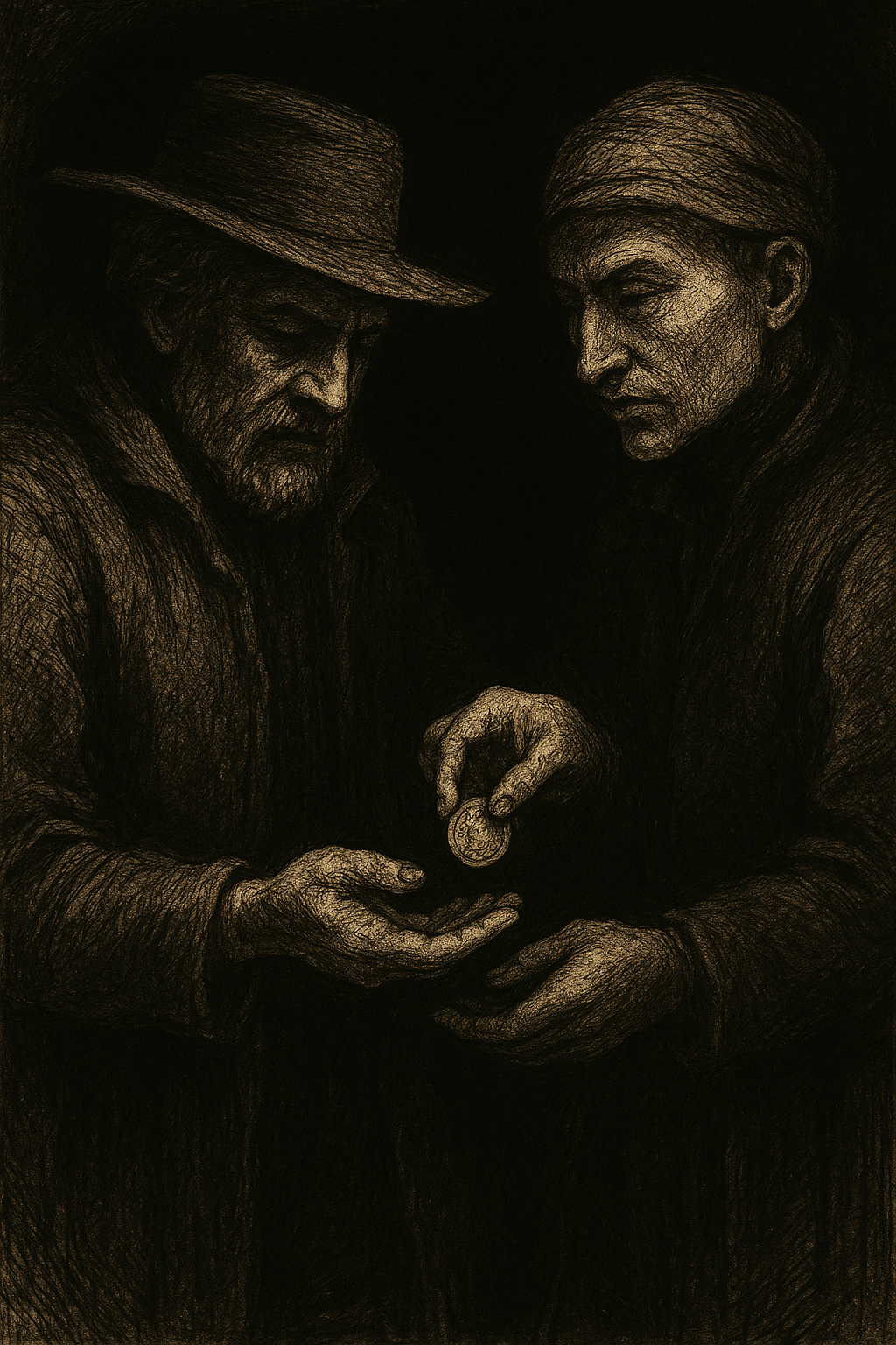
Turns out some 17th century printing offices practiced more than just “staining paper.” They often had, one might say, inventive financial practices.

A printing business often had a side economy run on dues and favors. The chapel, ostensibly a governing body of compositors, functioned less like a union and more like a cartel. The occupying chapelonians set prices and settled disputes, mostly on the down-low. And newcomers paid an entrance fee called a benvenue for access.

1/

Theo Rosendorftheo@typo.social
2025-07-01

5/5

A little of what’s coming to Daily Quadrat, Winter 2025.

One curiosity a day.
For the typographically obsessed.

Subscribe here → quadrat.today

Theo Rosendorftheo@typo.social
2025-07-01

“The effects of the work habits of the compositors of Shakespeare’s first folio have been meticulously examined. But the practices which resulted in that volume were shaped by a range of seemingly incidental characteristics of the work place and beyond.” —Joad Raymond, “Seventeenth-Century Print Culture”

4/

Theo Rosendorftheo@typo.social
2025-07-01

Perhaps this overstates the intrigue. It wasn’t organized crime, but it also wasn’t entirely above board. And the practices weren’t universal. But it wasn't uncommon at the time for many industries to run side economies. 

3/

Theo Rosendorftheo@typo.social
2025-07-01

Suppliers quickly learned the cost of doing business. Chapel money, an unofficial skim, was traded for loyalty. A foreman might pocket a penny per pound of ink and then find a way to secretly dispose of the ink to keep the money coming.

And there was the organ, a collective fund, loaned out with interest, and controlled by the so called organ master. (Of course this begs the question, what happens if you miss an interest payment!?)

2/

Theo Rosendorf boosted:
Theo Rosendorftheo@typo.social
2025-06-26

I once found myself lost in the Khan el-Khalili bazaar in Cairo. As any sensible person would, I asked a local for directions. What I didn’t know then was that Egyptians are likely to give you an answer to your question even if they don’t know a correct answer. They feel obligated to help, even if they send you off in the wrong direction!
1/

Theo Rosendorftheo@typo.social
2025-06-24

6/6

A little of what’s coming to Daily Quadrat, Winter 2025.

One curiosity a day.
For the typographically obsessed.

Subscribe here → quadrat.today/

Theo Rosendorftheo@typo.social
2025-06-24

The Study: The Aesthetics of Reading
media.mit.edu/publications/the

Image: A Cairo Bazaar by John Frederick Lewis, 1875

The type over the image is set in AW Conqueror by Jean Francois Porchez
typofonderie.com/fonts/aw-conq

5/

Theo Rosendorftheo@typo.social
2025-06-24

Kevin Larson (Microsoft) and Rosalind Picard (MIT) released a fascinating study in 2006 on the mood altering effects of typography, titled The Aesthetics of Reading. It avoids the Hawthorne Effect while dealing with a topic that is largely subjective in nature.
4/

Theo Rosendorftheo@typo.social
2025-06-24

Many non-designers view design as purely aesthetic and totally based on personal preference or taste. As half-baked a view as that is, it’s up to us as professionals to steer client collaborations by managing the Hawthorne Effect and help lead the project to an objective end.
3/

Theo Rosendorftheo@typo.social
2025-06-24

I eventually made it out of the bazaar but the experience lead me to learn about an interesting psychological concept known as the Hawthorne Effect. It’s a phenomenon whereby subjects alter their behavior in response to being studied. It’s not unlike asking a client what they think of your design, only to receive back a well-intentioned list of bad ideas: (1) make the logo bigger, (2) set the type in Hobo, (3) it needs more “wow factor!”
2/

Theo Rosendorf boosted:
Theo Rosendorftheo@typo.social
2025-06-17

It’s a wonder early printers didn’t call their trade “sticksmithing.” Nearly every tool they used seems to have been christened a stick. There’s the composing stick of course. The handheld device that sets the measure and holds the sorts as you compose. But from there, things get a little out of hand.
1/

Theo Rosendorftheo@typo.social
2025-06-12

@matratype Honored to have you Pooja!

Theo Rosendorftheo@typo.social
2025-06-12

5/5
A little of what’s coming to Daily Quadrat, Winter 2025.

One curiosity a day.
For the typographically obsessed.

Subscribe here → quadrat.today

Theo Rosendorftheo@typo.social
2025-06-12

It’s a wonder early printers didn’t call their trade “sticksmithing.” Nearly every tool they used seems to have been christened a stick. There’s the composing stick of course. The handheld device that sets the measure and holds the sorts as you compose. But from there, things get a little out of hand.
1/

Theo Rosendorftheo@typo.social
2025-06-12

Even the act of setting to a specific width was called justifying a stick. Apparently, the measure of a good compositor wasn’t in talent alone. It was in how many sticks they used.
4/

Theo Rosendorftheo@typo.social
2025-06-12

Once you’ve filled your stick, you empty it into a galley (finally, something not a stick). Then come the footsticks, head sticks, gutter sticks, and galley sticks to frame up the forme. You secure it all with quoins, nudged into place with the help of, surprise surprise, a shooting stick.
3/

Theo Rosendorftheo@typo.social
2025-06-12

Want to compose broadside? Better use a broadside stick. Setting a newspaper? That’s a job for the news stick. Posters? Poster stick. For everything else there was the jobbing stick. And when that stick is full, it’s a stickful. Naturally.
2/

Theo Rosendorf boosted:
Theo Rosendorftheo@typo.social
2025-05-30

In latin based alphabets (because they also appear in other writing systems) ligatures are some of the most visually expressive glyphs in a typeface. At its most basic a ligature joins two or more letters into a single glyph.
1/

Ioannis Aurelius Augurellus, published by Aldus Manutius. Venice, 1505.

Client Info

Server: https://mastodon.social
Version: 2025.04
Repository: https://github.com/cyevgeniy/lmst