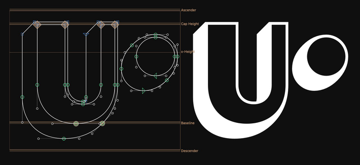
I occasionally work on projects where BubbleKern is super handy. It’s usually typefaces with randomised alternates, or one that requires “close but not touching” kind of spacing. My current custom project has both elements.
Typeface designer in London
@jla Yeah it’s difficult to communicate the nuance of the typeface; I wouldn’t be surprised if it’s too subtle to a lot of people. And I am ok with the idea of drawing Roman z, but this particular one sticks out.
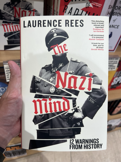
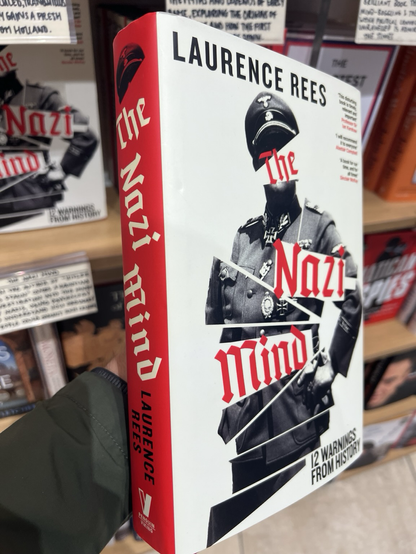
It had to happen sooner or later; Sachsenwald used for Nazi-related typography (with the book designer’s custom z)
@arrowtype Thanks! I actually saw this video but haven’t tried the recipe yet.
@simoncozens I have come across this as well; its precision seems to be only at pixel level but not subpixel.
@theohonohan Absolutely
Got barrel extrusion working. It took a while but I’m happy with the result!
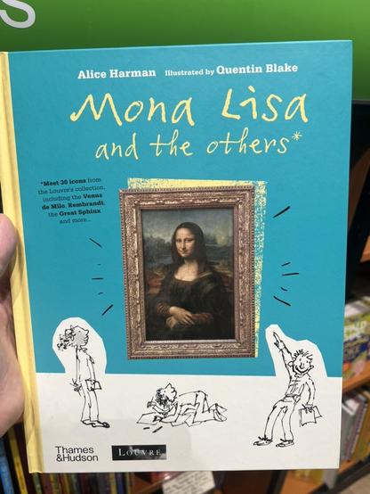
Found my Quentin Blake typeface in a children’s book. It’s great to see it in use even though only the ligatures are used (random alternates are disabled).
Someone must have forgotten what they already had and killed off. #Extensis
@sajatype Spotted in Reading
@pixelambacht It’s Kailua Choc linear red; I tried much lighter ones but they are far too sensitive for my taste. And click ones are too loud though I feel the sensation.
@paulvanderlaan Yes. I switched them around but gravitated towards space on the left. I can still have space and return on both sides if I want to.
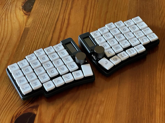
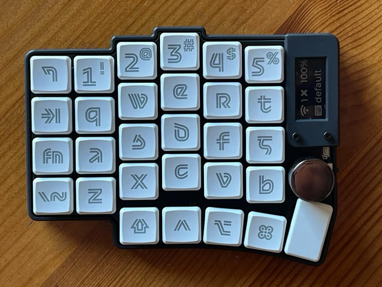
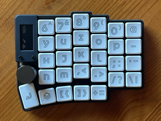
I’ve finally made my dream keyboard. Started with the typeface (of course) but eventually the PCB and case.
The typeface takes inspiration from mediaeval writing (two common keywords with keyboard: unicase and writing), and a bit of Aldo Novarese, Otmar Motter and logotypes like Sega.
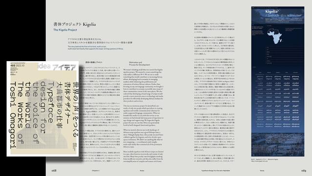
Just published: IDEA magazine’s latest issue looks at the work of Toshi Omagari (@tosche_e), international type design at Typotheque (@typotheque), and features an article about our Kigelia typeface family for Africa. IDEA is a quarterly magazine published in Tokyo, Japan since 1953 that focuses on graphic design and typography.
@simoncozens Heck yeah! Sorry I haven’t provided a Latin sample file (yet).
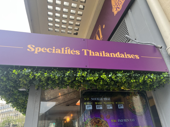
Watch out for ïl and îl in French; kerning, special diacritics, substitution, whatever.
Despite its audial similarity, I’m bummed to re-learn that coiffure is not a coffee place. #atypi #ATypIParis
@simoncozens Yes I have. I’ll definitely go to a few of them
@Lettermin Glad to know you’re coming, it’s been too long. See you very soon!
Is anyone else tricked into coming to Paris a day too early? (i.e. fancy a hangout?) #atypi #atypiparis #atypi2023
