🔥 Fontstand is working on becoming a cooperative—co-owned and governed by the independent type foundries. No VCs. No middlemen. It’s a radical rethinking of how platforms should work—built on trust, equity, transparency, and shared success at its core.
🔗 https://fontstand.com/news/design-news/creating-the-fontstand-cooperative/
Typotheque
Type Company giving shape to language, designing for communication in a world that is increasingly digital and multicultural. Tweets by Peter Biľak
Typotheque boosted:
Join us on Thursday for a free 50-minute online talk exploring the design and development of Terrassa, a typeface inspired by architectural lettering.
📅 19 June, 2025, 8pm Amsterdam time. Exclusively for Typotheque Club members*
Become a member for free here.
📍https://www.typotheque.com/club
@tphinney Have you seen Terrassa Gradient? https://www.typotheque.com/blog/terrassa
Typotheque boosted:
We’re are launching an independent industry-wide survey for font users. We want to hear about your experiences: What works? What’s confusing or frustrating? What would you change? Your answers will help us decide how licensing works within the Fontstand Cooperative.

Typotheque boosted:
An article worth reading every year or so. https://www.typotheque.com/articles/originality-in-type-design
@martabernstein Make sure you have fonts that render cantillation marks correctly. Most of the modern Hebrew fonts don’t support them at all.
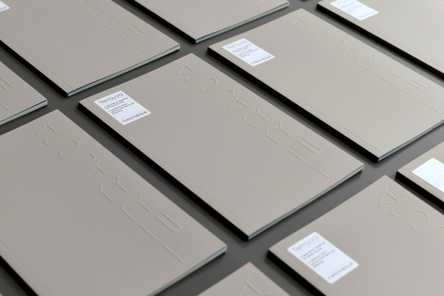
That was such a blast! Gràcies a totes! A week ago we had the pleasure of hosting an event in Barcelona to showcase our latest typeface, Terrassa, and its process.
Big thank you to everyone that came by, the team that helped us and the three wonderful speakers that introduced each part of the show.
Read more about the project on https://www.typotheque.com/blog/terrassa
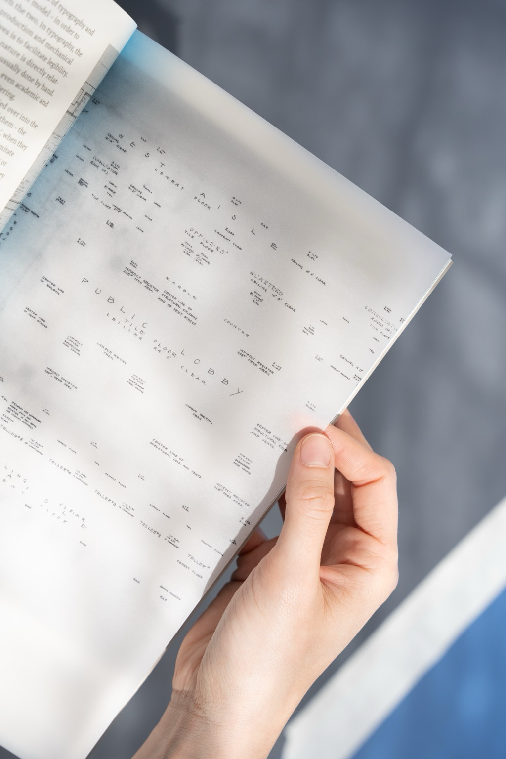
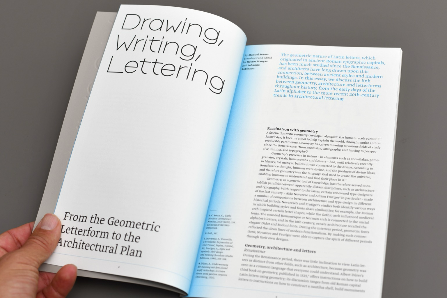
This printed type specimen presents the background and design thinking behind the Terrassa typeface. It features an in-depth essay by Manuel Sesma, titled Drawing, Writing, Lettering. From the Geometric Letterform to the Architectural Plan, as well as a prologue text by Nikola Djurek. Designed by Manera Estudi, the specimen showcases Terrassa in conceptual and visual detail. https://www.typotheque.com/books/terrassa-type-specimen
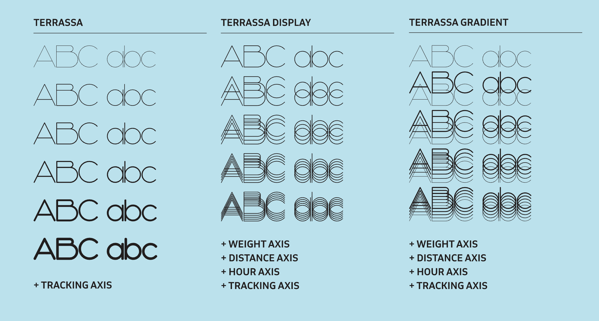
Terrassa Display and Gradient both contain five variable axes. We considered providing traditional static fonts as well, but the five axes would produce over 10,000 variations, which would overwhelm your font menu. Instead, we deliver Terrassa Display and Terrassa Gradient as variable fonts, allowing you to adjust the sliders rather than scrolling endlessly. https://www.typotheque.com/fonts/terrassa
Typotheque boosted:
I had the pleasure of engineering and implementing the Display and Gradient variations for the latest release from @typotheque. I’m especially proud to have contributed to shaping the concept behind these styles. Check out Terrassa, a new typeface designed by Nikola Djurek.
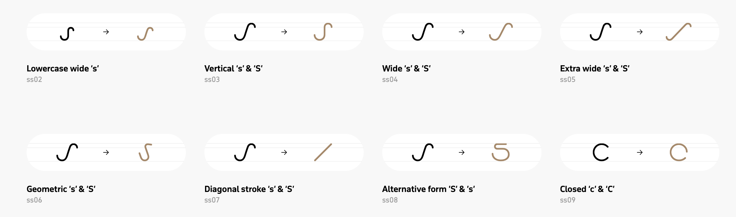
@MauriceMeilleur There are enough SSSSs for you to choose from. https://www.typotheque.com/fonts/terrassa#opentype-features
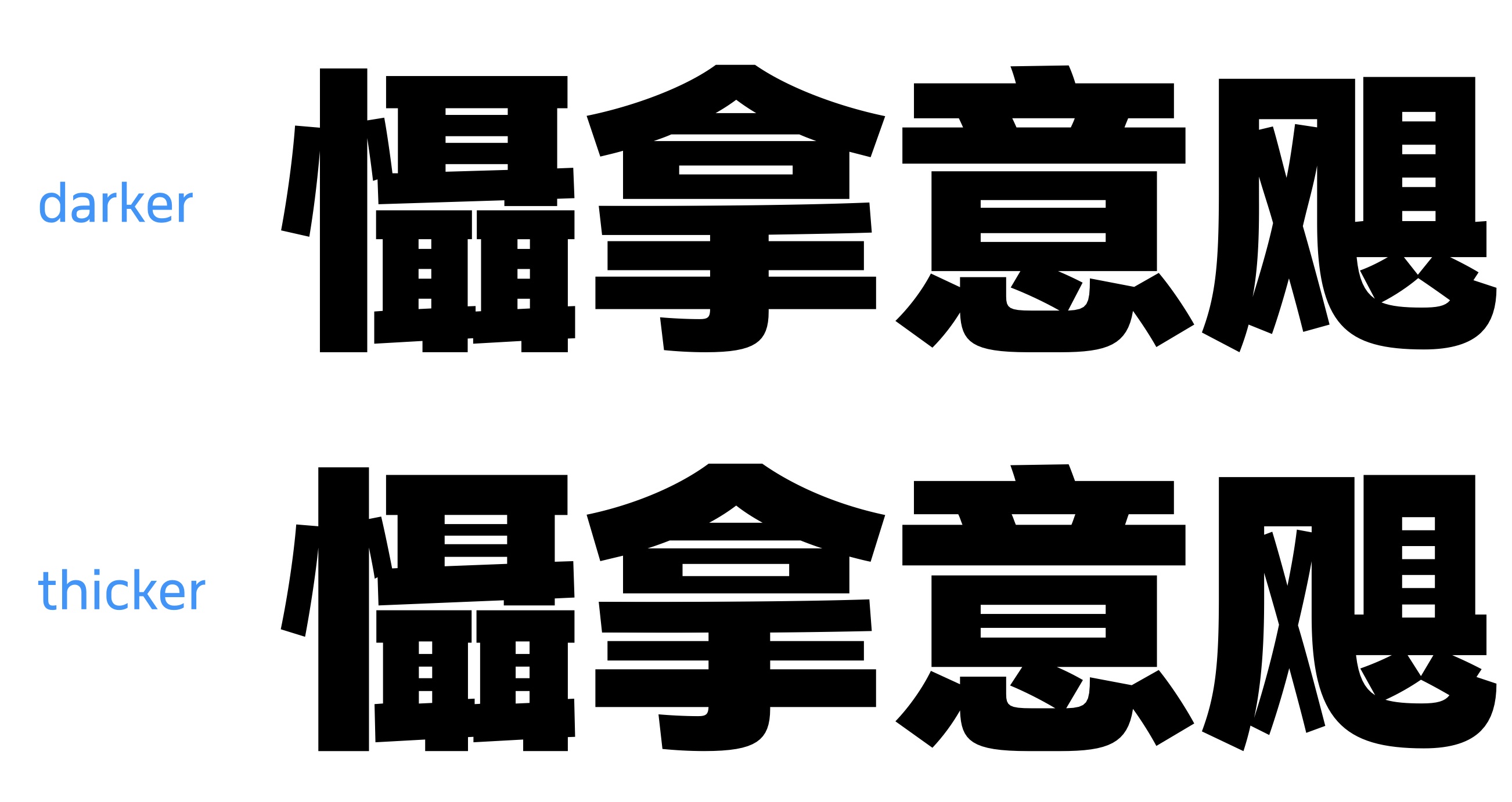
Designing dense Chinese characters presents a paradox: increasing the weight of the strokes can compromise legibility, yet insufficient weight fails to harmonise with the visual weight of Latin letters. Read more about creating very dark Chinese characters: https://www.typotheque.com/articles/chinese-character-weight
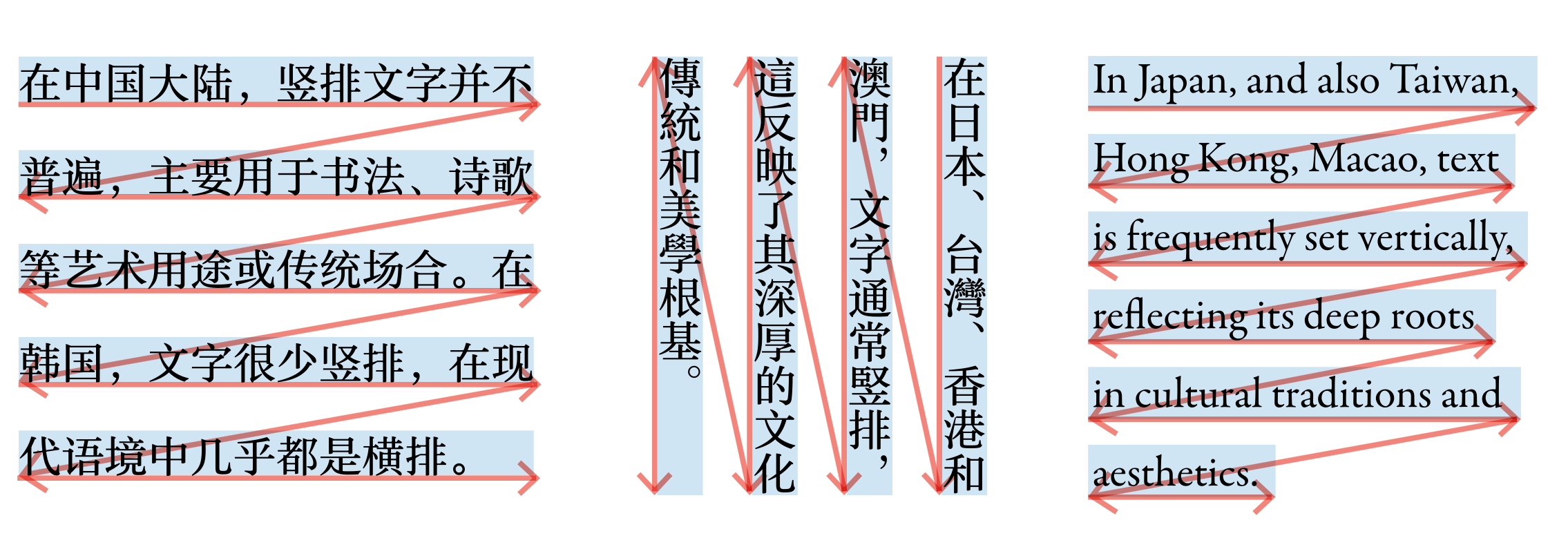
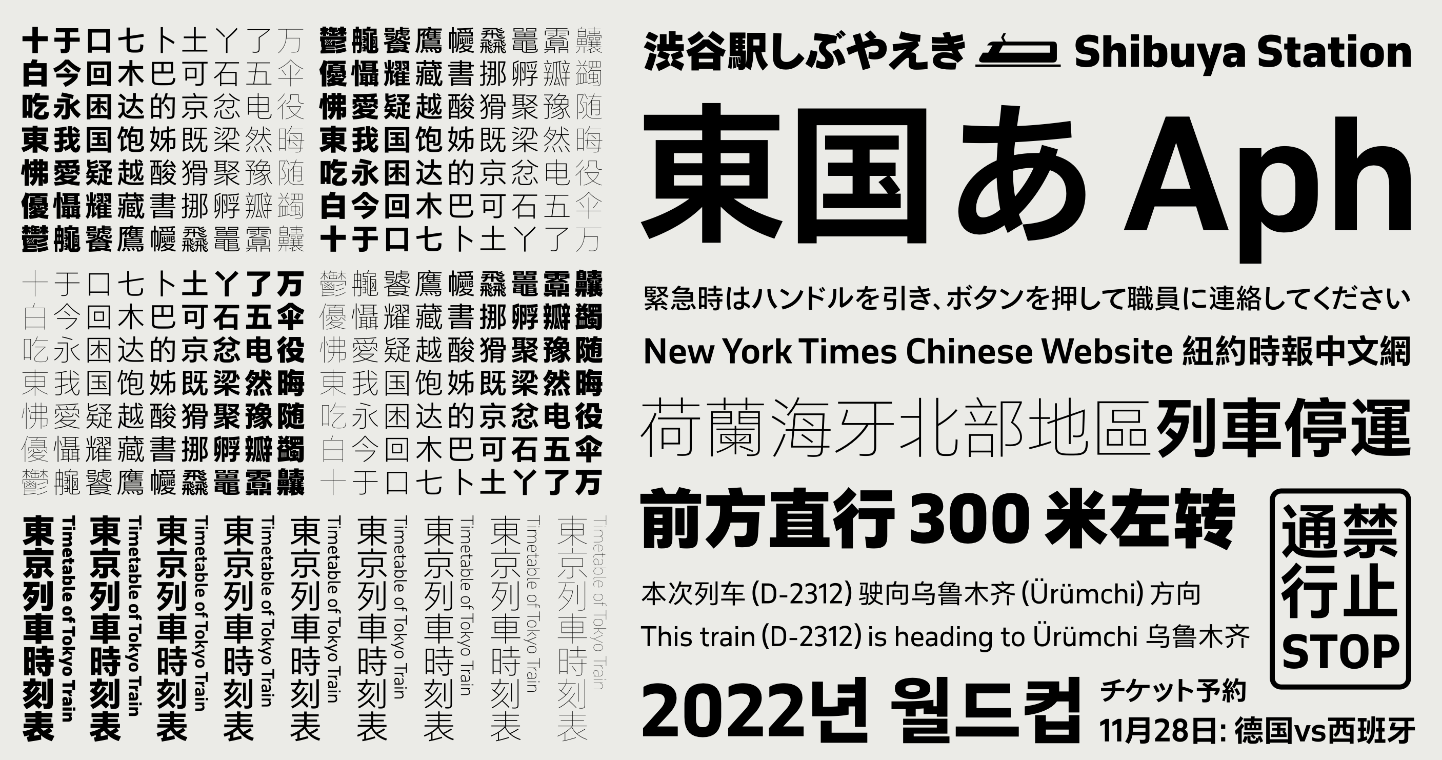
Chinese characters vary across East Asia due to regional language evolution and reform. Although it is possible to have a single CJK font, letterforms need to align with regional preferences. This article aims to explain the regional variants. https://www.typotheque.com/articles/understanding-cjk-regional-character-variants
@simoncozens Yes, thanks, these guides are great, and indeed very thorough. The article we posted is for idiots like me to avoid making silly mistakes, and recognise when the text is not looking right. I can attest that I made each of the mistakes when creating samples.
Using CJK fonts is not simple, so we prepared an article on the typesetting principles of Chinese, Japanese, and Korean (CJK) text
We posted some thoughts about designing CJK fonts and managing design consistency when you work with a large design team: https://www.typotheque.com/articles/designing-large-scale-chinese-fonts
@gabrowitsch Thanks Ivo!
We’ve worked with large character sets before, but this is a completely different level of complexity — after five years of work, we are pleased to present our CJK font collection. https://www.typotheque.com/blog/collection-of-new-original-cjk-fonts
I spoke with Mint about her beginnings, about Thai and Latin scripts, studying and working far from home, and her typeface Pristine.
Client Info
Server: https://mastodon.social
Version: 2025.04
Repository: https://github.com/cyevgeniy/lmst