Wade Baker

#InfoSec researcher and data storyteller; Cyentia Institute (@cyentiainst) co-founder; Virginia Tech professor; Verizon DBIR and VERIS creator; Advisor for RSA Conference and FAIR Institute; Star Wars fanboi; Coffee addict; Beer and cocktail snob; Father of 5.

I use this account on occasion to share and discuss research findings I consider informative and/or useful. Typically more active on LinkedIn: linkedin.com/in/drwadebaker

2025-06-12

Are #cybersecurity incidents growing more costly?

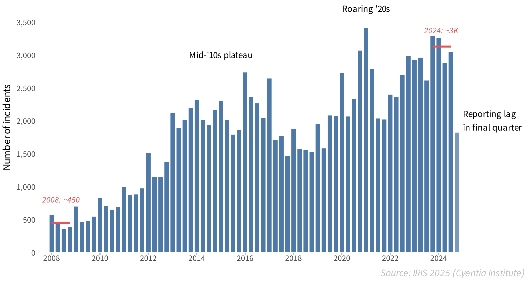
Cyentia Institute's recent Information Risk Insights Study points to a 15-fold increase in the cost of #incidents and #databreaches over the last 15 years.

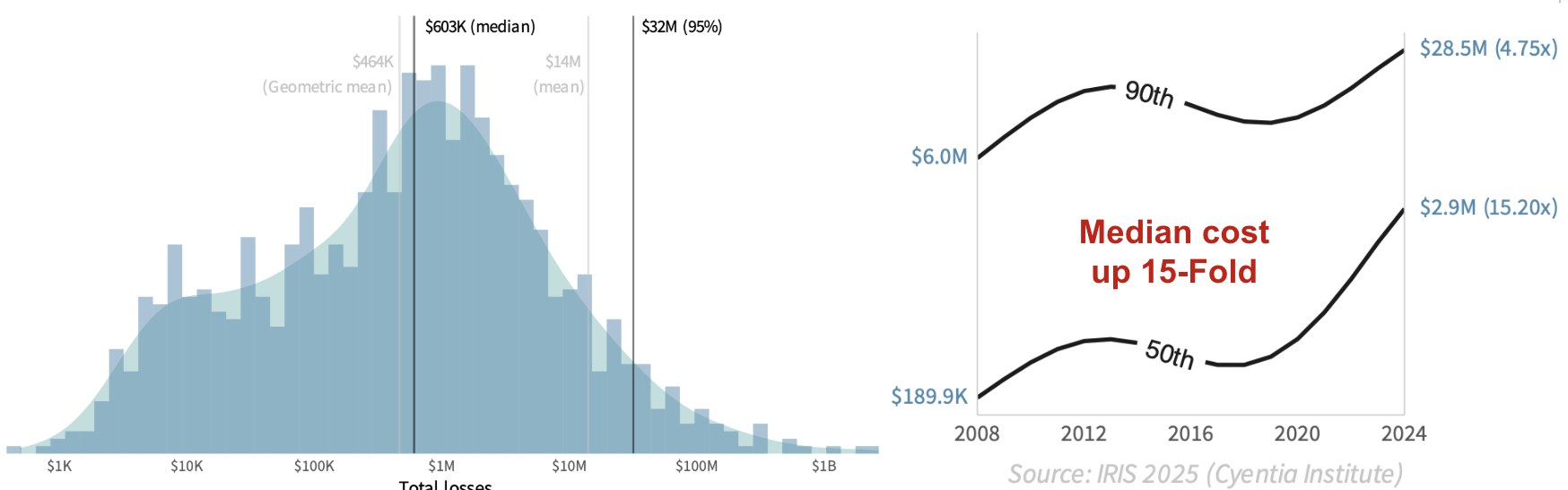
The chart on the left shows the distribution of known/reported financial losses from incidents across the time period of the study. The typical (median) incident costs about $600K, while more extreme (95th percentile) losses swell to $32M. Note that the chart uses a log scale, so the tail of large losses is a lot longer than it appears.

The chart on the right trends the escalating costs of cyber events over time. Median losses from a security incident have absolutely exploded over the last 15 years, rising 15-fold from $190K to almost $3 million! The cost of extreme events has also risen substantially (~5x). So, yeah—cyber events are definitely growing more costly.

That said, this picture looks a lot different among different types and sizes of organizations. How are financial losses and other #cyberrisk factors trending for orgs like yours?

Download the full IRIS 2025 to find out!
Free with no reg req'd - though you can join Cyentia's free membership forum for bonus analytical content related to the report.

cyentia.com/iris2025/

Chart showing 15x increase in financial losses from cyber events since 2008.
2025-05-08

Are security incidents becoming more common? That's the first question we seek to answer in the upcoming 2025 Information Risk Insights Study. Check out this article for a preview. #breaches #incident #cyberrisk

linkedin.com/pulse/security-in

2025-04-29

Presenting this morning at #RSAC2025 on findings from a massive study analyzing long-term cyber loss trends.

path.rsaconference.com/flow/rs

Banner with presentation title
2024-12-13

Cyber risk is not evenly distributed across users in your workforce. In fact, it's very lopsided. A large majority of risk events in your organization probably tie back to a relatively small population of users.

The attached figures provide some stats supporting that statement:

- Just 1% of users are behind 44% of all clicked phishing emails. 5% of users are responsible for 83.4% of all clicks.

- 1% of users are behind 92% of all malware events! 5% of users are responsible for ALL malware events. The remaining 95% had a clean record.

I don't think the proper response to these statistics is to grab torches and pitchforks and go round up these users to purge them from among us. Rather, these results present an opportunity to have a big impact on risk reduction by doing more focused/effective job of educating, incentivizing, and influencing the behavior we want to see among the riskiest users.

Full report "Exposing Human Risk" from Mimecast and Cyentia Institute is available here (no reg req'd): assets.mimecast.com/api/public

#cybersecurity #cyberrisk #insiderthreat #malware #phishing

2024-11-21

@cymaphore That's a good question, and unfortunately, I don't have a clear answer. The primary data for the blue line comes from vuln scans of infrastructure conducted by security teams.

I wonder if it may have something to do with the deployments of those assets in organizations. Critical servers would likely show slower remediation than *nix end user devices (OSX is super quick, for ex).

2024-11-21

@dragonfrog These could all be contributors. One clarification:

- even though the jumpiness is for remediation rather than exploitation, the sample of vulns for which we're measuring remediation data is only those with exploitation. So the line would be different for all vulns for *nix. We were trying for an "apples to apples" here so the lines are relative for the same vulns.

2024-11-21

@dragonfrog Here's another chart for *nix remediation. It's a larger sample not limited to only vulns with exploitation activity. This one is noticeably smoother.

2024-11-21

@dragonfrog Actually, I take that back - smaller sample size is still my hypothesis for the jumpiness. That last chart showed prevalence of all assets associated with each vendor and total exploitation activity (number of detections, I think).

But there could still be a smaller sample size of debian, F5, etc vulns that have exploit activity in the timeframe we studied.

Worth another look at some point...you got me thinking...

2024-11-21

@dragonfrog I thought the jumpiness might be a result of relatively low sample size but this chart shows a large number of debian systems in this data. So it's not that. I don't recall measuring time between CVE pub and patch specific to linux distros...wonder if there's a regular lag. Windows CVEs generally aren't released before there's a patch.

2024-11-20

@briankrebs @froge @Lee_Holmes Would def be interesting to look at a long time horizon like that. It's often hard to see forward progress in this field, but that could show investments making a difference.

2024-11-20

@ckure @Lee_Holmes @briankrebs I do think there is some of that reflected because the remediation clock start ticking when the organization detects a vulnerable asset. Some of the jumps are due to smaller sample sizes for some vendors.

2024-11-20

@evana Thanks!

We did not do a breakdown for this by type/channel, but it's a great idea. We have in earlier research compared remediation timelines by asset category. If memory serves, network devices take 10x longer than Windows/OSX and browsers.

2024-11-20

@penguin42 Fair point - I was referencing "found" as in detected by a vuln scanner in an org rather than a bug found in software. Most of those sharp edges are due to smaller sample sizes and mass patches/fixes

2024-11-20

@quixote those background lines are the overall averages across all vendors. It tracks closely with the most prevalent ones - MS, Google, etc

2024-11-20

@dragonfrog Yes - remediation activity is % of all detected vulnerable assets patched (or otherwise addressed).

The delay in start of exploit activity and patch availability roughly corresponds to the red line lifting off before that vertical dashed line that indicates CVE pub date.

2024-11-20

@Steph71 not directly, but those exploits could be represented here via post-infection C2 calls, etc.

Directly, this shows exploit activity detected by IPS and AV sensors.

2024-11-20

@groink My basic interpretation of that is there's a flurry of remediation activity once the patch is released in which all the easy or automatable ones are knocked out. After several months, only the hard-to-patch and overlooked assets are left.

2024-11-20

@Lee_Holmes @briankrebs

Jumps come from a few things: First, if the vendor doesn't have many exploited vulns, the red line with be "steppier" (whereas MS is smooth due to high n). Mass closures or multi-vuln patches can also create that effect.

2024-11-20

@beeoproblem yeah - it's a whole lot easier to patch a browser (Google) than industrial systems. Like you, I don't take comfort in that fact, but it's good to know. Increases importance of ensuring compensating controls to offset remediation lag, IMO

2024-11-20

I'm fascinated by the concept of measuring attacker-defender advantage in software, devices, and even entire IT environments. What do I mean by "attacker-defender advantage?" Lemme sum up and then share a chart.

Let's say you could measure the speed at which defenders remediate various types of security vulnerabilities across all relevant assets. Then say you could detect and measure the speed at which attackers find/exploit those vulnerable assets across the target population of organizations using them. Finally, plot those curves (across time and assets) to see the delta between them and derive a measure of relative advantage for attackers and defenders. That relative value is what I mean by attacker-defender advantage.

Since a picture is worth a thousand words, here's a visual example of the concept. The blue line represents defenders, measuring the speed of remediation. Red measures how attacker exploitation activity spreads across the target population. When the blue line is on top, defenders have a relative advantage (remediating faster than attackers are attempting to exploit new targets). When red's on top, the opposite is true. The delta between the lines corresponds to the relative degree of advantage (also expressed by the number in the upper left).

This chart comes from prior Cyentia Institute research in which we were able to combine datasets from two different partners (with their permission). Unfortunately, those datasets/partners are no longer available to further explore this concept - but maybe this post will inspire new partnerships and opportunities!

Any surprises in the attacker-defender advantage results depicted in the chart? Has anyone measured this or something similar?

#cybersecurity #vulnerabilities #cyberattacks #infosec #exploitation

Client Info

Server: https://mastodon.social
Version: 2025.04
Repository: https://github.com/cyevgeniy/lmst