IMO one of the best logos ever.
Myndex 🔵
✍🏻Awake Autistic Author📚
👁Visual Perception🔬Research
🌈Color 💡Light 👨💻UX 🎨Design
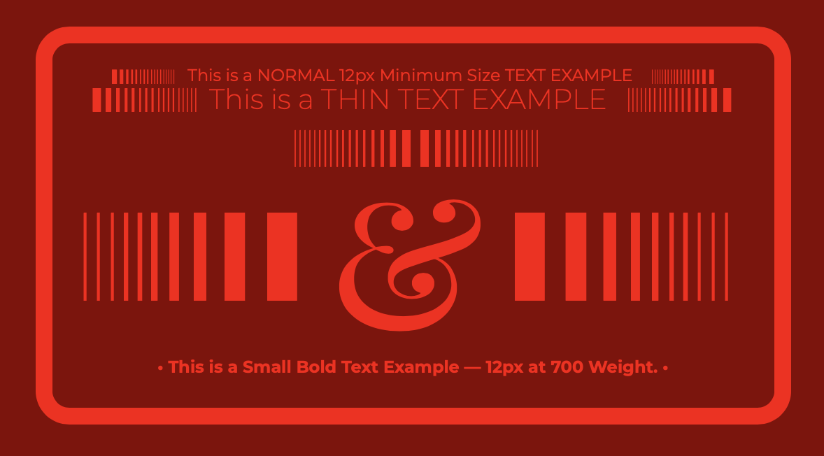
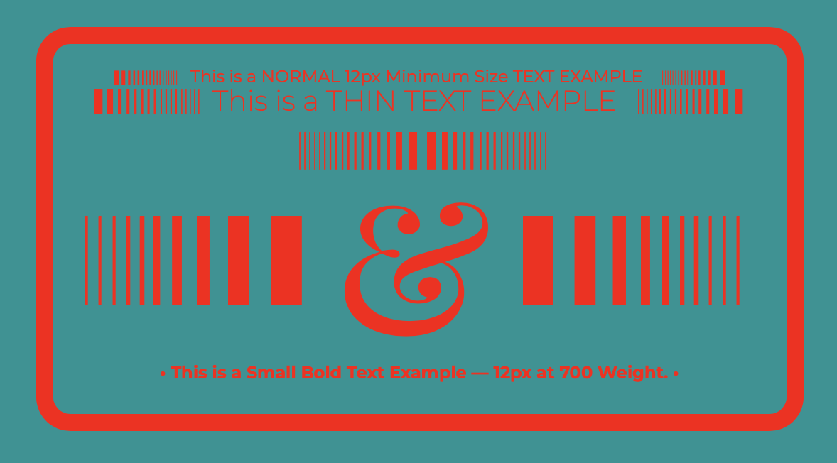
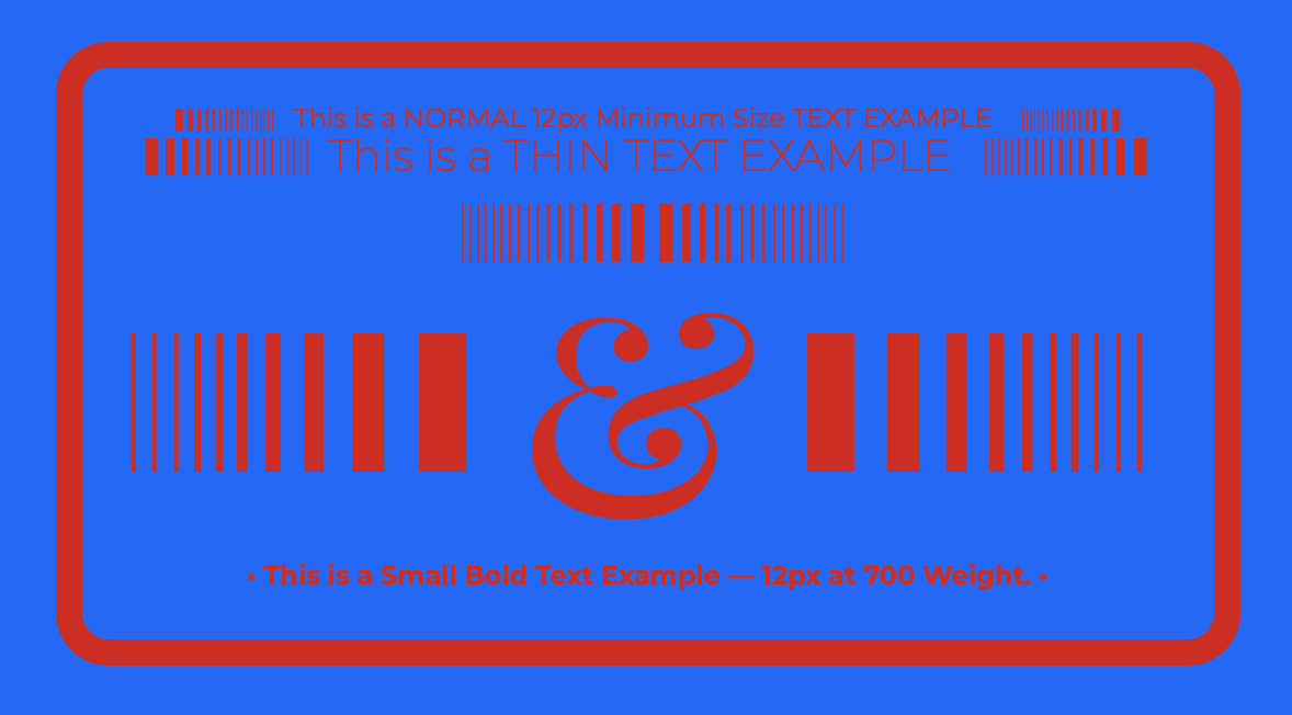
🍊APCA🐄 Accessible 🏁Contrast
🕸W3C AGWG👨🏼🔬Invited Expert
📓WCAG 3 Co-Author
🌎 The World is Reading™📚🐄
Myndex 🔵 boosted:
I just watched this prescient 2012 episode from political comedians Clarke & Dawe. It includes this:
C: Well, as you know in Economics, the great battle in the 20th century was that between capital and labour…
D: Won by capital
C: Won resoundingly by capital, who then move on to the next round and...
D: Who do they meet in the next?
C: They're going to meet democracy in the final
D: Wow, that'll be a good match
C: It'll be an absolute cracker
Most standard models don't include contrast. Contrast adaptation to the surrounding field affects the perception of the ring, not to mention the very sharp + and - edges of the right image.
The contrast of the left image is so low, it's difficult to determine if the lighter lines are lighter than the ring.
So much happens when we go from near threshold to suprathreshold...
I said this same thing like three years ago.
AI is the “Herb” (from Cheers) spliced onto a con artist with the confidence of PTBarnum.
Myndex 🔵 boosted:
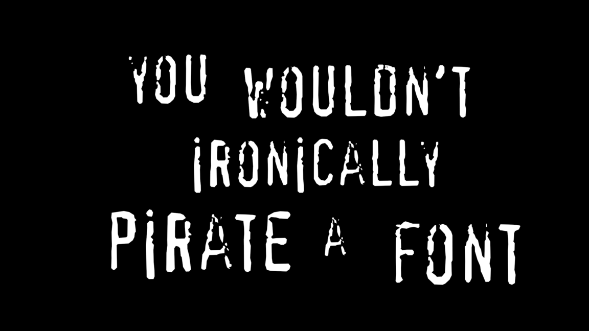
“You wouldn’t steal a car” anti-piracy campaign may have used pirated fonts
Digging into archived site points to use of questionable text styling.
https://arstechnica.com/gadgets/2025/04/you-wouldnt-steal-a-car-anti-piracy-campaign-may-have-used-pirated-fonts/?utm_brand=arstechnica&utm_social-type=owned&utm_source=mastodon&utm_medium=social
Myndex 🔵 boosted:
Yea, early onset cataracts, partly from sitting in front of three wide gamut displays 12 hours a day, and partly from prescription allergy sprays:
A Little Soapbox
People of earth: do not use nasal cortical steroid sprays. When you do, you are spraying steroids up channels next to your eyes. Guess what a leading cause of cataracts is? Steroids.
If ya have allergies, use anything other than nasal steroids. Carry a pack of kleenex. Your vision is more important than a stuffy nose.
Myndex 🔵 boosted:
In this case, the idiot is the one that did the typography for this faux billboard.
Seriously? This isn't even close to resembling proper design, and it's inaccessible.
The letters "He's an idiot", "90%", "the world" are low in contrast, and there is no alt text.
The perspective of the text doesn't match the physical billboard.
The lines of text aren't balanced, there are massive tracking problems which are laughably bad.
Come on, can't we even get memes right?
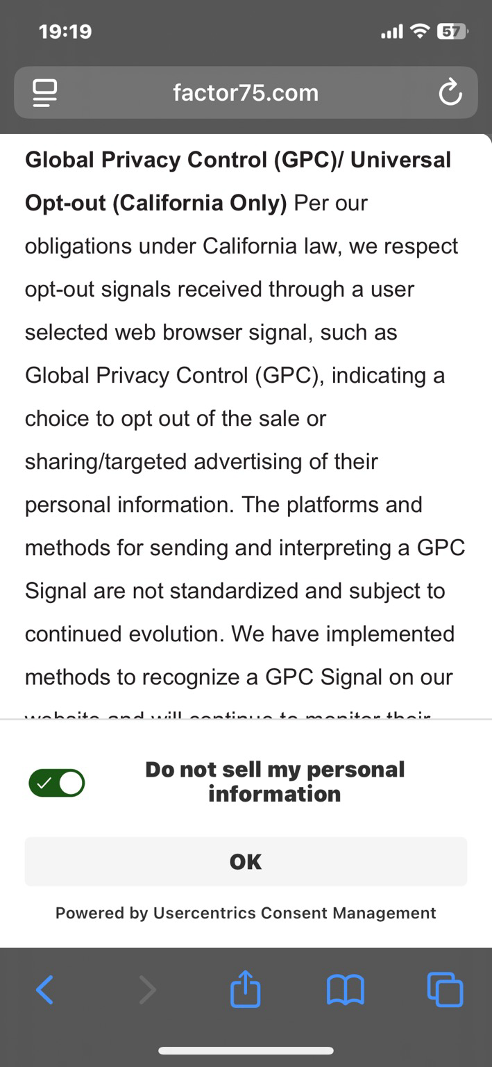
Dark patterns in design: does the switch ON mean I DON’T consent to my data being sold? Or does the switch OFF mean my data won’t be sold?
It's like a cop that asks “do you mind if I search your house” if you say “yes” the cop goes “he consented by saying yes” and if you say "no" the cop goes “he consented by saying he didn’t mind”.
There is a special place for the sociopaths that come up with this garbage.
Just an FYI: Moving servers, the APCA demonstration tool is now at:
On my ever-longer to do list... Thanks for the suggestion
Initial code is on GitHub at apca-w3 and there is also an npm package by the same name.
This is the stable public beta, but nevertheless interim code, and does not have some features we are releasing later this year.
Questions, comments, feedback at the documentation repo:
Myndex 🔵 boosted:
I'm working on a #SwiftUI view modifier that calculates a foreground Color that maintains sufficient contrast with the background and also takes the font into account. This can improve #accessibility without too much design-time overhead.
It's using APCA by @Myndex.
Not at the moment, as its so simple... but I could...
Myndex 🔵 boosted:
Because I wouldn't be me without responding to a conversation in a completely tangential way, finding only the slimmest of reasons to post, here is my personal recipe for bread-machine banana bread, modified from an old family recipe:
---
This is Andy's Banana Bread recipe designed for Bread Machines. (May 2013, modified from an old family recipe).
Mash the bananas, melt the butter, and put all ingredients except the walnuts in the bread machine.
Use the 2lb CAKE setting. At the "add nuts" beep, add the walnuts.
After walnuts are mixed in, remove the paddles and scrape down the sides of the pan with a rubber spatula.
YUM!
Ingredients:
2 OVER RIPE bananas, mashed
2 eggs
1 stick butter, melted (4oz)
4 oz vanilla yogurt
1 capful pure vanilla extract
2 cups flour
1 cup sugar
1 Tbs Molassas
2 tsp Cinnamon
3/4 tsp baking SODA
1 tsp baking POWDER
1/2 cup chopped walnuts (add at beep)
Try cream cheese spread on it - YUMMY!
I've reviewed some of Wendt and Faul's papers on binocular luster... do you have one you like regarding monocular luster? I'm interested to look into this more.
Regarding BT.1886 red, do you think the luster you describe is related to the chroma, or only related to the contribution of that red to luminance? (i.e. is the luster boundary for red equal to the luminance contribution from red relative to the luminance of an equivalent boundary using only an achromatic signal?)
I sense, due to the limitations of text in small chunks, I may be out of sync with the discussion... I wasn't trying to indicate that luster and chroma were specifically related, more that chroma as a "hue dependent luminance type measure" is in essence additive to luminance in terms of the sensation of vividness, pointing to HKe.
I think of luster as the perception of anisotropic qualities of a surface. I tend to think about this as a luminance channel related sensation, at least, it is present in achromatic stimuli.
And when you say gradient domain oriented, do you mean a gradient disregarding anchoring hi/lo clamping values?
As for the gradient fulcrum, I'm wondering if you mean the same as what I call "contrast center", the point for a given condition where the perceived contrast between a hi value and a lo value is equal (for practical terms, equally readable).
For an example, goto this link, then click "research mode" then select "split contrast" and adjust slider
https://www.myndex.com/SAPC/?BG=cccccc&TXT=333333&DEV=98G4g&RSH=true&SEL=radioSplit
So from the rough example math in the previous, with #f00, the L cone is receiving 3.5 times more than M.
With the grey, L receives 1.33 times more than M (L cones are more populous).
With the grey, the ganglion cells are switched to where the signal is sent to light/dark.
With the red #f00, the L gets 26% more luminance than the grey, and also L is not really competing with M as here, L is getting 71% more than M.
Point: there are clearly a number of places where the physiology favors a vibrant red vs a grey of same luminance.
Okay, so in the normal eye, there are more L cones than any other. Stim the L cones only, with the L cones making up the majority of the luminance signal (with L cone peak being a greenish yellow).
And meanwhile the S cones are not contributors to the luminance channel (any luminance from the display blue primary is due to the stim of the M and L cones).
The sRGB red primary creates about 21% luminance.
The first image is a neutral grey of 21% luminance #868686 against #f00 .(equal Ys, 0 C vs red 104 C)
The second image is #f00 v #860000 (Lc25)
The third is #009494 vs #f00
(equal Ys — 33 C v 104 C)
The 4th is #d11 v #06f
(equal Ys & equal chroma)
Note: Ys is "screen luminance"
----
Some very rough calcs:
#f00 mostly stims L cone to Ys=21.3%
#868686, the values are
R Ys= 4.5
G Ys=15.3
B Ys= 1.5
So #f00
L 16.6%
M 4.7%
L gets 3.5 x more than M
#868686
R
L cone 3.5%
M gets 1.0%,
G & B
Remaining 16.8%:
L 9.7%
M 8.9%
=
L for the Grey 13.2%
M for the Grey 9.9%
L 1.33 more than M
Client Info
Server: https://mastodon.social
Version: 2025.04
Repository: https://github.com/cyevgeniy/lmst