Got to work with 120 Early Career Researchers on poster + presentation design at NSF EPSCoR.
Nearly exploded Google Docs with 120 simultaneous people playing presentation slide & poster design games.
After 5 years, still my favorite group!
Trying to bring the magic of #UXdesign to science, so we can speed up discovery. I publish over-researched silly cartoons for scientists (including that viral #betterposter video). PhD in Work Psychology.
Got to work with 120 Early Career Researchers on poster + presentation design at NSF EPSCoR.
Nearly exploded Google Docs with 120 simultaneous people playing presentation slide & poster design games.
After 5 years, still my favorite group!
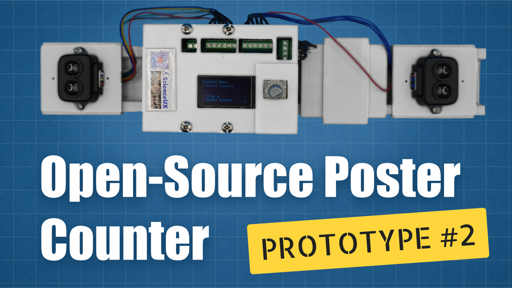
We have a hideously-ugly 3D printed prototype! 🎉
Video explains: https://youtu.be/7RgjXVU8XGU
Big update on our quest to create an #OpenHardware people counter to measure & improve how scientists forage for information in poster sessions.
Prettier, better device to follow. All designs/code on GitHub.
#betterposter
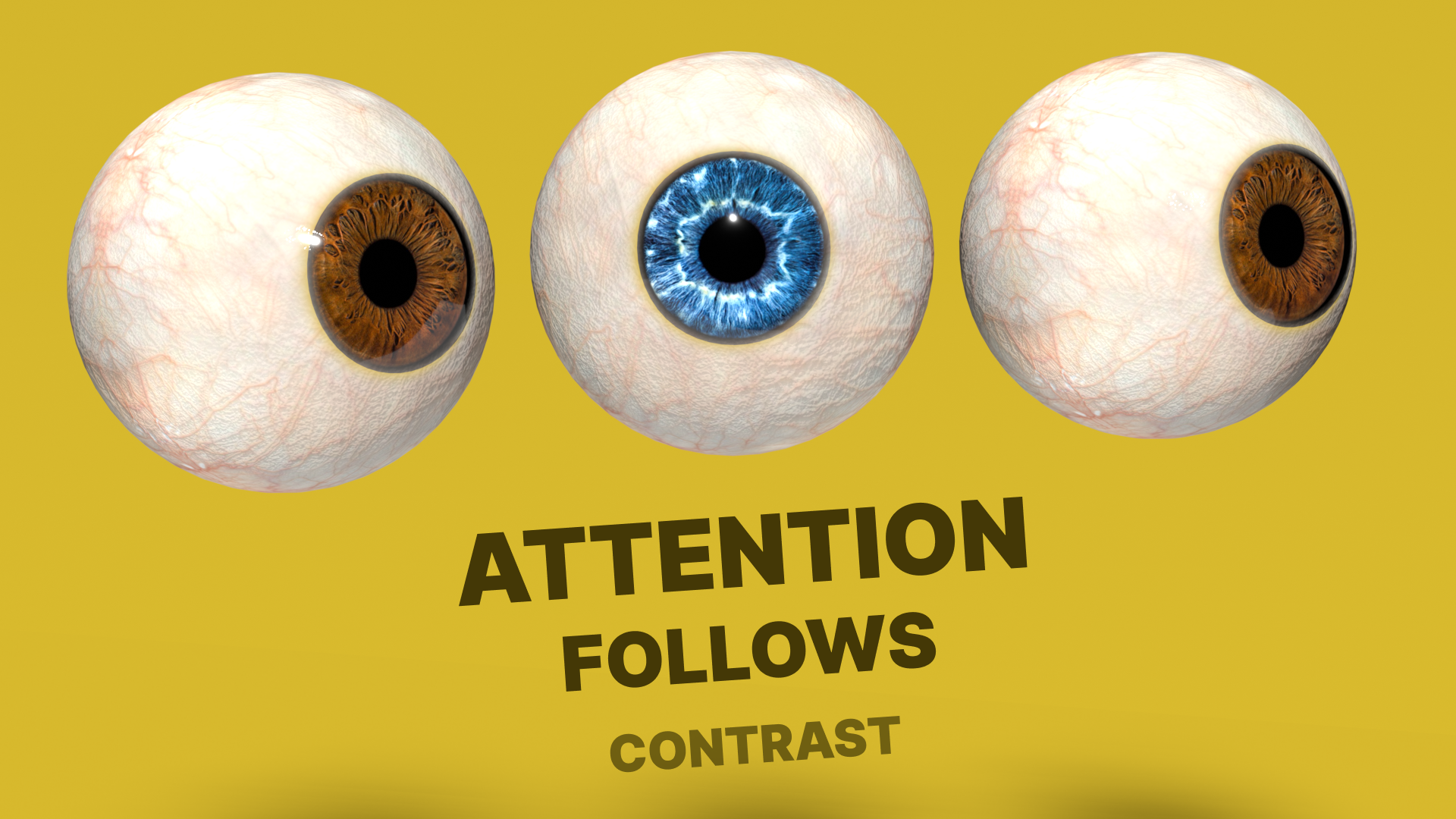
Quick science communication tip: Your eye goes to where the most contrast is first.
The most important point on your slide/poster should also have the highest contrast. Your 2nd point should have slightly less contrast, etc.
This is how you help people look at the right information, at the right time.
New video in my "design for scientists" series shows eye-tracked examples:
https://youtu.be/yjJDpx2jdgs
@mottg Wow great summary!
If we want more reproducible science, then we have to make science easier to reproduce.
Here is an early demo of a step towards that: Scalable, one-click access to re-run the LIVE code & data behind the study.
https://youtu.be/7AXxZ0a1ws0
@matthewfeickert @curvenote Made my day, Matthew! Thank you! So much work happening right now on the #scienceUX front and especially @curvenote. JOSS has been really inspiring too BTW, so back atcha!
The work @mikemorrison has done on scientific #UXdesign has big impacts across academia, which is super cool. I'm very thankful that Mike hasn't stopped, but rather continued and broadened this work at @curvenote!
APCs costing science $Billions.
Would love to be able to track average APC cost, so we can see *hopefully* progress in reducing that number through efficiency.
This fantastic study curated an APC dataset, but notes it may take regulation to force full, open transparency by publishers.
https://arxiv.org/abs/2407.16551
The power of a short animated gif in a scientific article. Adds so much understanding and engagement.
If you've been and Editor of a journal, DM me if you'd be up for a zoom to tell me all about your frustrations with journal software.
Trying to design better tools!
Another thing I love about being able to self-publish my own research with Curvenote Journals is that I don't have to complain about journal policies anymore — I can just make my own.
Relatedly, at scienceUX authors are encouraged to address the reader directly with "You" (e.g., "You can see evidence" versus "One can see evidence").
Because drowning science in a formal tone is inhuman and inaccessible.
Want to see a quick demo of the technology that might replace citations in scientific papers?
Goodbye citations, hello embeds.
I was just hoping for links in scientific papers, but this is even better!
https://youtu.be/A2JpI-5NIsc?si=d_0by8nu5aVfipcr
Happy Spring Semester! 🎉
Just a reminder that you can post your scientific posters, slides, research software interfaces — whatever! — on the scienceUX reddit and get suggestions from professional designers on how to make it work better.
@neuralreckoning - lol yeah there should be some formula where you space given to an image scales up as the image quality & relevance improves, and down otherwise. 😆
Boredom is repetition. Add 'contrast slides🦄' to your presentation that are different from your other slides to keep people awake.
Also, templates are the worst repeat (heh) offender of creating boring repetition.
Video explains with examples, tips, and science on how to inject timely novelty:
https://youtu.be/geNqadeqGWc
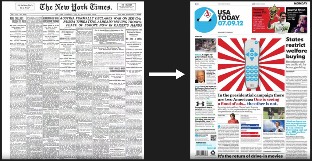
Newspapers were designed like walls of text (like scientific articles and posters), but then evolved a central hero area and clearer visual hierarchy.
(from Coursera on Typography design)
We've completed a 3-year field study on scientific poster design. But poster science doesn't really fit into an established journal.
This is why I started my own journal with @Curvenote.com. Niche research, published for impact, with public peer review.
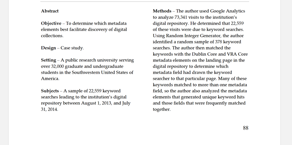
What's your favorite alternative to the traditional 'blob of text' abstract paragraph?
Here's a unique one:
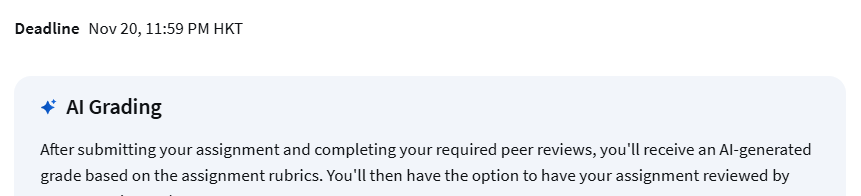
Coursera can AI-grade your assignments now! Which I kind of like sometimes?
AI peer review could be a good first-pass proofreading feature you could run yourself inside scientific article authoring/publishing tools like Curvenote before you submit somewhere.
Still want human review too ofc.
Select some text in a scientific article, and get related points from OTHER papers in that papers' citation network.
It made scientists in the test study feel more curious!
Cool #scienceUX prototype from:
https://buff.ly/3UFRRmJ