Inclusive Reading Technologies

📚 Let's Make Reading Fun Again 📖👓

We are a non-profit focused on research with the aim of improving accessibility and visually enhanced readability for all.

Inclusive Reading Technologies boosted:
robbdlx
2025-04-13

I'm working on a view modifier that calculates a foreground Color that maintains sufficient contrast with the background and also takes the font into account. This can improve without too much design-time overhead.

It's using APCA by @Myndex.

Inclusive Reading Technologies boosted:
Myndex 🔵Myndex@techhub.social
2025-03-18

@troy_s

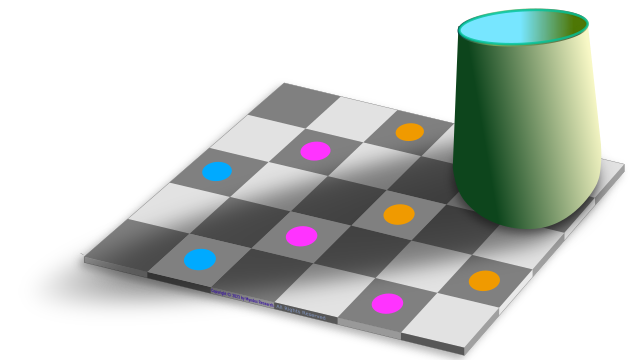
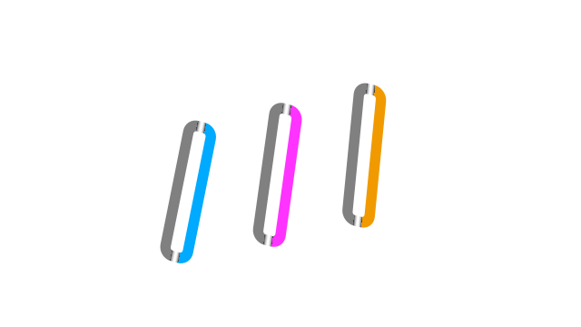
Elaborating on this a bit more, looking at the version with the solid bars connecting the in and out-of-shadow dots.

These bars are each the same color throughout, but notice on the grey bar that it appears to have a gradient in the area where it crosses the shadow.

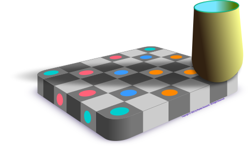
Another take on the checkerboard shadow and dot illusion, using yellow, blue, salmon, and teal colored dotsAnother take on the checkerboard shadow and dot illusion, using yellow, magenta, blue, colored dots.The checkerboard shadow and dot illusion, using yellow, magenta, blue colored dots, and also long thin bars of each color, that extend from the dot inside the shadow to the dot outside. The grey bar is all the same color grey, but appears to have a gradient as it crosses the shadow.The color alignment bars in isolation, showing the grey, yellow, magenta, blue colors are consistent throughout each bar. The gradient on the previous image is a perception due to the shadow context.
Inclusive Reading Technologiesreadtech
2025-03-10
Inclusive Reading Technologiesreadtech
2025-01-21

@marcedwards @nesevis

The few places APCA passes colors that WCAG 2 contrast rejects, are cases where the rejected colors are actually better for those with color vision deficiency.

In other words, WCAG 2 contrast isn't just wrong, its results can negatively impact readability.

Inclusive Reading Technologiesreadtech
2025-01-21

@marcedwards @nesevis

APCA substantially exceeds WCAG2 contrast in terms of actual accessibility, especially for dark mode.

WCAG 2 contrast SCs are essentially unusable for dark mode, and can be harmful to actual accessibility & readability. The fact that the EU is putting WCAG2 contrast into law is unfortunate.

WCAG 2 contrast is not based on any relevant readability research. WCAG 2 contrast is not peer reviewed, and the statements made in the understanding doc lack scientific support.

Inclusive Reading Technologiesreadtech
2025-01-16

@Sp3r4z

APCA is a key part of the APCA Readability Criterion, published by Inclusive Reading Technologies.

readtech.org/ARC/#visual-contr

Inclusive Reading Technologies boosted:
2025-01-16

I created smalls tools for my own personal needs, and I share it with you, if it cans benefit to someone else: a11y.sp3r4z.fr/colors/

It's a contrast checker based on WCAG 2.2 rules and APCA (still under development) rules, and some small other tools too.

I know it's quite basic, not really accessible and very messy, but well… 😊

Comments and ideas welcomed.

#a11y #accessibility

Inclusive Reading Technologiesreadtech
2025-01-16

@marcedwards

APCA is a key part of the APCA Readability Criterion, the draft standard from the non-profit Inclusive Reading Technologies, Inc.

readtech.org/ARC/

Inclusive Reading Technologies boosted:
Marc Edwardsmarcedwards
2025-01-16

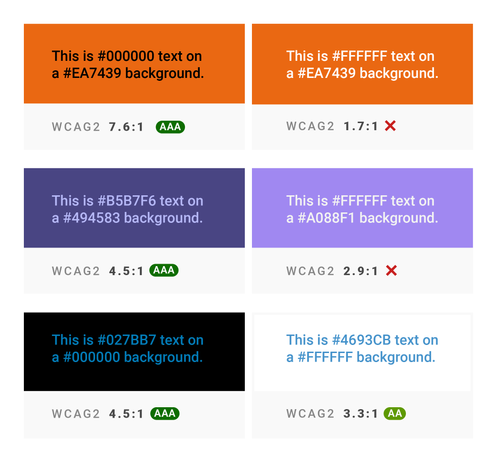
2025 should be the year you stop using WCAG 2 colour contrast testing, and switch to APCA. This article is a few years old, and covers everything well. blog.datawrapper.de/color-cont

A comparison of black text and white text on various background colours, using the WCAG 2 testing method. The contrast ratios do not match what you’d expect. For example, white text on an ornage background looks very high contrast, but black text on orange has a higher value.
Inclusive Reading Technologiesreadtech
2025-01-13

@aardrian

APCA is part of the APCA Readability Criterion, an open standard available from Inclusive Reading Technologies, Inc. A California non-profit, dedicated to science-based standards and research to improve readability for all.

readtech.org/ARC/

Inclusive Reading Technologiesreadtech
2024-07-08

@patrick_h_lauke @Kilian

Indeed: If color management is enabled (on any system, Win/Mac/Lix) the dropper may provide unpredictable results. Choosing a default sRGB profile while using the picker may help mitigate issues.

Better to use a stand alone dropper tool that is color management aware.

For MacOS, that's "Classic Color Meter" desktop app.

Discussion and best practices in our draft guidelines:

readtech.org/ARC/tests/visual-

Inclusive Reading Technologies boosted:
Myndex 🔵Myndex@techhub.social
2024-05-17

@leaverou @eric

"Unvetted" is WCAG 2 contrast, which had no testing, no peer review, and in fact was objected to by stakeholders like IBM back in 2008.

APCA has undergone over three years of public beta testing. The current version has been stable since February 15, 2021, and has had substantial third party expert review, including journal published peer-review, review by PhD-level accessibility experts, and was created with the oversight of W3C/WAI in the Visual Contrast Group and LVTF, which includes members of the US Access Board.

As is well known, the open public testing and open discussion continues at:
github.com/Myndex/SAPC-APCA/di

WCAG3 did a full reset, starting nearly from scratch. Because visual accessibility is a critical need, APCA guidelines are in public working draft stage as the APC Readability Criteria, a guideline hosted by the non-profit Inclusive Reading Technologies, Inc. readtech.org/ARC/

Questions and comments welcome at the GitHub forum linked above.
Inclusive Reading Technologies boosted:
Christian Lawson-Perfectchristianp@mathstodon.xyz
2024-05-07

I'm severely colourblind - my eyes can hardly detect red light at all.
So, working in web development, picking colour schemes is hard.
There are tools around to help you pick accessible colour schemes, but they assume that you can tell by looking that a colour is the one you want, and the only information you need the computer to calculate is the contrast ratio.
I realised I need a tool that will take the name of a colour and find a shade that gives a target contrast ratio.

Here it is: colourblind-palette-maker.glit

It uses the new APCA perceptual contrast algorithm and the Oklab colour space to help me find colours that people with better colour vision will interpret correctly, while ensuring there's good contrast for as many people as possible.

#accessibility #a11y #WebDev

Inclusive Reading Technologies boosted:
Myndex 🔵Myndex@techhub.social
2024-05-07

Recent positive, independent peer review of APCA:

"...15 years since the adoption of WCAG 2.0...enhanced color models adapted to human perception, have been developed...APCA shows more accurate results for measuring color contrast..."

#a11y #Webdesign #accessibility #color #colour #contrast #APCA #WCAG

doi.org/10.1007/978-3-031-3599

Inclusive Reading Technologies boosted:
2024-05-07

Color contrast tools to check against APCA

EL introduced me to contrast.tools recently, it uses the Advanced Perception of Color Algorithm (APCA) to check the accessibility of your text based on the desired colors and the font weight + size. But importantly, it also provides a lookup table to verify how you should (possibly, probably) interpret things.
I think that APCA is being floated as the new contrast…

https://piperhaywood.com/color-contrast-tools-to-check-against-apca/

#accessibility #APCA #color

Inclusive Reading Technologies boosted:
Amalgamamalgam_
2024-05-07

The other day I was trying to understand how much different colors contrast with each other so I’ve built a toy that you can play around with and see it!

You can change the background and foreground color and see how much they contrast with both and

Let me know what you think

rosenqvist.design/contrast-toy/

Inclusive Reading Technologies boosted:
Myndex 🔵Myndex@techhub.social
2024-05-07

@agvbergin @cwilcox808 @dkieffer

Yes halation in dark mode can be an issue. But in order to set a max contrast, the contrast calculation has to be perceptually uniform. WCAG2 contrast is not accurate to use this way, and WCAG2 is also not useful for dark mode.

APCA can calculate for dark mode, and we are testing the following maximums (negative Lc value means light text/dark BG).

DARK MODE MAX

Small text (under 24px): Lc -90 max

Medium bold text (24-36px): Lc -85max

Large text (>36px) and thick solid icons or buttons: Lc -80
And Lc -75 max if the BG is darker than `#333333 `

We have a discussion thread on the subject at the APCA forum: github.com/Myndex/SAPC-APCA/di

#color #APCA #WCAG #contrast #darkmode

Inclusive Reading Technologies boosted:
Myndex 🔵Myndex@techhub.social
2024-04-30

I was recently interviewed by Colleen Gratzer at @creativeboostco regarding APCA, Inclusive Reading Technologies, and guideline development.

We covered the important basics of perceptual uniformity, with ample visual examples.

#Webdesign #accessibility #A11y #WCAG #APCA #inclusive

creative-boost.com/apca-contra

Inclusive Reading Technologies boosted:
Antoinevillepreux
2024-04-28

I recently switched from WCAG2 to APCA on my personnal projects, so I needed a simple tool to check color contrasts against that new guideline.
Did not find the existing ones efficient enough so quickly developped one that suited my needs.

More: villapirorum.netlify.app/web/

The tool: villapirorum.netlify.app/web/c

WCAG 2.0: w3.org/TR/WCAG20
APCA : git.apcacontrast.com
A more sophisticated APCA tool : contrast.tools

Inclusive Reading Technologies boosted:
Matthias Ottmatthiasott
2024-04-28

And here’s the first draft of a perceptually uniform palette, created with @ardov’s incredible tool Huetone.

You can tune the LCH values until you get the desired color and check the APCA and WCAG contrast values.

huetone.ardov.me/

A color palette in the Huetone tool showing APCA contrast values and various charts that visualize th LCH channels of a selected color.

Client Info

Server: https://mastodon.social
Version: 2025.04
Repository: https://github.com/cyevgeniy/lmst