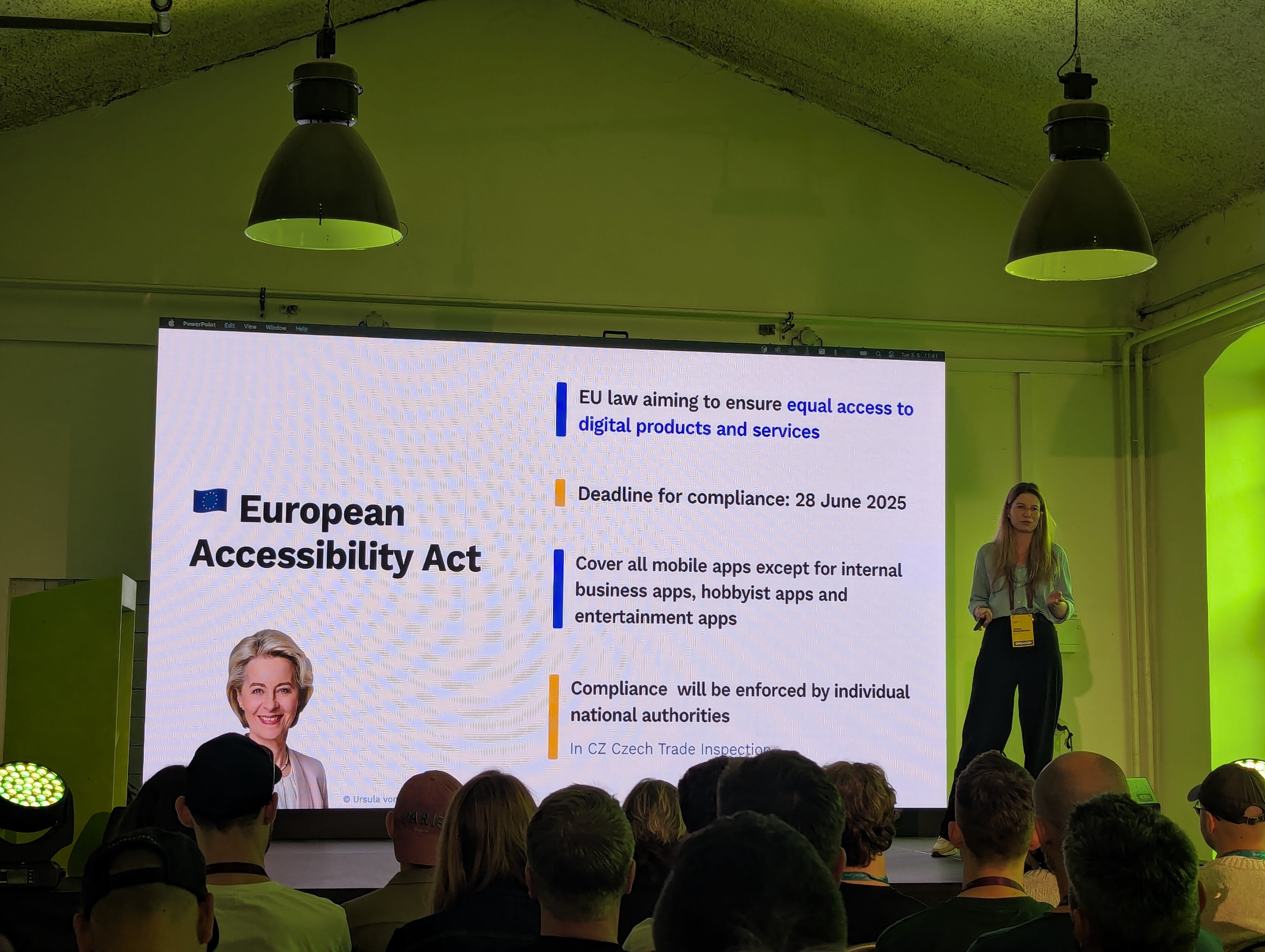
Develop Apps for Everyone: Making Mobile Apps Accessible
http://mdevcamp.eu/schedule-tuesday.html#jitka-pfeiferova-modal #mdevcamp #a11y #apca #wgca #liveregion
#APCA

#Development #Guides
Browser-applied contrast · How to make CSS choose black or white for contrast https://ilo.im/163v80
_____
#CSS #Color #BlackWhite #Contrast #Accessibility #WCAG #APCA #Browser #WebDev #Frontend
My husband and I made a color contrast checker with WCAG and APCA support.
It has Live Preview with APCA-specific details, assisting messages, helpful explanations, and permalink support.
We'll be happy to know what you think :)
A11y 101: 1.4.3 Contrast (Minimum), by @nattarnoff.bsky.social:
https://tarnoff.info/2025/03/25/a11y-101-1-4-3-contrast-minimum/
Woooow @marcedwards, thanks for sharing!
I always felt that some WCAG 2 color #a11y results were weird, but I never dove deeper. This shines a completely different perspective, super insightful!
The problem now is that benchmarking and testing services do still use #WCAG2 as their reference, so, absurdly enough, if we switched to #APCA we would get worse acccessibility scores… 🤨
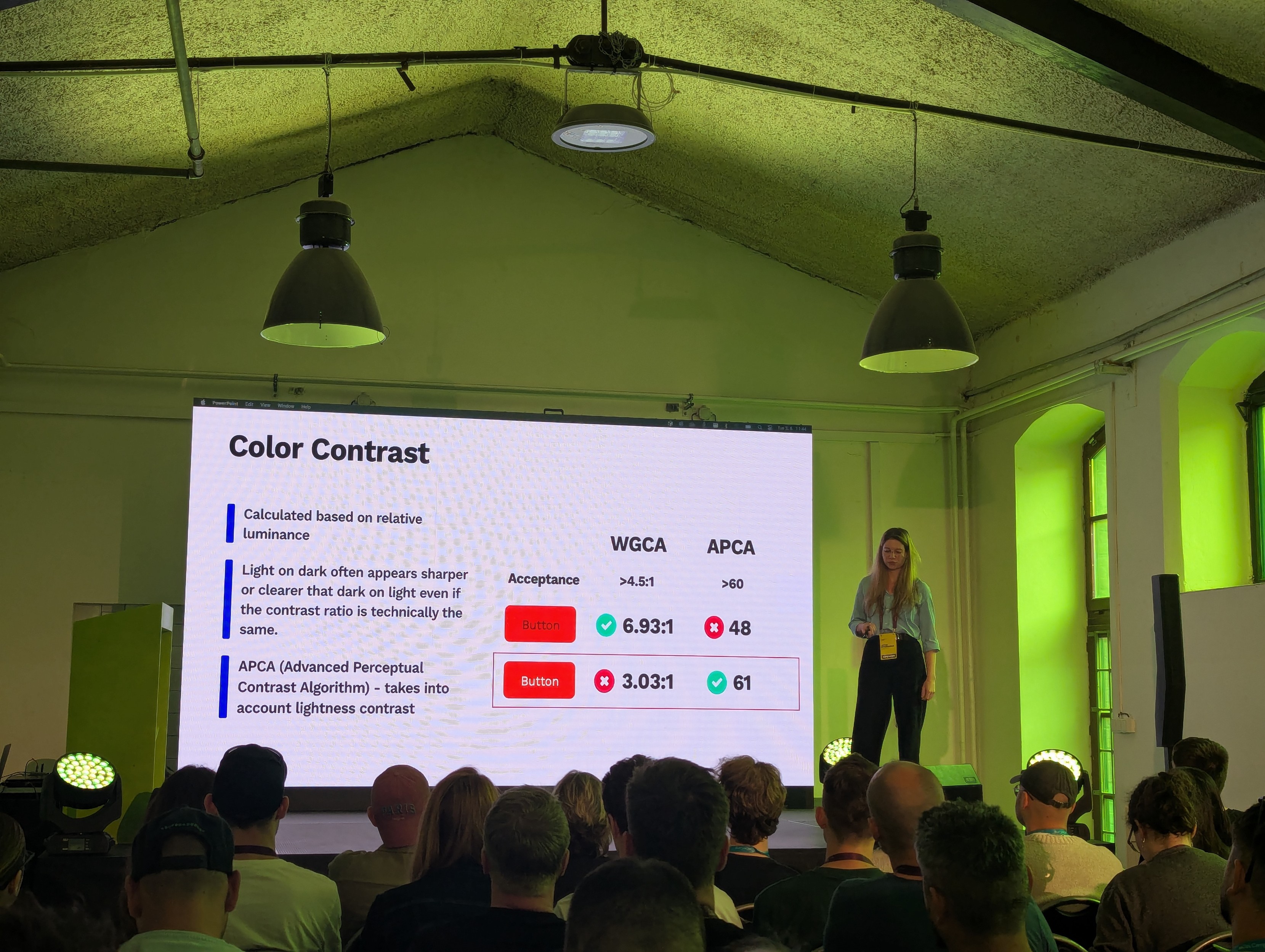
#APCA is designed to more accurately measure perceived contrast by assessing contrast in terms of lightness contrast, taking into account aspects such as polarity and contextual information like font size and weight.
APCA's more human-centred assessment of contrast gives companies like Stack Overflow more confidence that they are designing interfaces that are both aesthetically pleasing and readable by as many people as possible.
More on APCA: https://git.apcacontrast.com
Is orange the forbidden colour in accessibility? 🔶🙅
Stack Overflow made an exception during its accessibility-focused redesign and chose to measure #colour #contrast using the Accessible Perceptual Contrast Algorithm (#APCA). Although they initially considered the #WCAG colour contrast algorithm, they decided against it because it struggles to accurately assess colour contrast when using orange, which is a significant issue when orange is a brands primary colour.
Big accessibility cleanup on my website (https://villapirorum.netlify.app/dev) !
✅ Passed WCAG2 AAA color contrast AND
✅ Passed WCAG3/APCA color contrast
(checked with Wave & Visbug)
🥳
Also added support for text type in my color contrast checker / suggest tool (https://villapirorum.netlify.app/web/contrasted-colors)
#webdev #frontend #a11y #accessibility #apca #wcag3 #personalwebsite #amateurwebdev
@agvbergin @cwilcox808 @dkieffer
Yes halation in dark mode can be an issue. But in order to set a max contrast, the contrast calculation has to be perceptually uniform. WCAG2 contrast is not accurate to use this way, and WCAG2 is also not useful for dark mode.
APCA can calculate for dark mode, and we are testing the following maximums (negative Lc value means light text/dark BG).
DARK MODE MAX
Small text (under 24px): Lc -90 max
Medium bold text (24-36px): Lc -85max
Large text (>36px) and thick solid icons or buttons: Lc -80
And Lc -75 max if the BG is darker than `#333333 `
We have a discussion thread on the subject at the APCA forum: https://github.com/Myndex/SAPC-APCA/discussions/106
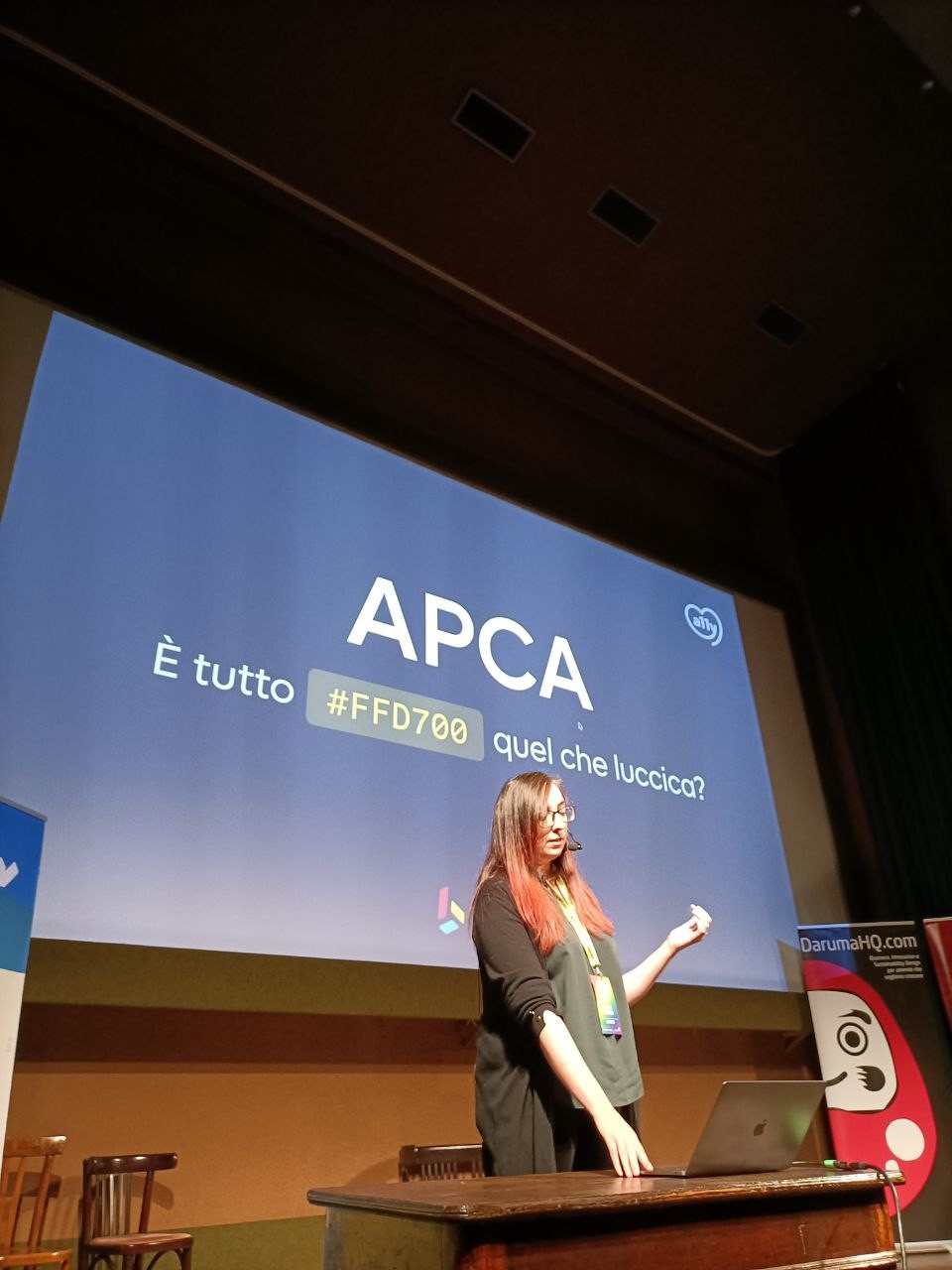
È il momento di Agnese Ragucci con il talk "APCA. È tutto #FFD700 quel che luccica?"
🖥️ Agnese è UI & DS Designer @ Buildo
#cssday24 #cssday #css #APCA
I recently switched from WCAG2 to APCA on my personnal projects, so I needed a simple tool to check color contrasts against that new guideline.
Did not find the existing ones efficient enough so quickly developped one that suited my needs.
More: https://villapirorum.netlify.app/web/
The tool: https://villapirorum.netlify.app/web/contrasted-colors/
WCAG 2.0: https://www.w3.org/TR/WCAG20
APCA : https://git.apcacontrast.com
A more sophisticated APCA tool : https://contrast.tools
The other day I was trying to understand how much different colors contrast with each other so I’ve built a toy that you can play around with and see it!
You can change the background and foreground color and see how much they contrast with both #wcag and #APCA
Let me know what you think
Did the same with #APCA. Interesting to see the differences.
Took much longer to implement btw. I'm also using absolute values, which you are not supposed to do, for comparison purposes.
How APCA Changes Accessible Contrast with Andrew Somers - YouTube
https://www.youtube.com/watch?v=E-CZial5VkU
After listening to this interview give this website a try: https://www.color-contrast.dev
It shows the Lc rating plus useful checks on what type of content it is approved for (e.g. body text, headers).
I was recently interviewed by Colleen Gratzer at @creativeboostco regarding APCA, Inclusive Reading Technologies, and guideline development.
We covered the important basics of perceptual uniformity, with ample visual examples.
Do standards and guidelines lag emerging technology?
Yes.
Can this be helped?
Also yes.
A brief article posted on Linkedin:
#a11y #Webdesign #WCAG #APCA #accessibility #Standards
https://www.linkedin.com/posts/andrew-m-somers_once-upon-a-time-our-technology-landscape-activity-7142562431314083840-GS-I?
Hi Piper, please feel free to direct any questions or issues you may have to me, also let me know if you are interested in being a beta site.
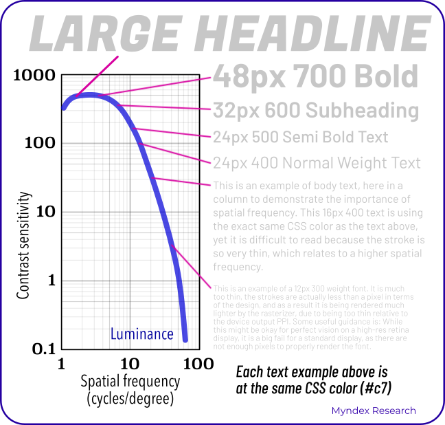
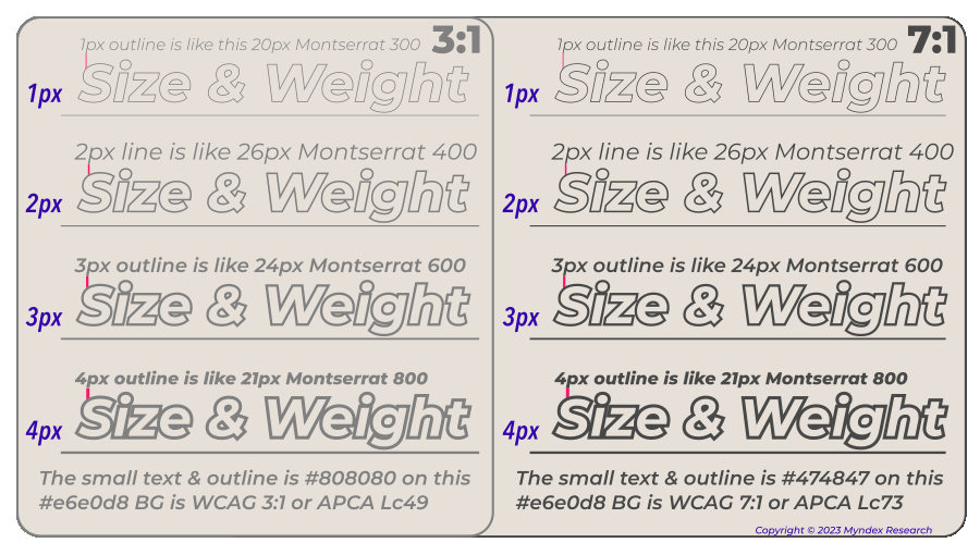
One thing I'll mention: the important consideration for contrast is spatial, not color. Font weight/line thickness does more for contrast perception than color distance.
One way to think of this is, luminance distance needs to be increased to support thinner strokes.
Examples:
Color contrast tools to check against APCA
EL introduced me to contrast.tools recently, it uses the Advanced Perception of Color Algorithm (APCA) to check the accessibility of your text based on the desired colors and the font weight + size. But importantly, it also provides a lookup table to verify how you should (possibly, probably) interpret things.
I think that APCA is being floated as the new contrast…
https://piperhaywood.com/color-contrast-tools-to-check-against-apca/
Client Info
Server: https://mastodon.social
Version: 2025.04
Repository: https://github.com/cyevgeniy/lmst