tambourineman
2025-06-20

@atpfm I was hoping my favorite podcast nerds would talk about github.com/apple/containerizat

To me, the most exiting thing to ship from Apple in a long time. I like when Apple focuses on low level stuff that makes our lives better instead of just breaking the UI every year or so
2025-06-18

@adventofcomputing ep 159
was great. The kind of content I look forward to from your show. Looking forward to the next ones on the series

2025-06-18

Any brave soul running Tahoe knows if, along with true 24bit colors, Terminal.app has now entered the XXI century with vertical and horizontal splits?
#macos26 #macostahoe
@atpfm

tambourineman boosted:
Arthur Charpentier ⏚ 🇨🇦freakonometrics
2025-06-18

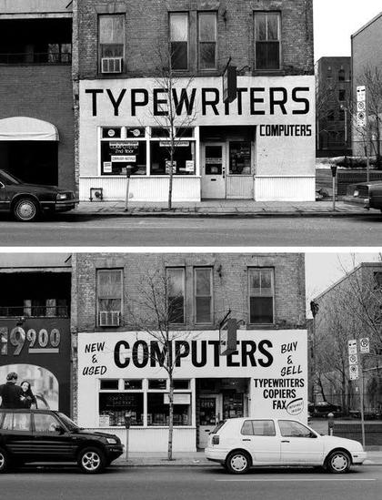
Toronto, 100 Adelaide St. E. – March 1989 / April 1998 by Patrick Cummins urbanspacegallery.ca/event/ful

2025-06-17

@atpfm that’s an awesome movie.

tambourineman boosted:
2025-06-16

A clip of @siracusa asking why things can’t be both beautiful and accessible and defining success as creating an accessible tool that most people enjoy using.

#atpfm #ios26

2025-06-15

@BasicAppleGuy I hope it doesn’t take 5 years for it to be acceptable

2025-06-14

@daringfireball Hadn’t seen Craig this uncomfortable since his first presentation where a close up showed his shaking hand holding the mouse. Well done @joannastern

tambourineman boosted:
Tuomas Hämäläinen 🇺🇦tuomas_h
2025-06-14

Apple love to preach "the UI gets out of the way of your content" with each new redesign, but how true is that in practice? Let's compare the total height of the Safari UI with a toolbar, favourites bar and tab bar visible, across the three latest Mac OS design languages – Yosemite, Big Sur and now Tahoe. I've added a red line for emphasis.

It sure looks to me like the UI is eating more into my content with each redesign.

Collage of three screenshots, showing a comparison of the upper left corner of Safari between Mac OS 10.10–10.15, 11–15 and 26. With each redesign, the Safari UI gets taller.
2025-06-12

@marcoarment amateur time. I wonder if Alan Dye ever heard of Fitts's law. So sad that my long time favorite platforms are at the mercy of empowered rookies.

tambourineman boosted:
Marco Armentmarcoarment
2025-06-12

A hallmark of iOS 26 design seems to be the consolidation of what was previously multiple toolbar buttons into a "…" button that shows a menu.

Which looks fine, I guess, but some VERY common actions are now an additional tap away!

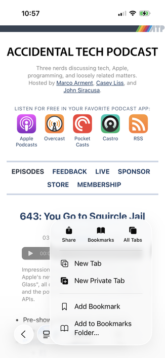
Safari is the worst offender. Want to switch tabs or close the current tab? The all-tabs view, previously the two-squares toolbar icon, is now buried in a menu, adding an extra tap and significant finger movement to possibly the most common action in Safari:

2025-06-11

@cabel melted a little bit just by watching. And I’m not even British.

2025-06-11

@mattro that angle has always been the case for macOS since the classic days. All light emanates from the Apple menu.

2025-06-11

@Cykelero they are enamored by rounded corners, it seems. The mouse is a precision device, the arrow should end in a single pixel. Otherwise, what’s the point?

(happy accidental pun)

2025-06-11

@Iconfactory @jimniels it’s hard to think outside the box when you’re stuck in one.

2025-06-11

@command_tab we are living in a tough enough world already. You might be right, but not it’s not for now. We need some peace. I’m still talking about the Finder, I think.

tambourineman boosted:
Ged Maheuxgedeonm
2025-06-11

I know I have aging eyes but the more I look at Liquid Glass app icons the fuzzier they get. The subtle glass bezels, reflected edge highlights and soft chromatic shadows result in an icon that is super soft and fuzzy at size.

I suppose I’ll get used to them but they are negating these high res retina displays big time. It’s like I’m looking at the icons through cheese cloth or something.

Liquid glass version of the QuickTime icon. Created from blue pieces of translucent glass with soft subtle edge treatments and soft blue chromatic shadowsLiquid glass treatment of the YouTube icon, red rounded wrecked shape with soft edges and subtle red drop shadows
2025-06-10

@atpfm Apple must have heard @siracusa complains about scrolling performance on Swift UI. They claim to be 6X faster on Tahoe

2025-06-09

@twostraws @marcoarment but why make an obviously bad decision just to dial it back later? These shouldn’t be amateurs trying the waters. They should be leading the UI/UX field.

Client Info

Server: https://mastodon.social
Version: 2025.04
Repository: https://github.com/cyevgeniy/lmst