📣 Announcement!
🦋🦋🦋
We’re on pause from Mastodon. Follow us on Bluesky instead https://bsky.app/profile/typofonderie.com
Join graphic designers, art directors, web designers who use our fonts! Buy the best quality fonts you need. Est. 1994.
https://typofonderie.com/links
👋 Annual design conference + learn type design @typeparis
📣 Announcement!
🦋🦋🦋
We’re on pause from Mastodon. Follow us on Bluesky instead https://bsky.app/profile/typofonderie.com
❈ ❇︎ ❈ Caslonian
➽ https://typofonderie.com/fonts?q=Caslonian
➽ https://caslonian.typofonderie.com
Four optical sizes, an Open face version, small capitals, ornate letters, vignettes, etc. Caslonian is drawn with a large x-height, exaggerating certain details and proportions. Caslonian is designed according to the Typofonderie Pro (and exclusive) glyphs set.


❇︎ Spark creativity with our new Caslonian by Jean François Porchez 126 fonts in 8 sub-families.
➽ https://typofonderie.com/fonts?q=Caslonian
➽ https://caslonian.typofonderie.com
If you are looking for an English-inspired typeface, that by its contrasts and sometimes excessive proportions will be pleasant to the eye: Caslonian is for you.


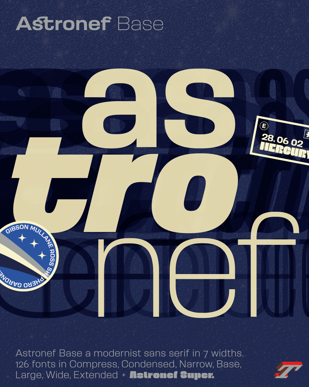
Today, we launch Astronef Base, a large family of seven widths for a total of 126 fonts, available in four different atmospheres/tones. The tones Boton, Widmer, Hollenstein form a tribute to these French graphic designers and type designers who carried during the 1960s, a certain vision of modernity in graphic design. Influence that persists in the world of French design.
➽ https://astronef.typofonderie.com
Discover the different features of the 8 families, read “The upsetter influences of Astronef”
[8 days left] 🛎 Register before 14 February 2024 at €120 (Early bird ticket!)
https://typeparis.com/now24
Speakers announced for Now24 are:
Marta Cerdà Alimbau, Leslie David, Carolina Landon, Shaun Loftman, Raissa Pardini, Paul Shaw, Jeremy Tankard, Violaine & Jérémy, VikaVita and Zoo.
Discover them on our website!
🎯 Don’t wait to register to Now24 conference (in English) that brings together graphic design and typography enthusiasts.
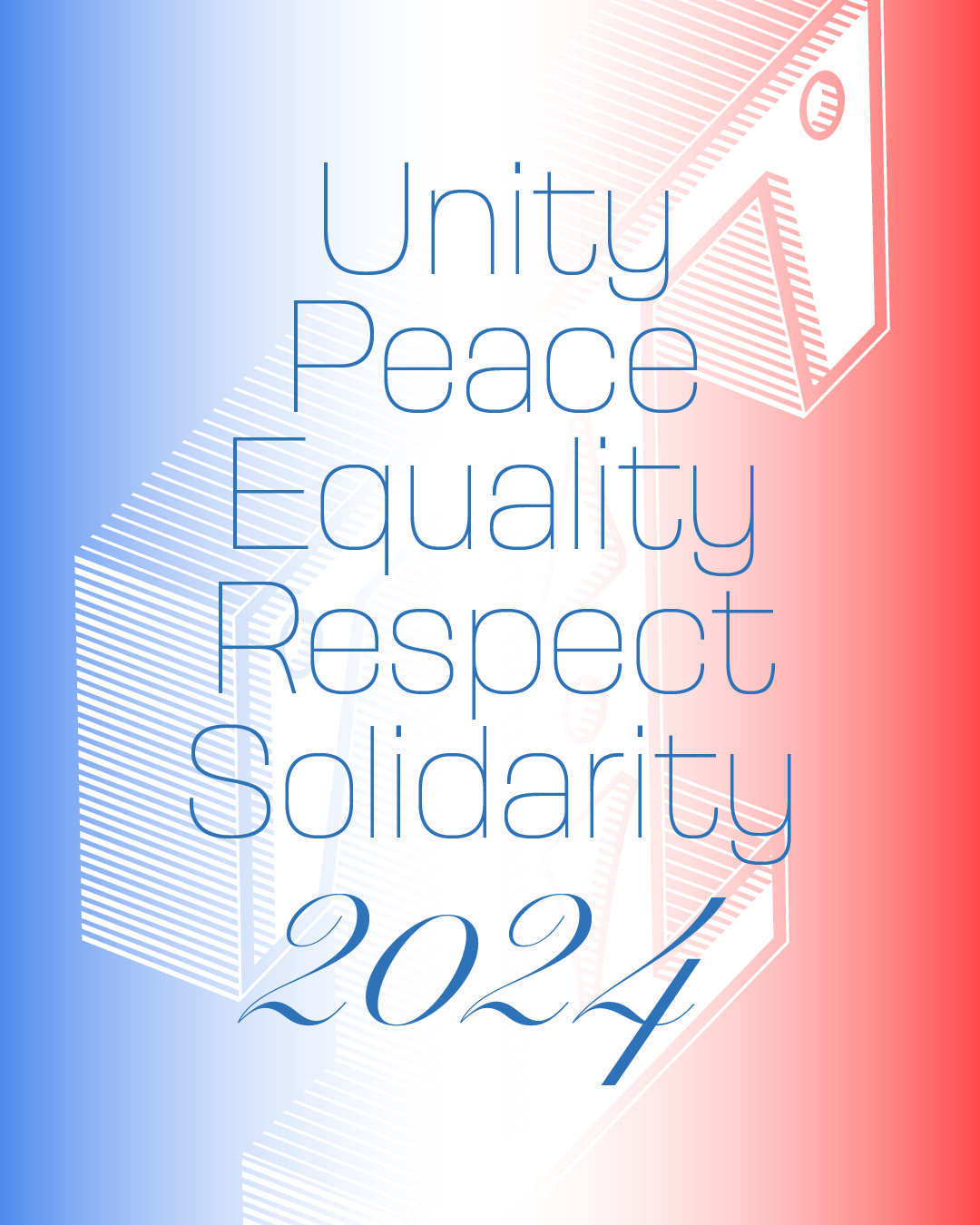
[FR] Chers amis,
Il me semble chaque année plus difficile de vous adresser nos voeux sans penser à ce monde. La planète et ses habitants subissent crise après crise, sanitaire, économique, sociale, climatique. Les extrémistes de tous bords semblent résolus à déstabiliser nos démocraties. Alors que pouvons-nous espérer de 2024? J’espère qu’elle vous apportera un peu de joie à vous et vos proches et que notre monde se porte mieux et s’apaise. —jfp

[EN] Dear friends,
It seems to me more difficult every year to send you our wishes without thinking about this world. The planet and its inhabitants suffer crisis after crisis, health, economic, social and climate. Extremists of all kinds seem determined to destabilize our democracies. So what can we expect from 2024? I hope it will bring at least a little joy to you and your loved ones and that our world will doing better and calms down. —jfp
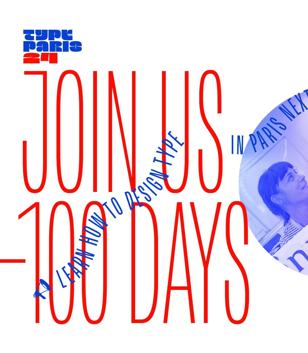
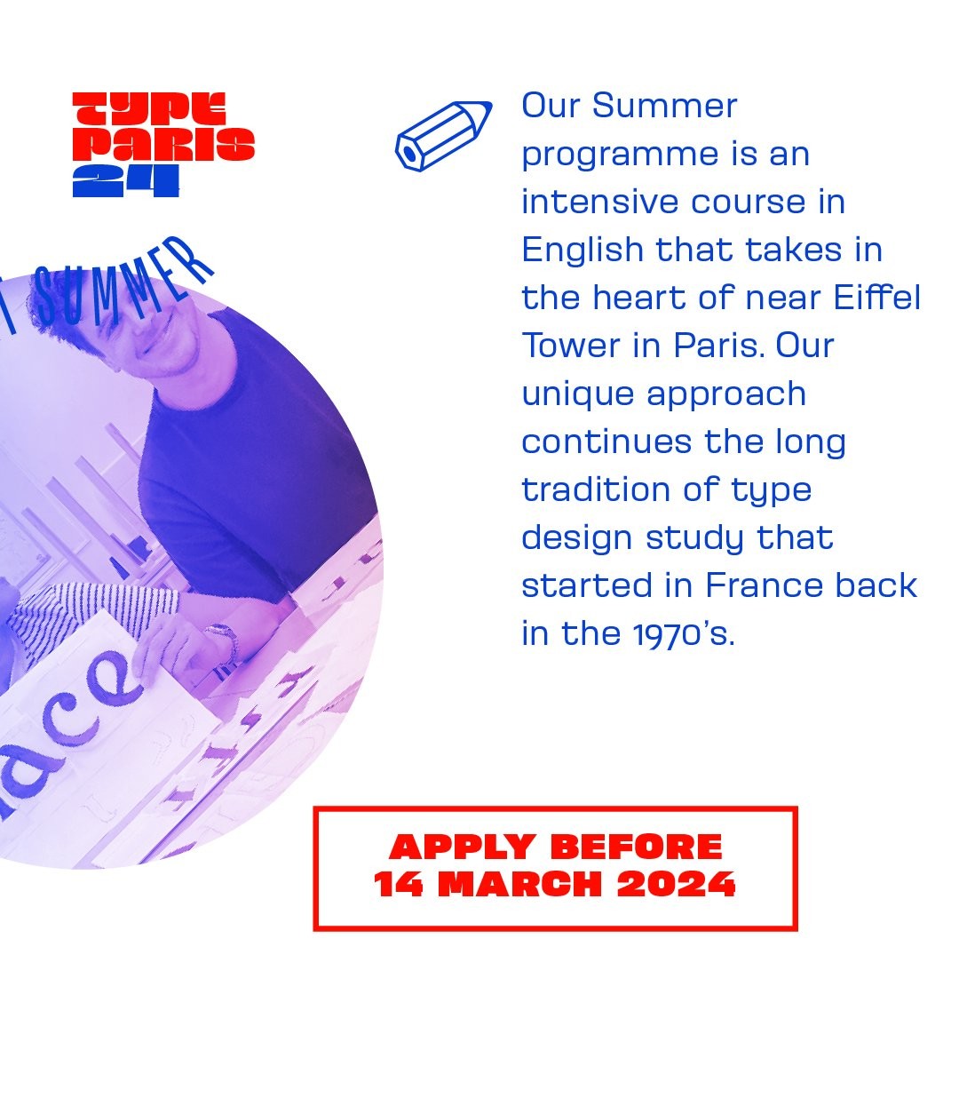
🚀 100 days left! Apply before the 14 March 2024 to submit your portfolio and have the chance to be selected for #typeparis24.
https://typeparis.com/summer24 Learn type design in 6 weeks, from 4 June to 12 July 2024.
Core team includes: Jean François Porchez, Mathieu Réguer, Marc Rouault, Rainer Erich Scheichelbauer, Georg Seifert, Gina Serret, Julie Soudanne, Malou Verlomme.
The international type critics confirmed are: Henrik Kubel, Ruggero Magrì...
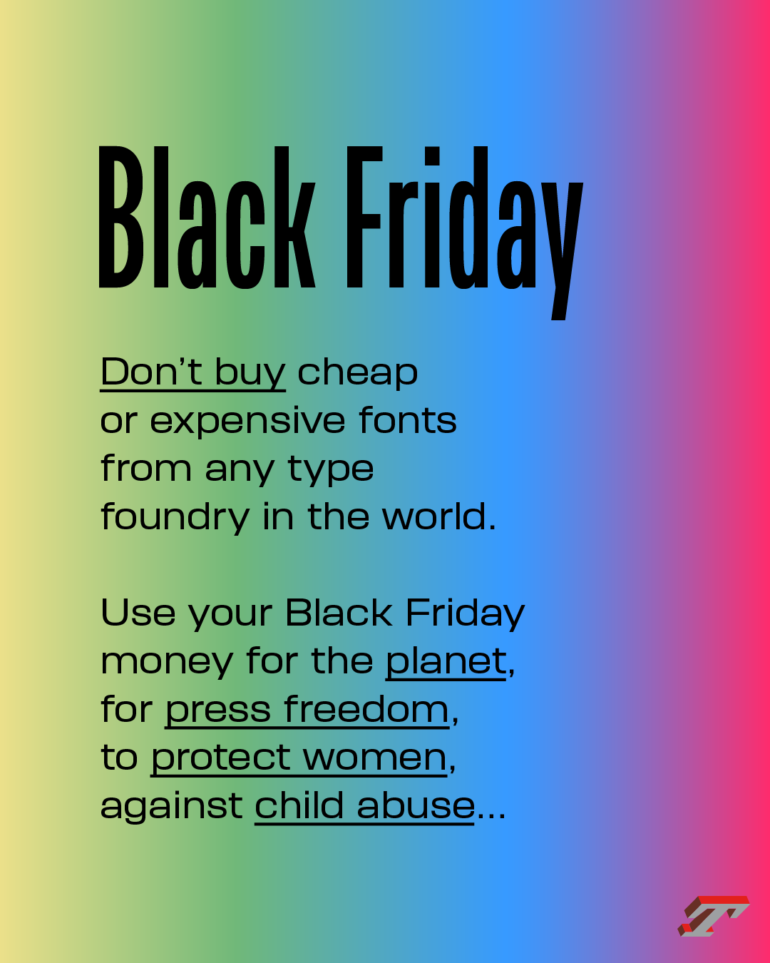
Join the call: #dontbuyfontsfriday
Use your Black Friday money for the planet, for press freedom, to protect women, against child abuse…
New! There are glyphs of Arsen that give it this special touch. Today the a. What glyphs have you spotted?
➽ typofonderie.com/fonts?q=Arsen
New! Arsen is a French Elzevir designed in four optical sizes: Affiche, Display, Normal, Text. Each of them providing 7 romans and 7 italics, featuring 990 glyphs by fonts.
➽typofonderie.com/fonts?q=Arsen
New! Arsen is a new French Elzevir designed by Joachim Vu, that brings a distinctive touch to your projects while ensuring excellent readability, thanks to its 4 optical sizes. Each subfamily offers 7 styles in Roman and italics, featuring 990 glyphs.
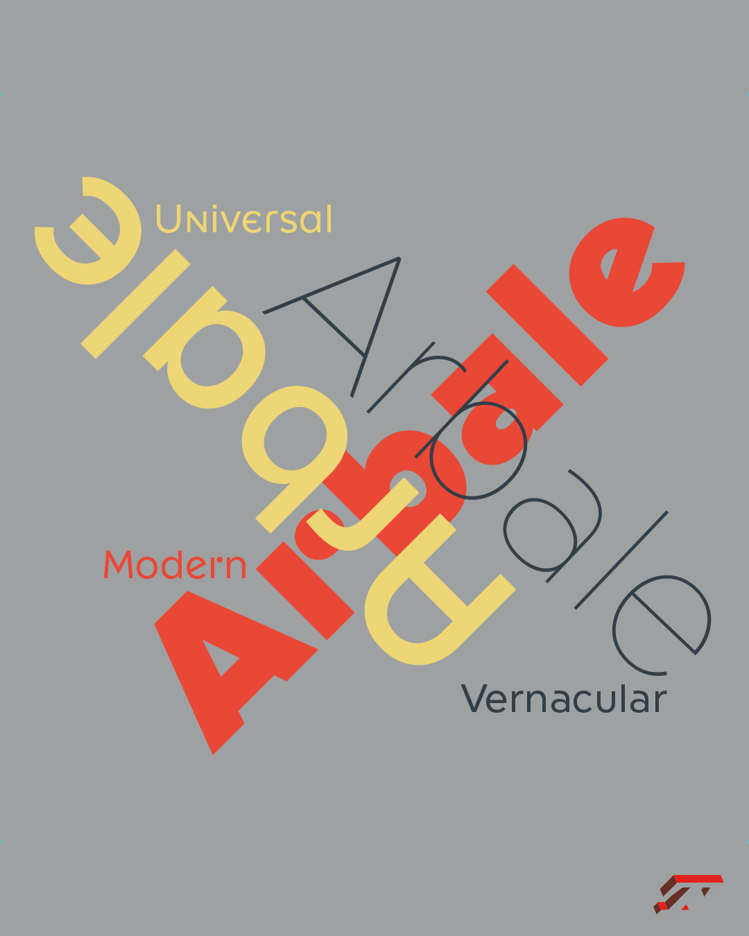
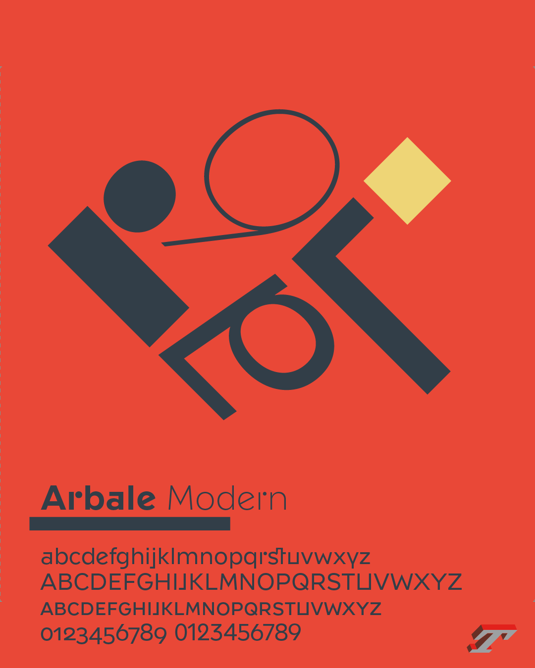
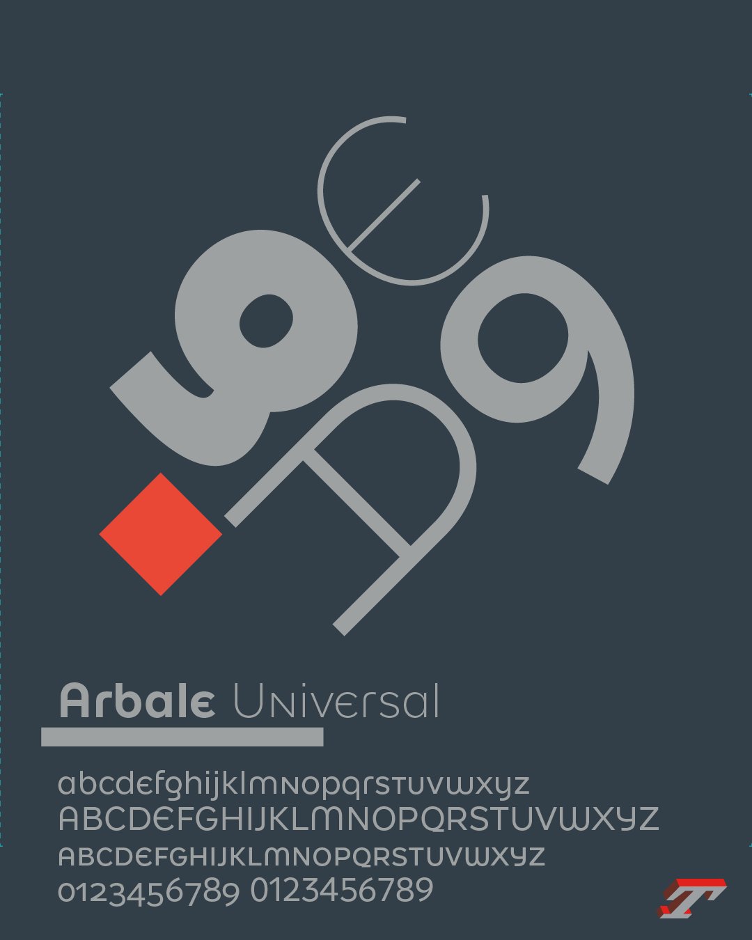
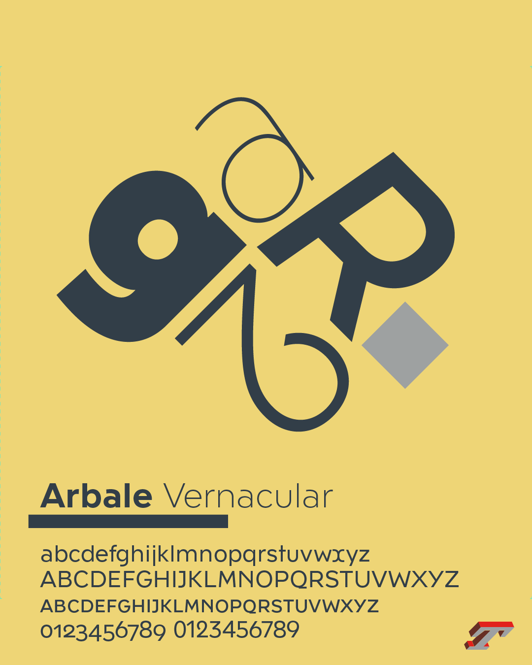
Arbale brings together various modernist influences and vernacular lettering of geometric inspiration from the 20th century: 9 romans and nine italics for a total of 1032 glyph by font.
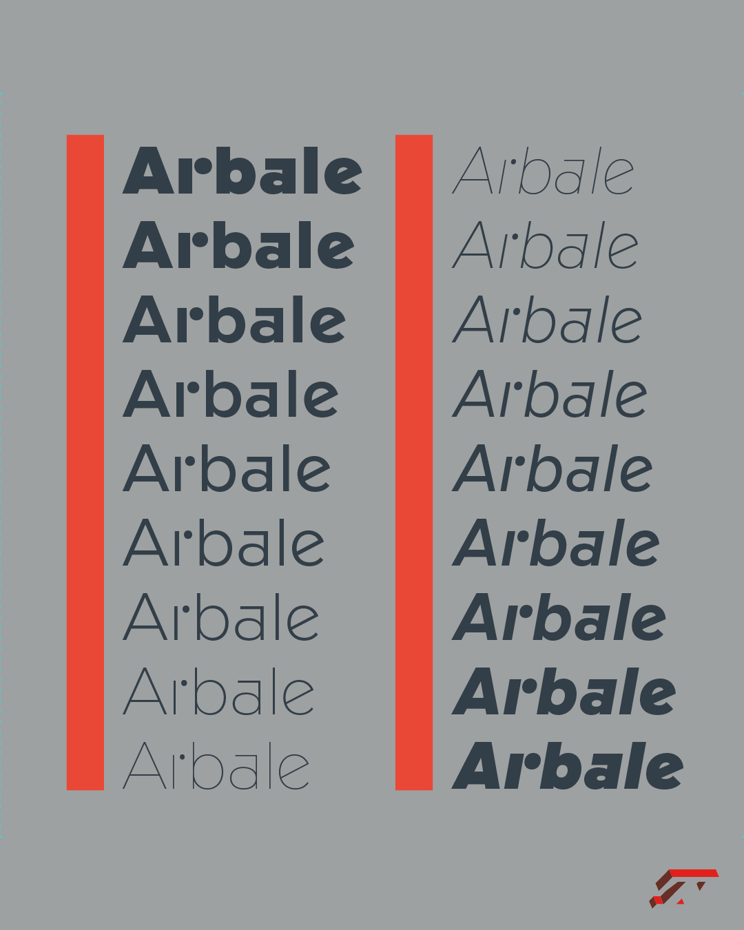
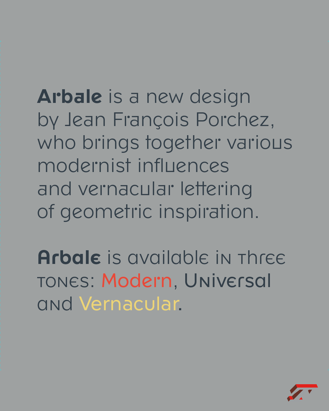
☎️ New! Arbale brings together various modernist influences and vernacular lettering of geometric inspiration from the 20th century. Designed by @jfporchez Arbale is available in three tones: Modern, Universal and Vernacular.
@akufadhl 😎great!
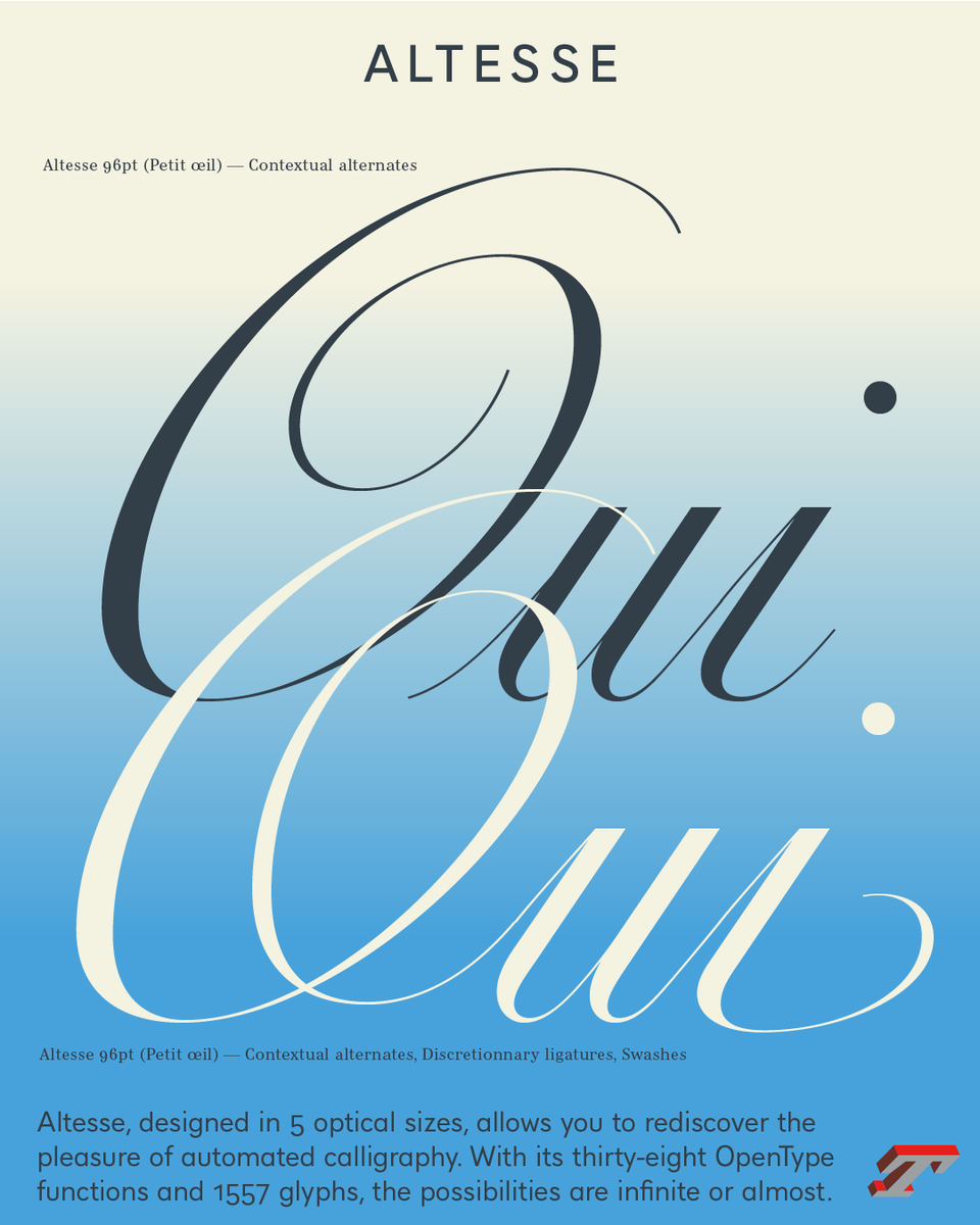
Oui! with 38 OpenType features, Altesse offer a lot of possibilities. The 1557 glyphs are divided as follows: two sets of capitals, two sets of numbers and lowercase glyphs, punctuation, ornaments and vignettes.
➽ https://typofonderie.com/fonts/?q=altesse
— — —
#typefaces #fonts #typography
@akufadhl if you’re able to display at similar larger sizes (or even bigger) as the main glyph you’re designing: it’s absolutely useful.
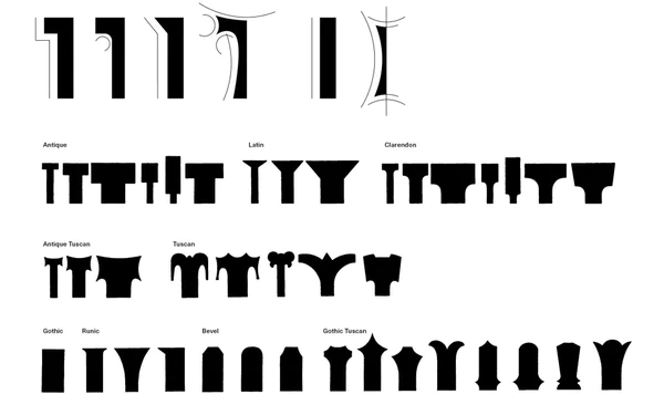
"Tuscan is a general term, “presumably invented by the type-founders”2 used to name an eclectic style that grew to include a staggering variety of designs." Read this excellent post about Tuscan in America: https://woodtype.org/blogs/news/91-antique-tuscans-in-america
DrawBot 3.129 is out!!
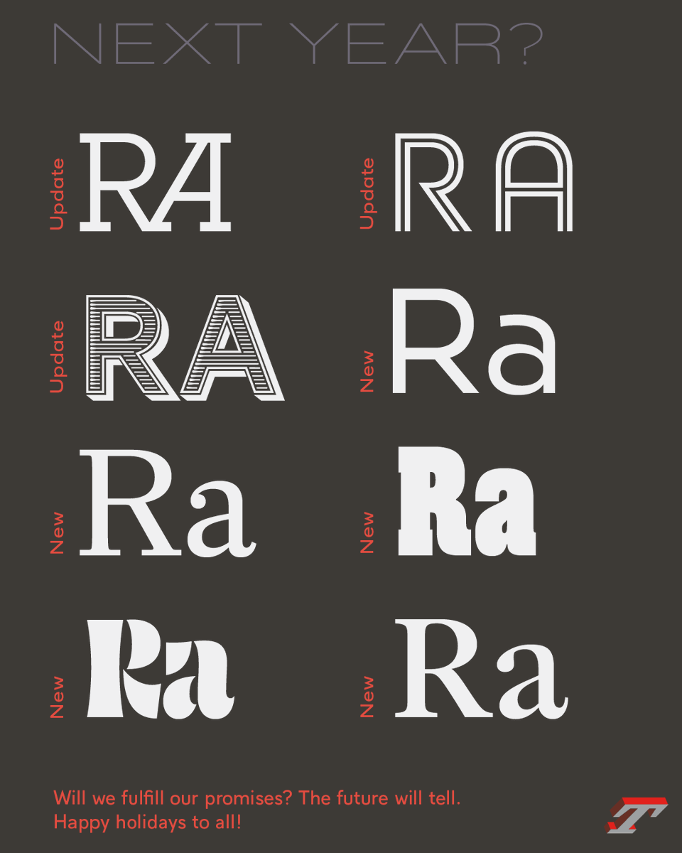
6/6 Typofonderie's Year in Review 2022: Our plans for 2023.
Happy Holidays for all!