This is an excellent and fascinating animation of how the 10 most populous cities in the world changed from 1500 to 2018
by @jburnmurdoch
Hang in - it takes a few seconds to begin. Twentieth in a 🧵 of #2022TopToots
This is an excellent and fascinating animation of how the 10 most populous cities in the world changed from 1500 to 2018
by @jburnmurdoch
Hang in - it takes a few seconds to begin. Twentieth in a 🧵 of #2022TopToots
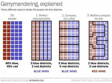
How gerrymandering can change election outcomes, in one chart
https://www.washingtonpost.com/news/wonk/wp/2015/03/01/this-is-the-best-explanation-of-gerrymandering-you-will-ever-see/
Nineteenth in a 🧵 of #2022TopToots
We worry about the wrong things. Exhibit A:
People killed annually by
Sharks 10
Elephants 100
Hippos 500
Snails 10,000
Dogs 25,000
Snakes 50,000
People 475,000
Mosquitoes 725,000
Eighteenth in a 🧵 of #2022TopToots
Workers working 60+ hours a week in one job
🇹🇷 Turkey 15%
🇨🇴 Colombia 14%
🇲🇽 Mexico 13%
🇬🇷 Greece 10%
🇰🇷 S Korea 8%
🇨🇱 Chile 7%
🇯🇵 Japan 6%
🇦🇺 Australia 6%
🇫🇷 France 5%
🇬🇧 UK 4%
🇺🇸 US 3%
🇨🇦 Canada 3%
🇪🇸 Spain 3%
🇫🇮 Finland 2%
🇩🇪 Germany 2%
🇩🇰 Denmark 2%
🇸🇪 Sweden 1%
🇳🇴 Norway 1%
Seventeenth in a 🧵 of #2022TopToots
U.S. men's facial hair styles in college yearbooks from 1898-2008
https://reddit.com/r/dataisbeautiful/comments/64q73v/comment/dg44iay/
Sixteenth in a 🧵 of #2022TopToots
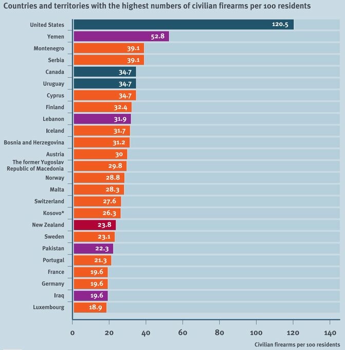
The US is the only country with more civilian guns than people
https://smallarmssurvey.org/database/global-firearms-holdings
Fifteenth in a 🧵 of #2022TopToots
Check out this cool elevation map of the contiguous US
https://www.reddit.com/r/dataisbeautiful/comments/jslbn9/us_elevation_tiles_oc/
Fourteenth in a 🧵 of #2022TopToots

Which US state has the largest share of people with ancestry from each European country?
https://www.reddit.com/r/MapPorn/comments/q9ct5b/what_us_state_has_the_largest_ancestry_in/
Thirteenth in a 🧵 of #2022TopToots
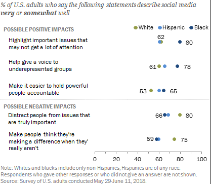
80% of Black Americans said social media help shed light on rarely discussed issues; the same share of White Americans said these sites distract from more important issues.
https://www.pewresearch.org/internet/2018/07/11/public-attitudes-toward-political-engagement-on-social-media/ #PewResearch
Twelfth in a 🧵 of #2022TopToots
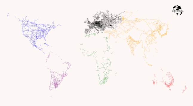
The only things on this map are railroads!
https://reddit.com/r/dataisbeautiful/comments/lj4wqt/the_railroads_of_the_world_oc/
Eleventh in a 🧵 of #2022TopToots
Can you spot the circles?
It took me a long time. Once you see them, they'll seem obvious.
This is the Coffer Illusion, by Anthony Norcia
Tenth in a 🧵 of #2022TopToots

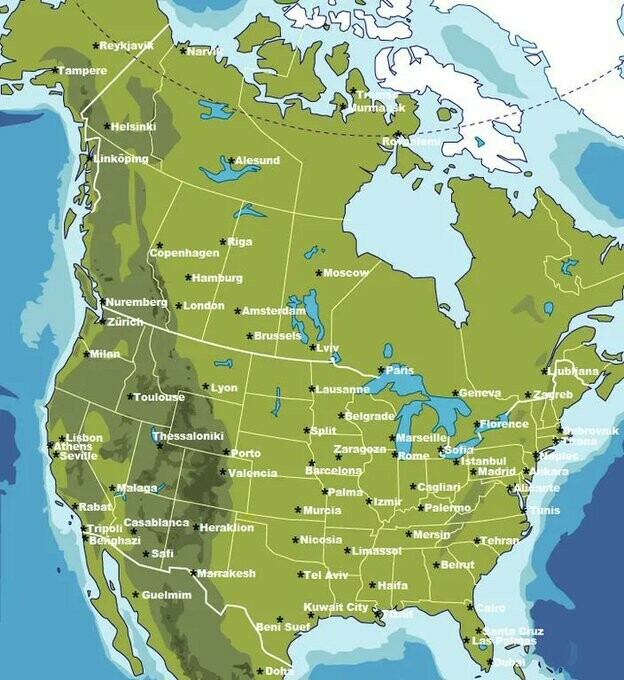
Check this out -- major cities in North America replaced by major cities across the Atlantic at the same latitude.
The Gulf Stream makes winters less severe in many European cities than it is in their U.S./Canadian counterparts.
https://www.reddit.com/r/MapPorn/comments/d8tbs5/major_cities_and_towns_in_north_america_replaced/
Ninth in a 🧵 of #2022TopToots
2022 Press Freedom Rank
1 Norway
2 Denmark
3 Sweden
16 Germany
19 Canada
24 UK
38 Taiwan
41 Burkina Faso
42 US
71 Japan
86 Israel
110 Brazil
119 Qatar
149 Turkey
150 India
155 Russia
168 Egypt
175 China
178 Iran
180 N Korea
https://rsf.org/en/index
Eighth in a 🧵 of #2022TopToots
This amazing map shows travel time from London to the rest of the world in 1881
Seventh in a 🧵 of #2022TopToots
Be sure to catch the end of this clever NASA "climate spiral" video showing monthly global temperature changes between 1880 and 2021
https://climate.nasa.gov/climate_resources/300/video-climate-spiral/
Sixth in a 🧵 of #2022TopToots
Estimated gender pay gap within job (same occupation at same firm)
🇯🇵 Japan 26%
🇰🇷 S Korea 19%
🇺🇸 US 14%
🇩🇪 Germany 13%
🇪🇸 Spain 12%
🇮🇱 Israel 12%
🇨🇦 Canada 12%
🇳🇴Norway 9%
🇫🇷 France 7%
From study https://nature.com/articles/s41562-022-01470-z#
by @OlivierGodechot & 28 others
Fifth in a 🧵 of #2022TopToots
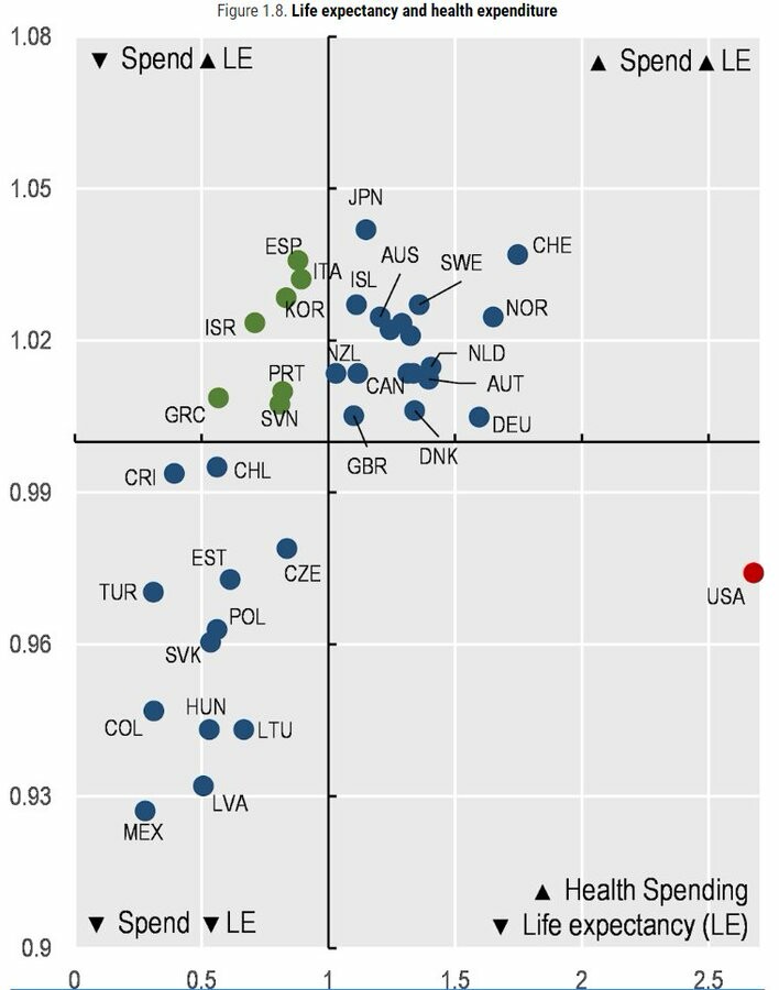
Check out this scatterplot of health spending per capita (x axis) & life expectancy (y axis) in OECD countries (lines = averages).
The United States sits alone in the bottom right quadrant due to its much higher spending and below-average life expectancy.
More info: https://oecd-ilibrary.org/sites/ae3016b9-en/1/3/1/index.html?itemId=/content/publication/ae3016b9-en&_csp_=ca413da5d44587bc56446341952c275e&itemIGO=oecd&itemContentType=book
Fourth in a 🧵of #2022TopToots
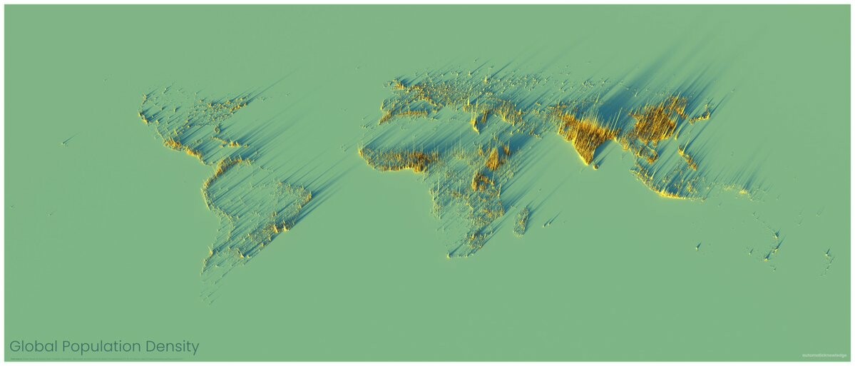
This map shows only people. It is a beautiful illustration of where people are concentrated.
If you squint, you can see Australia and New Zealand.
Map by Alasdair Rae https://www.visualcapitalist.com/cp/3d-map
Third in a 🧵 of #2022TopToots
More chocolate, more Nobel prizes
https://blogs.scientificamerican.com/the-curious-wavefunction/chocolate-consumption-and-nobel-prizes-a-bizarre-juxtaposition-if-there-ever-was-one/ Second in a 🧵 of #2022TopToots
Check out how land is used in the United States. Cows take up the most space!
https://www.bloomberg.com/graphics/2018-us-land-use/
First in a 🧵 of #2022TopToots