#BusFlow
@docpop One thing that irritates me in #comics is when an artist is trying to portray a gritty, urban environment so they put "graffiti" everywhere - which is often whatever naughty word they can get away with barely more flourish than their own handwriting.
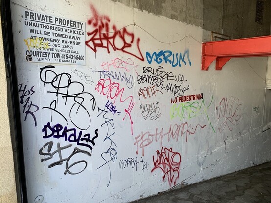
There's so many styles that suggest a time and place, like #BusFlow. And there's the cultural commentary too, that so often goes un-reflected. I get they're under deadline, but just a few source references would go a long way.
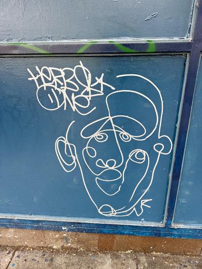
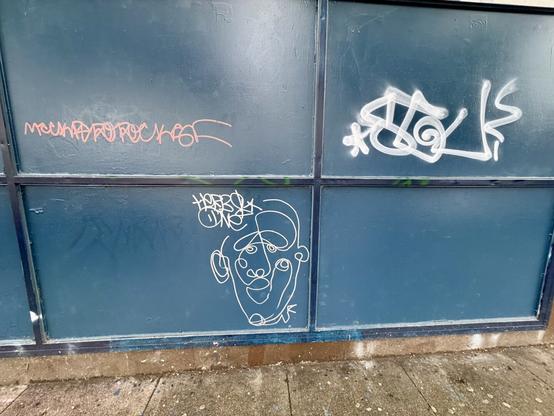
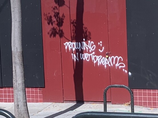
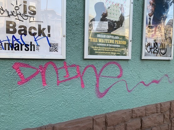
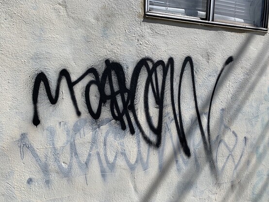
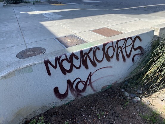
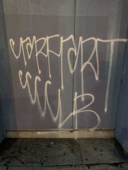
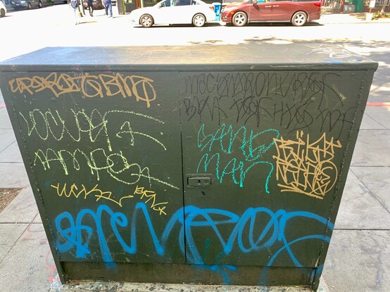
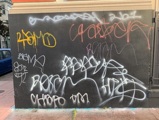
As San Francisco #BusFlow evolves, some of its characteristics become exaggerated. The loops in the Rs are getting bigger and the words tend to get wilder as they go. Bus Flow often gets bigger with each new letter, and words tend to droop down along the way. To me, this really evokes the feel of a Muni driver hitting the gas as a tagger was mid-flow. The feeling of hopping on and off of hurried buses is captured into the DNA of the Frisco Flow.
Hey neighbors, have you ever heard of San Francisco Busflow? It's a regional handstyle best recognized by its rounded typography, continuous lines, and loopy letters (especially in the Ks, Ms, and Rs).
Once you start looking, you'll notice that #BusFlow dominates the landscape in #SanFrancisco and the #BayArea. This regional style is even becoming popular around the world #graffiti
