#NewYorkCityFootball

Hilary PalménHilary@typo.social
2025-04-04

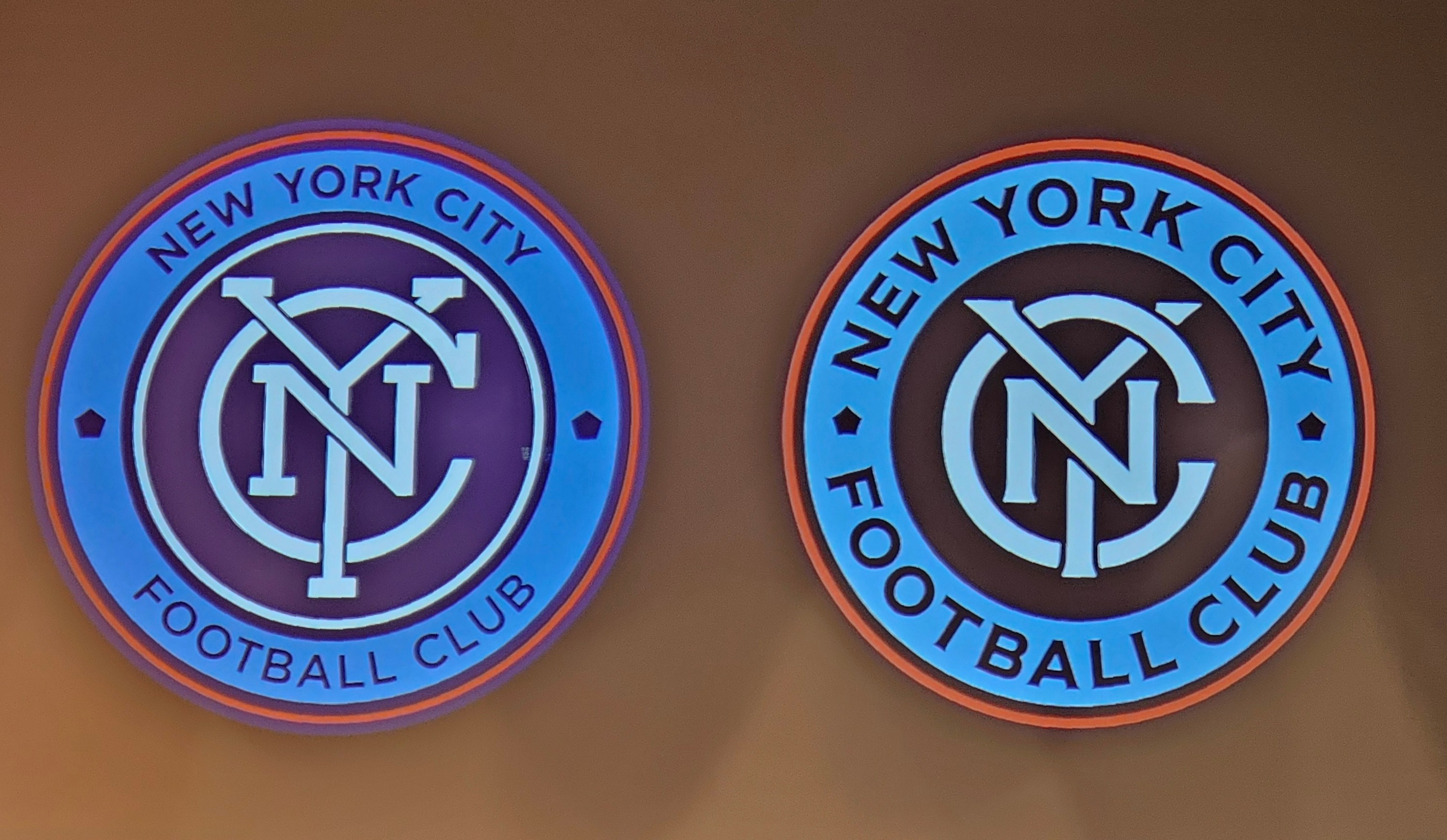
Listened to Tobias Frere-Jones talk about the design of the Madison Square typeface for New York City football (soccer) club. Such a luxury experience to be walked through the inspirations and implementation stories.

#CooperUnion
#HerbLubalinLecture
#FrereJones
#MadisonSquare
#NewYorkCityFootball
#Branding
frerejones.com/

Two round logos, both identical text and colors, the typeface varys in both. The before text around the circumference in the old riundel is thinner stroke width, smaller. And interlocking NYC in the center of the roundal has slab serif removed in the new design where the overlaying of the thicker letters leave them gently aliging

Client Info

Server: https://mastodon.social
Version: 2025.04
Repository: https://github.com/cyevgeniy/lmst