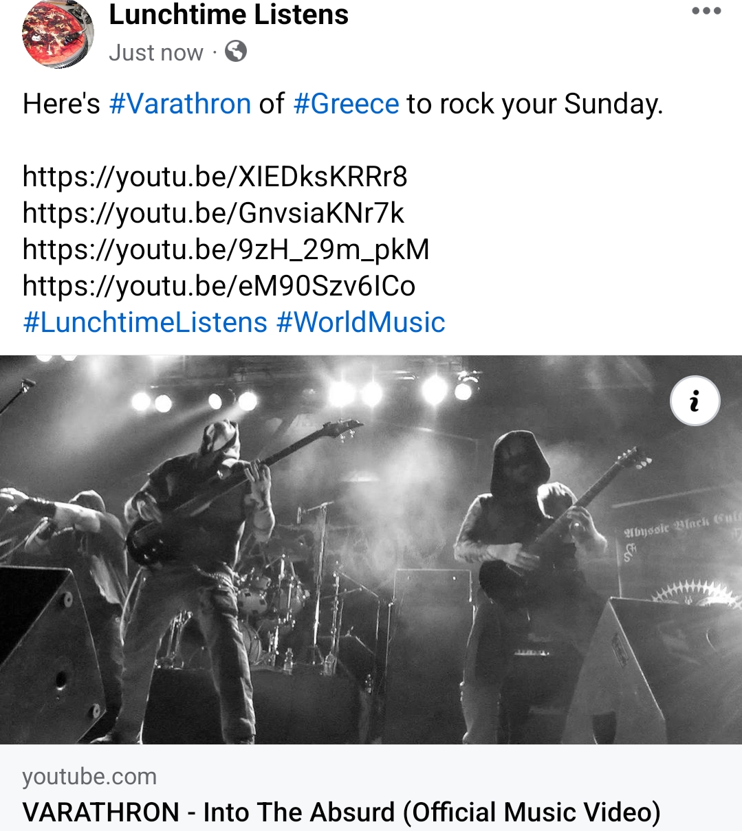
Here's #Varathron of #Greece to rock your Sunday.
https://youtu.be/XIEDksKRRr8
https://youtu.be/GnvsiaKNr7k
https://youtu.be/9zH_29m_pkM
https://youtu.be/eM90Szv6ICo
#LunchtimeListens #WorldMusic
#Varathron
GardensTale’s Top Ten(ish) Album Art of 2023
By GardensTale
As we drag our bloated stomachs from the dinner table of Listurnalia to the couch of January, it’s easy to forget that dessert has yet been served. Like a Monty Python waiter with a thin mint, the artwork article is here to ensure everyone’s entrails are catapulted across the living room in a shower of vomitus and viscera. Our yearly celebration of metal visuals is a wonderfully diverse one, if I say so myself, with a wide range of color palettes, moods and styles for you to feast your eyes on. This is the latest I’ve ever written this article, but spending a week among the clutches of Transsylvanian vampires held me up in completing it sooner.
The rules, the rules, the rules. Order must be established lest the resultant list means nothing at all.
- If we haven’t reviewed it, included it in a filter piece, or wrote a TYMHM article about it, it won’t be included. I’ve made one exception this year, because I can, but mostly because the review has just been sitting in the queue for ages as of this writing. So it’s been reviewed, just not published. Loophole!
- One entry per artist. This turned out to be easier than any other year. My stricter and quicker selection process had no doubles at all! Perhaps Kantor didn’t have much time this year.
- Original art only. While this does include photography (in vain, I’m afraid), it does not include a painting from 1739 with a logo slapped on. Be better than that, bands!
- And a new rule that is guaranteed to bite me in the ass at some point: no AI art! While there are ethical use cases for AI art, album covers aren’t one of them, and if I can at all help it I will not add fuel to that fire.
THE WORST
#3. Eternity // Mundicide — I didn’t want to just do artwork where the band clearly doesn’t give a fuck. That’s too easy. The joy is when a band has put in the effort to make something uniquely idiotic, and that is where Eternity’s cover comes in. How did no one at any point in the creation of this artwork say “Hey guys? This looks incredibly stupid.” The little arms, man. It’s like the world’s worst rendition of “It’s a small world after all.”
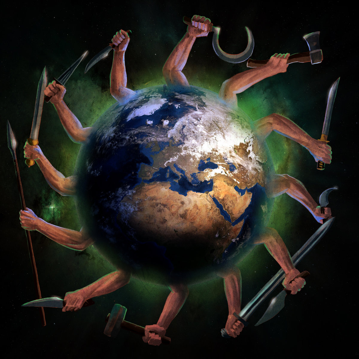
#2. Secret Rule // Uninverse — This is the unpublished exception and I’m sure you can see why I felt the need to make it. The amount of unskilled photoshop here is downright grotesque. Band photo album covers are rarely advisable, but with these outfits and poses, peak awkward is achieved several times over. Add the weird band name with overengineered logo and illogical pun of an album title and the cringe is complete.
#1. Savage Grace // Sign of the Cross — This is How Not To Composition 101. Everything on this cover is in the wrong place at the wrong scale. Not to mention, the typefacing is a disaster. Unexplained additional text, fonts that don’t match, vertical text, you name it, Savage Grace has got it. The lady knight in the foreground looks like she’s taking a very satisfying dump, and do try not to spray your drink across your screen when you zoom in on the meme-worthy face on the floor. An unmitigated disaster.
THE BEST
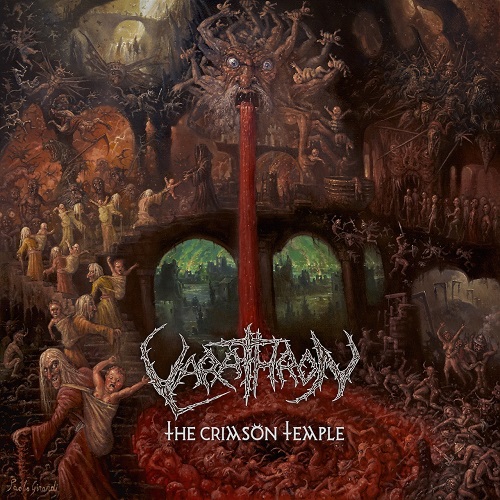
#(ish). Varathron // The Crimson Temple (artist: Paolo Girardi) — Girardi has been doing this for well over a decade and along with Burke, Kantor and Chioreanu is one of the most recognizable artists in the scene. This one is one of his more horrifying scenes, a grisly and visceral mass sacrifice. The many details and surreal horror recalls Hieronymous Bosch, but the clever composition draws the eye back to the crimson pool and the screaming evil god-face.
#10. Hexvessel // Polar Veil (artist: Benjamin König) — I’ve made it no secret that I love surreal art, and this deeply intriguing illustration by Benjamin König fits that bill completely. Both the misty blue sky and the black of night fit perfectly well over the idyllic snowy town, but the way the split forms a curious celestial figure is inspired. The largely monochrome coloration gives the art a sense of cold stillness, hovering between serenity and grim portent.
#9. Sanguine Glacialis // Maladaptive Daydreaming (artist: Alex O’Dowd) — This is probably the most meta we’re going to get today. I love the contrast of the dark, bleak room and forlorn painter with the glowing, overspilling painting full of warmth and life. The logo and title placement are uncommonly nice as well here. It’s such a lovely work of art I can even overlook the fact that the woman is clearly not dressed for the job at hand.
#8. Raider // Trial by Chaos (artist: Mitchell Nolte) — It’s difficult making art that’s purposefully crowded but still easy to read. Mitchell Nolte, who was featured here with last year’s excellent Dawnwalker art, manages with ingenious color use, creating contrast with the warrior’s fiery aura to spotlight him in the center of a writhing mass of monsters. Wielding a broadsword in one hand and strangling a multi-eyed monster snake with the other solidifies the subject’s status as one of the most badass bastards in metal art this year.
#7. Fire Down Below // Low Desert Surf Club (artist: Christi du Toit) — Comic style illustrations are a rare treat in metal, and those done well are rarer still. Christi du Toit clearly has a knack for wondrous, intriguing layouts. I love the sharp shading and color palette, and the atypical, adventurous feel the illustration exudes. I read a lot of webcomics, and if I saw this on a cover page I’d already be hooked.
#6. Grant the Sun // Voyage (artist: William Hay) — So many metal covers are grim, dark, foreboding or violent. The art for Voyage, on the other hand, is a quirky and colorful affair. The diving panda and the anglerfish make for an interesting dichotomy, a collision of worlds that are never supposed to meet. But the wink and smile belies the beautiful details, such as the streams of air escaping the panda’s mouth or the various level of refraction in the turbulent waters.
#5. Wormhole // Almost Human (artist: Adam Burke) — Adam Burke is usually the go-to guy for sci-fi cosmoscapes, but his strongest artwork this year graces the cover of Wormhole, or as I’m told the correct pronunciation is, WWWOOORRRMMHHOOOOLLEEE. What I especially like about this art is how much story it suggests. Either something that wasn’t human is in the midst of becoming gradually more so, or someone is shedding their humanity (as well as skin). Either way, it has something to do with the rhino beetle, and I can’t wait to find out what.
#4. Evile // The Unknown (artist: Eliran Kantor) — Few artists could make me include a cover that is like 75% black. Kantor can, though. The slim beam of light cast by a cracked cellar door is the only light for the father and son, surrounded by inky blackness. Kantor is an expert at expressive faces, and this pair ooze fear and despair. It’s an effective and haunting image that uses black as a tool to tell a story. If only the album were as great as the artwork.
#3. Slomatics // Strontium Fields (artist: Ryan Lesser) — I knew this had to be on the list the moment I saw it. I’ll even forgive the lack of album and band titles. The breathless figure reminiscent of the Statue of Liberty, her eyes beaming and her hair waving as if underwater, stands in stark contrast with the glistening embodiment of cosmic horror behind her. A clever trick that enhances that contrast, besides the clash in color, is the difference in shading. The flesh monster has been rendered in angry blotches, the statuesque woman in more marble-like tones. Don’t forget to check out the full-size art in the review!
#2. Harm’s Way // Common Suffering (artist: Corran Brownlee) — This stark, haunting piece makes it abundantly clear that “It’s Raining Men” is a horror scenario. The dreamlike surrealism and the apocalyptic climax clash into a nightmare depiction that took my breath the first time I saw it, and still fills me with an appropriate excess of dread when I look at it now. Rendering it entirely in black & white and cleverly constraining the cloud of people with a frame makes the scene feel both immense and claustrophobic.
#1. Deadly Carnage // Endless Blue (artist: Alexios Ciancio) — Though this list is ever a contentious one, I don’t think much protest will be levied at the winner this year. Graphic designer Alexios Ciancio is the vocalist and guitarist for Deadly Carnage, making this the rare treat of a band member designing their own album’s cover. Inspired by traditional Japanese art, Ciancio has created an absolute feast for the eyes. Though the portrait-oriented illustration leaves a lot of blank space on the sides, the dynamic composition that spills out the frame grants sumptuous life and vitality. The spectral nature of the cresting whale elevates the scene above the earthly and into the ethereal, which the music inside encapsulates. And whereas many artworks suffer from zooming in too much, the crisp lines and myriad beautiful details keep me scrolling endlessly across the canvas, from the swans flying out of the frame to the upended rowboats. A visual masterpiece.
#2023 #DeadlyCarnage #Eternity #Evile #FireDownBelow #GrantTheSun #HarmSWay #Hexvessel #Raider #SanguineGlacialis #SavageGrace #SecretRule #Slomatics #Varathron #Wormhole

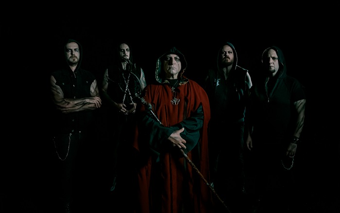
Varathron – The Crimson Temple Review
By Doom_et_Al
“Always respect an old man still playing in a young man’s game,” the saying goes. “There’s a reason they’re still around.” With that in mind, it’s curious how little attention Greek black metal stalwarts, Varathron, generally receive. Formed 35 years ago in an era when many AMG staff had not been conceived, and Steel Druhm still had hair, Varathron were instrumental in establishing the famous “Hellenic black metal sound” alongside legends such as Rotting Christ and Macabre Omen. Perhaps it’s the frequent line-up changes, or the lengthy gap between albums (at 7 albums in 35 years, they’re no Rogga Johannson), or maybe it’s the long shadow cast by more famous contemporaries, but for whatever reason, these influential elders have long flown under the radar (only 2014’s Untrodden Corridors of Hades has been reviewed on this site). That’s a pity, because 2018’s Patriarchs of Evil was a fantastic slab of black metal goodness, crying out for TYMHM treatment. Now these legends are back with The Crimson Temple. Does the AMG Law of Diminishing ReturnsTM apply? Or does wisdom keep the inevitable at bay?
What’s always set Varathron apart from many pretenders is their willingness to incorporate elements of traditional metal into the black metal aesthetic. Yes, you’ve got the occult influences; yes, you’ve got the synths and the tremolos; but what you may not be expecting is the strong emphasis on riff-based melodies and a classic approach to songwriting. No long, pointless doodles or interludes… no, what we have here is verse-chorus-verse of the good stuff, with minimal bloat or drag. As their career has progressed, Varathron’s production have improved massively, with the music becoming more melodic and accessible. As we arrive at The Crimson Temple, we are, by black metal standards, in accessible territory, with Varathron continuing the trend of shinier production, catchier melodies, and a lighter approach. There’s also an embrace of slightly different styles (thrash, doom, and death metal all weave their way in). It’s with these explorations that things go slightly awry. While never unenjoyable, the new forays result in the band occasionally getting bogged down.
The Crimson Temple starts incredibly strongly, with three bangers right out of the gate. “Hegemony of Chaos,” “Crypts in the Mist,” and “Cimmerian Priesthood” highlight what makes Varathron such a potent outfit. There’s a perfect blend of evil atmosphere, catchy melodies, strong performances, and that uniquely Hellenic propulsion. These songs move, and they do so with purpose and momentum. I defy you not to tap your foot while listening to the chorus of “Crypts in the Mist.” Go on, just try it. If we’d had an album of these, we would all be rearranging our end-of-year lists. This approach isn’t completely abandoned in the second half, but only “Shrouds of the Miasmic Winds” comes close to capturing the early magic.
The Crimson Temple loses its footing when it marches gamely into realms Varathron aren’t as adept in. “Immortalis Regnum Diaboli,” with its emphasis on thrash, is only partially convincing, and that’s when the chorus steers back to black metal. “To the Gods of Yore” goes for a doomy, slower vibe that’s atmospheric, but boring. Varathron did this slow-song trick before, but whereas the more sedate parts on albums such as Patriarchs of Evil had gorgeous, melancholic synths, here we just have plodding guitars. It’s also a pity that most of the good material appears on the first half of the album, making it feel very unbalanced. There’s a noticeable loss of momentum as you head into the final quarter.
The Crimson Temple is incredibly frustrating to review. When it’s on fire, it’s excellent, highlighting what a potent and enjoyable band Varathron can be. I understand they wanted to experiment and avoid making an album of the same song repeated 10 times. But when that song is such a banger, I suppose I wanted them to do just that. The Crimson Temple shows that Varathron are not content to fly on autopilot in the twilight of their career. But sometimes, with age, comes wisdom. And wisdom is knowing what you’re good at and sticking with it. If there is another album in 6-7 years, I would love Varathron to consider that.
Rating: 3.0/5.0
DR: 8 | Format Reviewed: 320 kbps mp3
Label: Agonia Records
Websites: varathron.bandcamp.com | facebook.com/varathron
Released Worldwide: December 1st, 2023
#2023 #30 #AgoniaRecords #BlackMetal #Dec23 #GreekMetal #MacabreOmen #Review #Reviews #RottingChrist #Varathron
Client Info
Server: https://mastodon.social
Version: 2025.04
Repository: https://github.com/cyevgeniy/lmst