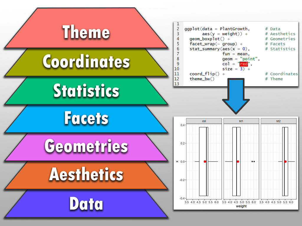
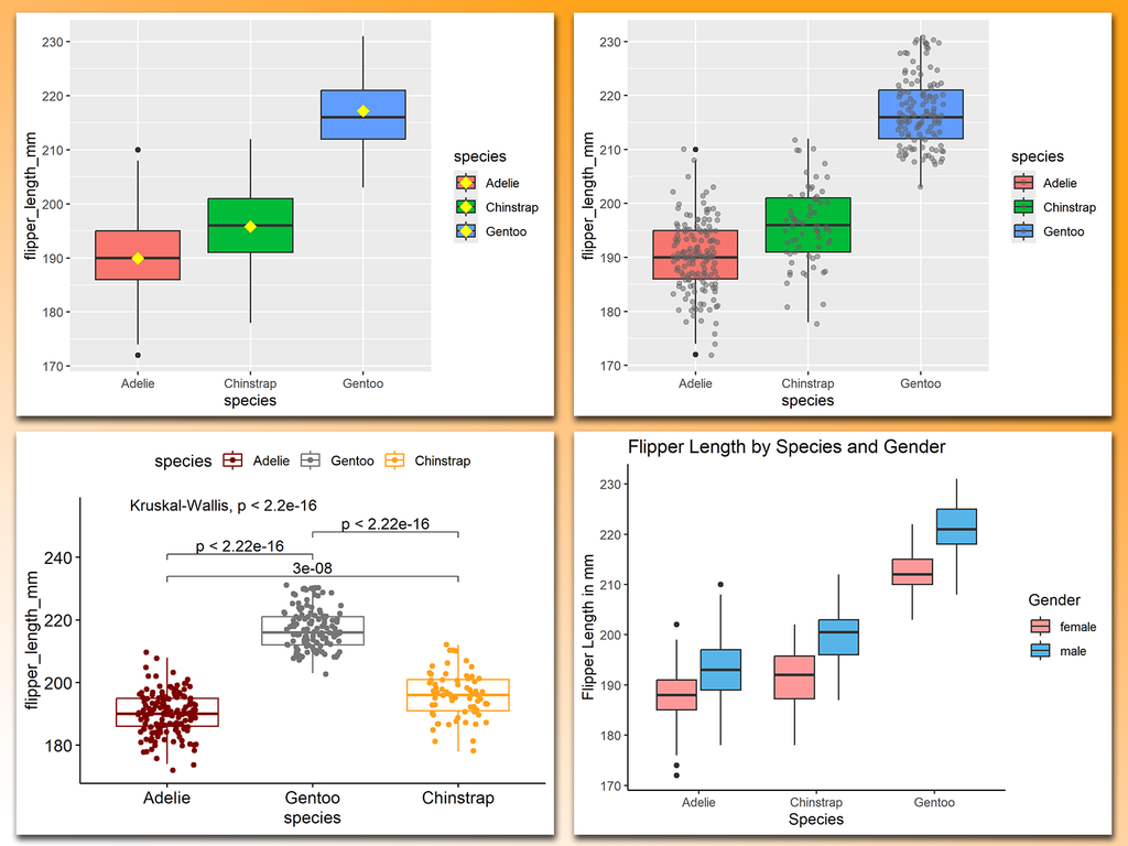
The "Grammar of Graphics" is a powerful concept that ggplot2 in R is built on. It breaks down the process of data visualization into layers, making it easier to customize and understand how to build effective charts.
Want to dive deeper into creating beautiful and informative visuals with ggplot2? Check out my online course on "Data Visualization in R Using ggplot2 & Friends!" Take a look here for more details: https://statisticsglobe.com/online-course-data-visualization-ggplot2-r