My two worlds collide in this new @FontsInUse post for my rock band's new album.
Featuring type from @velvetyne @ohno @djrrb & yours truly (Big Fog Foundry)
https://fontsinuse.com/uses/67834/suped-up-suped-up-album-art-and-promo-assets
Type at work in the real world. Fonts In Use is an independent archive of typography.
My two worlds collide in this new @FontsInUse post for my rock band's new album.
Featuring type from @velvetyne @ohno @djrrb & yours truly (Big Fog Foundry)
https://fontsinuse.com/uses/67834/suped-up-suped-up-album-art-and-promo-assets
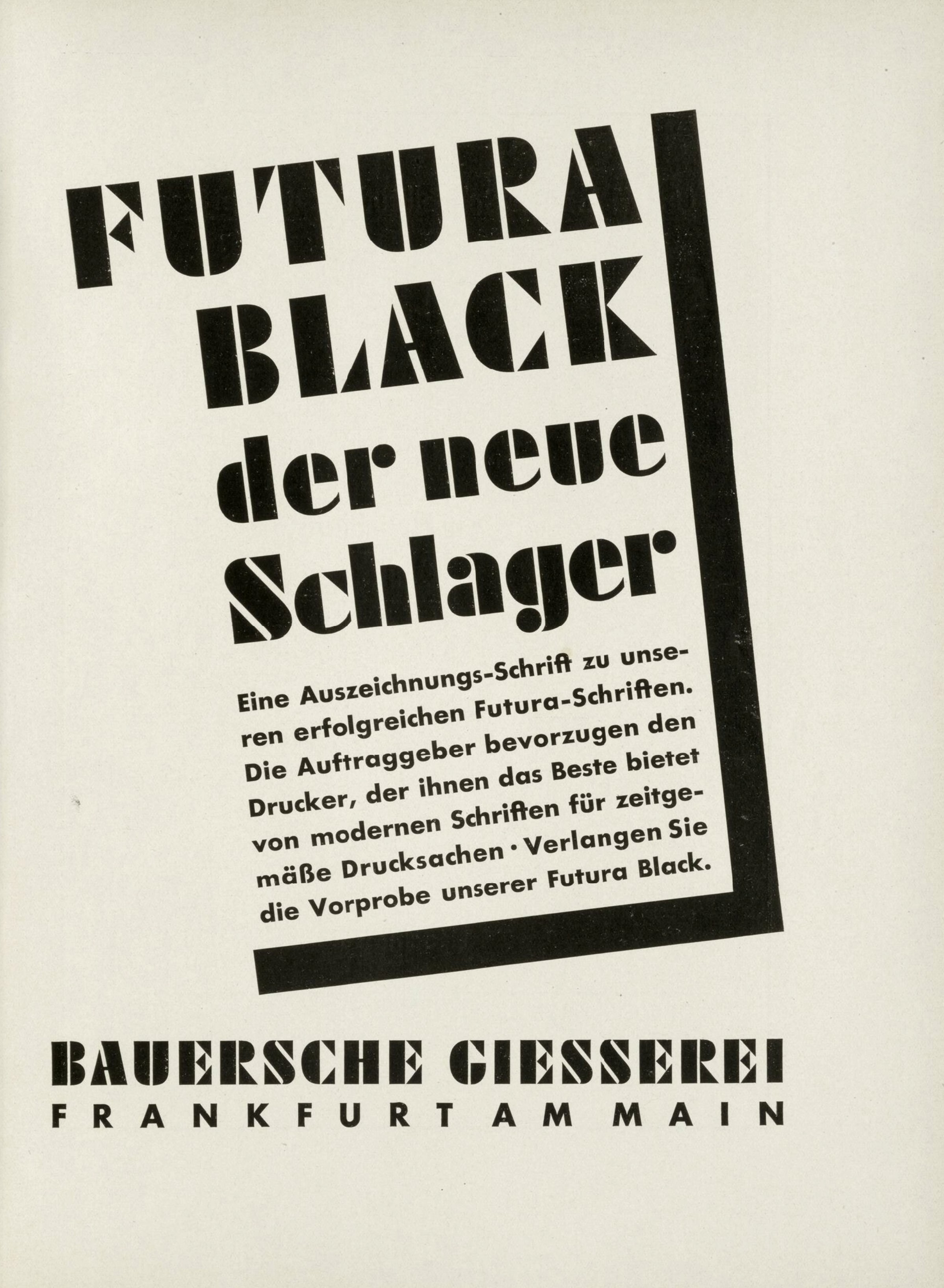
2/2 Futura Black has been around since 1929, when #PaulRenner added the planar, stencil-like display style to his seminal Futura series for Bauer. You can now study 100 in-use examples dating from 1931 to 2023:
https://fontsinuse.com/typefaces/7655/futura-black
#FontsInUse #FuturaBlack #fonts #typefaces
This week, not one but two #typefaces joined the exclusive Club 💯 at https://FontsInUse.com!
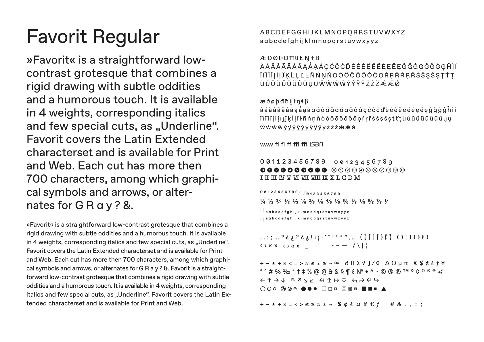
1/2 With ABC Favorit (2016), #Dinamo laid the cornerstone to their success story. The quirky low-contrast grotesk is now documented with one hundred applications in the #FontsInUse Collection:
https://fontsinuse.com/typefaces/41429/abc-favorit
#ABCFavorit #fonts
New on the Blog: #StarWars movie posters from Hungary.
Tibor Helényi’s art and typography demonstrate how the world’s most famous space opera looked very different behind the Iron Curtain:
https://fontsinuse.com/uses/41850/star-wars-movie-posters-from-hungary
#TiborHelényi #JohnLangdon #MayThe4th #MayTheFourth
#StarWarsDay #FontsInUse #fonts
Music themed NEWS LTR №16 for your eyes, in your mails, if you happen to subscribe (to the LettError News LTR). But you can always read the archives. Or sign up. It is free. https://buttondown.com/letterror/archive/
One of the most fun type customizations I have ever worked on is now on @FontsInUse :
In memoriam Ray Cruz, 1943–2025. The lettering artist, graphic designer, teacher, and designer of 50+ typeface styles died on March 26 at the age of 81.
Bio: https://fontsinuse.com/uses/60206/eddie-floyd-soul-street-album-art
Examples of his fonts in use: https://fontsinuse.com/type_designers/727/ray-cruz

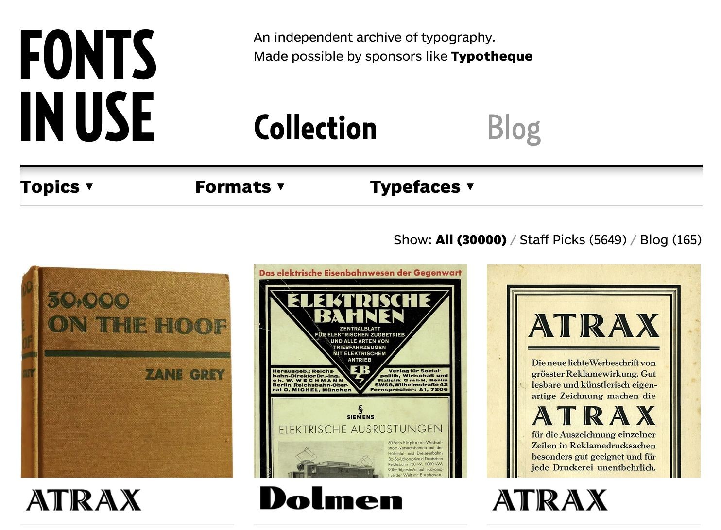
Milestone unlocked: we’ve published the 30,000th Use on https://fontsinuse.com today!
♥︎ Thanks to all contributors for making this happen, as well as to our sponsors from the type and design community.
Cooper Black is absolutely EVERYWHERE in Peru, on signs for everything from toys to jewelry to guns and just about anything else you can think of.
It’s often stacked vertically, sometimes squooshed, occasionally hand-rendered.
It’s more prevalent than Helvetica and I love it.
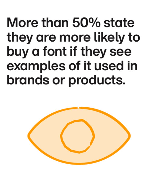
As we know at @FontsInUse, most people are more likely to buy fonts after they see them in use.
@jerry1970 That’s the Letraset classic Pump: https://fontsinuse.com/typefaces/1886/pump For future requests, also consider @FontID.
@kai Dear Kai, thanks for reminding us of the upcoming milestone! 🙈 As for the first question, that would be about 4,060 accounts who made at least one published contribution. Answering the other one quickly veers into the territory of #ExistentialTypeQuestions (what is a typeface?), but to give you a number, there are 72K+ active type entities in the database, 11.7K of which are represented with at least one Use.
For comparison, here are some numbers from 2018: https://fontsinuse.com/uses/20000/10000-uses-on-fonts-in-use
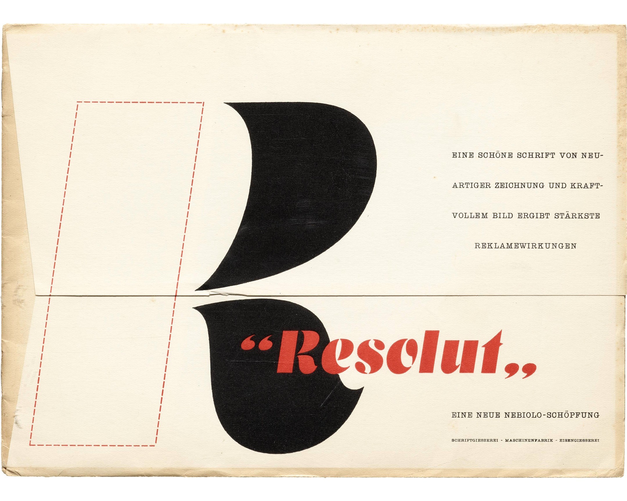
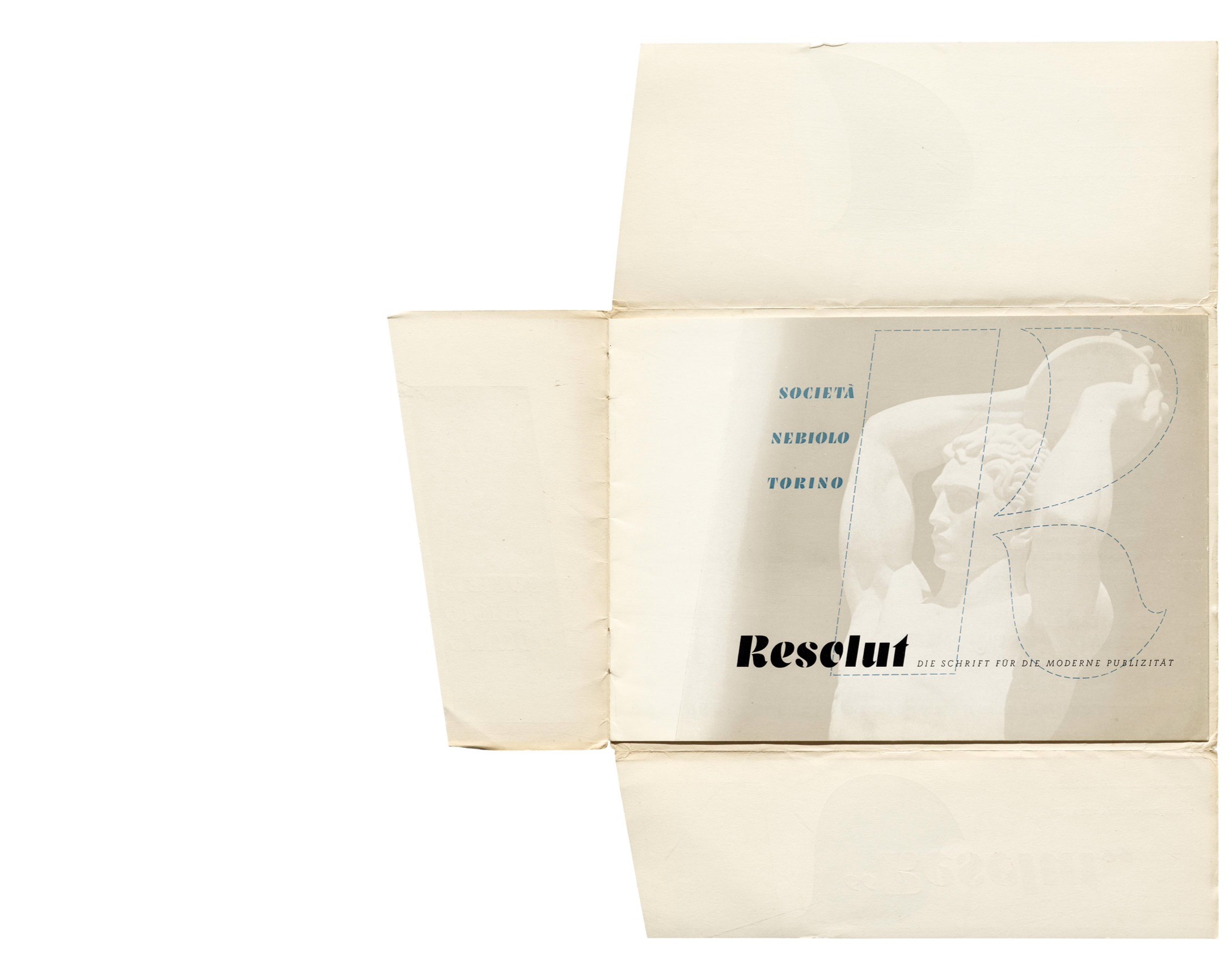
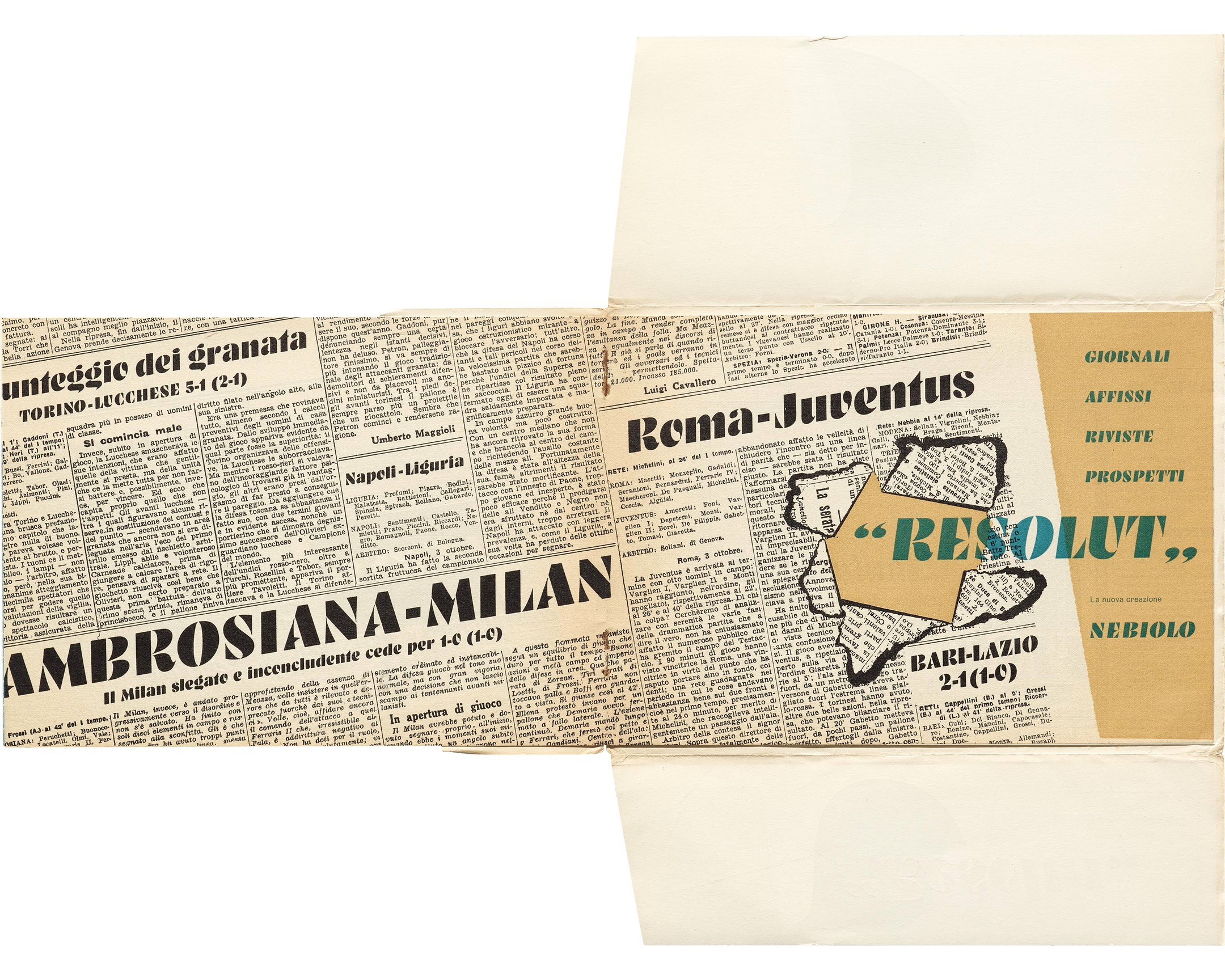
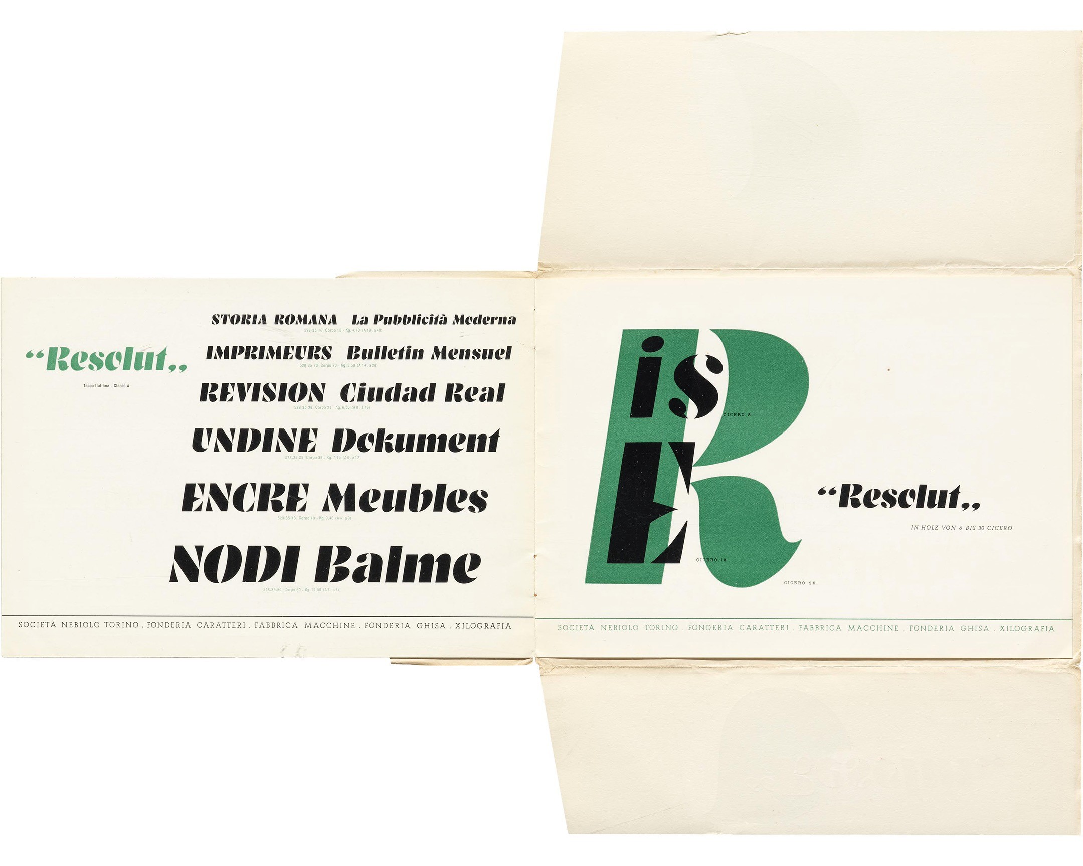
Resolut specimen (typeface by Hans Brünnel), Nebiolo, 1939.
See the complete specimen in the Online Archive: https://oa.letterformarchive.org/item?workID=lfa_type_0044&utm_source=Mastodon
More on Resolut from @FontsInUse: https://fontsinuse.com/typefaces/32714/resolut
#Typefaces #Fonts #TypeSpecimens #Nebiolo #1930s #TholenaarCollection
Submitted two posts to @FontsInUse recently — https://fontsinuse.com/uses/66635/the-jante-law about a JAnte Law poster designed and produced 15 years ago and https://fontsinuse.com/uses/66273/berling-prize-diploma-2023 about the design of last years' Berling diploma with a hommage to the late Peter Bruhn
⤷⤴︎⤵︎ 1,000 examples of type set on a curve:
https://fontsinuse.com/tags/3595/type-on-a-curve?order=most-liked
#FontsInUse #typography
Poll for people who use fonts:
Which of these limited descriptions seems most attractive to you for licensing commercial fonts?
(Please abstain from voting if you make or sell fonts and don’t regularly use others people’s fonts.)
Macula by Jacques La Bailly @fonthausen in use.
Released at @boldmonday
—
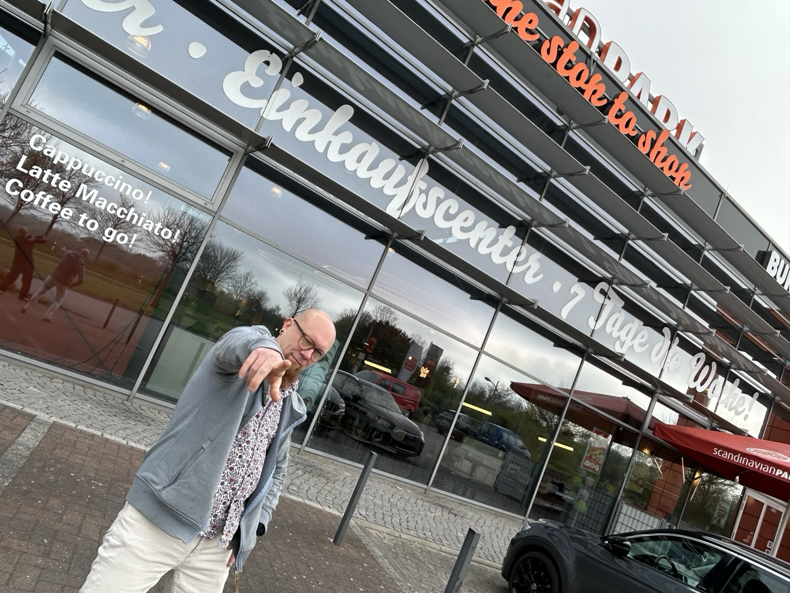
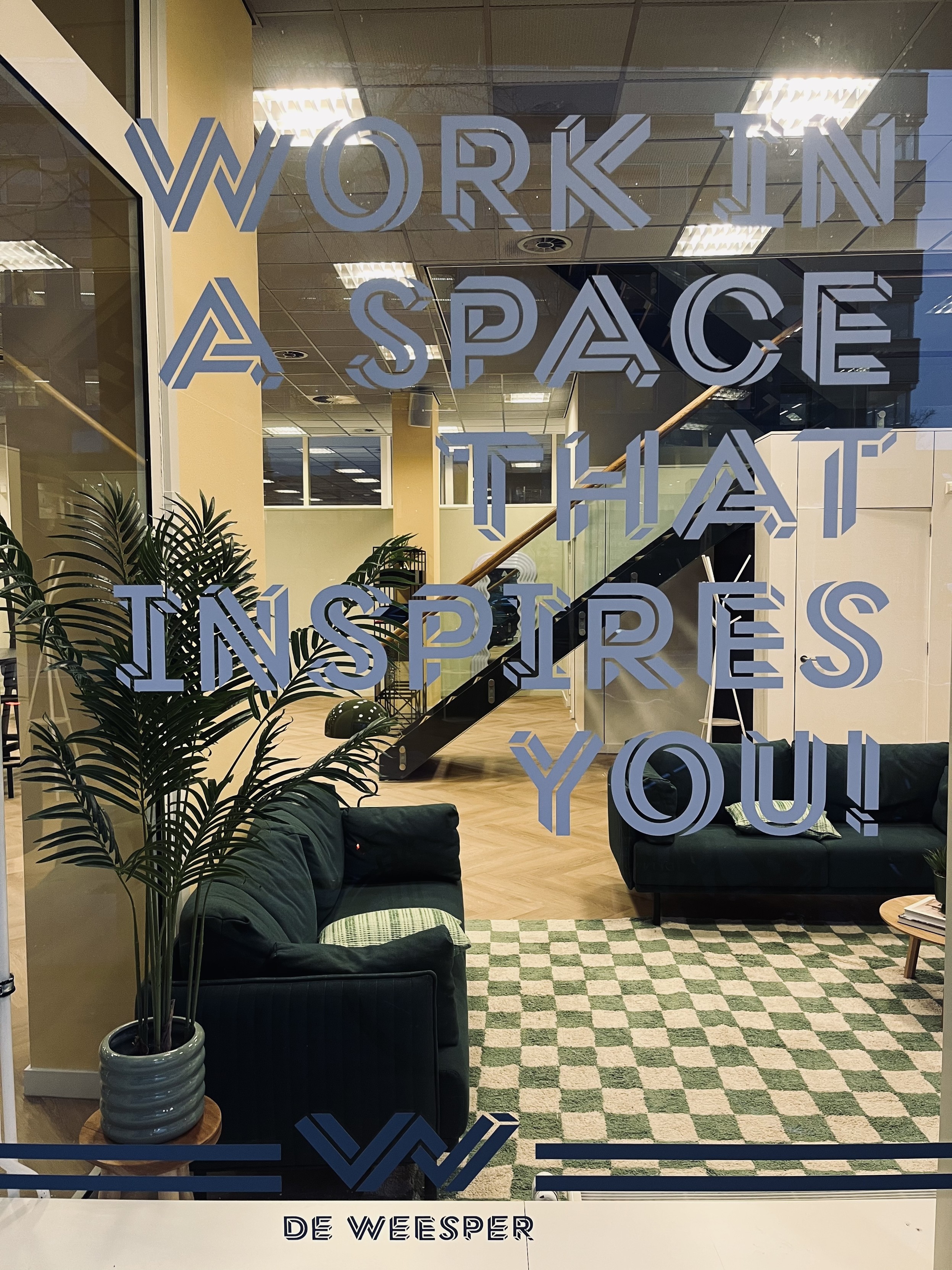
We posted this before, but there have been additional slogans added to the window. In case there are also flyers etc. we might make a case at #FontsInUse @FontsInUse
—
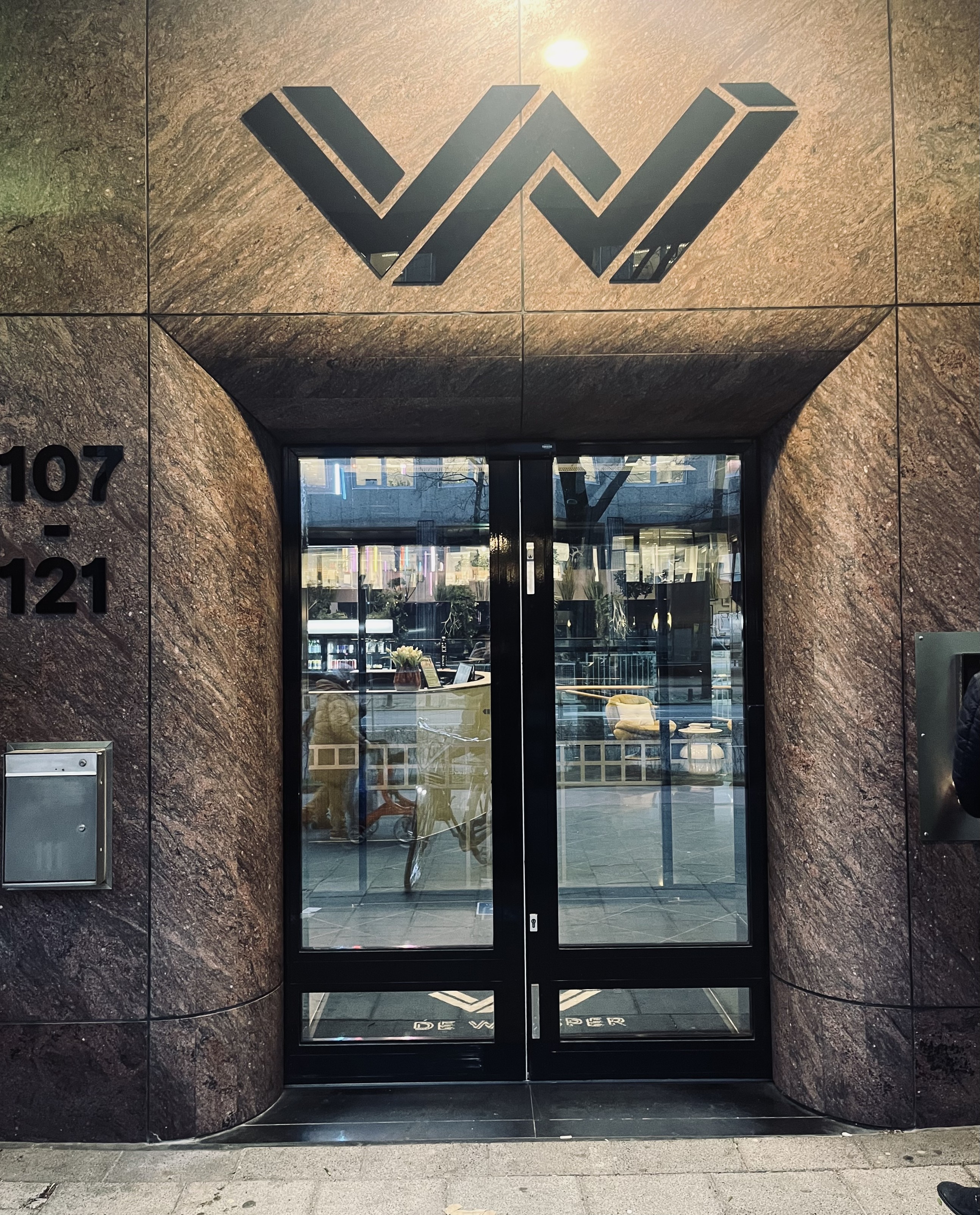
Fun detail, the double-u of the logo is stretched, and it’s not a problem.


Search is back!
🔎 https://fontsinuse.com