#FontsInUse

2025-12-24

For your typographic holiday reading, here’s @fhardwig on a songbook with Christmas carols produced by artists of the Werkstatt Haus zum Fürsteneck … in 1940: fontsinuse.com/uses/11409/lied

“As soon as one starts reading, one is painfully reminded that the heyday of this workshop in the tradition of the Arts and Crafts movement coincided with Nazism, and that its members allowed those in power to coopt their talents for propaganda purposes. As beautiful as Claudius and the two-colored musical notation might be, the joy is spoiled by the content which is drenched in the unholy zeitgeist.”

#FontsInUse #typography #Christmas #Nazism

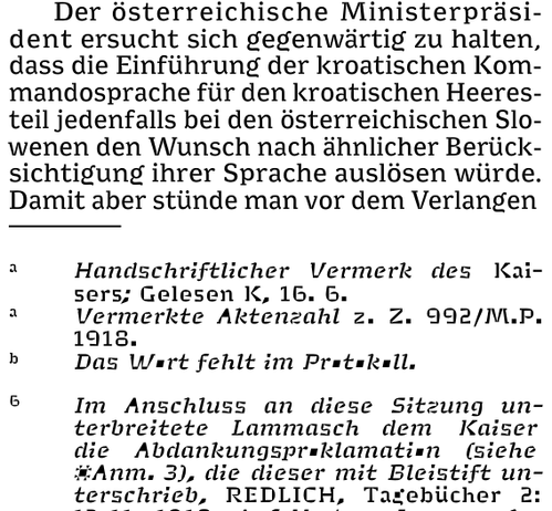
Detail from “Lieder zur Weihnachtszeit”, produced by Werkstatt Haus Fürsteneck in Frankfurt/Main and published by Georg Kallmeyer Verlag in Wolfenbüttel in 1940, showing the page with “Hohe Nacht der klaren Sterne” by Nazi songwriter Hans Baumann (1914–1988), “a prime example for the new carols of the 1930s that should replace Christian songs”.

The musical notation features a special typeface cut by Paul Koch (1906–1945), printed in red and black. The blackletter typeface used for the text is Claudius, based on letterforms written by his father, Rudolf. The illustration of mother and child is by Heinrich Pauser (1899–1989), another artist of the Haus zum Fürsteneck workshop and a student of Koch senior.
2025-12-22

Ten days ago, The Hague’s newest cultural venue Intercity opened doors for a sneak preview; the opening featured my oldest son looking handsome in uniform, and signage by All Sizes set in Thermorest by @mass_driver

#intercity070 #fontsinuse #typography #070 #massdriver #thermochrome

Intercity opening, 12 dec 2025, outdoor signageIntercity opening, 12 dec 2025Intercity opening, 12 dec 2025, Garderobe sign set in Thermochrome fontLight and sound art by David Schoch in the backyard of the venue. Intercity opening, 12 dec 2025
2025-12-19

Staff pick:
Issue no. 11 of Mosaïque magazine investigates how the music industry protects perpetrators of sexist and sexual violence. For the title, “La fabrique du silence”, art director Alexandre Créquer used the Thin weight of his own Mosa. 🔒 More:
fontsinuse.com/uses/72283/mosa

#FontsInUse #fonts #typefaces

Cover of Mosaïque magazine numéro 11, September 2025, showing a large padlock (3D work by Valentin Gaubert and Yann Genty). The title “La fabrique du silence” appears to be engraved into the padlock, in caps from Mosa Thin, with one word per line. The Mosaïque logotype at the top, partly obscured by the shackle, is custom lettering by Alexandre Créquer. Small text is set in Neue Haas Grotesk.
Tunera Type Foundrytunera@mastodon.design
2025-12-19

Insenheim typeface (by Benoît Ferran) in use at the Octobre Numérique festival website! octobre-numerique.fr/ <--#fontsinUse #Isenheim #typeface #font #typography #BenoîtFerran #tuneratypefoundry

2025-12-11

Staff pick:
“Readings of the Archive” is a book about Argentinian architect Amancio Williams (1913–1989) published by the Canadian Centre for #Architecture in partnership with Spector Books. Design studio Our Polite Society used two of their own typefaces: the monospaced OPS Favorite and the newly released OPS And Ever, a proportional update and continuation of the latter. Its Ultra weight that’s used on the cover is still unreleased.
fontsinuse.com/uses/73378/aman

#FontsInUse #typography #BookDesign

Orange book cover with three black-and-white photos and black text all set in an extrabold sans-serif typeface, OPS And Ever Ultra. At the top, in a very large size, “Amancio Williams”. In a medium size, “AP205” and “Readings of the Archive” rotated at the left and right, and “Studio Muto / Claudia Shmidt / Pezo Con Ellrichshausen” at the bottom.
2025-11-23

GT Walsheim joins Club 💯!
Noël Leu’s “friendly but precise” sans (Grilli Type) with the characteristic G has crossed the mark of one hundred Uses in the #FontsInUse Collection.

Inspired by 1930s lettering of Swiss poster designer Otto Baumberger, GT Walsheim was first released in a single style in 2009, and gradually expanded to eight weights plus obliques. In 2014, Leu unlocked Cyrillic support with the help of Mirco Schiavone. The 2017 revision added condensed styles.

fontsinuse.com/typefaces/7622/

2025-11-12

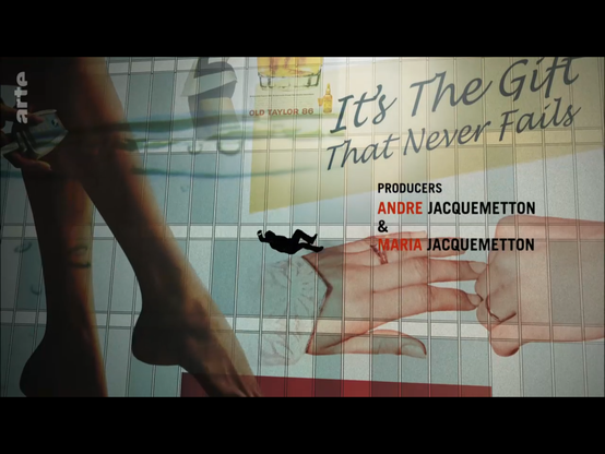
Mad Men is on German TV. They already lost me 15 seconds into the intro when I saw the Lucida Handwriting font (1991) – in a show set in the early 1960s? #FontsInUse

2025-11-12

Shoutout to Thomas Huot Marchand's great #Minuscule typeface made for extremely small sizes! Even though it takes some to render a 360 page part of a book reflowed to one A0 page in 3pt body copy with 2pt footnotes, it works and is still legible when printed! #oldschooldataviz #fontsinuse 256tm.com/en/overview_1.htm

Screenshot of 3/3.8 and 2/3pt typeset text in Minuscule
2025-11-03

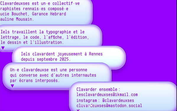
My font Panchi Mono in use! by @clavardeuxses

This graphic design collective from my homeland Brittany just launched their website: lesclavardeuxses.fr

Give them some love 🫶

Screenshot of a website.
2025-10-30

Staff pick:
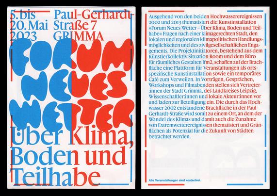
Forum Neues Wetter was a series of talks about #climate, soil, and participation in Grimma, Germany. For the design of the poster and program flyer, Wolfgang Schwärzler @ws combined amorphous lettering with Gamuth (@productiontype) and the upcoming Friedl (Camelot Typefaces). More:
fontsinuse.com/uses/72909/foru

#FontsInUse #typography #fonts #typefaces

Front and back of the program flyer for Forum Neues Wetter, printed in two HKS spot colors. While the left halves have blue text with red border elements, the colors are reversed on the right. The German text reads:

5. bis 20. Mai 2023, Paul-Gerhardt-Straße 7, Grimma: Forum Neues Wetter. Über Klima, Boden und Teilhabe
Ausgehend von den beiden Hochwasserereignissen 2002 und 2013 thematisiert die Kunstinstallation »Forum Neues Wetter – Über Klima, Boden und Teilhabe« Fragen nach einer klimagerechten Stadt, den lokalen und regionalen klimapolitischen Handlungsmöglichkeiten und des zivilgesellschaftlichen Engagements. Die Projektinitiatoren, bestehend aus dem Künstlerkollektiv Situation Room und dem Büro für räumliches Gestalten lfm2, schaffen auf der Brachfläche eine Plattform für Veranstaltungen als ortsspezifische Kunstinstallation sowie ein temporäres Café zum Verweilen. In Vorträgen, Gesprächen, Workshops und Filmabenden stellen sich Vertreter:innen der Stadt Grimma, des Landkreises Leipzig, Wissenschaftler:innen und lokale Akteur:innen vor und laden zur Beteiligung ein. Die durch das Hochwasser 2002 entstandene Brachfläche in der Paul-Gerhardt-Straße wird somit zu einem Ort, an dem der Wandel des Klimas und damit auch die Zunahme von Extremwetterereignissen thematisiert und Grünflächen als Potenzial für die Zukunft von Städten betrachtet werden.
Typofonderie: fonts & typographytypofonderie.com@bsky.brid.gy
2025-10-20

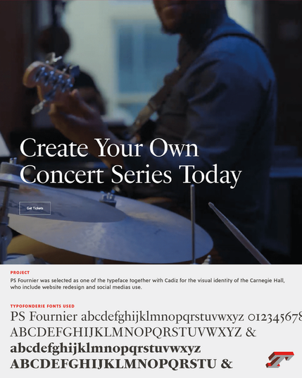
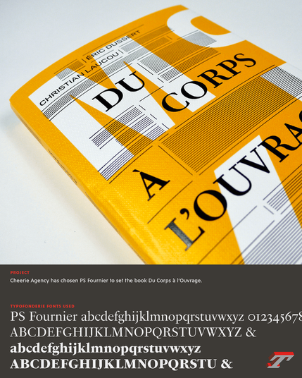
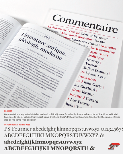
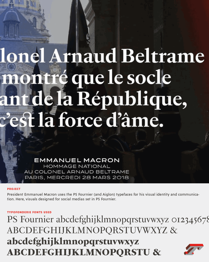
Discover a selection of projects set in PS Fournier, excellent text and titling typeface, which reflects the perfect French elegance. ➽ typofonderie.com/fonts-in-use... — — — #fontsinuse #typefaces #fonts #branding

2025-09-23

Dutch designer Ad Werner (1925–2017) would have turned 100 years today. We’re celebrating with two newly added Uses of his lowercase-only display typefaces, Dubbeldik and Paperclip:
fontsinuse.com/type_designers/

#AdWerner #FontsInUse #fonts #RecordCovers #1970s #OTD #OnThisDay

Florian Hardwigfhardwig
2025-09-10

Puffin Arcade is a family of bitmap fonts designed by @cakelab and released by @boldmonday. 11 of its 12 styles can be combined in layers for chromatic effect.

That’s exactly what designer Julika Altmann did for the headlines in an article celebrating the 40th birthday of .

See more at @FontsInUse: fontsinuse.com/uses/71910/supe
… or read the full article at @ZEITONLINE:
zeit.de/2025/38/super-mario-vi

Detail from the article header with a pixel animation showing a jumping Super Mario with a carnivorous plant to the left and a turtle to the right. The headline reads “Spielen Sie sich durch die Super-Mario-Geschichte” (English: “Play your way through the history of Super Mario”). It is a multicolor layered combination of four styles of Puffin Arcade: Liquid, Nerf, Wipe, and Loadout. Source: https://www.zeit.de/2025/38/super-mario-videospiel-40-geburtstag
2025-09-04

FONTS IN USE: With McQueen, Cigarsauerkraut’s Enrico Kunze found the ideal solution for Katrin Terwiel’s business philosophy. The use case for the expert in diversity strategy, mental health, and neurodiversity with the professional title of corporate psychologist, especially the distinctive character of the typeface’s strokes, shows that business does not have to be boring.

See McQueen in use: fontwerk.com/text/katrin-terwi

#FontsInUse #McQueenTypeface #VisualIdentity #CorporatePsychologist #Ad

2025-08-10

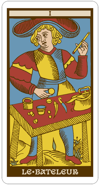
Reinterpreting some Conver-style #tarot cards in #svg using @velvetyne 's great #Basteleur font, #inkscape, #imagemagick and some #bash scripts!

--------------------
#fontsInUse

Le bateleur, first major arcane of the tarot
2025-08-06

Staff pick:
The catalog for the “Faits divers” exhibition at MAC VAL was designed by Félicité Landrivon (brigadecynophile). She used @anfalov’s KTF Rublena, an interpretation of “the most used black grotesk on the ex-USSR terrain”. Other #FontsInUse include two more #typefaces by Kyiv Type Foundry that are based on metro station signs in the Ukrainian capital, @federico’s Exposure, and @JTDType’s Transducer. →
fontsinuse.com/uses/65238/fait

#Typography #BookDesign

Edgar WaltherteWalthert@typo.social
2025-07-28

Another poster, another @FontsInUse !

The Utopian Quest for a Pasigraphy introduces 20 language systems to communicate with images or symbols.

Adding #SitelenPona (#TokiPona) and #EarthLanguage to the ever extending list of #fonts on #FontsInUse.

fontsinuse.com/uses/69745/the-

Client Info

Server: https://mastodon.social
Version: 2025.07
Repository: https://github.com/cyevgeniy/lmst