Cheers to everyone who delayed fossil fuel phaseout by saying "you can't switch off fossil fuels overnight"
Because thanks to them everyone now has to face a situation where fossil fuels are switched off overnight 🙃🙃🙃
Cheers to everyone who delayed fossil fuel phaseout by saying "you can't switch off fossil fuels overnight"
Because thanks to them everyone now has to face a situation where fossil fuels are switched off overnight 🙃🙃🙃
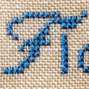
@clauseggers @hdonker Agreed: unusual – but not unique. See the comments on this Flickr page for more examples of such a cursive yet unconnected ‘r’:
https://www.flickr.com/photos/hardwig/5475516509/
Linotype, Astrology, and Invisible, Radioactive Pencil Patents (you know, just the usual stuff):
https://realdougwilson.com/writing/linotype-bulletin-astrological-covers
Berliners: we have a space available in our shared studio! Mitte/Kreuzberg, U8 H.-Heine-Str., in a nice community of 16 designers, illustrators, writers, animators, artists. Reasonable rates. With kitchen, wifi, shared printer.
Details per DM or mail. Boosts welcome.
For those who want to test their perception of colour, I made a little game called "What's My JND"
RE: https://typo.social/@fontstand/115894282316847781
One month to go — and only 40 tickets remain. With 210 already sold, we will be sold out. If you want to attend the conference in Berlin, now is the time. 🎟️
#fontstandcon2026
@boldmonday @triple @eWalthert @sajatype @w__h_ @ohno @cakelab Here’s an example from the realm of metal type, shown by Pittsburgh Type Founders in 1918. Not a systematic approach, but definitely fractions with broken bars.

@paperposts That’s a stylized Shell of Saint James, showing the way to Santiago de Compostela: https://en.wikipedia.org/wiki/Camino_de_Santiago
@triple @eWalthert Dang.
But it won’t be the last one for this year! Pretty sure we’ll be doing another one in summer, for @typostammtisch. (I know this doesn’t help much for non-Berliners.)
The #fontstandcon2026 Friday Workshops are almost sold out! Don’t miss your last chance to register before they are all gone.
Check the full schedule at the conference website:
https://fontstand.com/conference
@justvanrossum @joanacorreiatype @ShokoMugikura @fritz_groegel @fhardwig

Where I am mentally when I browse automatically translated tags on MYFONTS.COM™

Looking for a typeface that revived these letters, if it exists. I couldn’t find one. Anyone could help out?


@martabernstein
https://www.flickr.com/photos/hardwig/4373276189/in/album-72157622847839978/
Wagner Zip-Change has the right letterforms and Double D NF about the right faceting. I’m not aware of a font that brings together both.
https://fontsinuse.com/typefaces/17981/double-d-nf
https://www.fontspace.com/wagner-zip-change-font-f10468

Best decision this year, yet:
Signing up for a lettering workshop whit Jeroen @shamrock Klaver.
The learning curve is incredible!


FIRST OFFICIAL LOOK AT DARGON ICONS I am OVER THE MOON with them alkjdlkgjkdlfj https://www.type-together.com/dargon-sneak-peek
Looking for a flat in #berlin ? We're moving houses and subletting our flat in Neukölln for 6 months before the next tenants can move in.
It's a 87m2 flat at the fifth floor in a back house of Sonnenallee, bright and very quiet even with open windows. It has a huge kitchen/living room, 2 bedrooms and a balcony. We could leave some minimal furniture like couches, a big futon bed, etc. Move in from the 15.03 or 01.04.
Please share if you know some people who might be interested. PM me for more details.

@gerritvanaaken @rainerklute @fontwerk Plot-Twist: schon die allererste DIN-Schrift war kursiv. Die geneigte DIN 16 wurde 1919 noch vor der aufrechten DIN 17 als Norm für die Beschriftung technischer Zeichnungen definiert. Die (nicht gerundete) DIN 1451 folgte erst in den 1930ern.

Sport
https://bgtype.alexeystar.com/place/68
#BelgradeType #Beograd #Belgrade #typography #streetType #urbanType #srpskaTipografija