Here's a cute little preview of where I go with this:
Frank ⌁
Nowadays I am researching and coding at CMU's HCII at the intersection of data interaction and accessibility. Formerly at Adobe, Highsoft (Highcharts), Apple, Visa.
In my spare time I'm writing a tabletop rpg (at 400+ pages currently).
Anti-fascist, queer, and trying to be less online these days.
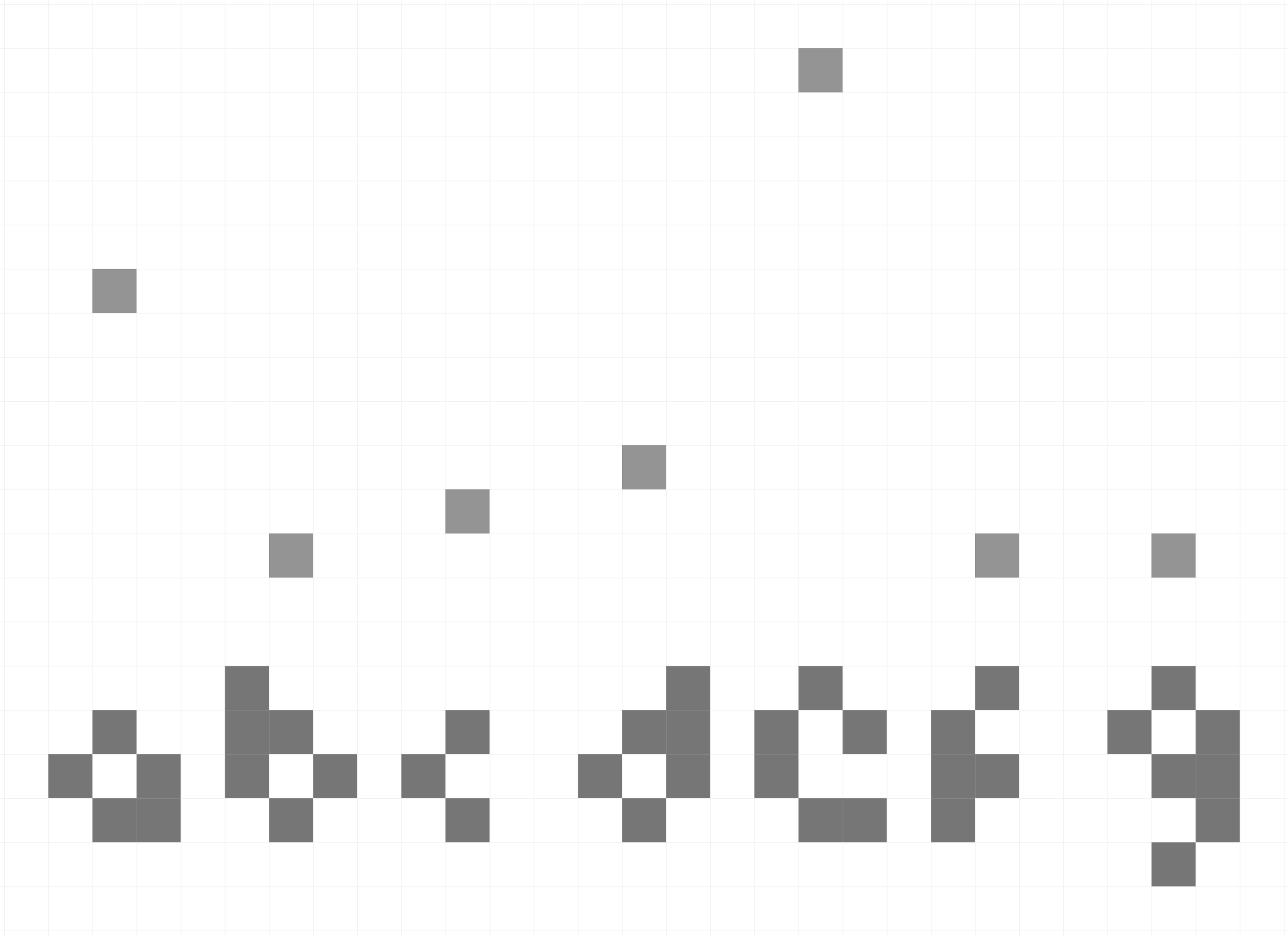
Folks on bluesky loved this, while folks on linkedin did not. Perhaps mastodon will have fun with it too? I made a game out of the "data-to-ink ratio," taking it to its logical (or *illogical*) extreme:
I wrote this a couple of days ago and have continued adding to it. This has now turned into a manifesto against web accessibility overlays.
I oppose them on functional, philosophical, and aesthetic grounds. They're spoiling personalization for accessibility.
https://www.frank.computer/blog/2025/04/overlays-are-for-suckers.html
Frank ⌁ boosted:
@frankelavsky's thoughts on SaaS accessibility overlays perfectly match mine. Happy to see them validated by somebody else — I'm not crazy!
https://www.frank.computer/blog/2025/04/overlays-are-for-suckers.html
@fossheim Sarah... I am completely blown away by how good this is. This is incredibly well done, informative, demonstrative, and helpful. This is a monumentally good piece.
Frank ⌁ boosted:
All the issues I wrote about in the blog post were based on manual tests btw. Some of those were probably picked up on by the automated tests, but a lot of them are in addition to what these tools can detect.
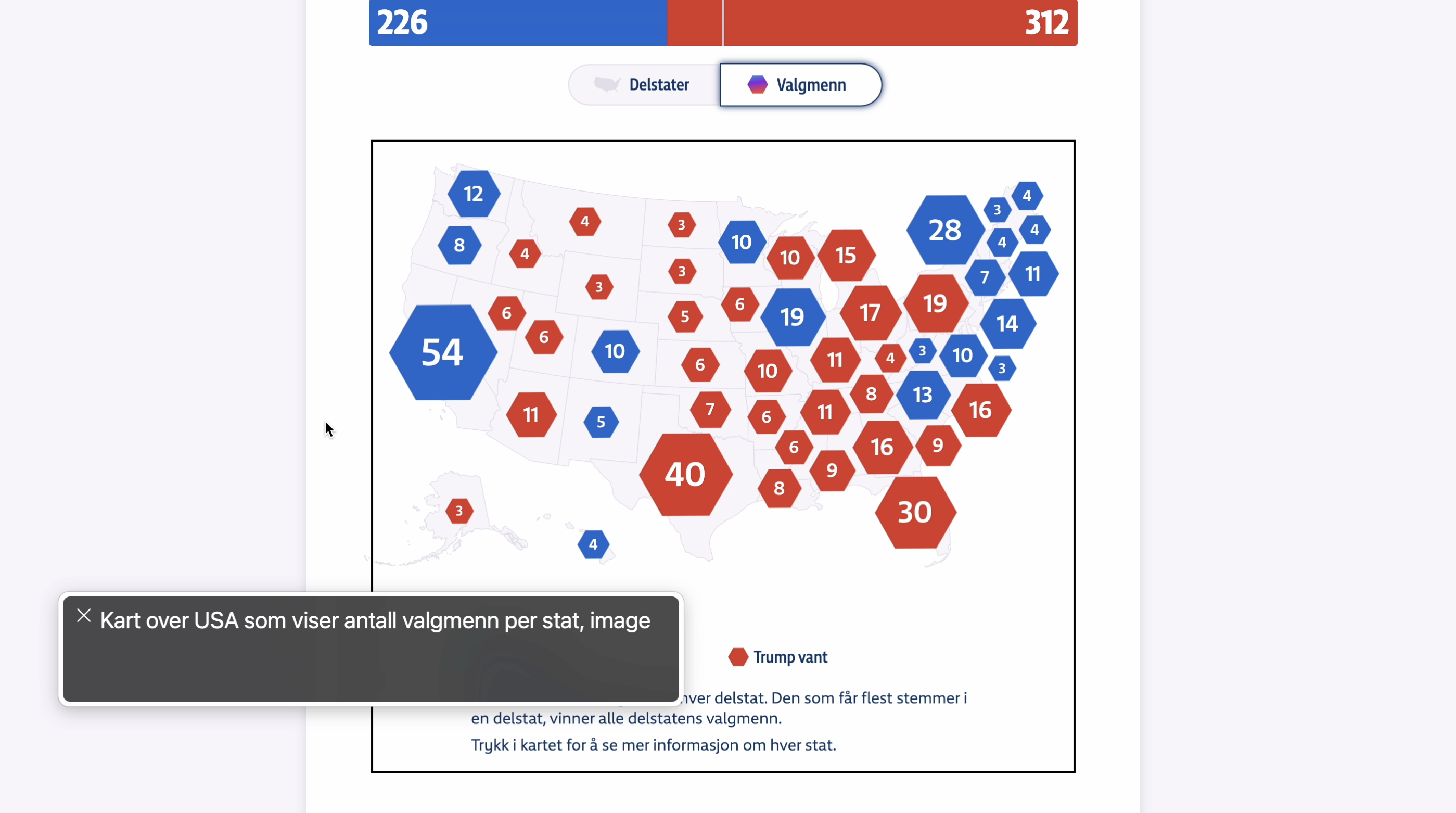
For example, several maps were turned into images with alt text where the alt text didn't communicate any actual data or insights ☹️
Frank ⌁ boosted:
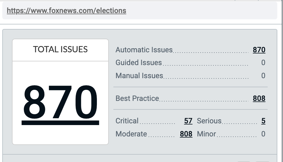
I'm not the only one finding a lot of issues. When running axe devtools (a free tool any developer can use!), 870 automatic issues were detected on the Fox News dashboard :blobcatfearful:
A quick google search tells me Fox News made $15 billion in 2024. Weird that with that amount of revenue they didn't have the resources to run a free tool and add alt text to their icon buttons.
Frank ⌁ boosted:
New blog post out (finally) ✨ I tested the dataviz accessibility of the 2024 presidential election dashboards, and (as expected) found a lot of issues to write about:
https://fossheim.io/writing/posts/2024-dataviz-a11y-elections/
I had a lovely podcast conversation about some topics that are highly relevant now: what does it mean to hope, and how do we hope in ways that can make our cities better?
I wrote a summary of our chat in my blog (links to full podcast are included too!):
https://www.frank.computer/blog/2024/11/knowledge-prediction-hope.html
Hey @lea... what can I read to learn more about "underdetermination" in creative processes? Fascinated by this while reading your DIS "Investigating Underdetermination" piece.
Posting publicly in case others have ideas/leads too.
The immortal @eric wrote a blog post that was scientifically engineered in a lab to be exactly what I'd love to share with other people about alt text, writing, and a love of fantasy.
Here you go, enjoy:
https://ericwbailey.website/published/dungeons-and-dragons-taught-me-how-to-write-alt-text/
Just posted about this so I can link to it later!
https://vis.social/@frankelavsky/112762272162861162
Want to know how to write better alt text for complex figures and tables?
Some links:
DIS'23 Guidelines (my favorite walkthrough ever written): https://dis.acm.org/2023/creating-accessible-figures-and-tables/
arXiv session on describing scientific figures (linking a great example from that): https://accessibility2023.arxiv.org/materials/Extended_Description_Examples/ExtendedDetailsUnderImage.html
A whole repo (aka list) of resources going even further:
https://github.com/dataviza11y/resources
Next week is a fun milestone for me! I'm finally coming back to #AccessU (hosted by @knowbility), where I gave my first-ever accessibility talk. I'll be giving my biggest, most detailed workshop ever! It's going to be a blast.
Plus, Global Accessibility Awareness Day (#GAAD) wraps up the week!
If you're going to AccessU this year, please hit me up!
I'd love to chat and connect, especially since I'm going to miss Wednesday night's networking event!
Frank ⌁ boosted:
Keep an eye out for the first Data Visualization Accessibility workshop at @ieeevis this year!! Organized by @laurasouth_, Naimul Hoque, Pramod Chundury, @frankelavsky, Lucas Nadolskis, @kekewu728, Brianna Wimer, @dom, Danielle Albers Szafir, Jonathan Lazar, and @elm
CFP: Position papers (2-4 pages) that discuss topics relevant to accessible data visualizations
Submissions due Jul 15th!
In my work and studies I've been prototyping quite a lot. In some ways, prototyping now occupies most of my time when I'm not writing or reading.
But what does prototyping mean? And what is a high vs low fidelity prototype? I reflect on this here:
https://www.frank.computer/blog/2024/01/what-is-a-prototype.html
📣 Really cool, practical, remote visualization workshop series alert! 📣
I'm collaborating with @gotdairyya and @databard, hosted by Graphic Hunters where we focus on the critically important parts of visualization: accessibility, feminism, and design critique.
This series will absolutely help you frame your work in better, more meaningful ways. Highly recommended and we even have some diversity tickets too, so share for the sake of others who might want to attend.
Frank ⌁ boosted:
Fantastic short talk by @frankelavsky, introducing the fundamental concepts of #accessibility to cartographers. He does a really crisp job covering the fundamentals, including:
- social model of disability
- situational impairment
- disability-centered design
- "nothing about us without us"
Highly recommended, even if you don't care a whit about #maps.
Client Info
Server: https://mastodon.social
Version: 2025.04
Repository: https://github.com/cyevgeniy/lmst