#DataVis

Kristin (vis.social Admin)kristinHenry@vis.social
2025-12-18

Ok, so that guy complained tonight (?) about the state of things when he came back into office?

Um...this is one of many things he left behind from his last time in office.

In January of 2021, I created this piece to help myself process what was happening. I started when there were only 400,000 American deaths from Covid. I updated it when we hit 500k. And I just couldn't update it again.

kristinhenry.github.io/howBig/

#Datavis #DataArt #art #covid #uspol

screenshot from an animated data visualization of 'how big is 400,00?'. The number of deaths in the US at the time.
2025-12-15

The #plushtodon are fluent in English of course, as is @destatis For an international audience this #datavis of the latest population projection for Germany can be linked to English independently of browser localisation. Also – unlike the #plushies – use your opposable thumbs right away on your smartphone. The age pyramid now has feature parity at all sizes.
service.destatis.de/bevoelkeru

Two new mastodon plushies look at a population pyramid of Germany in 2057 when they themselves may have children. While the outline depicts the default model, the much narrower pyramid is of a hypothetical model calculation with zero net migration.
Marian Dörknrchtct@vis.social
2025-12-11

New paper ✨

»Conceptual Analogues: Coming to Terms with Data Visualisation«

doi.org/10.11588/ic.2025.1.113

In which I propose conceptual analogues as terms that fuse theory and practice to expand the language of data visualization. It is based on a contribution to the early-pandemic workshop »What is the Digital Doing?« and is out now in a special issue of Interface Critique, edited by Nina Tolksdorf and Lindsey Drury.

#DataVis #Critique #Theory #CriticalDataVis #DigitalHumanities #InterfaceDesign

2025-12-04

Kleines random Update, wenn man mal wissen mag wie sich die Aufmerksamkeit für #talkshows (#lanz und co) so auf Plattformen wie Bluesky & Mastodon verhält, ich hab die letzten paar Monat mal visualisiert.

Ist jetzt noch nicht so richtig fertig aber wer mal in der #datavis herumstochern mag: feel free.

observablehq.com/@arrrrrmin/at

Marian Dörknrchtct@vis.social
2025-11-29

RE: hachyderm.io/@dubroy/115631863

nested glyphs on a temporal citation chart and they even got it right in black and white. very nice!

reminds me of Citeology by folks at Autodesk: research.autodesk.com/publicat

#DataVis

2025-11-28

oh shit, the stats found out about the data... the'll never get me, i'm always two itetations ahead! #datavis #thuglife

i received a scary, formally served "yellow letter" from the berlin and brandenburg state office of statistics.
sport of sacred spherical cowsbeadsland@hcommons.social
2025-11-24

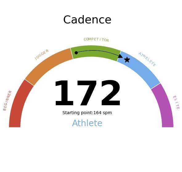
Raj's dashboard, updated this morning, shows Stratus dynasty with diversified XFG.3 family at plurality, accounting for quarter of all samples. Notably, GISAID submissions don't reflect CDC's estimated growth of XFZ & XFV recombinants.

GISAID data for the most recent four-week period is dominated by paltry submissions from New York (80 sequences), followed by Maryland (45), Colorado (41), Minnesota (33), and Illinois (26).

After missing last month's update for reason of government shutdown, #CDC's most recent dataset, updated Friday, finally breaks out estimates for multiple XFG subvariants.

Nowcast suggests three XFG strains have gained significant share in past four weeks, along with two recombinants, XFZ (child of PG.3.2 and XFC.3) and XFV (child of LP.8.1 and XFG.3.3.1).

Note that, in absence of robust data from states, CDC has given up modeling historical estimates, instead giving only shares of reported sequences.

#ThisIsOurPolio #variants #CovidIsNotOver #dataviz #datavis

Chart: Estimated and Reported U.S. Variant Proportions by Common Name
Sources: CDC, Cov-Lineages, NYITCOM, D. Focosi, WHN, others

[ beadsland on Ko-fi ]

Reskin of CDC's Variants Nowcast, and any significant variants in GISAID not broken out by CDC.

Four bar-style tree-charts, for four-week periods through Oct 26–Nov 22. Legend of last four-week period, organized by subheadings of color-grouped families and convergent clusters. Percentages overlay each color key, reflecting share as of most recent tree-chart.

Nearly all WHO-Vaccine-Target JN.1 dynasty. Stratus XFG family accounts for over four fifths share.

For 10/26–11/22, packed bubble charts fill single-variant tiles, indicating diversification (per GISAID) not apparent from CDC's Nowcast.

Legend:

XFG [reds]:
69% - XFG.2†, XFG.3†, XFG.3.4.1 / QF†, XFG.4.1† & other Stratus XFG
10% - XFG.14.1
8% - XFG.6, XFG.1.1† & other XFG.1

JN.1.11 [browns]:
9% - XFZ, XFV, NW.1 & FDA-Vaccine-Target LP.8.1
0% - other JN.1.11

JN.1 + FLiRT-LF-7 [blues]:
⅛% - LF.7.9
¼% - other LF.7

LF.7 + NTD-meets-RBD [purples]:
⅕% - XFC
0% - other LF.7 + NTD-meets-RBD

WHO-Vaccine-Target JN.1 [green]:
0% - XEC

Other [greys]:
4% - Nimbus NB.1.8.1 / PQ, XFY & XDV.1
⅓% - Other (not specified)
_____

XFC is a child of April's WHO-Vaccine-Target scion LF.7 and Mayish JN.1.11 scion LP.8.1.1 / NY.

XFZ is a child of left-field WHO-Vaccine-Target scion PG.3.2 and Augustish recombinant kid XFC.3.

[Some footnotes omitted, due to too many recombinants.]
Adam Dalliancepre@boing.world
2025-11-23
2025-11-22

@kamapu That is an awesome visualisation! #datavis

sport of sacred spherical cowsbeadsland@hcommons.social
2025-11-22

After missing last month's update for reason of government shutdown, #CDC's most recent dataset, updated Friday, finally breaks out estimates for multiple XFG subvariants.

Nowcast suggests three XFG strains have gained significant share in past four weeks, along with two recombinants, XFZ (child of PG.3.2 and XFC.3) and XFV (child of LP.8.1 and XFG.3.3.1).

Note that, in absence of robust data from states, CDC has given up modeling historical estimates, instead giving only shares of reported sequences.

Raj's dashboard, updated two weeks ago, shows Stratus wildly diversified, having spawned multiple third-generation pango aliases & descendant recombinants. Previous data had suggested XFG was stagnant.

GISAID data for the latter two-weeks-and-change of the most recent period is dominated by submissions from California (120 sequences), followed by New York (87), Minnesota (49), and Colorado (36)—paltry all round.

#ThisIsOurPolio #variants #CovidIsNotOver #dataviz #datavis

Chart: Est. & Reported U.S. Variant Proportions by Common Name
Sources: CDC, Cov-Lineages, NYITCOM, D. Focosi, WHN, others

[ beadsland on Ko-fi ]

Reskin of CDC's Variants Nowcast, and any significant variants in GISAID not broken out by CDC.

Four bar-style tree-charts, for four-week periods through Oct 26–Nov 22. Legend of last four-week period, organized by subheadings of color-grouped families and convergent clusters. Percentages overlay each color key, reflecting share as of most recent tree-chart.

Nearly all WHO-Vaccine-Target JN.1 dynasty. Stratus XFG family accounts for over four fifths share.

For 9/28–10/25, packed bubble charts fill single-variant tiles, reflecting GISAID detail not shown by CDC's Nowcast.

Legend:

XFG [reds]:
69% - XFG.2†, XFG.3†, XFG.3.4.1 / QF†, XFG.5.1†, XFG.4.1†, XFG.5.2†, XFG.3.4.3 / QS† & other Stratus XFG
10% - XFG.14.1
8% - XFG.1 & XFG.6

JN.1.11 [browns]:
9% - XFZ, XFV, NW.1 & FDA-Vaccine-Target LP.8.1
0% - other JN.1.11

JN.1 + FLiRT-LF-7 [blues]:
⅛% - LF.7.9
¼% - other LF.7

LF.7 + NTD-meets-RBD [purples]:
⅕% - XFC
0% - other LF.7 + NTD-meets-RBD

WHO-Vaccine-Target JN.1 [green]:
0% - XEC

Other [greys]:
4% - Nimbus NB.1.8.1 / PQ, XFY & XDV.1
⅓% - Other (not specified)
_____

XFC is a child of April's WHO-Vaccine-Target scion LF.7 and Mayish JN.1.11 scion LP.8.1.1 / NY.

XFZ is a child of left-field WHO-Vaccine-Target scion PG.3.2 and Augustish recombinant kid XFC.3.

[Some footnotes omitted, due to too many recombinants.]
Marian Dörknrchtct@vis.social
2025-11-21

RE: vis.social/@InfoPlusConf/11558

wow!! so fast! thank you, @InfoPlusConf, for putting the #infoplus2025 talks and discussions online and making them freely available. really appreciated! sad i couldn't be there in person.

#DataVis #BingeWatching

ruthpozueloruthpozuelo
2025-11-20

A need some fresh pair of eyes:

✅ Is this viz clear?
✅ What does it show?
✅ Would you change anything?

My curve text tecnique is still quite crappy but dont know how to do it better at the moment, please disregard that!


The image displays a cadence chart labeled "Cadence" with a rating of 172. It highlights different skill levels from "Beginner" to "Elite" with color-coded segments. A star indicates the current position within the "Athlete" range.
Helena Klara Jamborhelenajambor
2025-11-18

⏰ tomorrow, Nov 19, 5pm Berlin/4pm London

“Data Vis for Cancer Patient Education“ - a talk

Link & Abstract: alt-text and also:
biovis.net/2025/meetup/ (right under picture)

Nov 19th, at 17:00 to 18:00, CET
Location: Join Zoom Meeting
https://tu-dresden.zoom-x.de/j/67863904836?pwd=mVqoyB6DlxAbFAtN7kx0Ka62KHFmUJ.1
Meeting ID: 678 6390 4836
Passcode: BioV!s2025

Cancer care is increasingly guided by precision data, such as patients metabolomic, genetic, transcriptomic, or immune status. This poses a challenge for clinicians to communicate treatment decisions. To bridge this gap we therefore developed, evaluated, and adopted visual treatment timelines for cancer patient education. Data visualizations help humans to understand data and are especially effective to communicate risks, uncertainties, or large data and have proven to be a suitable help in cancer communication. 
 
Recordings of previous talks are available:
https://youtube.com/playlist?list=PL5kIQRQ6TU8Ifu_5h2iipUmIKCqhs50zx&si=Smchvhyu6_cX6kjZ
Khoury Vis Lab @ NortheasternKhouryVis@vis.social
2025-11-13

🌌 “Our Energy Nexus” is featured in #InfoPlus2025!
This interactive installation by Chloe Prock & friends reimagines energy as a collective force, turning pollution data into shared hope + action.
informationplusconference.com/
#datavis #dataart

The picture shows two viewers standing in the front of a large interactive screen displaying clusters of triangle marks that represent pollution data.

Here's a new article on my Tutor/Mentor blog that may be of interest to #dataviz & #datavis networks. tutormentor.blogspot.com/2025/11/enga... In it I point to an "Interactive Research Map" created by a team at the University of Central America in El Salvador.

In 2009 Chris Warren, a Northwestern University graduate and Public Interest Fellow at Cabrini Connections and the Tutor/Mentor Connection, created the concept map shown here and shared it in an article titled "Mapping Northwestern University for Tutoring/Mentoring Programs".
sport of sacred spherical cowsbeadsland@hcommons.social
2025-11-10

Raj's dashboard, updated today, shows Stratus wildly diversified, having spawned multiple third-generation pango aliases & descendant recombinants (incl much of Other on this chart). Previous data had suggested XFG was stagnant.

GISAID data for the latter two-weeks-and-change of the most recent period is dominated by submissions from California (120 sequences), followed by New York (87), Minnesota (49), and Colorado (36)—paltry all round.

Despite profound diversification of XFG, CDC had yet to break out estimates for any of its subvariants.

#CDC's most recent dataset, updated Sept 26, showed Stratus XFG family dominating, with Nimbus NB.1.8.1 / PQ in second place, down to one-fourteenth share, this nearly neck-in-neck with FDA Vaccine Target LP.8.1 at one-seventeenth share.

Note that, in absence of robust data from states, CDC has given up modeling historical estimates, instead giving only shares of reported sequences.

#ThisIsOurPolio #variants #CovidIsNotOver #dataviz #datavis

Chart: Est. & Reported U.S. Variant Proportions by Common Name
Sources: CDC, Cov-Lineages, NYITCOM, others

[ beadsland on Ko-fi ]

Reskin of CDC's Variants Nowcast, and any significant variants in GISAID not broken out by CDC.

Four bar-style tree-charts, for four-week periods through 9/28–10/25. Legend of last four-week period, organized by subheadings of color-grouped families and convergent clusters. Percentages overlay each color key, reflecting share as of most recent tree-chart.

Stratus XFG family accounts for over three quarters share.

For 9/28–10/25, leading GISAID sequences make up for outdated CDC Nowcast. Packed bubble charts fill single-variant tiles.

Legend:

LF.7 + NTD-meets-RBD [red]:
77% - XFG.2†, XFG.3†, XFG.14.1†, XFG.3.4.1 / QF†, XFG.5.1†, XFG.4.1†, XFG.5.2†, XFG.3.4.3 / QS† & other Stratus XFG

JN.1.11 [browns]:
2% - FDA-Vaccine-Target LP.8.1
1% - KP.3
½% - other JN.1.11

LF.7 + NTD-meets-RBD [purples]:
½% - XFC
¾% - other LF.7 + NTD-meets-RBD

JN.1 + FLiRT-LF-7 [blues]:
0% - LF.7.9
1% - other LF.7

JN.1 [greens]:
0% - JN.1.16.1 / LF
0% - other WHO-Vaccine-Target JN.1

Other [greys]:
8% - Nimbus NB.1.8.1 / PQ
10% - Other (not tallied)
_____

Stratus XFG is a child of April's WHO-Vaccine-Target scion LF.7 and Juneish JN.1.11 scion LP.8.1.2 / NW.

XFC is a child of April's WHO-Vaccine-Target scion LF.7 and Mayish JN.1.11 scion LP.8.1.1 / NY.

† Variants, not broken out by CDC, that represent significant share of recent GISAID sequences.
sport of sacred spherical cowsbeadsland@hcommons.social
2025-11-10

#Annoplot #dataviz development has been temporarily suspended as of October, after only about fifty lines added since last round of work in September:

hcommons.social/@beadsland/115

Work in first week of October focused on:

* support for #datavis of partial periods of GISAID data
* tweaks to scrim and suds implementations
* revisions to captions to reflect current events

Work in first week of November focused on development of Buoy, a tool for floating self-boosted posts periodically, as a function of other posting behavior:

hcommons.social/@beadsland/115

This added about 400 lines, plus another 50 lines to duplicate existing hotmods library:

hcommons.social/@beadsland/115

Chart: Annoplot Dataviz Library*: Project Profile
Subtitle: 12.8K lines† across component modules and significant submodules.

Multi-level pie chart organized into six major categories by color. Each outer wedge shows a tally of number of lines for that sub-component.

Brown buoy wedge notably exploded out; all others show no discernible activity.

A legend is split across both sides of the chart. Each key mirrors one of the wedges on the dual pie chart, along with a sentence or two description of each (sub)component thereby represented.

Caption:

* Pre-release development version 2025-11-09.

† Python, Markdown, C, Elixir, and shell source files. Blank lines omitted form tallies.

Exploded wedges reflect proportions of lines changed in prior 41 days. Dotted areas represent non-blank comment lines and Markdown.

Wedges:

🔴 levels
🧀 [blank wedge] - 460, 🧀 hospitals - 282

🟣 chirp
🧀 [blank] - 537

🔵 annoplot
🧀 [blank] - 544, 🧀 artists - 750, 🧀 artists/adorn - 360, 🧀 artists/deco - 511, 🧀 artists/legend - 419, 🧀 coord - 583, 🧀 coord/base - 259, 🧀 margin - 256, 🧀 util - 537

🟢 tiop
🧀 [blank] - 235, 🧀 bullseye - 321, 🧀 capacity - 455, 🧀 devpie - 572, 🧀 devpie/slice - 295, 🧀 variants - 770, 🧀 variants/legend - 389, 🧀 variants/orchard - 432, 🧀 variants/rajdash - 602, 🧀 variants/tree - 437, 🧀 …/tree/branch - 359

🟤 bots
🧀 [blank] - 181, 🧀 buoy - 437, 🧀 talky - 821

⚫ . [period by itself]
🧀 [blank] - 458, 🧀 TODO.md - 504
2025-11-07

If you're following the #UNL #statistics` saga (proposed for elimination based on bad stats), you might find the seminar we gave yesterday interesting...

youtube.com/watch?v=fUk2R0UYWpA

It was weird to rail against someone for an hour, but strangely cathartic, and the #datavis seems to have been effective?

All #academics should be aware of the absolute BS that administration can create with perfectly reasonable sounding #data, #stats, and #metrics

2025-11-01

A student told me about the new Oklab color space, which fixes a problems with previous perceptual color spaces (like LAB).

Unfortunately, when I tried Oklab instead of LAB to make color bins for a datavis, the lightness dimension is much longer, which makes it hard to show a lot of bins.

#datavis

Diagram of "All RGB Colors Binned Into Cubes." Shows bins in Oklab space and in CIELAB space. Each one is divided into 11 lightness level (Oklab: 0, 0.1, ..., 1; LAB: 0, 10, ..., 100). At each level is a set of squares along the a and b axes. In Oklab each lightness level is about 5 by 5 bins, but in LAB it's about 15 by 15 bins).

Client Info

Server: https://mastodon.social
Version: 2025.07
Repository: https://github.com/cyevgeniy/lmst