Jeff Allen

sharing things I create - mostly maps, graphics, and photos of places

2025-05-23

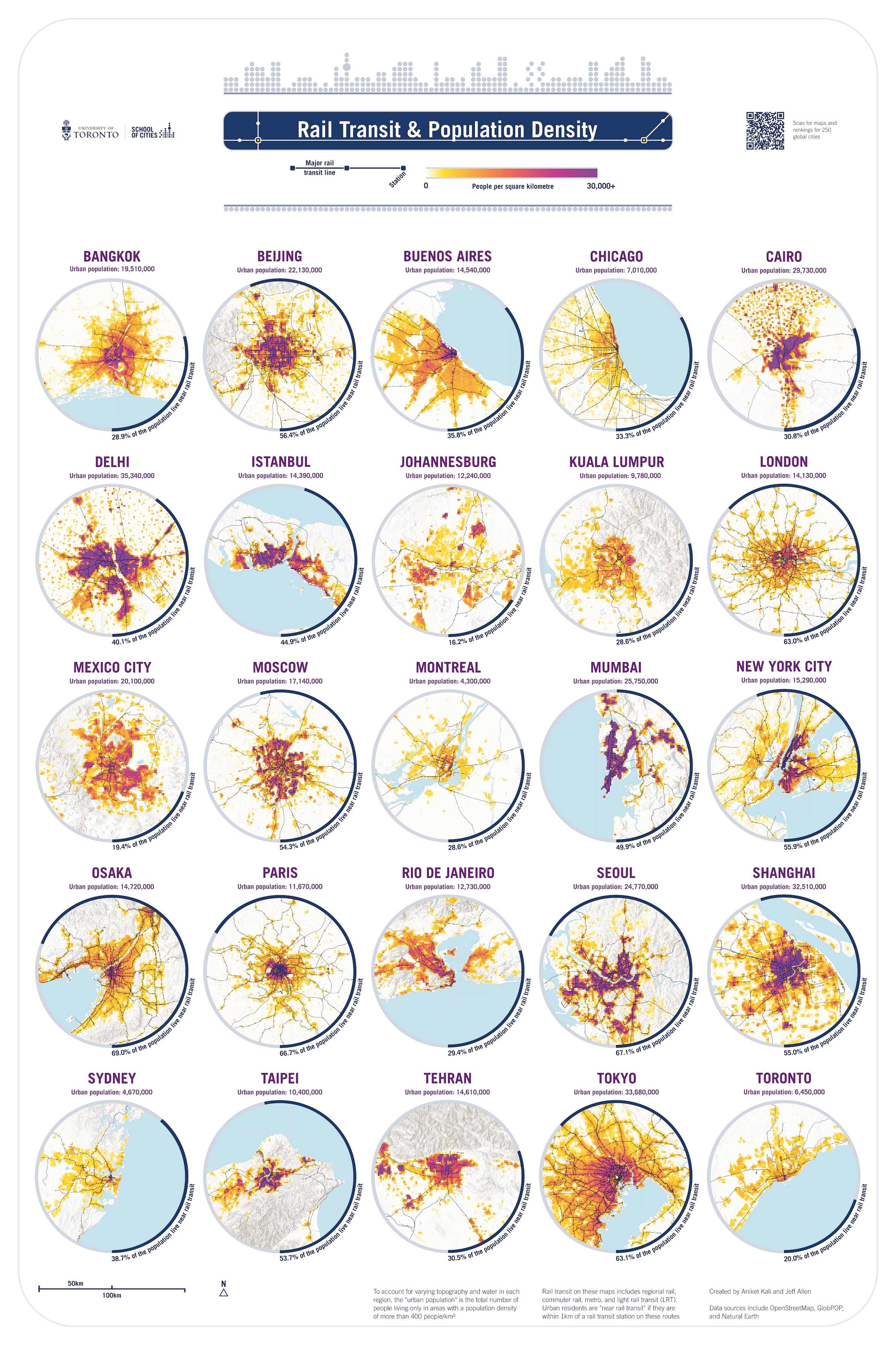
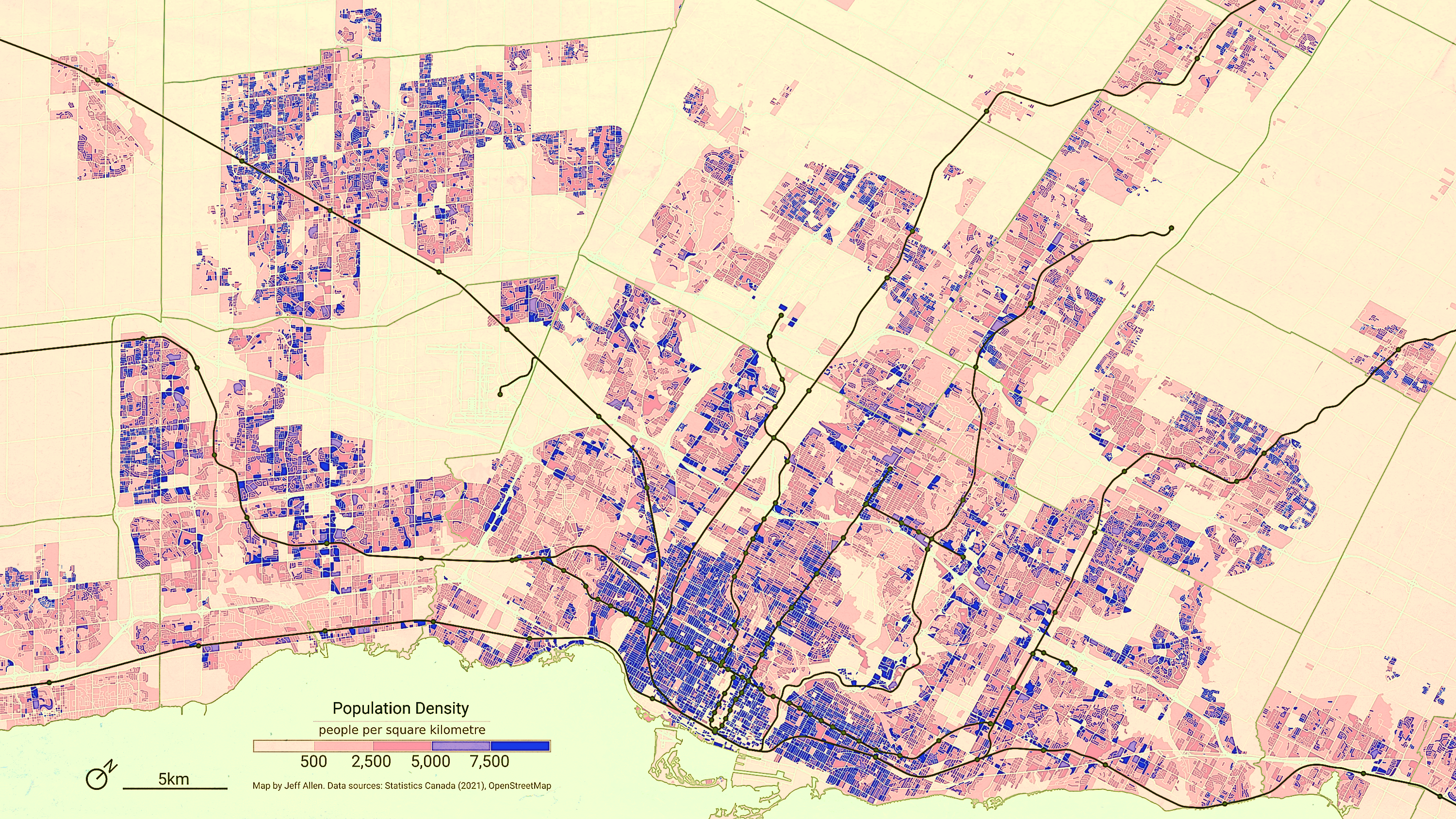
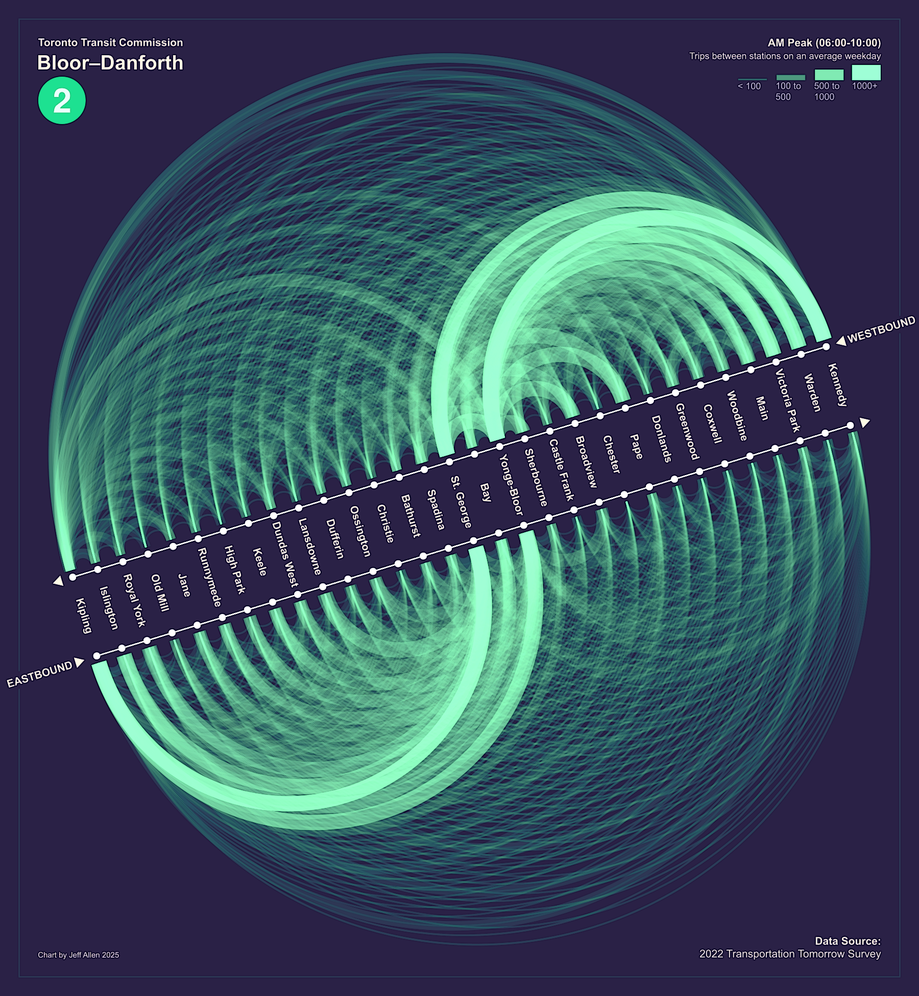
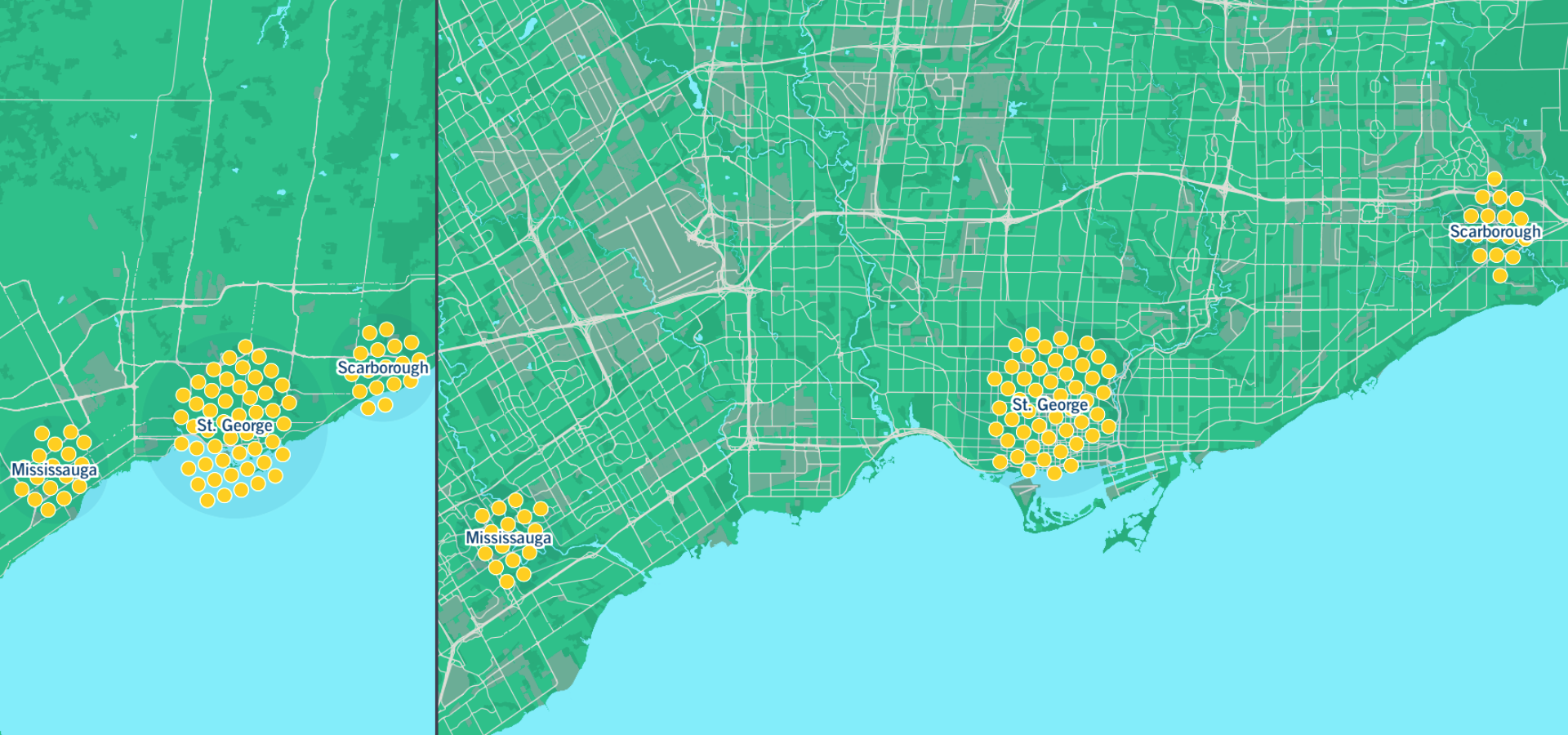
fun map poster of rail transit and population density by Aniket Kali and myself - just showed this at the Canadian Cartographic Association 2025 conference this week
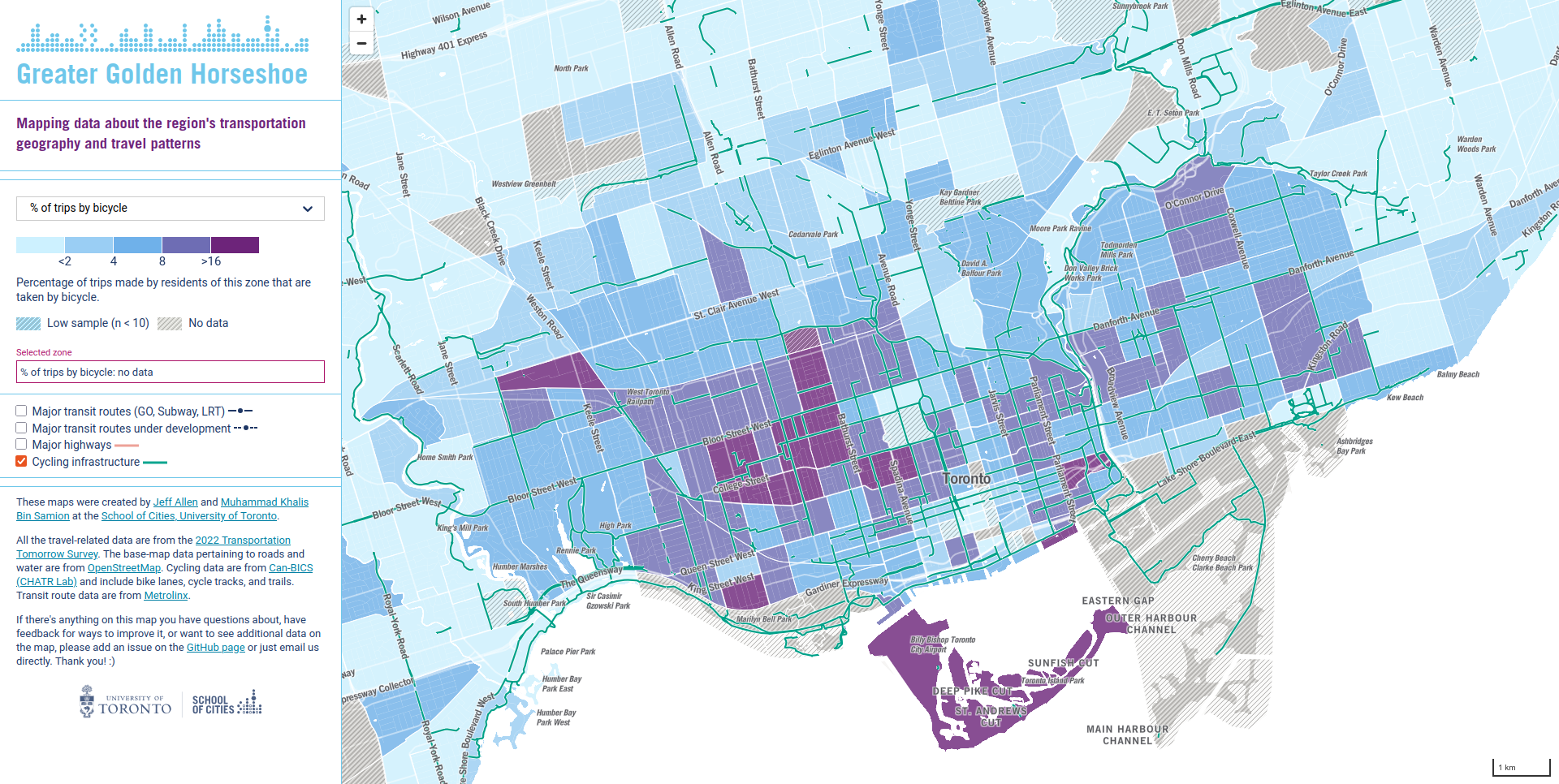
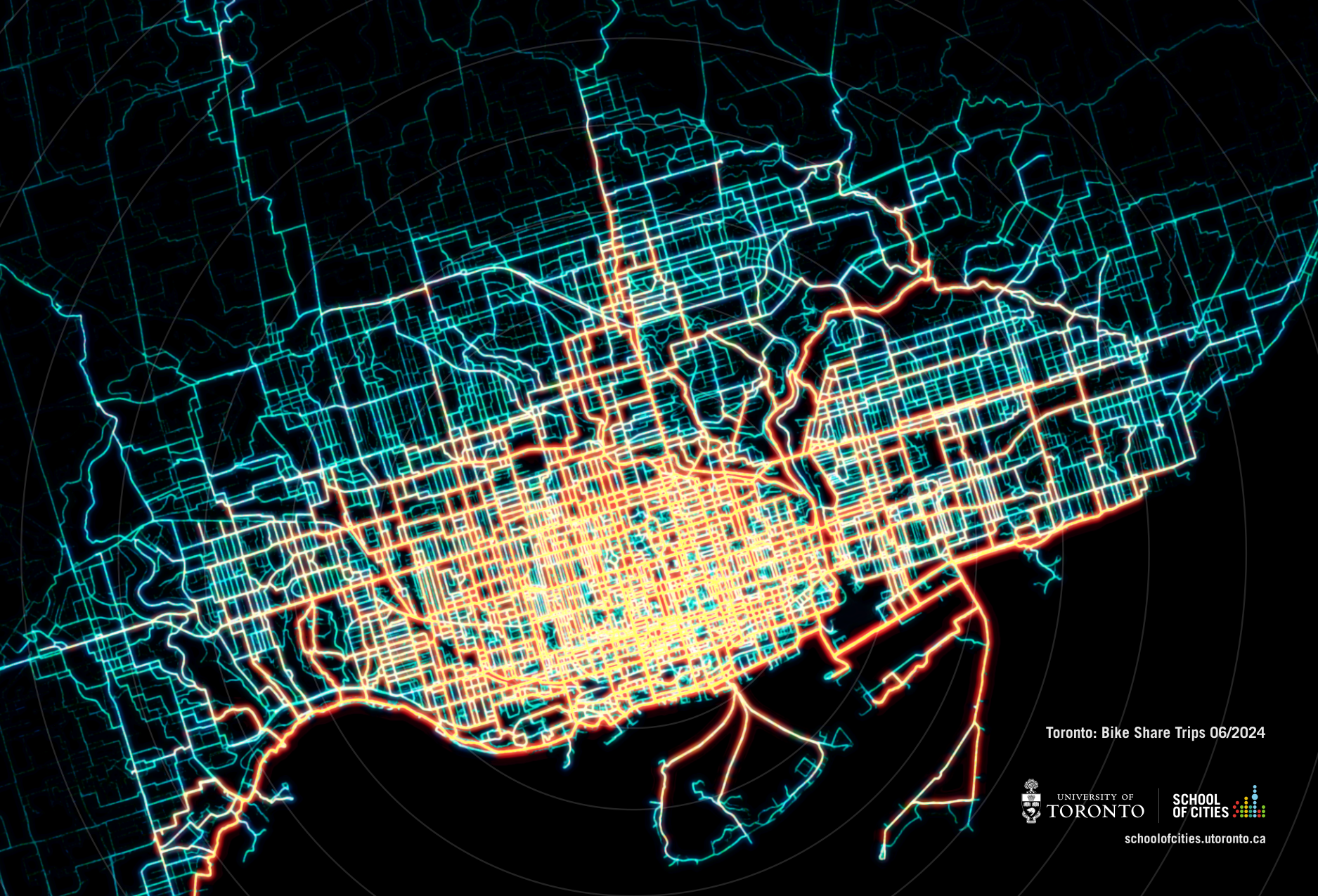
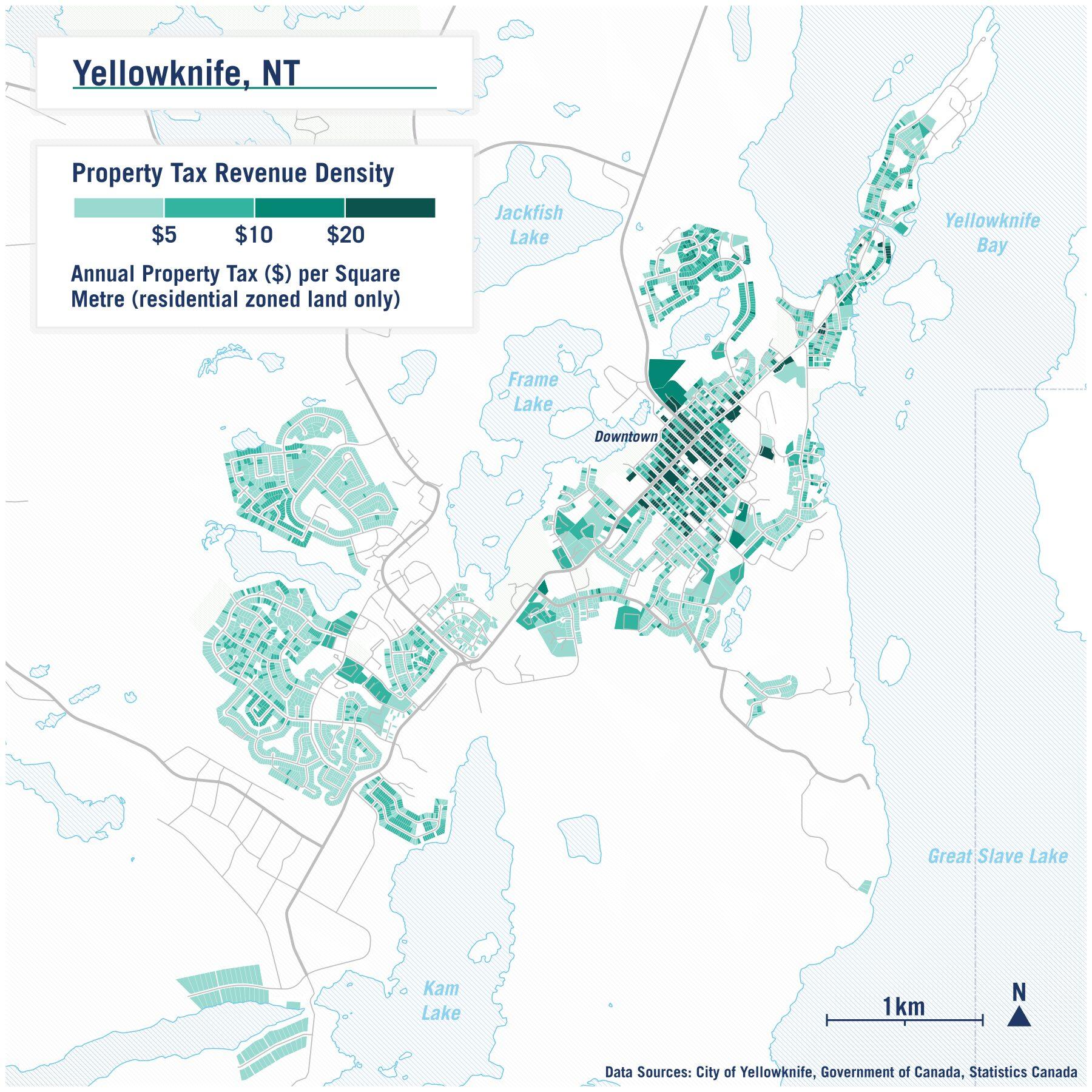
check out more maps here:) schoolofcities.github.io/rail-

#maps #transit #gis #geopandas #inkscape #openstreetmap

poster showing 25 maps, each of a different city, with each showing a 1km grid of population density overlaid by major rail transit routes
2025-04-08

postcard version of our Toronto bike share trip density map

#maps #dataviz #toronto #BikeTooter #biketo

network heat-map showing patterns of where people tend to ride bike share in Toronto
2025-04-07

quick map I made about a year ago of Yellowknife showing property tax revenue density

keep on going back to this one as a way to show benefits of denser/central neighbourhoods

wish we had more openly available property tax data like this across Canada

#maps #gis #qgis #yellowknife #urbanism

Map of Yellowknife coloured by property tax revenue per km2. The map highlights how the central, denser, downtown area has higher revenue / is more productive on a per area basis.
2025-03-26

colour remix of a 2021 population density map of the toronto region made a couple years ago

#toronto #maps #dataviz #inkscape #gimp #qgis

population density choropleth map of the greater toronto area overlaid with major rail lines - data from 2021
2025-03-24

@nex @gvwilson

Yup data are from the Transportation Tomorrow Survey - a self reported survey from 2022/23

The code snippet to create the chart in R is here - github.com/schoolofcities/mini

I essentially created two charts, one for eastbound and one for westbound and then stitched them together in InkScape

Sorry for delay responding - I don't check my account super often

2025-03-24

@deborahh - data are from this 2022/23 survey - dmg.utoronto.ca/tts-introducti

2025-03-19

Recent data doodle - arc diagram of morning peak trip flows on TTC Line 2

#ggplot2 #dataviz #toronto #transit #ttc

Arc diagram of trip flows between stations on Toronto's Line 2 Bloor-Danforth Subway between 6am and 10am for an average weekday in late 2022/early 2023
2025-03-14

playing with dynamically generating bee-swarm plots in maplibre and d3 based on zoom-level

#maplibre #d3 #maps #dataviz #gis

two maps each showing clusters of points (bee-swarms) around three locations in toronto to compare relative amounts - the maps are at different zoom-levels/scales - but the clusters of points (bee-swarms) adjust their location to not overlap and remain distinguishable
2025-03-09

CN Tower casting a morning shadow 1985

Check out more aerial imagery of #toronto on our comparative viewer - schoolofcities.github.io/histo

Aerial imagery showing the CN Tower casting a shadow on surrounding land in 1985. At the time, much of the nearby area were parking lots, warehouses, and rail yards.
2025-03-08

Part of a map I'm creating encompassing the northwestern part Georgian Bay and nearby area (work in progress)

Map of the area around northwestern Georgian Bay including Little Current, Espanola, Killarney, and Point Grondine
2025-03-07

each metro station in taipei has a unique stamp - was super fun to try to collect as many as i could during my visit a few weeks ago

recently made this metro stamp map for the songshan–xindian (green) line commemorating my trip

higher res here: jamaps.github.io/maps/songshan

#taipei #taiwan #transit #maps #inkscape

schematic map of the songshan–xindian line in taipei including unique stamps for each stationtop portion of a schematic map of the songshan–xindian line in taipei including unique stamps for each stationphoto of a stamp at jingmei station in taipei
2025-02-26

recently charted replacement values of infrastructure across Canada

made from statscan data for this report: schoolofcities.utoronto.ca/wp-

#canada #infrastructure #dataviz

tree-map bar chart of the total value ($) of infrastructure assets across canada broken down by type of infrastructure (e.g. roads, transit, water) and condition (e.g. poor, fair, good, etc.)
2025-02-24

playing with some terrain iterations around dehradun today

#qgis #gimp #map #dehradun

map of terrain around dehradun in abstracted colours, dark-ish green-ish for mountains, red-ish for hills, and yellow-ish for flatland
2025-02-18

quick air pollution map of taiwan

#qgis #gis #taiwan

map of taiwan showing PM2.5 air pollution, ranging from blue/low to red/high - the areas of changhua and yunlin have the worst levels of air pollution on the island on average
2025-02-18

quick population density map of taipei city

#qgis #gis #taipei

choropleth map of taipei city highlighting areas of high population density - map also shows rapid transit routes, topography, streets, and water
2025-02-16

overture places data in taipei alongside some topographic data

#qgis #gimp #gis

dot map of overture maps 'places' dataset in Taipei, highlighting areas with high and low density
2025-02-16

overture places data in bengaluru joined to hexagons

#qgis #gimp #gis

blue/turquoise hexagons over a street network in bengaluru - the lighter the hexagons the more 'places', based on overture map data - highlighting areas with high points of interest density

Client Info

Server: https://mastodon.social
Version: 2025.04
Repository: https://github.com/cyevgeniy/lmst