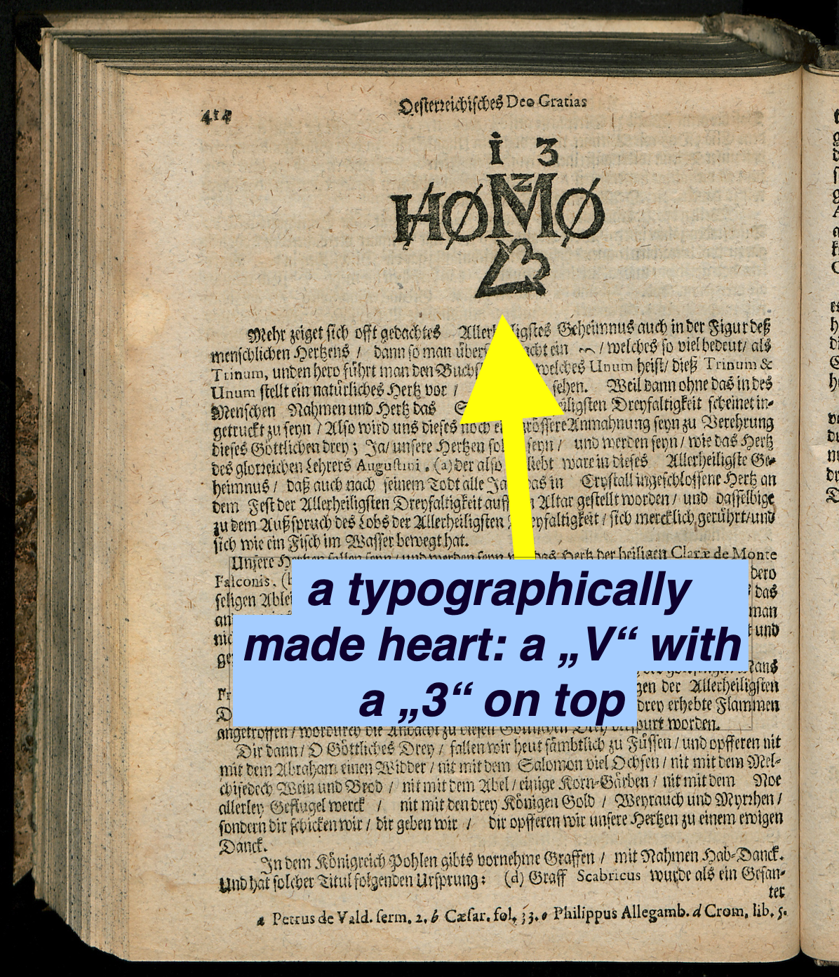
A printed ❤️ symbol from a 1702 text about the Holy Trinity. That's an #earlymodern #emoticon <3
jo lang uste fonts
meandering type design graphic design generative design teaching learning
@letterror @nicksherman this video has some very interesting rgb pixel microscopy: https://www.youtube.com/watch?v=1IrbVvB_lHM
jo lang uste fonts boosted:
pretty epic win that they destroyed the internet and search engines so that you have to use AI instead now and instead of not being able find what you need you have to figure out if what you’re reading is a hallucination while it validates and enables psychosis and narcissism and increases by magnitudes the environmental cost
@fhardwig @MauriceMeilleur @simoncozens @justvanrossum
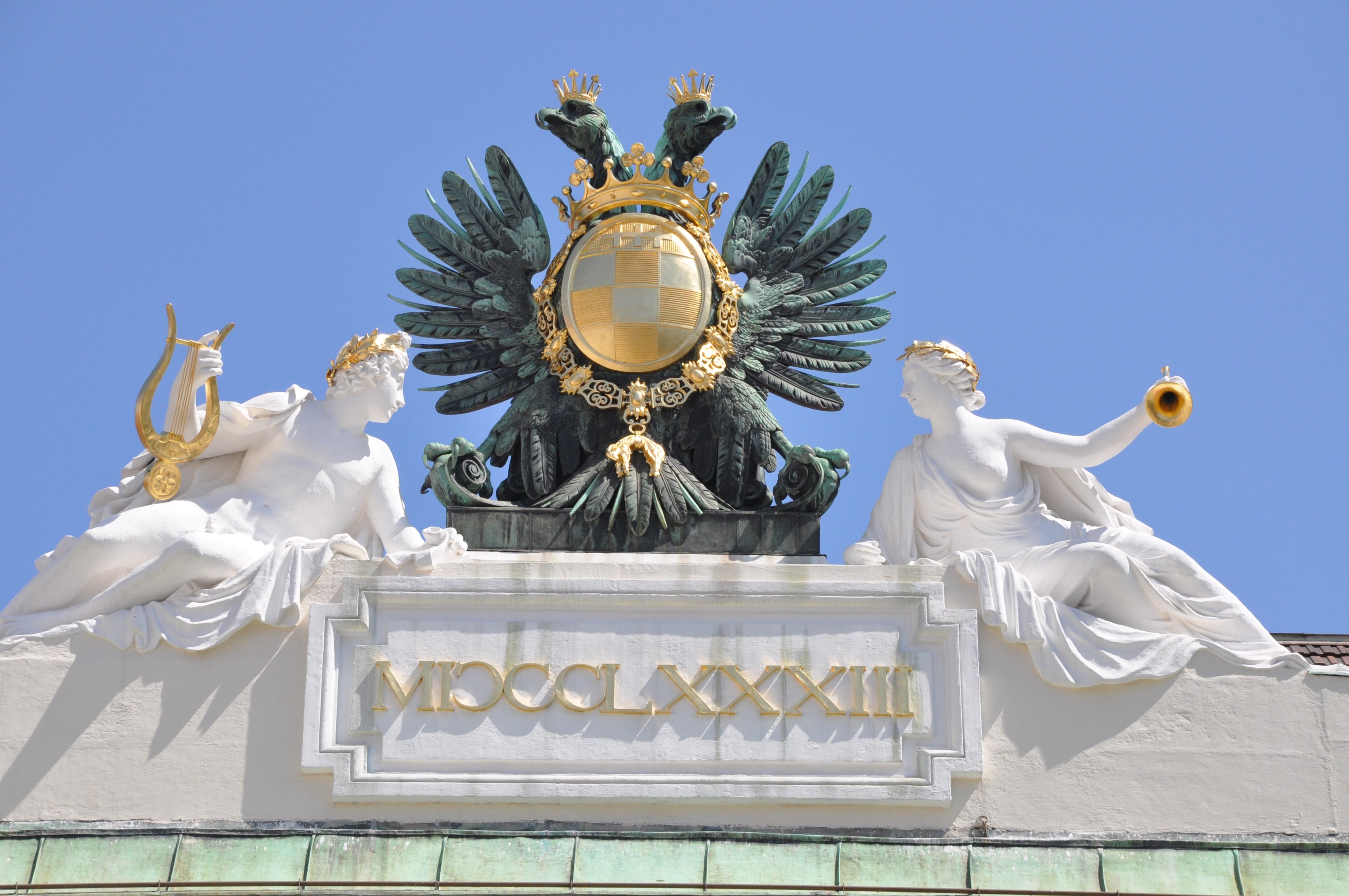
one more from vienna
@letterror probably needs more context but did you try eg ```calc(100% - 2em)```?
jo lang uste fonts boosted:
Yo, people! A new typeface is out on Velvetyne and this one fell into the marmite of bizarre type. Letters is a display typeface by Céline Hurka and Jules Janssen which derives from a historical interest in the depiction of paper within the realm of printed matter, such as teared ribbons and ornamental backgrounds. Go to https://velvetyne.fr/fonts/letters/ to get it now! #typeface #font #opensource #letters #bizarre #experimental #typography #libre

jo lang uste fonts boosted:
I'm sorry but requiring me to ask permission before entering Nick Cleggs house, going into his fridge and making a Scooby Doo-style sandwich then leaving with all of his valuables and his wife would 'kill' my desire to eat a Scooby Doo-style sandwich from the contents of Nick Cleggs fridge and run away with his wife
@the_salmone @ANRT kind of. afaik it uses the svg table to include the open paths.
jo lang uste fonts boosted:
Azimut is a series of three interrelated fonts designed as part of the city of Strasbourg’s term as UNESCO World Book Capital in 2024. The typeface is the work of three fabulous designers: Benjamin Blaess, Mathieu Réguer and Julien Priez.
The fonts are available for free download and it was very pleased to be asked me to write an accompanying text. Check the whole project out here!
@the_salmone maybe check the talk by François Chastanet at this years automatic-type conference at @ANRT
https://vimeo.com/1061511522
jo lang uste fonts boosted:
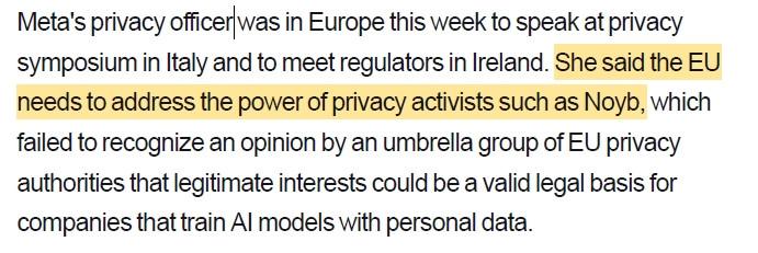
You just know you're doing something right when #Meta 's data protection officer talks about your ‘power’ and how she wants the #EU to ban you from doing your work.🤡
Want to help us become even more ‘powerful‘? Click here to find out how: https://noyb.eu/en/support-us
Original Art: https://www.pixiv.net/en/artworks/55975367

jo lang uste fonts boosted:
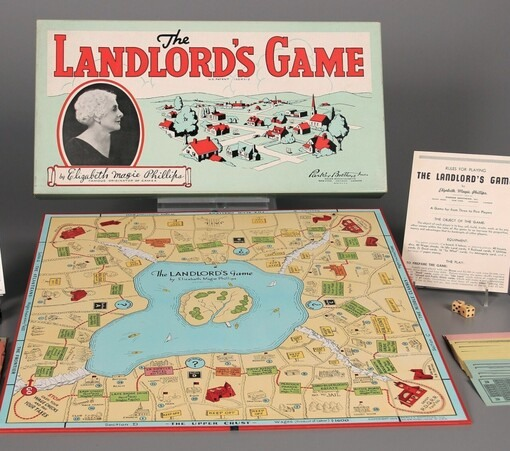
Monopoly wasn't invented by the Parker Brothers, nor the man they gave it credit for. In 1904, Monopoly was originally called The Landlord's Game, and was invented by a radical woman. Elizabeth Magie's original game had not one, but two sets of rules to choose from.
One was called "Prosperity", where every player won money anytime another gained a property. And the game was won by everyone playing only when the person with the least doubled their resources. A game of collaboration and social good.
The second set of rules was called "Monopoly", where players succeeded by taking properties and rent from those with less luck rolling the dice. The winner was the person who used their power to eliminate everyone else.
Magie's mission was to teach us how different we feel when playing Prosperity vs Monopoly, hoping that it would one day change national policies.
When the Parker Bros adopted the game, they erased the "Prosperity" rules and celebrated "Monopoly".
jo lang uste fonts boosted:
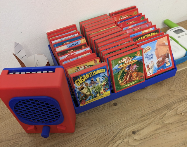
Here is the humongous blog post describing how Boxie, the always offline audio player for my 3 year old was built. Includes files and instructions so you can build your own (if you are brave).
@e_kloczko maybe Quark does not support the rlig.
is there a script / language info in the feature code? maybe Quark expects that info?
```
languagesystem DFLT dflt;
feature rlig {
script DFLT;
language dflt;
sub l a by l_a.rlig;
} rlig;
```
jo lang uste fonts boosted:
FontGoggles 1.8.6 is out:
- https://github.com/justvanrossum/fontgoggles/releases
Highlights:
- Updated language, script and feature tags to OpenType 1.9.1. Thank you Denis Moyogo Jacquerye.
- Updated uharfbuzz to 0.49.0 and HarfBuzz to 11.0.1. This reinstates support for the experimental VARC table, which accidentally got broken.
- Made the core FontGoggles non-UI library code usable on platforms other than macOS. Contributed by Rob Stenson.
@e_kloczko @TiroTypeworks
a small addition, in case you do not have this information yet. you can add some text that might be read by some application so the feature name does not show as 'Stylistic Set 01':
feature ss01 {
featureNames {
name 1 "Historic alternates";
name 3 "Historic alternates";
};
sub m m by m_m.hist;
} ss01;
@e_kloczko is fontlab building the features automatically?
the suffix of the glyph is somewhat independent of the feature name but using the same can be helpful.
thanks for the clarification. i haven’t read Tolkien (shame on me) but a 'hist' feature sounds like it would be appropriate. but as far as I know inDesign does not support that feature so reverting to a stylistic set (as you do) seem the best option.
TextEdit on mac OS does support the feature.
@jenskutilek @e_kloczko if there is some context on when and where one or the other should be used you could also put them in the same feature.
feature liga {
sub m' m' e by m_m.alt;
sub m m by m_m;
}
liga;
This would replace every 'm m' followed by an 'e' with the m_m.alt glyph. Other 'm m' would be replaced with the 'm_m' glyph.
jo lang uste fonts boosted:
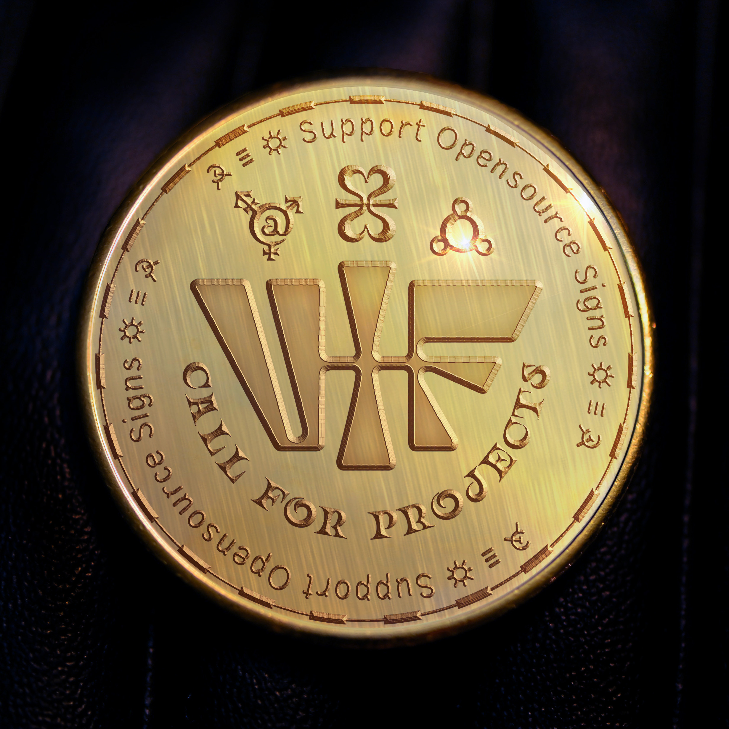
We’re launching our first ever call for projects: Support Opensource Signs!
Submit your idea of a typographical project before the 15th of May and get the chance to have it released on Velvetyne and receive support from our team and a tuition of 1800€.
We're looking for weird ideas, under-represented scripts, commercially non-viable projects, projects at the meeting point between language and type design…
Details: https://velvetyne.fr/news/support-opensource-signs-1/
Please share to your networks.
Client Info
Server: https://mastodon.social
Version: 2025.04
Repository: https://github.com/cyevgeniy/lmst