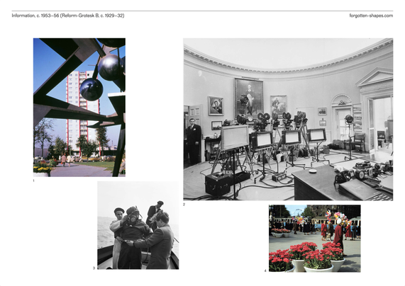
@db Thank you for mentioning the release of “Reform-Grotesk” and “Information”.
professor for type design @ design department HAW Hamburg
research + design
Pierre Pané-Farré (@panefarre)’s research into the development of Reform-Grotesk and its later revision Information, to complement the release of the Forgotten Shapes revivals:
https://forgotten-shapes.com/information?article=reform-grotesk-and-information-2
Has this been shared on here before? 🤩
A virtual Noordzij Cube https://haw-type-design.github.io/noordzij-cube/
By @panefarre & @simonthiefes
@eWalthert @simonthiefes @justvanrossum Thanks! No, we haven’t shared this project to the broad public yet, as for now, it was more a early concept to make the cube more accessible or alternatively accessible to our type design students here at the HAW Hamburg. I am thankful, that Simon helped to get the idea into shape!
@nicksherman @simonthiefes
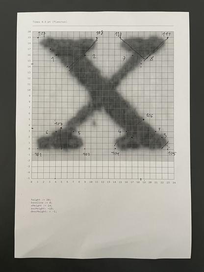
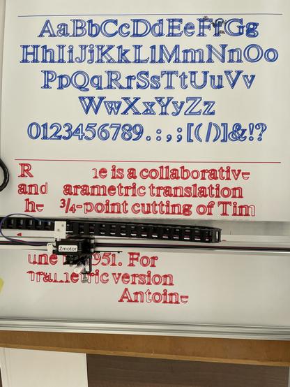
Actually yes! Thank you for this. Would have gotten intouch with you anyhow, as the project isn’t done yet. Your scans were helpful, as I wanted to pick an ubiquitous design to reinterpret with my students. Its formal exaggeration to make it workable in small sizes makes it for me also interesting to use in large poster typesetting, which will follow. I will keep you updated. Here some early plotting in c. 4.75 pt.
Yesterday, we collectively drew letters using metapost in in the browser-based plancton editor. The template is based on a version of Times originally drawn for 4.75pt.
The students had great fun.
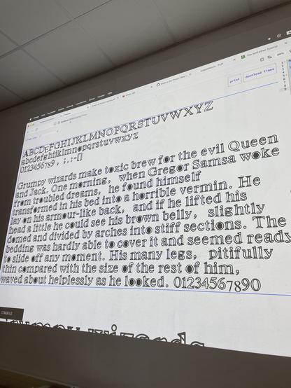
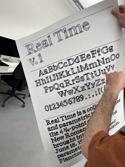
@panefarre named the font »Real Time«.
Staff pick:
LB Plantes was set up to participate in responsible and sustainable #viticulture and #agriculture. For the visual identity, Toulouse-based studio Huz & Bosshard used different weights and widths of the Klub typeface family designed by @panefarre:
https://fontsinuse.com/uses/54192/lb-plantes
And the recently issued Octagon Variable, which plays with dimension and perspective. https://fontsinuse.com/typefaces/217716/octagon-variable
Octagon Variable, very nice project at the HAW/Finkenau in Hamburg as part of the first year type design introduction class under the guidance of @panefarre and @simonthiefes
https://github.com/haw-type-design/octagon-variable
