Can you spot a problem? #typography (Related: It's sad how any logo related web search is over-run by spammy low quality garbage sites)
#Typography


SUNDAY SONGS • Ik verbaas me altijd over ziekenhuismensen. Niet het personeel maar de ogenschijnlijke figuranten in het ziektecircus. De bezoekers. Of wie het ook allemaal zijn. Veel corduroy, shawls (nee, geen sjaals), moeilijk edoch gezond schoeisel, akela’s, zij met een diepe liefde voor algehele sexloosheid, ouderen met adertjes in het gezicht, mager, kromme ruggetjes, sabbelend aan rietjes in lauwe smoothies, handbalvrouwen, grijzende vaders met iets te strakke jassen voor hun buikjes, treurende hangborsten in wikkelvestjes, moeders die op zonen zitten, dochters die op de telefoon zitten… het is me wat. Alle prikkels.
Wat doén al die mensen daar?
Tjokvolle parkeerplaats, vieze automatenkoffie, te lang warmgehouden panini’s met teveel rode ui en te weinig opgedroogde mozzarella (at ik), baliemedewerkers die geen flikker te doen hebben en betaald lijken te worden voor ‘er zijn’, toiletten met kranen, die je heel hygiënisch verantwoord met je elleboog kan bedienen. Zeep die naast je handen drupt. Schuifelend ongemak. Prullenbak. Kimberley Clark. Wie ís Kimberley Clark eigenlijk?
En waarom hebben alle apotheken zoveel ladenkastjes en hoe kan het dat alles altijd maar op voorraad is? Met die keurige etiketjes. Brillendames die van appels houden, met gebruiksadviezen die ik meteen weer vergeet.
Het is een jungle.
En waar zijn de verwijderde keel- en neusamandelen van mijn poppes nu gebleven? En waarom zoveel pijn voor mijn meis nog steeds, dagenlang.
.
Vandaag een aardig oudje: ‘All My Little Words’ van The Magnetic Fields. Het vijfde nummer in de playlist, je vindt ‘m inmiddels op Tidal. Tidal? Ja, stap ook maar over. Meer geld voor de artiesten, geen sponsoring van Trumps inauguratie, goedkoper family-abo…
.
4/52
.
[techniek: inkt, acrylverf, houtskool, pen, lijm en wederom een stukje Zweedse papierschat op een 21 × 29,7 cm karton / ik beloof plechtig ooit een ander kleurpalet te gebruiken ;-)]
.
#52sundaysoflettering
#sundaysongs
#typography
#mixedmedia
#themag

Try text scaling support in Chrome Canary - Josh Tumath
🔖 https://www.joshtumath.uk/posts/2026-01-27-try-text-scaling-support-in-chrome-canary/
🔗 https://ellyloel.com/try-text-scaling-support-in-chrome-canary-josh-tumath/
#Bookmarks #Accessibility #Mobile #Typography #WebStandards #Browsers
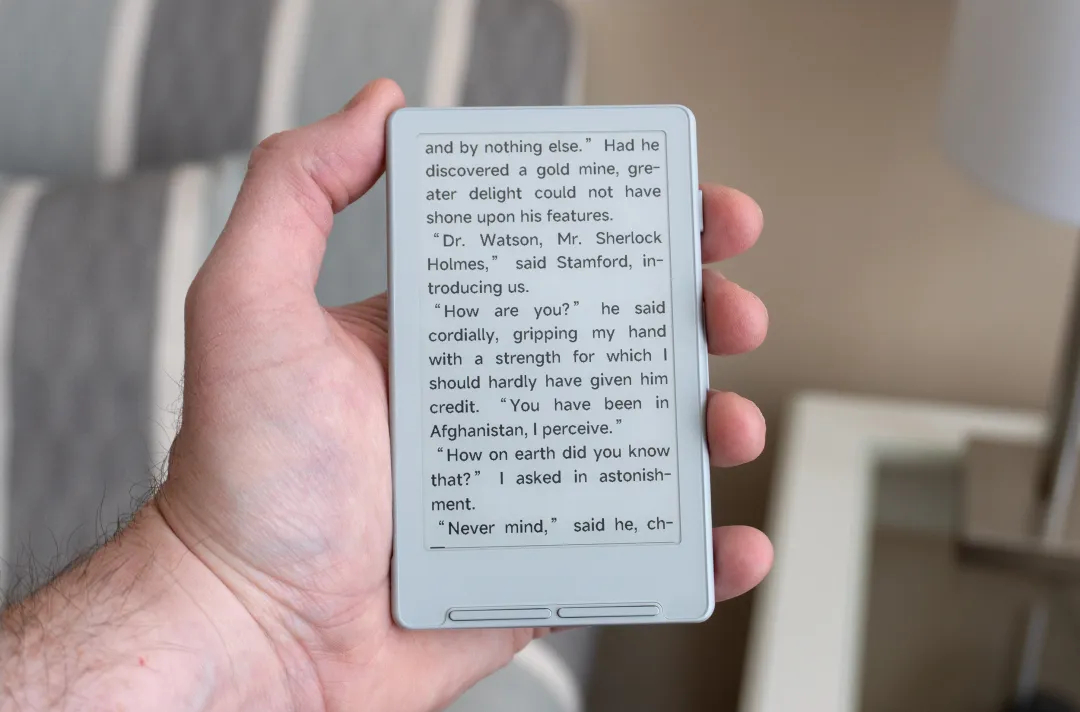
The #typography is the standard Terrible, unfortunately.
Why is it that makers of these devices, unlike,say, print publishers historically (less so today) cannot consult experts on typography? This has been a big issue from the first ebook readers. &"reading modes" in browsers have the same issues.
RE: https://bsky.app/profile/did:plc:7exlcsle4mjfhu3wnhcgizz6/post/3mdsps7gqoa2l
A Nike-Inspired Typography Study by Beka Bekaia https://theinspirationgrid.com/a-nike-inspired-typography-study-by-beka-bekaia/ #typography #GraphicDesign #DesignInspiration #DesignInspo #inspiration #InspirationGrid


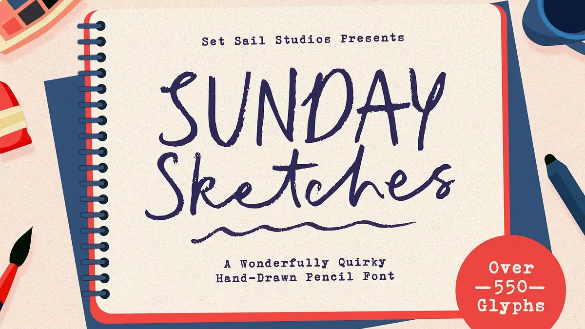
Sunday Sketches Font by Sam Parrett of Set Sail Studios
Design flourishes when it embraces imperfection. The Sunday Sketches font by Sam Parrett of Set Sail Studios captures this exact sentiment. Digital design often feels too sterile. Consequently, creatives seek tools that inject humanity back into their work. This handwritten typeface offers precisely that necessary warmth. It utilizes real pencil textures. Therefore, it bridges the gap between analog art and digital convenience. We must examine why the typeface became so trending in the genre of quirk, fun, handwritten typefaces.
You can purchase the typeface from:
Set Sail Studios Creative MarketWhat Distinguishes the Sunday Sketches Font from Standard Script Typefaces?
Most digital scripts suffer from “repetition fatigue.” This phenomenon occurs when identical characters appear side-by-side. It destroys the illusion of handwriting. However, the Sunday Sketches font solves this through a method I call the Glyphic Variation Velocity. This framework ensures that no two words look exactly alike. Sam Parrett designed this system intentionally.
He included over 550 glyphs in a single file. You receive multiple variations of each letter. Therefore, the text maintains a realistic, rough texture. The human nature of this font shines through every imperfect stroke. It feels organic. Designers rarely find such depth in a single package. The typeface surpasses most expectations for handwritten typography.
The Sunday Sketches Font by Sam Parrett of Set Sail Studios is a Handwritten TypefaceYou can purchase the typeface from:
Set Sail Studios Creative MarketUnderstanding the Numeric Alternate System
Complexity often hinders creativity. Yet, Set Sail Studios prioritized usability here. They implemented a “Numeric Alternate System.” You simply turn on Standard Ligatures. Then, you type a number after a letter. For instance, typing ‘a1’, ‘a2’, or ‘a3’ generates distinct variations. This feature allows for rapid customization.
Consequently, you control the flow of the text. You choose the specific look of every character. This interaction makes the Sunday Sketches font a dynamic design tool. It is not merely a static asset. It functions as a creative partner.
The Importance of Organic Letter Connection
Flow determines readability. Handwritten fonts frequently fail here. They often look disjointed. In contrast, the Sunday Sketches font excels at Organic Letter Connection. This thesis suggests that letters should bleed into one another naturally. Parrett achieved this by hand-drawing the source material.
He used real pencils on paper. The software captures the grain and the pressure. Thus, the connections feel authentic. You do not see the digital seams. This quality makes this handwritten typeface ideal for large headers and brand identities.
How Does the Bonus Doodles Feature Enhance Visual Storytelling?
Typography tells only half the story. Visual elements must support the narrative. Fortunately, the Sunday Sketches font includes a massive bonus. This is the ‘Sunday Sketches Extras’ font file. It contains 52 unique doodle characters. You access these by selecting the separate font and typing letters A-Z.
These doodles include underlines, stars, hearts, arrows, and frames. Therefore, you build a cohesive visual language. You do not need to search for matching vector icons. They already exist within the font family. This integration saves time. Furthermore, it ensures stylistic consistency across your project.
Technical Accessibility and PUA Encoding
Professional designers require flexibility. Software limitations should not hinder access. The Sunday Sketches font is fully PUA encoded. This stands for Private Use Area. It means you can access all characters via the Glyphs panel.
However, non-designers benefit too. You can paste letters from Font Book on Mac or Character Map on Windows. It works in non-compatible software. Therefore, this handwritten typeface remains accessible to everyone. You do not need Adobe Creative Cloud to use it effectively.
Assessing the Global Reach through Language Support
Modern branding is global. A font must speak many languages. The Sunday Sketches font supports a vast array of European languages. It covers English, French, German, Spanish, and Portuguese. Furthermore, it supports distinctive alphabets like formatting in Czech, Polish, and Turkish.
This wide support creates value for international agencies. You can use this handwritten typeface for a campaign in London and adapt it for Berlin. The consistency remains. This versatility justifies the investment.
Why Should Designers Prioritize the Sunday Sketches Font for Future Projects?
We currently witness a shift in design trends. I define this as the “Tactile Digital Renaissance.” Audiences crave texture. They reject flat, corporate minimalism. The Sunday Sketches font perfectly aligns with this movement. It offers high-resolution detail.
The realistic rough texture catches the eye. It stops the scroll on social media. Moreover, the quirky nature of this font conveys authenticity. Brands use it to sound human. They use it to sound approachable. Therefore, using the typeface is a strategic branding decision.
Mastering the Art of Imperfect Consistency
Perfection is boring. Character comes from quirks. This font provides “Imperfect Consistency.” The strokes wobble slightly. The baseline shifts. However, the legibility remains high. This balance is rare.
Sam Parrett mastered this equilibrium. He ensured the font looks fun yet professional. Consequently, you can use it for merchandise. You can use it for book covers. The Sunday Sketches font adapts to the context. It always adds charm without sacrificing clarity.
Final Thoughts on Set Sail Studios’ Contribution
Sam Parrett continues to innovate. His work at Set Sail Studios sets a high bar. The handwritten typeface exemplifies his dedication to quality. He engages with his community. He encourages users to connect on Instagram. This personal touch matters.
You can purchase the typeface from:
Set Sail Studios Creative MarketIt mirrors the font’s aesthetic. Both are accessible and genuine. Designers looking for inspiration should analyze this typeface. It teaches us that digital tools can still possess a soul. The Sunday Sketches font is not just a download. It is a lesson in authentic digital art.
Frequently Asked Questions (FAQ)
What is the Sunday Sketches font?
The Sunday Sketches font is a quirky, hand-drawn typeface created by Sam Parrett of Set Sail Studios. It features a realistic pencil texture and includes over 550 glyphs, ensuring a natural, handwritten look for digital designs.
How do I access alternate characters in the Sunday Sketches font?
You access alternates by enabling Standard Ligatures in your software. Then, simply type a number (1, 2, or 3) after a letter. For example, typing ‘a1’ changes the character to a different variation.
Does the Sunday Sketches font include graphic extras?
Yes, the font comes with a ‘Sunday Sketches Extras’ file. This bonus doodle font allows you to type letters to generate 52 different sketches, including hearts, arrows, and stars.
Is the Sunday Sketches font compatible with standard software?
Yes, the font is PUA encoded. This means you can copy and paste special characters from your system’s character map into any software, even if it lacks a Glyphs panel.
What languages does the Sunday Sketches font support?
The font supports a wide range of languages, including English, French, German, Spanish, Italian, Portuguese, Swedish, Norwegian, Danish, Dutch, Finnish, and many Eastern European languages like Polish and Czech.
Check out other popular typefaces in the Fonts category here at WE AND THE COLOR, or take a look at our selection of the 100 hottest typefaces for graphic designers in 2026.
Subscribe to our newsletter!
[newsletter_form type=”minimal”]#font #fonts #handmade #handwritten #handwrittenFont #SamParrett #SetSailStudios #SundaySketches #typeface #Typography


In letters of fire
#typography
RE: https://bsky.app/profile/did:plc:qrcrc4zkaavwzwdlpj35ufwm/post/3mdqggxbksk25

#graphisme #graphism #typographie #typography
Réception de la Nouvelle Typographie dans les scènes graphiques francophones : rejets, adoptions, renégociations (1925–1979)
Symposium, 12-14 février 2026
Auditorium de la Cité internationale des Arts
18, Rue de l’Hôtel de Ville
75004

Archives are such a labor of love. Some great visual inspiration here… #graphicdesign #typography
https://kottke.org/26/01/0048257-a-huge-collection-of-grap

As someone who does occasionally have to submit things in the “you must use $SHITTY_DEFAULT_WINDOWS_FONT” format, I do appreciate a good cleaned-up look-alike. So here’s .
If Cortina isn’t a font name it should be.

Wallace and Gromit Font
@mxk @vicgrinberg knowing kerning can be hard on the senses
Sketchbook Poster: Hypochondriac (album) by Brakence
—-
Pleasantly surprised by this record, super chaotic and heartfelt. Love the percussion and abrupt theme changes throughout.
18” x 24” Poster
—-
#brakence #hyperpop #graphicdesign #posterart #typography
—-
Pleasantly surprised by this record, super chaotic and heartfelt. Love the percussion and abrupt theme changes throughout.
18” x 24” Poster
—-
#brakence #hyperpop #graphicdesign #posterart #typography


At Silphium Design, we believe typography should breathe. Our latest exploration of biophilic typography shows how the fluidity of the natural world meets the precision of digital type. By integrating organic rhythms into letterforms, we create a more soothing and resonant user experience. Discover how to bridge the gap between human language and biological forms. Let's make the web a bit more natural together.
https://silphiumdesign.com/natural-design-biophilic-typography-insp-nature/

🟡 The Weekly Typographic
Absurd, Tasty, and Origami 🦢
by #MicahRich & The League Of Moveable Type
Variant
Dubai, UAE / Monotype
Cassis / Printmag
Absurd in Design / Uxdesign
Dpark’s Origami Archive

The other day I went to the Library to read this book:
Modern Optical Experiments in Typography: Univers Ultra Light Oblique (1968)
Tim Lee & Mark Soo
I am now fully prepared to design my own font.

Client Info
Server: https://mastodon.social
Version: 2025.07
Repository: https://github.com/cyevgeniy/lmst