Had you asked me yesterday
I would have told you
that I was worried
this summer would be defined
by cases of razor blade throat
and boots stomping on faces,
but if you ask me now
I must tell you
that I am worried
this summer will be defined
by something even worse.
Simon Cozens
Simon Cozens boosted:
@poem_editions This is the way.
Simon Cozens boosted:
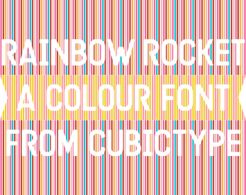
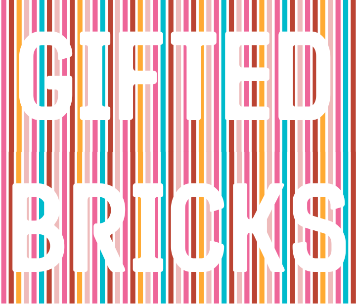
Rainbow Rocket is here! A self-striping colour font family with 21 colour styles, some for free, some paid for. Shapes based on Arugula (an earlier font of mine that also means "rocket"); colours based on a variety of mostly found things.
Here i show examples from my Garden, gifted toys, and a font specimen i found at the Letterform Archive.
Share and Enjoy! (please boost)
https://drj11.itch.io/rainbow-rocket-font
#itchio #font #RainbowRocket #CubicType #ad


Simon Cozens boosted:
NEW
A postcard from a spectator of a constitutional crisis
How things look in June 2025
By me
Substack: https://emptycity.substack.com/p/a-postcard-from-a-spectator-of-a
Personal blog: https://davidallengreen.com/2025/06/a-postcard-from-a-spectator-of-a-constitutional-crisis/
@traecer No, no, I've been assured multiple times that the Founding Fathers were Super Geniuses who expected presidents to be bad actors and so built in multiple layers of defence against abuse. Have faith in the holy text.
@tphinney For showing off display capabilities of VG,I'd suggest Tilt and my own Sixtyfour Convergence. Otherwise have a look down https://v-fonts.com/
Man, so glad the US constitution has all them protections against tyranny.
@ohbendy I'm sure we've used this trick in the Myanmar shaper before. Have you tried it in https://github.com/miloush/dwbox ? The right repo would be https://github.com/MicrosoftDocs/typography-issues but I think more investigation is needed first. Maybe a dummy font which just has "sub Someglyph by NULL;" in a stylistic set to test whether or not it's applying.
@ohbendy Odd. It was added to Harfbuzz because Windows/Word does support it and it was needed for Arial Unicode MS! https://bugzilla.mozilla.org/show_bug.cgi?id=1128658
Simon Cozens boosted:
🚀 Big news! 🚀
I'm launching the type foundry ⋆˙⟡ 𝖕𝖑𝖔𝖒𝖇 𝖙𝖞𝖕𝖊 ⟡˙⋆ — with my talented partner in design, Max Esnée.
https://www.plombtype.com/savate/
Together, we’re crafting a variety of typefaces with distinct voices, and also enjoy working closely with clients on custom designs.
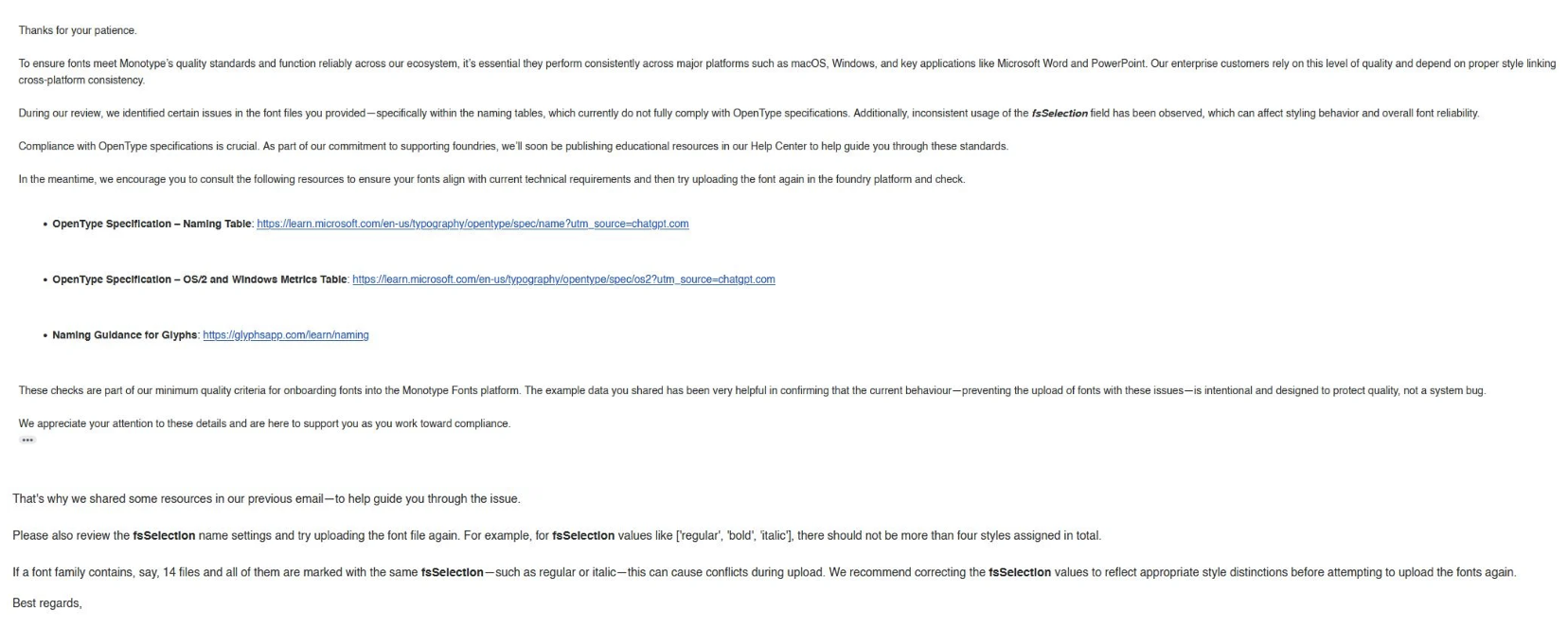
I know, I *know* it's a trivial thing but I cannot get over how Monotype are apparently using ChatGPT to respond to technical foundry questions.
Round the decay of that colossal wreck, boundless and bare, the lone and level sands stretch far away.
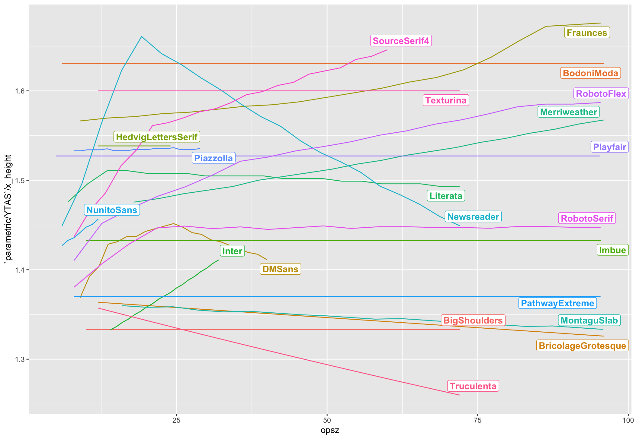
@kentlew I measured descender as bottom of p and ascender as top of h in the graphs in my blog post, but in the graph I showed above in the thread, I divided that value by the top of x to give a proportion (see the Y-axis label). I feel that most fonts surveyed actually kept that extender-to-x-height proportion constant across the opsz range.
@n8 In terms of revealing capabilities and equipping people, I came across https://diataxis.fr/ recently which seems like a very sensible approach to organising documentation. Sharing in case you hadn't already seen it.
@justvanrossum @TiroTypeworks @kentlew "Do *something* to justify my quotation for drawing additional masters." 😉
@kentlew I think this is the main problem. There's optical size as in "make this look better at small sizes" and optical size as in "make this look fancy at big sizes" and they're two different techniques which happen to share a name.
@kentlew Bottom of the p is exactly how I measured it.
Simon Cozens boosted:
Dear USA
Deploying troops against civilians will not go well.
Yours
Great Britain and Northern Ireland
Client Info
Server: https://mastodon.social
Version: 2025.04
Repository: https://github.com/cyevgeniy/lmst