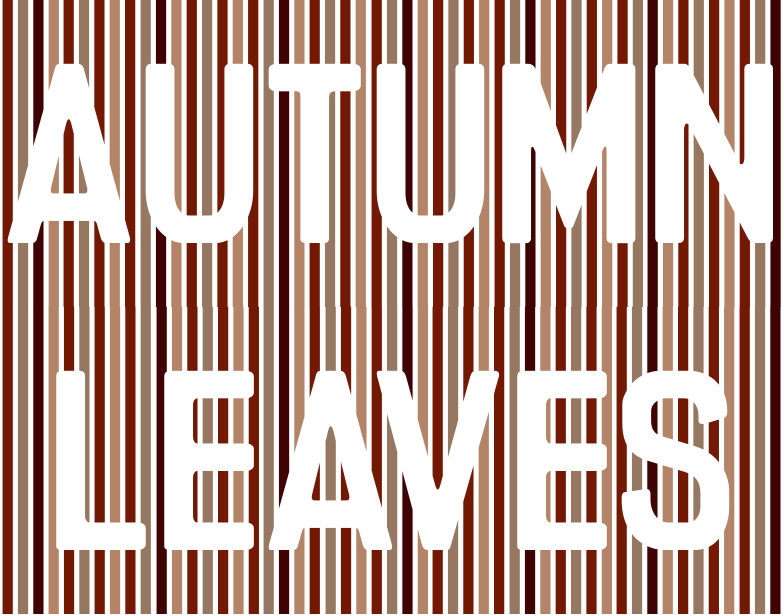
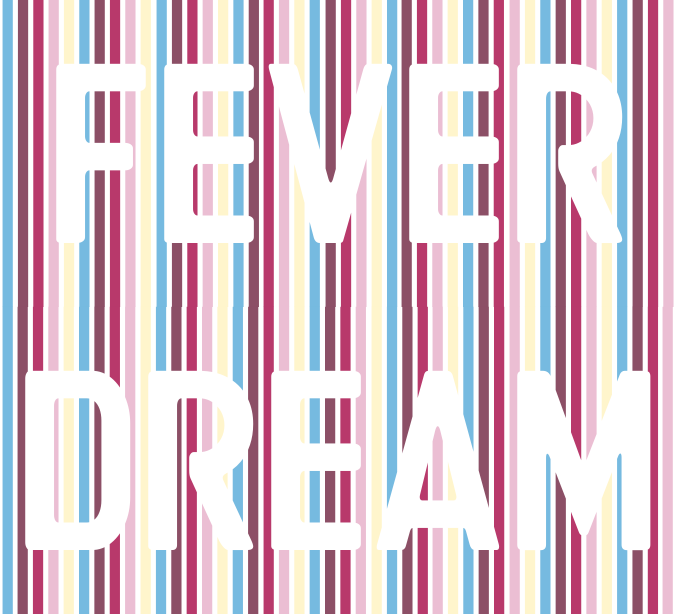
all the glyphs have widths that are multiples of a stripe, and as you can see (up toot) there are 6 extra stripes required in the 2nd row to fill the gap. I designed in the font for U+200A HAIR SPACE, U+2009 THIN SPACE, U+2008 PUNCTUATION SPACE to be 1-,2-,3-stripes wide. They can be used to center the text. With a U+2008 on each side (1st image).
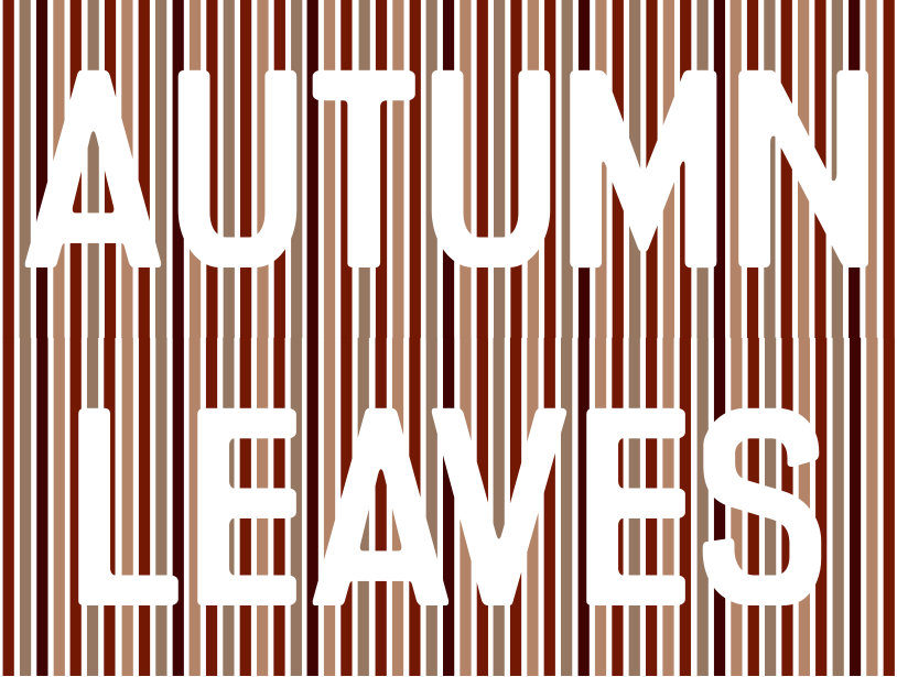
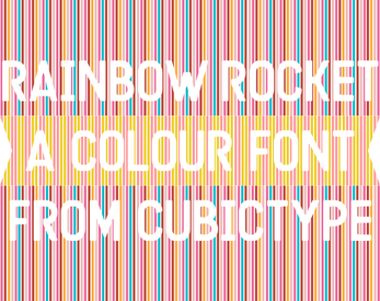
For social media posts, it's a bit tight, and needs a bit of extra padding. So i add another U+200A either side.