#chartsinthewild

Helena Klara Jamborhelenajambor
2023-11-25

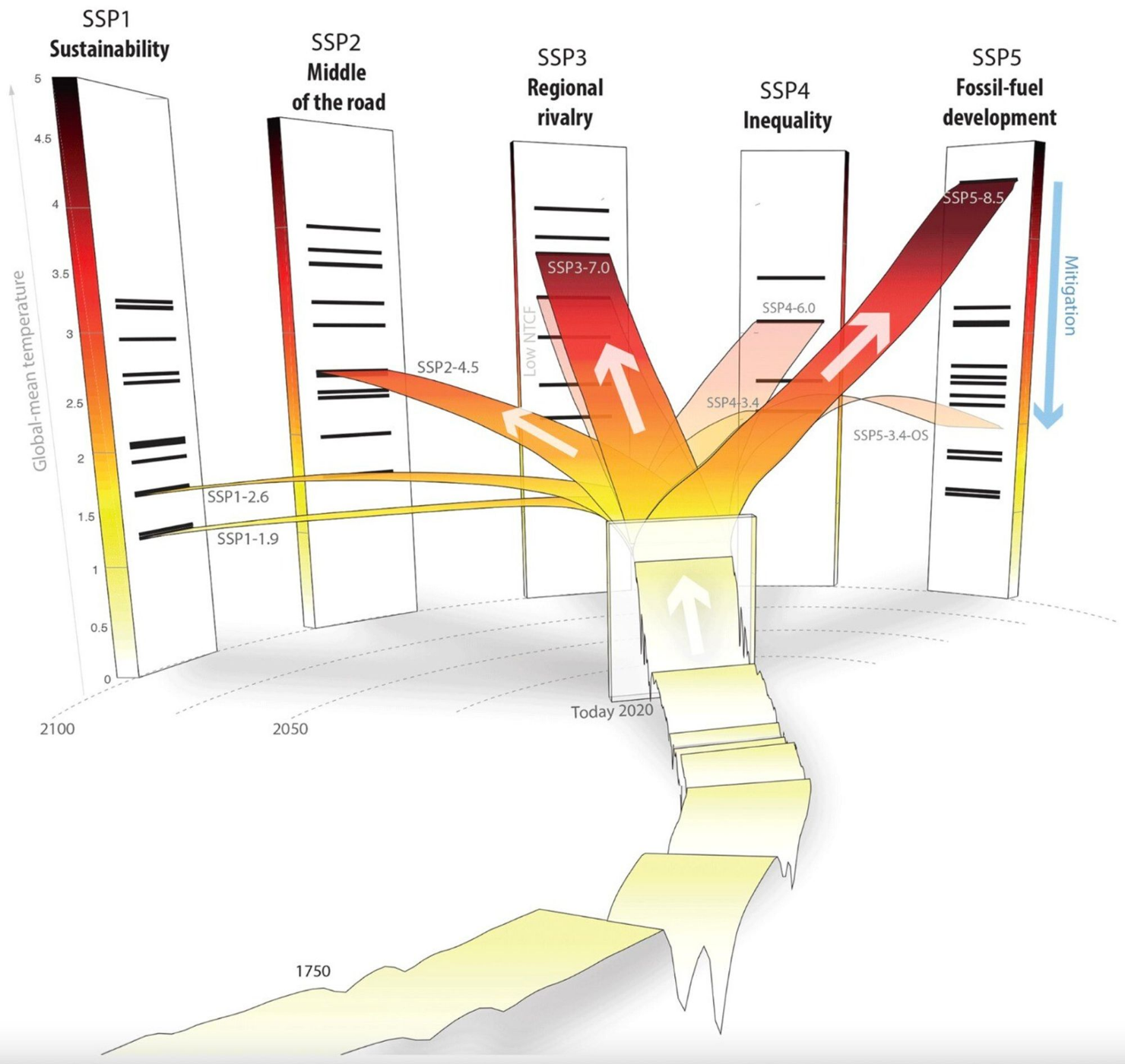
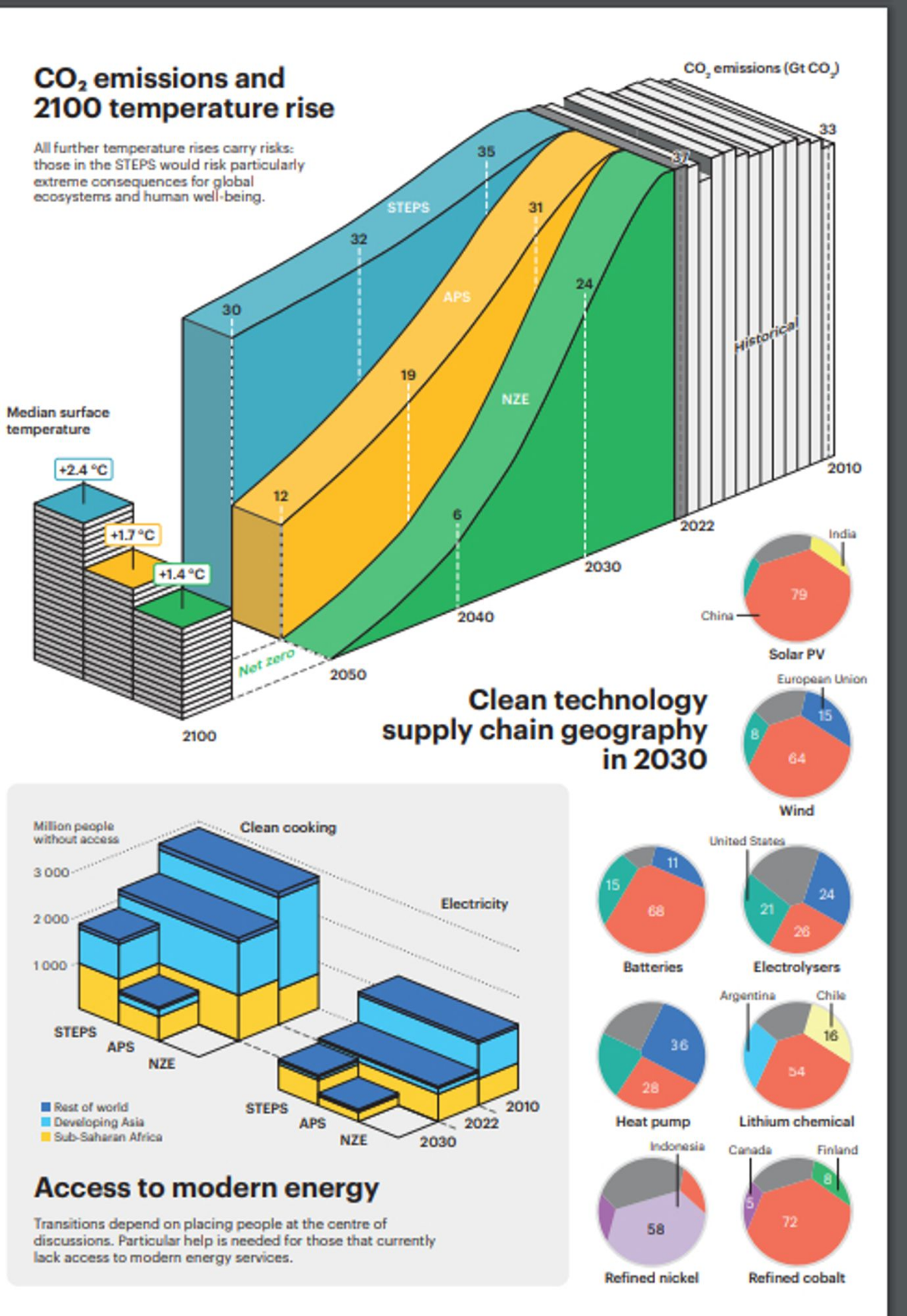
Is it just my perception or is there indeed a return of style and ?
unnecessary 3d effects, flamboyant colors, shadows and wild typography?

In this case imo it works, such Important data and all means to draw attention are likely beneficial.

(H/t Ketan Joschi on bluesky)

Line chart as ribbon which diverges into five different scenarios/projections based on future fossil use.
2023-09-23

Loved this visualisation as part of an exhibition on ‘How to Build a Low-Carbon. Clay, concrete and steel are some of the most widely used building materials, but they are much higher in embodied carbon – a large amount of energy is required to make them.

Thought the chart was great. Even has a discontinued y-axis, although the unit maybe isn’t that clear 😁

Exhibition is free in the London Design Museum designmuseum.org/exhibitions/h

#ClimateChange #Sustainability #DataViz #ChartsInTheWild

3D Visualisation of carbon dioxide emissions for different construction materials using real life objects that are sized by their emissions. Straw and Stone have low emissions while Steel has the most.

Client Info

Server: https://mastodon.social
Version: 2025.04
Repository: https://github.com/cyevgeniy/lmst