#svgFont

2025-06-23

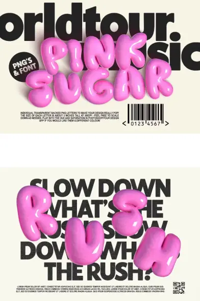
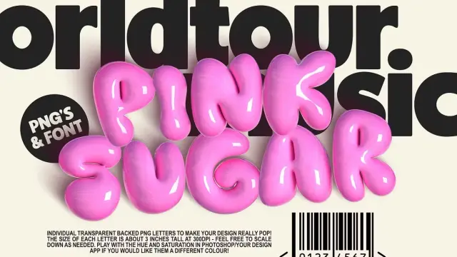
Pink Sugar Letters and SVG Font by Nicky Laatz

Your Guide to Creating Stunning, Playful Designs with the Pink Sugar Letters and SVG Font.

Some digital assets just have that special something. They possess a spark of personality that can instantly transform a good design into an unforgettable one. The Pink Sugar letters and SVG font by the celebrated designer Nicky Laatz is precisely one of those gems. It’s more than just a set of characters; it’s a complete toolkit for injecting joy, vibrancy, and a touch of glossy fun into any creative project. This guide is your complete reference, walking you through everything this incredible pack offers. It will show you exactly how to leverage its unique features for your own work. What truly makes this digital asset pack so special and a favorite among creators? Let’s explore why the Pink Sugar collection has become a go-to resource for designers everywhere.

Download from Creative Market

What Exactly Is in the Pink Sugar Letters and SVG Font Pack?

At its heart, this collection from Nicky Laatz is pure digital candy. It’s designed to give your text a beautiful, super shiny, 3D effect without any complicated steps. The aesthetic is playful, modern, and incredibly eye-catching. When you get the pack, you receive two main components that offer different levels of creative control.

First, you get a full character set of individual PNG letters. These are high-resolution image files with transparent backgrounds. Each letter, number, and symbol is a perfectly rendered 3D object with a glossy, light-catching finish. Think of them as digital building blocks for your words.

Pink Sugar Letters and SVG Font by Nicky Laatz Download from Creative Market

Second, the pack includes a matching SVG Bitmap font. This font allows you to type out your text directly, just like you would with any other font. However, it’s a special kind of font that retains the rich color and texture of the original design. This combination gives you the ultimate flexibility, allowing you to choose the best method for your specific project.

Pink Sugar Letters vs. The SVG Font: Which Should You Choose?

This is a fantastic question, and the answer depends on your project’s needs and your preferred workflow. While both options deliver that signature Pink Sugar look, they serve slightly different purposes. Nicky Laatz herself often recommends leaning towards the PNG letters, and for good reason.

The individual PNG letters offer unparalleled creative control. Since each letter is a separate image, you can manually place, rotate, and resize each one independently. Do you want to make the “O” a little bigger or tilt the “S” for a more dynamic feel? With the PNGs, you can do that with simple drag-and-drop precision. This level of control is what adds that extra layer of custom-made playfulness to your typography. It helps you break free from the rigid baseline of a traditional font, creating a truly unique and lively layout.

On the other hand, the SVG Bitmap font is all about convenience. You install it, select it, and simply type. It’s a faster way to lay out text, especially for longer phrases or sentences where manual placement would be too time-consuming. It’s an excellent option for quick mockups or projects where a uniform layout is desired. Ultimately, for those high-impact, custom-feeling designs, the PNG letters will be your best friend.

Unlocking Creative Freedom with the Pink Sugar Letters: Sizing and Customization

The technical specifications of the Pink Sugar letters and SVG font are just as important as their aesthetic. Understanding them ensures your final designs look crisp and professional, whether they are for digital screens or print.

When it comes to sizing, the PNG letters are built for high-quality work. They are rendered to print out beautifully at a maximum size of around 3 inches tall in a 300dpi document. This resolution is perfect for most print projects, like stickers, invitations, or small packaging details. Of course, you are always free to downscale them to fit any digital design, from a social media post to a website banner. The SVG letters have a fixed height of 800 pixels, which is a limitation related to SVG font file sizes, but still generous for most web-based applications.

Here’s where the real magic happens for Photoshop users. If you have a moderate skill level in Photoshop (specifically CC20 or newer), you are not just limited to pink! You can actually tweak the color of the PNG letters to match your brand or design palette perfectly. Imagine these glossy, 3D letters in a cool mint green, a sunny yellow, or a sophisticated navy blue. This feature dramatically expands the versatility of the pack, making the Pink Sugar letters and SVG font an even more valuable asset in your design library.

Software Compatibility: Do You Have the Right Tools?

Before you start creating, it’s essential to know if your software can handle these files. The good news is that at least part of this pack is incredibly accessible.

For the PNG Letters:
Because they are standard PNG image files, the letters are compatible with almost any graphic design tool you can imagine. This includes professional software like Adobe Photoshop and Illustrator, as well as incredibly user-friendly platforms. Yes, that means you can easily use the Pink Sugar PNG letters in Canva! Just upload them as images and start arranging your text. This broad compatibility makes the PNGs the most versatile part of the package.

For the SVG Bitmap Font:
SVG fonts are a more advanced font technology, and not all software supports them yet. To use the installable SVG font, you will need one of the following programs:

  • Adobe Photoshop CC 2017 or newer
  • Adobe Illustrator CC 2018 or newer
  • Procreate 4.3 or newer

Always check your software version to ensure you can take full advantage of the SVG font if you plan to use it.

A Quick Note on Bitmap vs. Vector

It is crucial to understand that both the PNG letters and the SVG Bitmap font are, as the name suggests, bitmap-based. This is a key technical detail.

Think of a bitmap image like a digital photograph. It’s made up of a grid of tiny squares called pixels. When you make a bitmap image larger than its original size, the software has to guess how to fill in the new space, which can lead to blurriness or a “pixelated” look.

This is different from a vector graphic, which is created using mathematical equations. Vector graphics can be scaled to any size—from a tiny icon to a massive billboard—without ever losing quality.

Because the Pink Sugar assets are bitmap-based, you should always design with your final output size in mind. They are perfect as is and for downscaling, but avoid significantly enlarging them to maintain that sharp, glossy finish.

Creative Inspiration: Where to Use Your New Favorite Font

The playful, high-end look of the Pink Sugar letters and SVG font makes it perfect for a wide range of applications. Its personality shines brightest in projects that aim to be fun, modern, and engaging.

Consider using it for:

  • Social Media Graphics: Create jaw-dropping Instagram posts, Pinterest pins, and YouTube thumbnails that stop the scroll.
  • Branding and Logos: It’s a fantastic choice for boutiques, bakeries, candy shops, kids’ brands, or any business with a vibrant and cheerful identity.
  • Product Packaging: Design eye-catching labels for cosmetics, candles, or food products that need to pop on the shelf.
  • Website Banners and Headers: Make a bold first impression on your homepage with a fun, 3D headline.
  • Invitations and Announcements: Craft beautiful and unique invitations for birthdays, baby showers, or celebratory events.

The Pink Sugar letters and SVG font invite you to have fun with your designs. It empowers you to create custom typography that feels both professional and deeply personal. Its combination of high-quality rendering, creative flexibility, and user-friendly options makes it a standout choice for any designer looking to add a little sparkle to their work. So, what will you create first?

Download from Creative Market

Feel free to find other trending typefaces for different creative needs here at WE AND THE COLOR or check out our selection of the 50 best fonts for graphic designers in 2025.

#3d #3DFont #3dLetters #font #fonts #letters #NickyLaatz #PinkSugar #svgFont #typeface
Pink Sugar Letters and SVG Font by Nicky LaatzPink Sugar Letters and SVG Font by Nicky Laatz
2025-06-15

Mint + Magnolia Typeface: The Handwritten Font by Nicky Laatz That Will Transform Your Designs

This post contains affiliate links. We may earn a commission if you click on them and make a purchase. It’s at no extra cost to you and helps us run this site. Thanks for your support!

Sometimes, a typeface needs to feel personal but look professional. It should be elegant yet approachable. It’s a tough balance to strike. Well, your search might just be over. Let’s talk about a stunningly authentic typeface that has been capturing the hearts of designers everywhere: Mint + Magnolia by the brilliant Nicky Laatz. This isn’t just another script font. It’s a piece of art, meticulously crafted to feel like a real, handwritten pencil note, filled with casual charm and effortless class.

Purchase at Creative Market

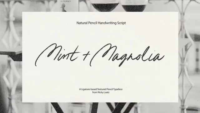
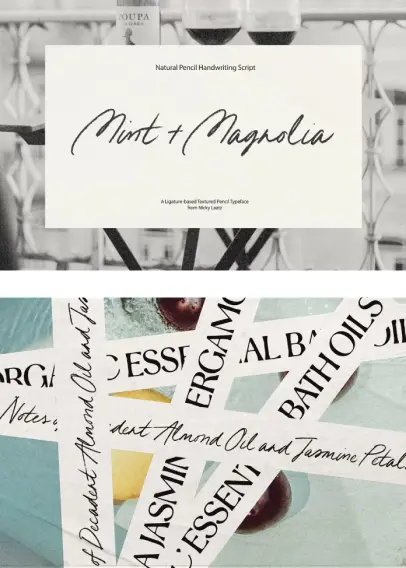
The Mint + Magnolia typeface introduces itself as a casual yet classy, handwritten pencil script. It feels warm, human, and incredibly genuine. When you see it, you don’t just see letters on a screen; you feel the subtle texture and the natural flow of a hand gliding across paper. It’s this unique quality that makes it more than a font—it’s a tool for connection. It allows your brand, your invitations, or your social media posts to speak in a voice that is both polished and deeply personal.

Mint + Magnolia Typeface by Nicky Laatz Purchase at Creative Market

What Makes Mint + Magnolia So Irresistibly Charming?

At its core, Mint + Magnolia offers you beautiful versatility. It doesn’t just give you one style; it gives you two distinct personalities to play with. You get a regular version, which has an upright, friendly posture. Then, you have a slightly more oblique or slanted version. This one carries a bit more energy and forward motion. The best part? Both of these expressive styles are available in two different formats, each serving a unique purpose for your creative projects.

This thoughtful approach from Nicky Laatz means you get incredible flexibility right out of the box. Imagine designing a logo with the steady, welcoming feel of the regular version, then using the slanted version for a call-to-action on your website to create a sense of urgency. The Mint + Magnolia font family empowers you to create a cohesive yet dynamic visual language.

The Secret Ingredient: Unlocking True Authenticity with Ligatures

Here is where the real magic happens. Have you ever noticed how certain letter combinations flow seamlessly when you write by hand? Think about a double ‘l’ or a ‘th’. They connect in a unique way. The Mint + Magnolia typeface replicates this beautifully with OpenType ligatures. When you have this feature turned on in your design software (like Adobe Photoshop, Illustrator, or Affinity Designer), these specially designed letter combos appear automatically as you type.

These are not just simple connections. They are thoughtfully crafted double-letter ligatures (like ‘ss’, ‘tt’, ‘ll’, ‘rr’, ‘oo’, ‘ee’) that prevent the sterile repetition you see in lesser script fonts. Instead of two identical ‘o’s sitting side-by-side, you get a single, fluid stroke that looks completely natural. This attention to detail elevates Mint + Magnolia from a simple font to a sophisticated script that truly mimics handwriting.

But what if your favorite design app doesn’t support these fancy features? No problem at all. The font is PUA (Private Use Areas) encoded. This simply means you can still access all the beautiful ligatures and alternate characters. You just need to use Font Book (on a Mac) or Character Map (on a PC) to browse, copy, and paste them directly into your project.

SVG vs. Vector: Choosing the Right Mint + Magnolia File

When you get the Mint + Magnolia font pack, you’ll find four font files. This might seem a little confusing at first, but it’s actually a brilliant system designed to give you the best of both worlds. Let’s break it down.

The Textured Realism of the SVG Font

Included in the pack are Mint+Magnolia-SVG.otf and MintMagnolia-SVG Slanted.otf. SVG stands for Scalable Vector Graphics, but in the font world, it means something a little different. These are bitmap fonts. Think of them as high-resolution pictures of letters. What does this give you? Texture. The SVG version of Mint + Magnolia preserves every tiny graphite detail and subtle imperfection of the original pencil markings. This creates a level of realism that is simply breathtaking.

However, there’s a small catch. Because these are bitmap-based, they aren’t infinitely scalable. For the best results, Nicky Laatz recommends a print height of no more than 1cm for the uppercase letters. If you go much larger, you might start to see the pixels, and the quality could degrade. This version is perfect for smaller applications like return addresses on envelopes, delicate social media watermarks, or realistic digital signatures. Please note, the SVG version currently supports English only.

The Scalable Perfection of the Vector Font

You also get Mint+Magnolia-Regular.otf and Mint+Magnolia-Slanted.otf. These are the standard vector-based fonts you are likely familiar with. Instead of pixels, these fonts are built with mathematical paths and points. This means you can scale them to any size you want—from the tiniest print on a business card to a massive billboard—and they will remain perfectly crisp and sharp.

This version is your go-to for logos, headlines, packaging, and any project that requires resizing. Furthermore, the vector version of Mint + Magnolia comes with extensive language support, covering a wide range of Western European languages, including French, German, Spanish, Swedish, and many more.

Meet the Creator: The Artistry of Nicky Laatz

To appreciate the Mint + Magnolia typeface fully, you have to know the artist behind it. Nicky Laatz is a powerhouse in the world of font design, renowned for her incredibly popular and high-quality script fonts on platforms like Creative Market. Her work is celebrated for its authenticity, charm, and usability. She has a unique talent for bottling the energy of handwriting and turning it into a functional, beautiful tool for other creatives. With Mint + Magnolia, she continues this tradition, delivering a font that is both a workhorse and a piece of art.

How to Use the Mint + Magnolia Typeface in Your Projects

So, where can you use this gorgeous font? The possibilities are nearly endless. Its blend of casual elegance makes it a perfect choice for:

  • Branding and Logos: Create a memorable, approachable logo for a boutique, a cafe, a photographer, or a lifestyle blogger.
  • Wedding Invitations: Add a touch of personal, romantic flair to your entire wedding stationery suite.
  • Social Media Graphics: Make your Instagram quotes and Pinterest pins stand out with a font that feels genuine and handcrafted.
  • Product Packaging: Give your products a bespoke, high-end feel that connects with customers on a personal level.
  • Website Headlines: Use it for headers and titles to inject personality and warmth into your digital presence.

The true strength of the Mint + Magnolia font is its ability to adapt. It can be the star of the show or a subtle, supporting accent.

Finding the Perfect Partner for Mint + Magnolia

While Mint + Magnolia is a showstopper on its own, pairing it with another font can create a truly professional and balanced design. A good rule of thumb is to pair a decorative script with a clean, simple font. The contrast allows both typefaces to shine without competing.

Nicky Laatz herself recommends pairing it with her own ‘Stylish Aesthetic’ typeface. It’s a clean, modern, and elegant font that provides the perfect counterbalance to the organic flow of Mint + Magnolia. This combination creates a sophisticated hierarchy in your designs, guiding the reader’s eye effortlessly.

Purchase at Creative Market

Ultimately, the Mint + Magnolia typeface is more than just a set of characters. It’s a tool for expression, a bridge for connection, and a shortcut to beautiful, authentic design. Whether you’re a seasoned professional or a passionate hobbyist, this font gives you the power to make your work feel more human.

Feel free to find other trending typefaces in the reviews here at WE AND THE COLOR. In addition, explore a selection of the 50 best fonts for designers in 2025.

#font #fonts #handwritten #MintMagnolia #NickyLaatz #svgFont #typeface

Mint + Magnolia Typeface by Nicky LaatzMint + Magnolia Typeface by Nicky Laatz
2025-04-14

Pasta and Wine Font: Pouring Hand-Painted Charm onto Your Designs

Some typefaces whisper sophistication, shout excitement, or, in some delightful cases, offer a warm, friendly hug. Finding that perfect typeface, the one that truly speaks the language of your project, can feel like searching for a hidden gem. You sift through countless options, many polished and precise, others perhaps a bit too formal or cold. Sometimes, though, you stumble upon something different. Something vibrant. Something that feels less like a digital tool and more like bottled creativity. That’s exactly the feeling the Pasta and Wine typeface evokes.

Imagine the easy-going vibe of a sunny afternoon gathering with friends. Picture the effortless charm of a hand-painted sign outside a cozy trattoria. Think about the simple joy found in something made with care and a touch of playful imperfection. This is the essence captured by Pasta and Wine, a remarkable creation from the talented font designer Nicky Laatz. Nicky has a wonderful knack for infusing her fonts with life, character, and an undeniable sense of fun. With Pasta and Wine, she invites us to embrace a style that’s refreshingly authentic and brimming with personality. It’s more than just a font; it’s an experience waiting to unfold on your next creative project. Ready to see what makes it so captivating?

Download at Creative Market

What Exactly is This Delicious-Sounding Typeface?

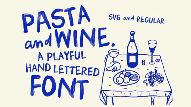
At its heart, Pasta and Wine is a hand-drawn, or more accurately, a hand-painted Bitmap SVG font. Now, what does that mean for you, the designer or creative enthusiast? Standard vector fonts use mathematical points and lines to create smooth, scalable letters. They’re incredibly versatile, of course. Bitmap SVG fonts, however, are different. They retain the rich textures and transparency variations of the original artwork – in this case, actual paint strokes!

When you use Pasta and Wine, you’re placing tiny, incredibly detailed images of painted characters onto your canvas. This allows for a level of realism and texture that standard fonts simply cannot replicate. You can almost see the brush marks, the subtle variations in paint thickness, and the delightful imperfections that make hand-painted lettering so appealing. It brings an organic, tactile quality to digital design, instantly adding warmth and authenticity. Doesn’t that sound like a fantastic way to make your work stand out?

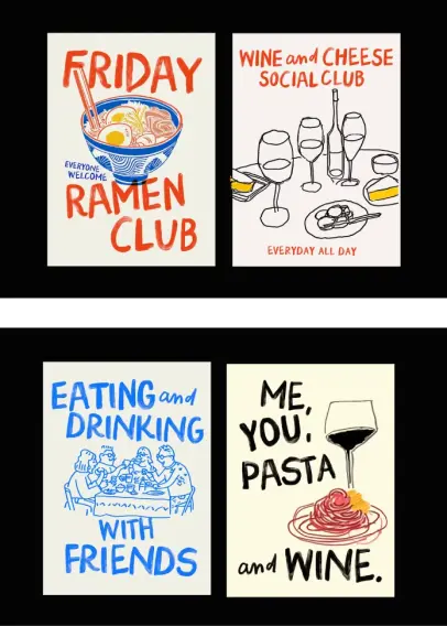
Pasta and Wine Typeface, a hand-drawn Bitmap SVG Font by Nicky Laatz Download at Creative Market

Meet the Family: BIG and SMALL Styles

Nicky Laatz didn’t just create one look; she gave us a versatile duo within the Pasta and Wine family. This pairing offers wonderful flexibility for creating dynamic and engaging typography.

First up is Pasta and Wine BIG. This style is exactly what it sounds like: bold, impactful, and presented entirely in uppercase letters. But there’s a clever trick here! Nicky designed alternate versions for each uppercase letter. How do you access them? Simply toggle between typing uppercase (Shift + letter) and lowercase (just the letter key). This simple action swaps between different painted versions of the same capital letter, allowing you to create a much more natural, less repetitive hand-lettered look. Isn’t that a neat feature? It prevents that “cookie-cutter” feel some all-caps fonts can have.

Complementing its bolder sibling is Pasta and Wine SMALL. This style features lovely lowercase letters, perfect for supporting text, subheadings, or adding a touch of contrast when paired with the BIG style. What makes SMALL extra special are the included OpenType ligatures. Ligatures are special character combinations where two or more letters are joined into a single glyph, mimicking natural handwriting. For example, typing “and” might automatically trigger a unique, connected “and” character. These ligatures further enhance the authentic, hand-painted feel, making your text flow beautifully.

And a fun little tip: need an ampersand (&)? In the Pasta and Wine BIG font, just type the “&” character. For the word “and” using the connected ligature in the SMALL font, simply type the letters “a”, “n”, “d”. Easy!

Beyond SVG: Regular Versions Included

Worried about software compatibility with Bitmap SVG fonts? While programs like Photoshop CC 2017+ and Illustrator CC 2018+ handle SVG fonts beautifully, Nicky Laatz understands that not everyone uses the latest software or requires that textured detail for every application.

That’s why both Pasta and Wine BIG and SMALL also come in ‘Regular’ (non-SVG) versions. These are standard vector font files (like OTF or TTF) that will work universally across almost all software and operating systems. While you won’t get the intricate painted texture of the SVG versions, you still retain the unique shapes, playful energy, and overall character of the Pasta and Wine design. This ensures you can bring that casual, hand-crafted vibe to projects regardless of your technical setup. It’s thoughtful additions like this that make a font package truly user-friendly, don’t you think?

Where Can Pasta and Wine Bring Its Charm?

The personality of Pasta and Wine – fun, super-casual, lighthearted, cheeky, and full of pizazz – makes it incredibly versatile. Where could you imagine using it?

  • Branding: Perfect for businesses aiming for a friendly, approachable, and perhaps slightly quirky image. Think cafes, bakeries, artisan food producers, craft shops, or even fun lifestyle blogs. The Pasta and Wine font immediately signals warmth and authenticity.
  • Packaging: Imagine it on labels for homemade jams, craft beer bottles, or organic snacks. Its hand-painted look adds a touch of artisanal quality.
  • Greeting Cards: Its cheeky and cheerful nature is ideal for birthday cards, thank you notes, or informal invitations.
  • Posters & Flyers: Create eye-catching posters for events, sales, or just inspirational quotes. The BIG style ensures your message gets noticed!
  • Social Media Graphics: Craft engaging quotes, announcements, or promotional images for platforms like Instagram and Pinterest. The texture of the SVG version really pops on screen.
  • Menus: Could there be a more fitting font for a casual Italian restaurant or wine bar menu? The name itself suggests it!
  • Website Headers & Accents: Use it sparingly for headers or call-to-action buttons on websites aiming for a personal, handcrafted feel.

Essentially, anywhere you want to inject personality, avoid formality, and convey a sense of fun and human touch, Pasta and Wine is ready to play. Can you already picture it elevating your own designs?

The Cherry on Top: Bonus Illustrations!

As if two distinct font styles in both SVG and Regular formats weren’t enough, Nicky Laatz includes a fantastic bonus: a collection of coordinating illustrations! This is such a thoughtful addition, providing extra creative assets that perfectly match the font’s aesthetic.

These aren’t just throwaway extras; they’re provided in a variety of useful formats:

  • Vector Illustrator files (.AI)
  • Vector EPS files (compatible with many vector programs)
  • PNG files (with transparent backgrounds, easy to drop into any design)
  • Layered Photoshop files (.PSD)
  • PDF files

Having these illustrations readily available means you can easily create cohesive designs. Use them to embellish text, create borders, build logos, or add spot illustrations to your layouts. They perfectly complement the hand-painted style of the Pasta and Wine font, making it effortless to achieve a unified, charming look across your entire project. It’s like getting a mini design toolkit!

Technical Notes and Getting Started

It’s important to note that the primary language support for Pasta and Wine is English. However, Nicky has included some common diacritics (like accents), which you can usually see in the preview images provided when purchasing the font.

Remember, to get the full textured effect of the Bitmap SVG versions, you’ll need compatible software (generally Adobe Photoshop or Adobe Illustrator). The Regular versions, however, will work almost anywhere.

Accessing the alternates in the BIG style is usually done by switching between uppercase and lowercase typing. Accessing the ligatures in the SMALL style typically requires software with OpenType support, where you can enable features like “Standard Ligatures”.

Why Choose Pasta and Wine?

In a digital landscape often dominated by sleek, minimalist, or perfectly geometric typefaces, Pasta and Wine offers a breath of fresh air. It champions imperfection, celebrates the human hand, and injects pure, unadulterated fun into design work.

It’s more than just letters; it’s a feeling. It’s casual conversation, shared laughter, sunny afternoons, and the simple pleasure of something made with genuine character. Nicky Laatz has bottled that feeling into a versatile, user-friendly font package, complete with stylistic alternates, helpful ligatures, standard fallbacks, and delightful bonus illustrations.

So, if your next project calls for a typeface that’s bold yet friendly, textured yet accessible, and bursting with personality, look no further. Say hello to Pasta and Wine. It might just be the secret ingredient your designs have been waiting for. Why not give it a try and see what delicious creations you can cook up?

Download at Creative Market

Feel free to find more trending typefaces on WE AND THE COLOR.

Subscribe to our newsletter!

[newsletter_form type=”minimal”]

#bitmapFont #font #NickyLaatz #PastaAndWine #svg #svgFont #typeface

Pasta and Wine Typeface, a hand-drawn Bitmap SVG Font by Nicky LaatzPasta and Wine Typeface, a hand-drawn Bitmap SVG Font by Nicky Laatz

Client Info

Server: https://mastodon.social
Version: 2025.04
Repository: https://github.com/cyevgeniy/lmst