As some of you may have already noticed, in the latest #Mastodon update, we've reworked the layout of the web app for smaller screen sizes. It should be easier to navigate and more pleasant to the eye. Let me know what you think!
Developer. This is my main account for the time being. I have six profiles now on Mastodon, sigh.
I will remove followers who haven't posted anything.
I tried Facebook's Finnish Text-to-Speech model, and it's terrible.
I didn't expect this, watching Adam Savage's Vision Pro persona's update and ending has tidbits from @daringfireball's The Talk Show creation of stereo recording. Very cool.
★ The Talk Show Live From WWDC 2025
https://daringfireball.net/2025/06/the_talk_show_live_from_wwdc_2025
@simonbs Developers, developers, developers!
The Liquid Glass Mac example at 9:58 looks decent. Idea to use it sparingly is the only way to make any sense of it.
Also, the pink bathrobe guy must be the final boss in the Gen-Zification of Apple.
@jay @stroughtonsmith I just finished ATP episode, and all I can hear is @siracusa in my head complaining when watching this example.
There is no coherence if everything floats like that, maybe if one item was floaty, but everything?
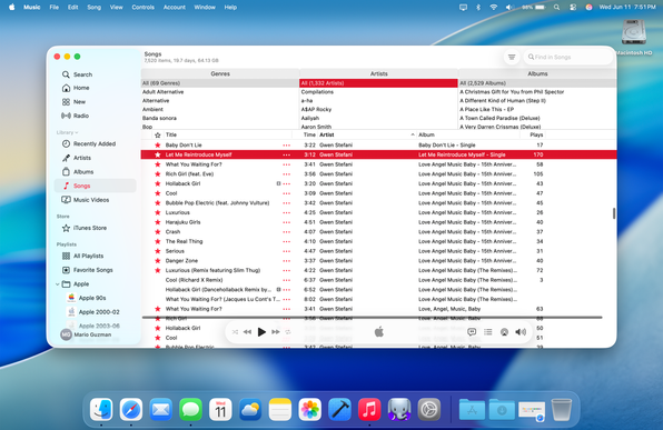
UITabBarController's new UITabAccessory API is all pretty straightforward — sizing and glass is all automatic, progressive blur extends under the accessory, style transitions between dark and light depending on the content underneath. Inserting a UISearchTab will get you the search icon. See the Music app in Compact layout to get a good feel for how it works
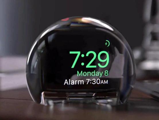
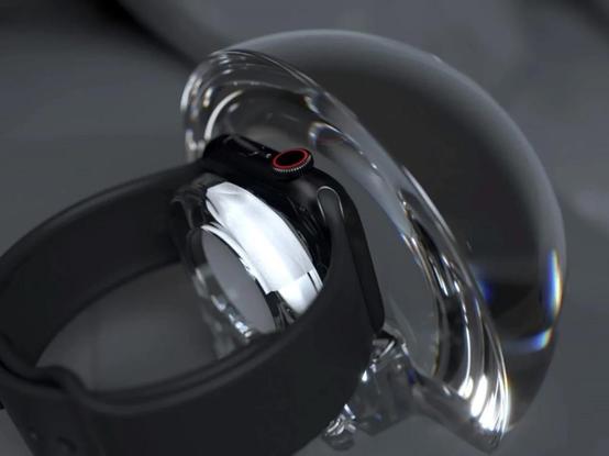
Differing levels of transparency/translucency effects in Tahoe get weird, like here on Apple's website, when the content mostly disappears behind the nav bar on the website, then reappears behind the browser chrome? Why is an app window MORE transparent than a website? My head hurts.
Kävi kuten veikattiin: Googlen tekoälyvastaukset tuhoavat nettisivustoja
Tekoälyvastausten käyttöönoton jälkeen osa maailman verkkosivustoista menetti valtavat määrät satunnaisista lukijoistaan. Näiden silmäparien katoaminen iskee suoraan julkaisijoiden liikevaihtoon - ja on johtanut jo toimittajien irtisanomisiin.
https://dawn.fi/uutiset/2025/06/12/googlen-tekoalyhaku-julkaisijat-pulassa
When you try to create user interfaces where you don't have distinct and hard separations for compartmentalization, you end up with weird shit like this. Notice how the horizontal scroll bar is above the Now Playing controls.
Don't try to be too clever where you UI just starts to fall apart.
That said, I think Apple is only company that can pull off something like this, because the app developers are still responding to changes like this. Whereas in Windows, there are no *new* apps really made, it's mostly crickets.
Windows (in)famously has the old UI paradigm embedded inside the OS, Mac just removes the old from time to time.
In times like these, when Apple changes a whole new look, Liquid Glass, the Windows model is clearly better for legacy businesses.
Native components must look really odd when they suddenly appear as glass or start to float. Imagine your ATM suddenly getting an update like this.
This is also an opportunity for selling web-first apps.
@atpfm Floaty bits, not a fan of floaty bits.
643: You Go to Squircle Jail
https://atp.fm/643
Impressions and analysis from WWDC 2025: Apple's new universal UI design with "Liquid Glass", all of the new 26-series OSes using it, and the potential of the new Apple Intelligence APIs.
Why is copy-pasting HTML tables from browser to text still so hard? These days I find it easier to copy HTML, then paste to ChatGPT, let it to convert to something like Markdown table...
There could be an easier way, like browsers injecting into the clipboard text some dividers like | (Clipboards allow different mime types of same content)
