J'aimerais bien que le fediverse ait aussi une / des alternative.s à MySpace.
Aussi fou fou. Aussi personnalisable.
Avec la possibilité de faire des pages affreuses
Fil
Philippe Rivière
Fil boosted:
Fil boosted:
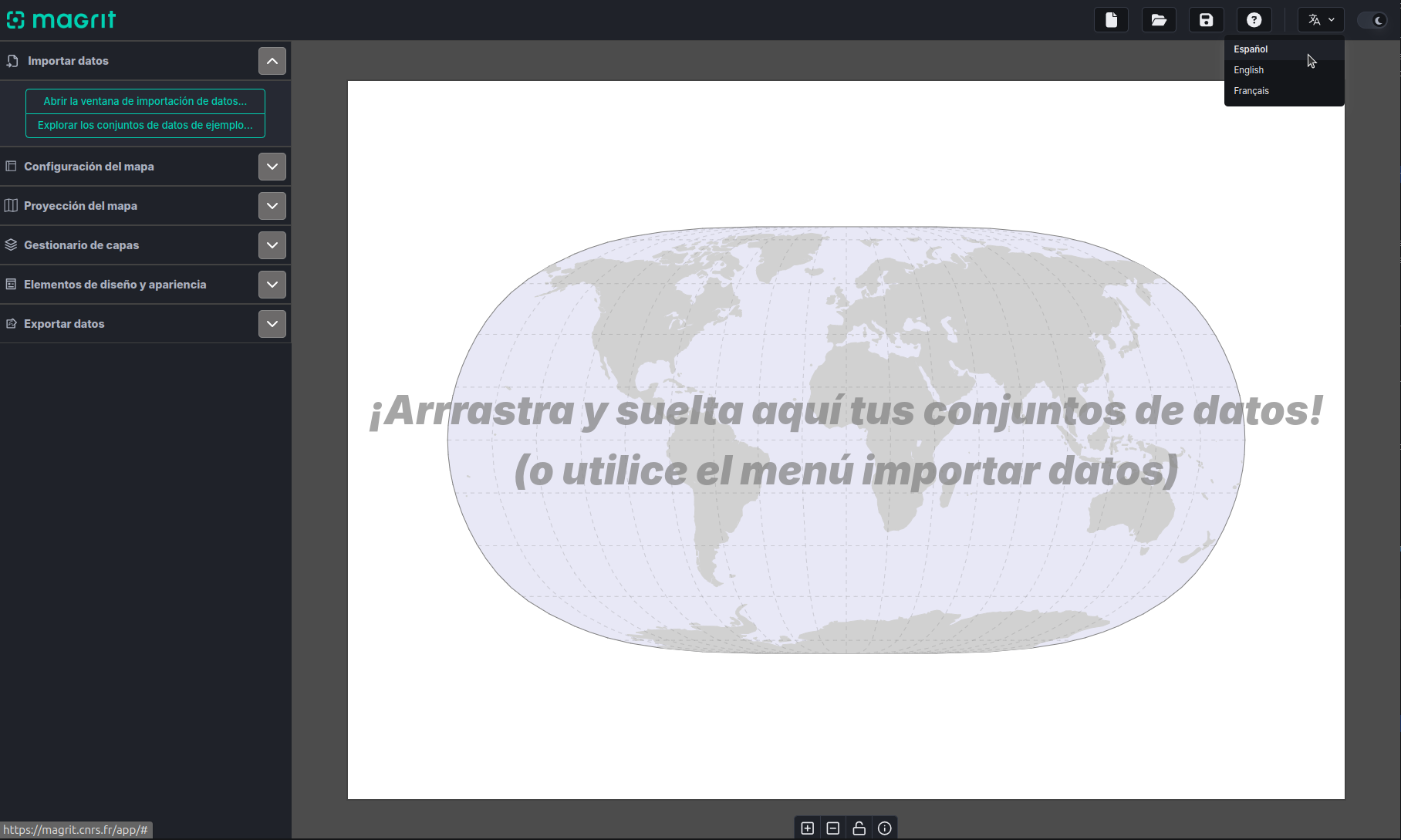
A new version of Magrit has been released today: version 2.2.0, which includes a new interface language, Spanish!
This translation was contributed by Carmen Brando, who is a research engineer at the École des hautes études en sciences sociales. Many thanks to her!
If you too would like to contribute a new language to Magrit, don't hesitate to get in touch with us on the application repository (https://github.com/riatelab/magrit).
@dymaxion @nelson @migurski @jef @peterme @mistertim @npseaver @hex @v @jonty @sparks @yoz @air_pump @feralresearch @burritojustice @vruba @mizmay @llimllib @randometc @meetar @stefpos @diagram @gsvoss @prehensile @KevinMarks @inverse @shashashasha @ngsmcphrsn
@HelloQuitteX autre petit bug confusant, le fichier "followers.js" de mon archive s'appelait en fait "follower.js" sans s
@HelloQuitteX fyi j'ai un peu galéré avec le site : les boutons ne sont pas tous actifs (le "2" en particulier ne clique pas), et mon domaine mastodon n'est pas supporté
Fil boosted:
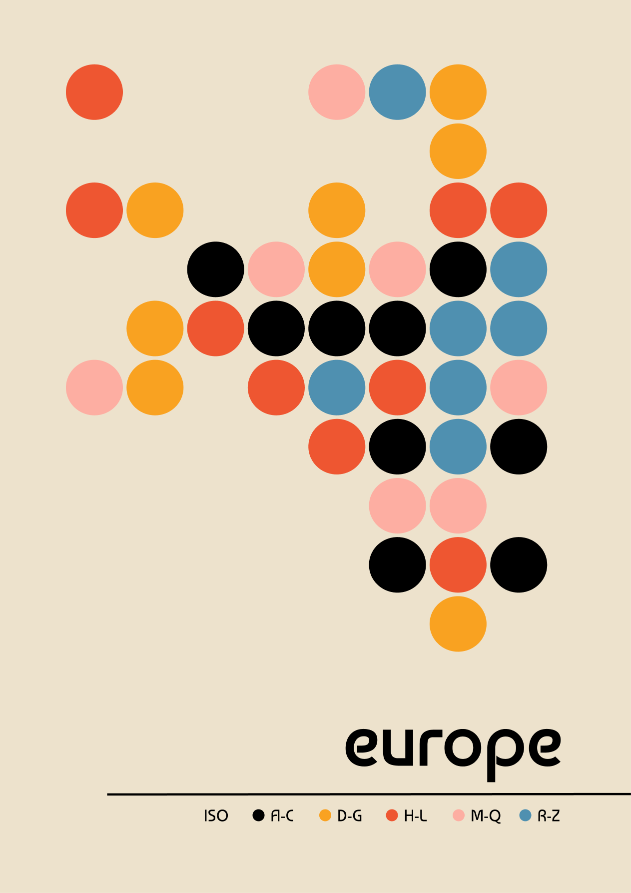
On a mapping run - Bauhaus inspired grid map of europe. Each country is coloured by the first letter of their ISO name. 🟠 🔵 🟡
Maybe a little puzzle to figure out the grid I used 😅
Initial map made in #python using #matplotlib then refined in Figma. Code: https://github.com/Lisa-Ho/small-data-projects/tree/main?tab=readme-ov-file#012025-grid-map-of-europe
How to: reproduce this lovely Bivariate Map with Observable Plot
(original by Muhammad Mohsin Raza)
https://observablehq.observablehq.cloud/pangea/plot/bivariate-map
@antoinechambertloir au moins le jeune figarien ne risque pas de lire une femme
Fil boosted:
Very therapeutic...
Simple styling OpenStreetMap data in QGIS. Solving problems, optimizing geometry generators and expressions.
Fil boosted:
Le #COVIDLong tue. #ActUp Paris revient sur des décennies de postures de déni et de désinformation face aux virus. Ce communiqué, complet, sensible, scientifiquement pertinent, sociologiquement infiniment triste, fait un bien fou.
Masquez-vous en intérieur, bordel.
Fil boosted:
I saw a climate graph on the web that I liked and wanted to recreate, so I figured out how to make them in Observable Plot and wrote a quick tutorial on how to make it
https://llimllib.github.io/climatecycles/
(from: https://dominicroye.github.io/en/2021/climate-circles/)
@julienkirch la dose létale est évoquée ici https://www.youtube.com/watch?v=GefwcsrChHk
Fil boosted:
On desktops (i.e., wider screens than mobile) CVESky — https://cvesky.labs.greynoise.io/ — now has an interactive heatmap going back up to 30 days. Click/tap on any cell to go to the CVE on Bluesky.
Observable Plot is, perhaps, *too easy* to use?

Fil boosted:
Fil boosted:
I took a page out of @simon and @jakelazaroff 's book and made a little #bluesky firehose visualizer of most frequent hashtags with @observablehq
https://mclare.blog/posts/visualizing-the-blue-sky-firehose/
#art, #blacksky, and #booksky seem to consistently top the list (aside from all the nsfw stuff...)
@davduf "Fil avait raison" je note
Client Info
Server: https://mastodon.social
Version: 2025.04
Repository: https://github.com/cyevgeniy/lmst