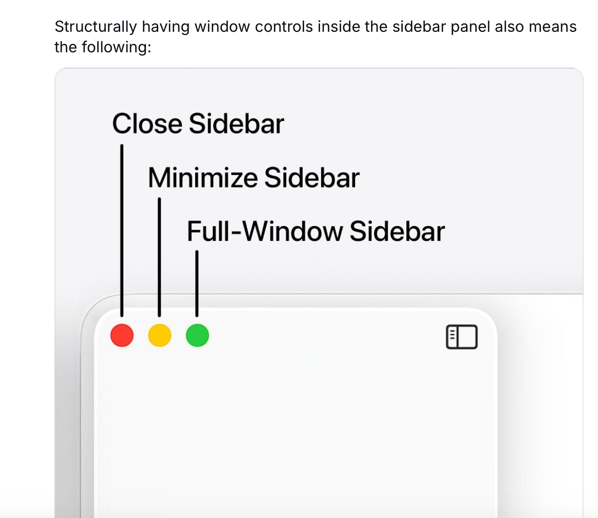
Menu item icons in macOS 26 reduce usability – should be optional
Please copy-paste the report as a new report in Feedback Assistant if you agree.
Menu item icons in macOS 26 reduce usability – should be optional
Please copy-paste the report as a new report in Feedback Assistant if you agree.
I’ve got better things to do than write about Liquid Glass (again), and yet, here I am.
🔗 https://lmnt.me/blog/ive-got-better-things-to-do-than-this-and-yet.html
@siracusa @kylehalevi What’s really great about these early Aqua designs (the buttons in particular) – they looked translucent without actually being translucent. So they looked cool and glassy but also had perfect legibility at the same time.
Technotes https://zhenyi.gibber.blog/technotes
After a week seeing the new #LiquidGlass now, what is your stance on the new designs?
Boosts for reach appreciated ✌️
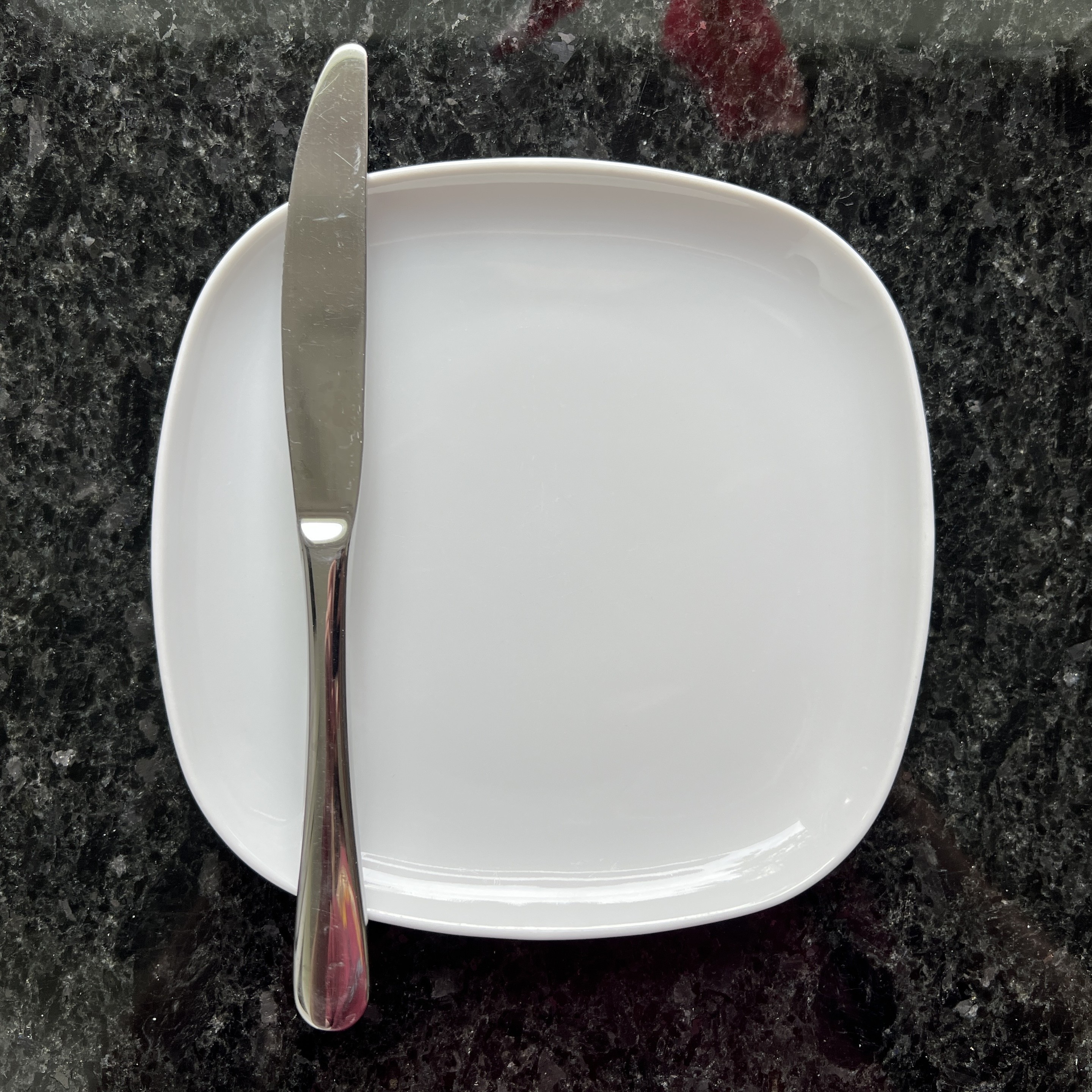
Saw this on my kitchen counter today and thought „hmm, ‚Solid Porcelain‘ might be a cool design language, actually.“
Can do the same 3d effects, nice highlights / reflections, and easier to read on than the transparency of #LiquidGlass. Plus, stuff sticking out of the icon is always fun. #iOS #MacOS #WWDC25
@tuomas_h This looks sooooo much better!
Mockup time! What could be a reasonable "middle ground" between the Mac OS design that we have today and the radical Liquid Glass design we saw this week from #WWDC25?
Disclaimer: this does not attempt to solve all the issues of modern Mac OS design, such as cramped toolbars caused by full-height sidebars and combining the toolbar with the title bar. I feel like the Apple of today is too far gone to do anything about those.
Read on to see what I actually tried to address.
They needed a study to find that out?
https://orf.at/stories/3396532/

@mattro Looks so much better!
Something cool about _the new way_, is Apple are kind enough to include their SVGs in asset catalogs. You can reassemble icons in Icon Composer and re-colour them. *fixed*.


Liquid Glass feels like that earliest reveal of Aqua — flashy, and completely over the top and needing twelve months of refinement and public feedback to get the balance quite right. The problem is, Apple's yearly schedule doesn't allow for that kind of iteration before release; we have about a week or two to get our feedback in, but this plane's going to land in September regardless
@natpanferova To me it seems ALL of them are available!
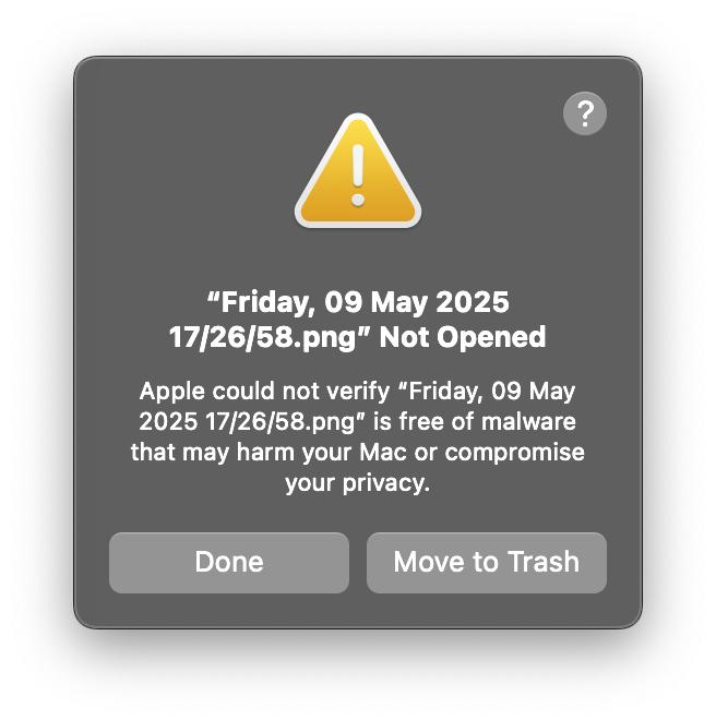
Are you serious, Apple? Will you now show these nagging dialogs for every app that ships with macOS?
And where’s the “Don’t show again” button?
@lapcatsoftware They even ask for a sysdiagnose when you report a typo in the documentation…
@ptujec You are making very good progress on this 🤣
Apple's security prompts are bordering on paranoia now. I took a screenshot on my iPhone and sent it to my Mac, and now Apple won't let me open it. This is ridiculous!
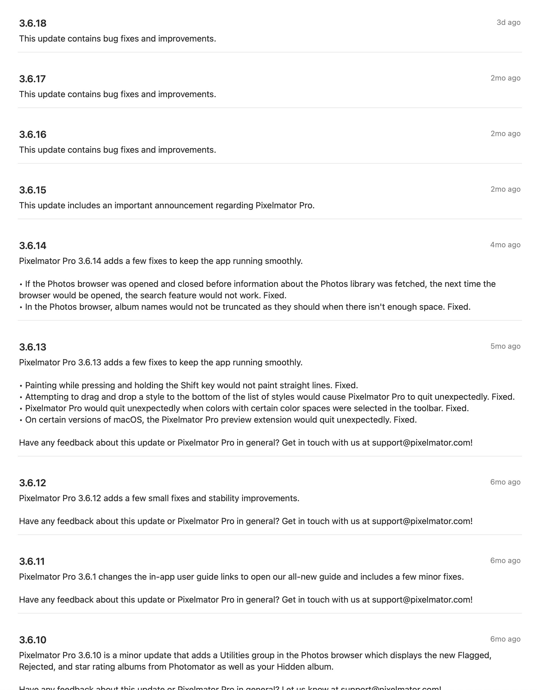
Pixelmator Pro release notes over time. Slightly changed since being acquired by Apple.