I like how @flowingdata says in this podcast episode of Data Journalism that his goal is not to help people understand charts as much as to understand data as it relates to their daily life. It explains his angle so well.
Simon Rogers
Datajournalist & Data Editor @Google. Formerly @Twitter, @Guardian. Co-host with @albertocairo of http://datajournalismpodcast.com.
Have some #ddj and data analytics experience and interested in Google Trends data? We may have the role for you on our team. DM me.
I wrote a piece about how data journalists are already using #ai
https://simonrogers.net/2023/03/28/ai-for-data-storytelling/
Simon Rogers boosted:
If you've ever wanted to hear my thoughts on data journalism (I mean, who wouldn't?), @simonrogers and @albertocairo collected them here on this great (and only?) podcast about data journalism https://podcasters.spotify.com/pod/show/ddjpodcast/episodes/Rani-Molla-data-for-journalism-e20q034
Simon Rogers boosted:
It was a pleasure chatting with @albertocairo and @simonrogers for The Data Journalism Podcast about my book, developing science graphics on deadline, and working with freelance data designers and illustrators. And as a wonderful bonus, Simon created a sonification of my favorite dataviz of all time—the pulsar chart featured on the Unknown Pleasures album cover. Listen to it here: https://anchor.fm/ddjpodcast/episodes/The-science-of-dataviz--with-Jen-Christiansen-e1vjrpl
Simon Rogers boosted:
Studio Ghibli Makes 1,178 Images Free to Download from My Neighbor Totoro, Spirited Away & Other Beloved Animated Films
https://www.openculture.com/2020/12/studio-ghibli-makes-1178-images-free-to-download.html
Simon Rogers boosted:
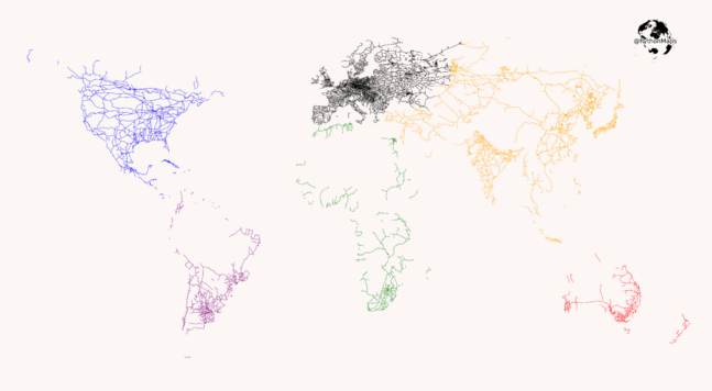
The only things on this map are railroads!
https://reddit.com/r/dataisbeautiful/comments/lj4wqt/the_railroads_of_the_world_oc/
Eleventh in a 🧵 of #2022TopToots
Simon Rogers boosted:
The Joy of Data podcast with @nigelblue- a fascinating chat and takes me back to my early career in #illustration ✏️ so agree with what is said… ‘Make the app do what you want it to do’ https://anchor.fm/ddjpodcast with @simonrogers @albertocairo #explanationgraphics #informationgraphics #scicomm still have my Muybridge books btw! ✏️
@bdshaw love it!
Simon Rogers boosted:
Inspiration for today's #inkyDays drawing came from a post here, about #penplotter card exchange. Thank you for the inspiration @paulgb
Simon Rogers boosted:
@ProPublica does amazing work. And I'm such a fan of their WeePeople font that I've used it in various projects...Including this mid-covid piece about How Big is 400,000 https://kristinhenry.github.io/howBig/
This piece is both data viz and art, as I think of it. I was also outraged that so many were dying.
Simon Rogers boosted:
Yesterday we published the first issue of Data Bites. It's a bi-weekly newsletter with tips on data journalism/data communication. It's really an extension of our Intro to Data Journalism series but you can sign up for it on its own here: https://newsletters.mediahack.co.za/subscribe/databites/
Simon Rogers boosted:
If you haven't heard of the 'Information Graphics Visionaries' books series, I recommend that you take a look: https://visionarypress.com/
I've just received the first three volumes and I think I'll be entertained and delighted for many weeks.

.@albertocairo and I host the #datajournalism podcast. Check it out:
Datajournalismpodcast.com
Client Info
Server: https://mastodon.social
Version: 2025.04
Repository: https://github.com/cyevgeniy/lmst