Create a Stunning Progress Chart in Excel in Minutes!! #ExcelTips #DataVisualization
Learn how to create a sleek progress chart in Excel quickly and easily. Perfect for tracking goals or projects! #ExcelTips #Charts. source
Create a Stunning Progress Chart in Excel in Minutes!! #ExcelTips #DataVisualization
Learn how to create a sleek progress chart in Excel quickly and easily. Perfect for tracking goals or projects! #ExcelTips #Charts. source
✨ Interactive Data Visualization "Show n Tell", using Apache ECharts
https://media.rogivue.net/2025/video/data-visualization-demo_apache-echarts_2025-07-05.mp4
#AI is a #bubble - just look at the data:
Money invested in private companies in 2024
- United States: ~$94 billion
- China: ~$8 billion
- Europe: ~17 billion
Difference in China and US is >10x! Ridiculous!
Annual private investment in artificial intelligence - by Our World In Data (April 2025):
https://ourworldindata.org/grapher/private-investment-in-artificial-intelligence
#ArtificialIntelligence #AIHype #Data #Economy #Economics #DataViz #DataVisualization
Kepler.gl: The latest attempt at data visualization that thinks it's a revolutionary game-changer, but it's really just a glorified map maker with a fancy name. 😏✨ Congratulations, you've reinvented Google Maps, but with more bugs! 🐞💥
https://kepler.gl/ #KeplerGL #DataVisualization #MapMaker #GameChanger #TechHumor #HackerNews #ngated
📊📈 We’ve released the “Chart.js Wrapper for Vaadin” – an #opensource component to integrate Chart.js charts in Vaadin apps. Supports Chart.js v4, async data loading and dark mode.
Check our Github Repo or https://xdev.software/news
@OverviewEffekt has been creating beautifully animated videos about real stars, like https://www.youtube.com/watch?v=elPKc0R-gq0 with the added context of the sci-fi stories (like Dune) set in those systems. (2/3)
🌐 http://overvieweffekt.com
#overvieweffect #datavisualization #astronomy
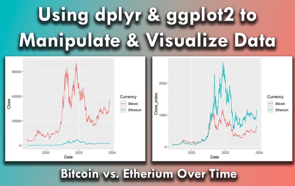
Using dplyr and ggplot2 in R can significantly streamline your data analysis process, making it easier to work with complex data sets.
I have created a video tutorial in collaboration with Albert Rapp, where I demonstrate how to do this in practice: https://www.youtube.com/watch?v=EKISB0gnue4
#coding #datavisualization #rprogramming #dataviz #statisticalanalysis #package #datastructure #ggplot2 #bigdata #tidyverse
Training Requirement: Freelance Trainer – Spyglass TS (Enterprise Applications)
Location: Remote | Duration: Project-Based / Part-Time
Experience: 10+ years
📩 Email: amritk1@overturerede.com
📞 Call/WhatsApp: +91 9289118667
You can also explore and apply to current openings here:
🔗 https://zurl.co/3fAbr
🔖 #SpyglassTraining #EnterpriseAnalytics #ObservabilityPlatform #FreelanceTrainer #HiringNow #RemoteJobs #DataVisualization #TechTraining #DigitalOperations #APIIntegration #TSstream
Anatomy of a mass disappearance in Mexico -- EL PAÍS English https://english.elpais.com/international/2025-06-28/anatomy-of-a-mass-disappearance-in-mexico-mom-i-fell-into-the-hands-of-the-mafia.html #humantrafficking #mexico #immigration #datavisualization
#ai #aiArt #aiArtWork #isotype #dataviz #diagram #employment #craftspeople #statistics #visualization #infographic #international #labor #jobs #ai #aiArt #aiArtWork #isotype #datavisualization #diagram #employmentstatistics #craftspeople #internationaldata #visualcommunication #infographics #design
Life Expectancy in Europe Compared to the US
#HackerNews #LifeExpectancy #Europe #US #DataVisualization #HealthStatistics
Want to bring your plots to life? gganimate is a powerful extension for ggplot2 in R that transforms static visualizations into dynamic animations. It makes it easier to highlight changes and trends over time in a clear and engaging way.
The attached animated visualization, which I created with gganimate, shows inflation trends for six countries since 1980.
Take a look here for more details: https://statisticsglobe.com/online-course-data-visualization-ggplot2-r
#python #datavisualization
#plotly #technology #industry
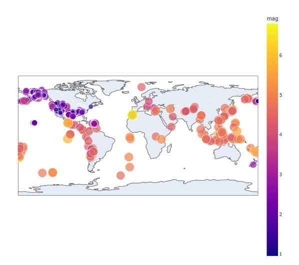
Thinking Outside the Box: Top 20 Plotly/Python Code Examples of Amazing Data Visualization That Will Blow Up Your Mind!
Uncovering Hidden Treasures of Plotly’s Interactive Graphics & Apps for Data-Driven Decision-Making (DDDM) across Industries
Example: live global earthquake visualization around Sat, Sep 9, 2023, 12:11 AM (Morocco earthquake) using Plotly EDA.
#exploremore 👇
Data Visualization
At NextGen2AI, we turn complex data into clear, actionable insights through advanced data visualization. Using AI and modern tools, we create dynamic dashboards and visual stories that help businesses make smarter, faster decisions with confidence.
Visit: http://nextgen2ai.com/about.html
#DataVisualization #NextGen2AI #BusinessIntelligence #DataAnalytics #SmartDecisions
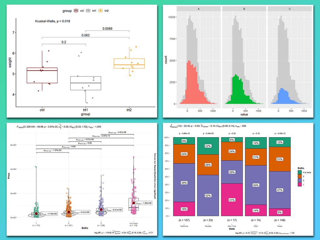
Comparing groups is often one of the main goals in data visualizations. The ggplot2 package in R, along with its powerful extensions, makes it easy to create visualizations that highlight differences, trends, and relationships between groups.
Click this link for detailed information: https://statisticsglobe.com/online-course-data-visualization-ggplot2-r
#businessanalyst #datavisualization #statistics #package #ggplot2 #rstats
Tired of Excel’s limitations? Learn how Python can help you automate reports, build dashboards, and create clear visuals—no prior coding experience needed. If you know spreadsheets, you're ready to go.
Pre-order now and get 30% off with code BEYONDEXCEL for the pre-order sale! (6/23–6/29)
https://nostarch.com/python-excel
#Python #Excel #DataScience #OpenSource #DataVisualization #Automation #WorkSmarter #PythonForData #Programming
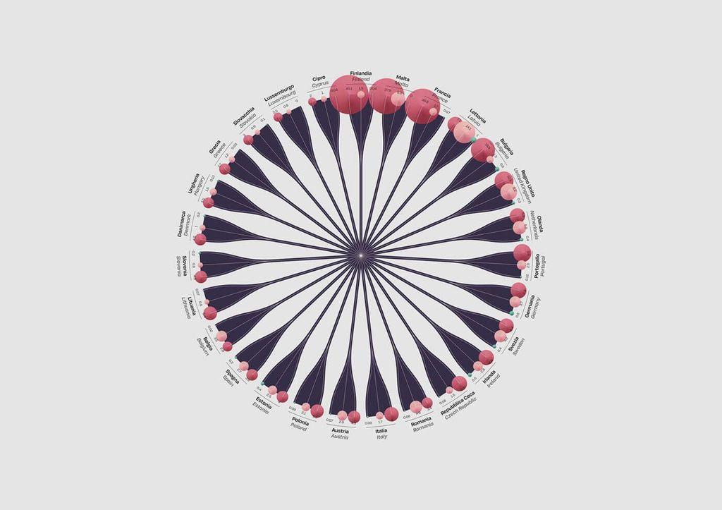
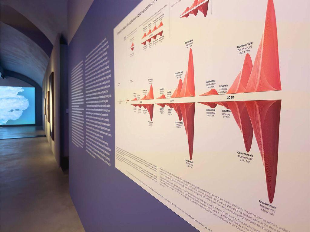
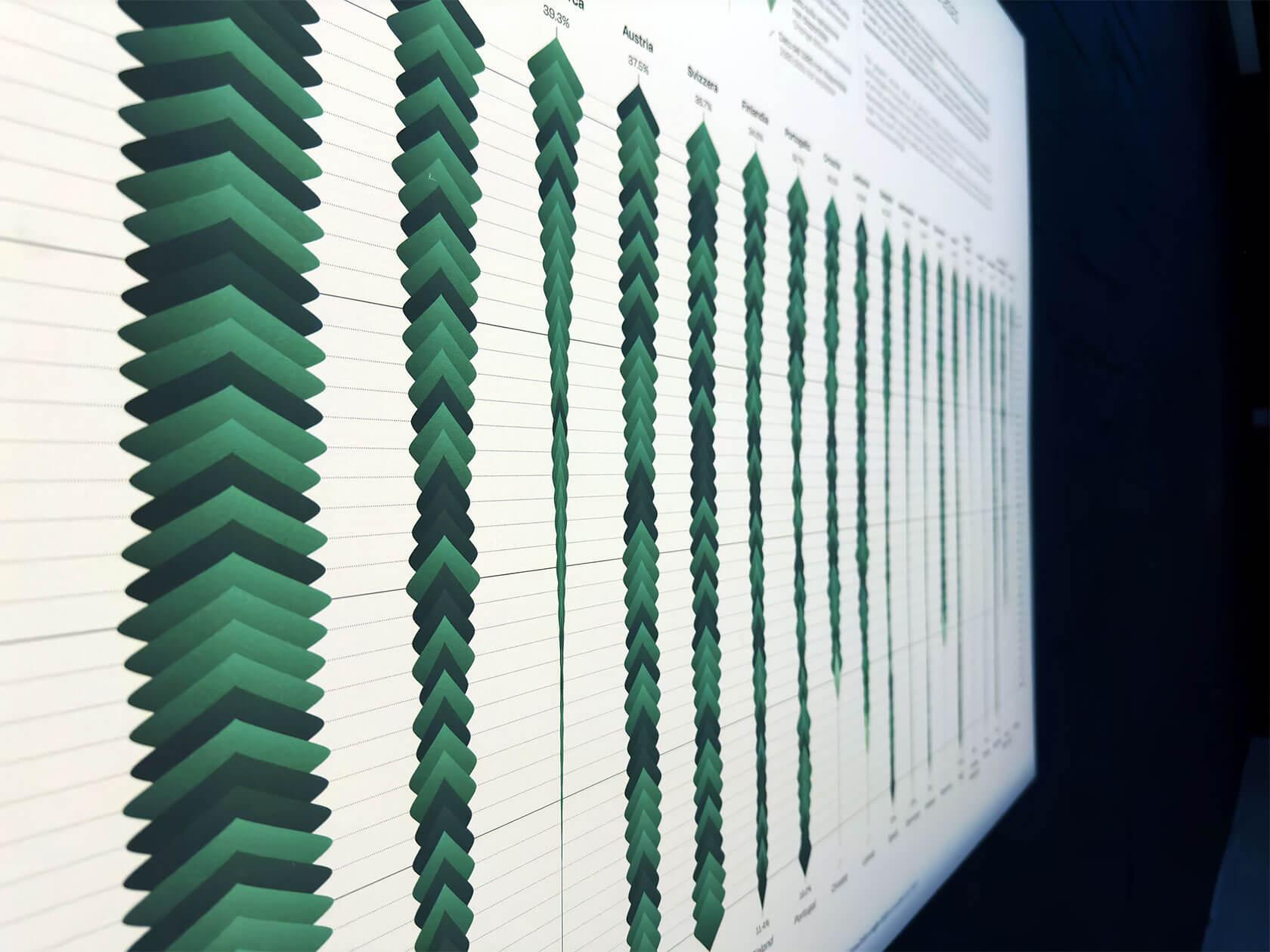
Elegant Structures: Federica Fragapane’s Award-Winning Infographics https://theinspirationgrid.com/elegant-structures-federica-fragapanes-award-winning-infographics/ #data #DataVisualization #infographics #InformationDesign #GraphicDesign #DesignInspiration #DesignInspo #inspiration #InspirationGrid