@rosetta @typographica @mwichary Nothing but the sign is left there unfortunately
tanyatypes
tanyatypes boosted:
10 years ago today I published my article “Variable Fonts for Responsive Design” at A List Apart:
https://alistapart.com/blog/post/variable-fonts-for-responsive-design/
I was very happy when, a year and a half later, the OpenType specification was updated to support variable fonts.
Since then, I’ve spent a lot of time making and working with variable fonts, including building up the https://v-fonts.com directory (now sadly out of date).
There have been bumps in the road, but it’s been satisfying to see the technology spread over time.
tanyatypes boosted:
A very good thread for anyone who makes fonts (though also relevant to other creative fields):
https://typo.social/@letterror/113197010813210485
tanyatypes boosted:
This Saturday, we published a batch of Uses for typefaces with horizontal contrast, i.e., thick tops and bottoms. In particular, there’s:
• the classic Zipper (Bob Newman, Letraset, 1970)
• the lesser known Sintex (Aldo Novarese, VGC, c.1970)
• the downright obscure Kangaroo (Dave West, PLINC, c.1969)
• and the OG, Gothic Bold (Hamilton, 1889).
See them all: https://fontsinuse.com/search/advanced?v=2&match0=all&typefaces0=32521,31801,31312,88960
#FontsInUse #fonts #typefaces #ScienceFiction #paperbacks #BookCovers
tanyatypes boosted:
Is anyone affiliated with an academic institution able to help me get a copy of the 23 October 1936 issue of The Illustrated Sporting and Dramatic News here:
It contains a preview of the Inn Signs Exhibition of 1936 that I'm currently researching.
I'd be happy to offer something nice via snail mail in exchange...
tanyatypes boosted:
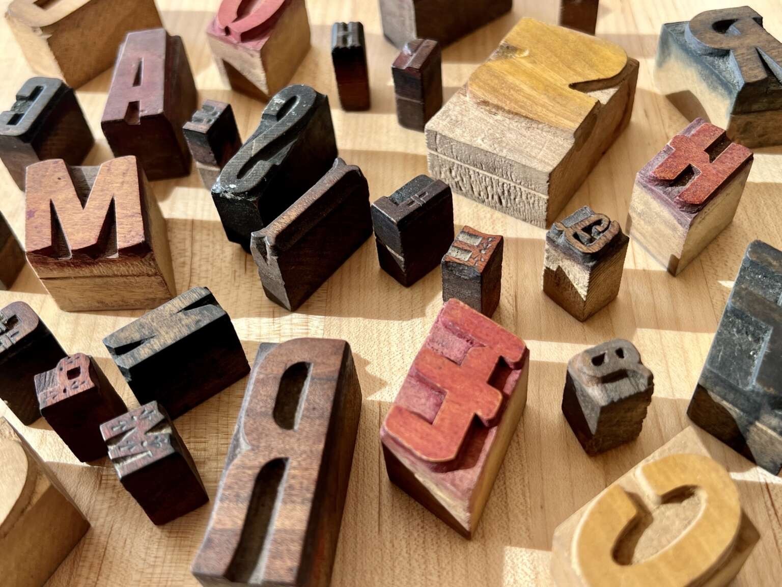
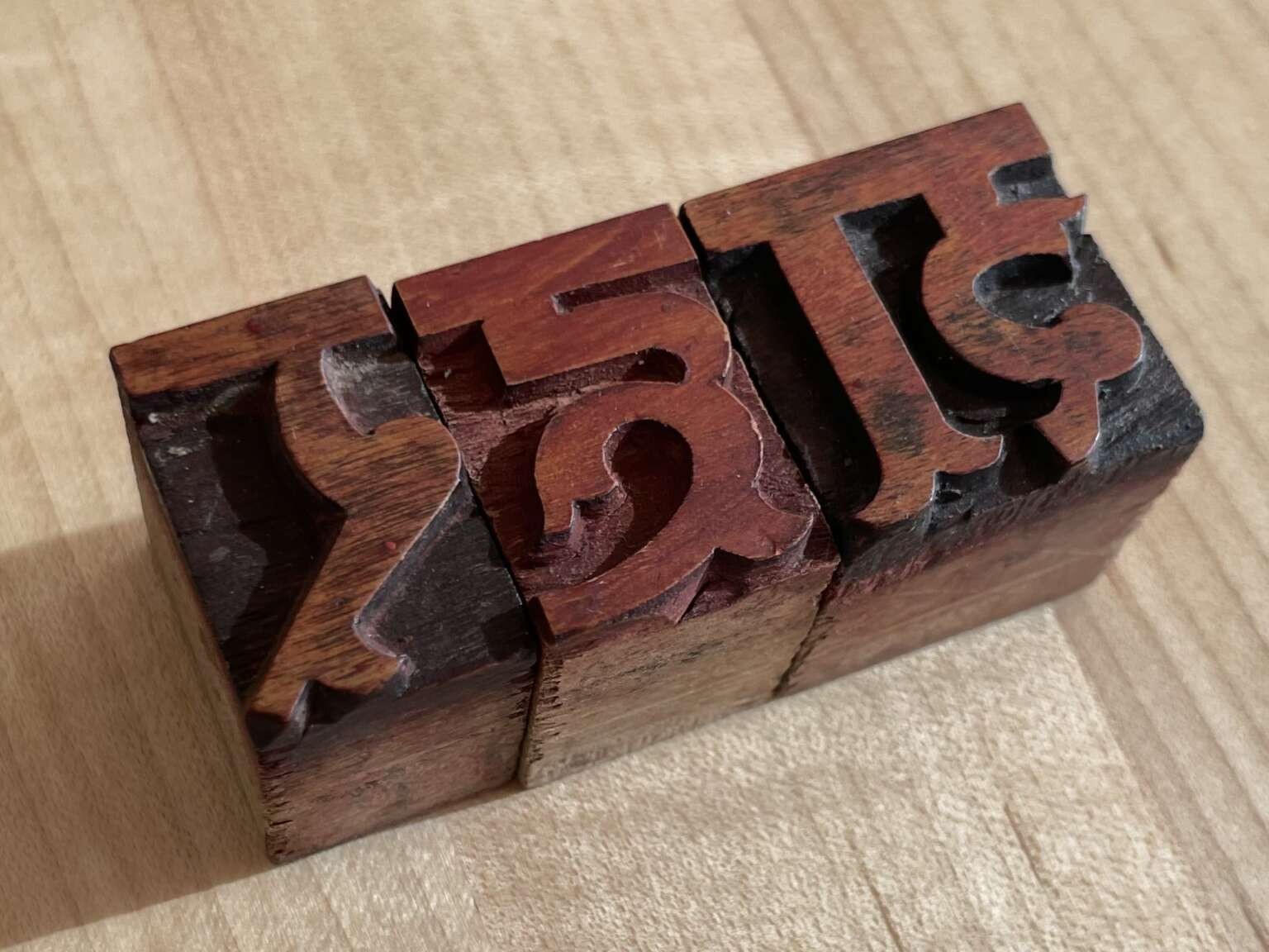
Another surprise: how the type was made. @tanyatypes acquired a set of handcut rubber stamps from the company and interviewed former employees. Rather than using a pantograph to trace a pattern and cut type with a mechanical router, as was common in the West (https://printinghistory.org/virgin-demo/), workers would cut these stamps by hand, then use them to mark a mirrored letter on wood blocks that were then chiseled by hand to create the resulting type.
tanyatypes boosted:
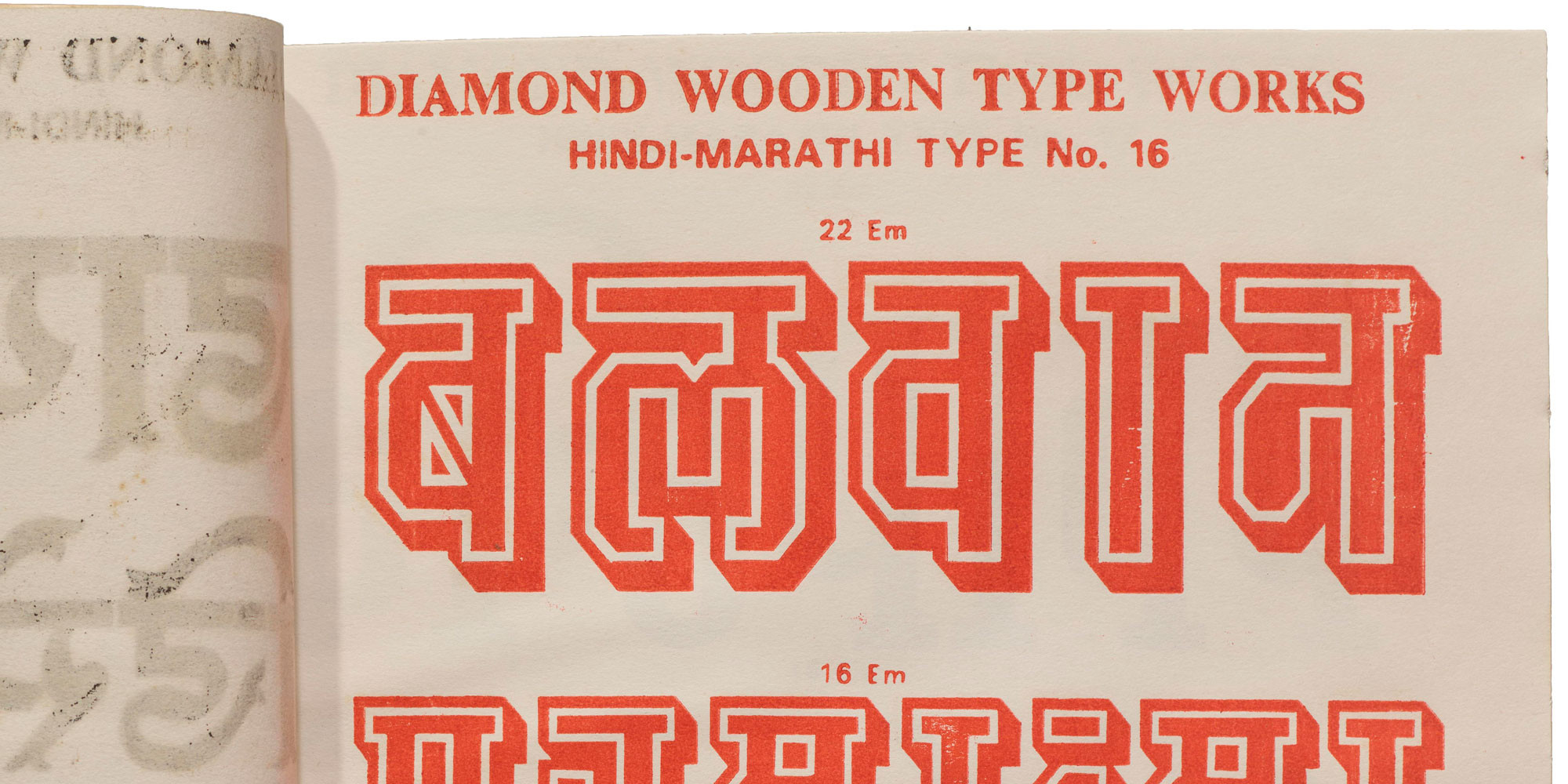
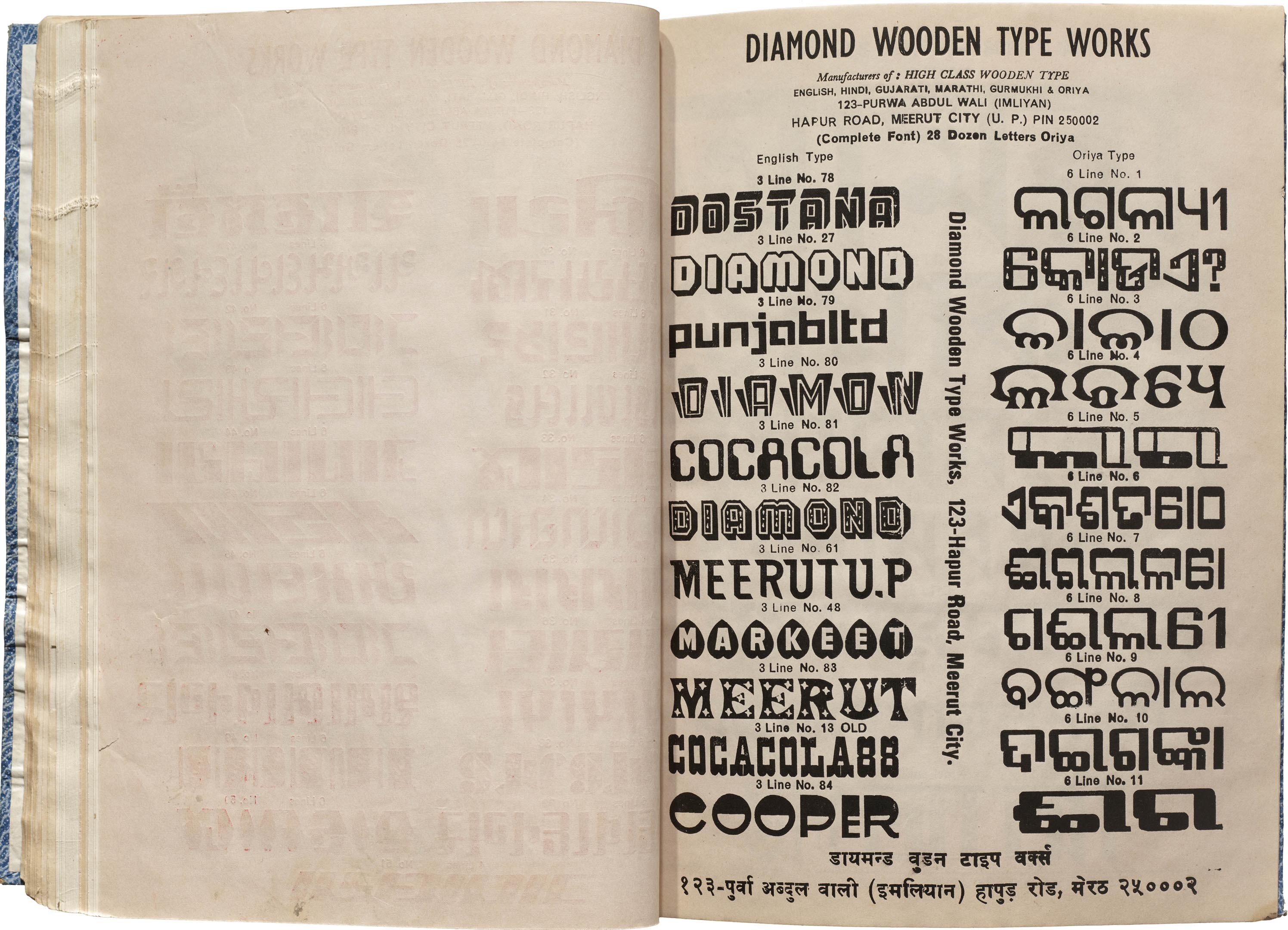
Roughly hand-bound in blank covers, two specimen books nonchalantly contain a wealth of fascinating type history, from both India and the West. When we first acquired these catalogs, we were struck by the range of styles and scripts represented, and knew there was a story to tell. So we sent our Indian correspondent, @tanyatypes, to shine a light on some Diamonds. https://letterformarchive.org/news/diamond-wooden-type-works/
#WoodType #TypeSpecimens #Typography #IndianDesign
tanyatypes boosted:
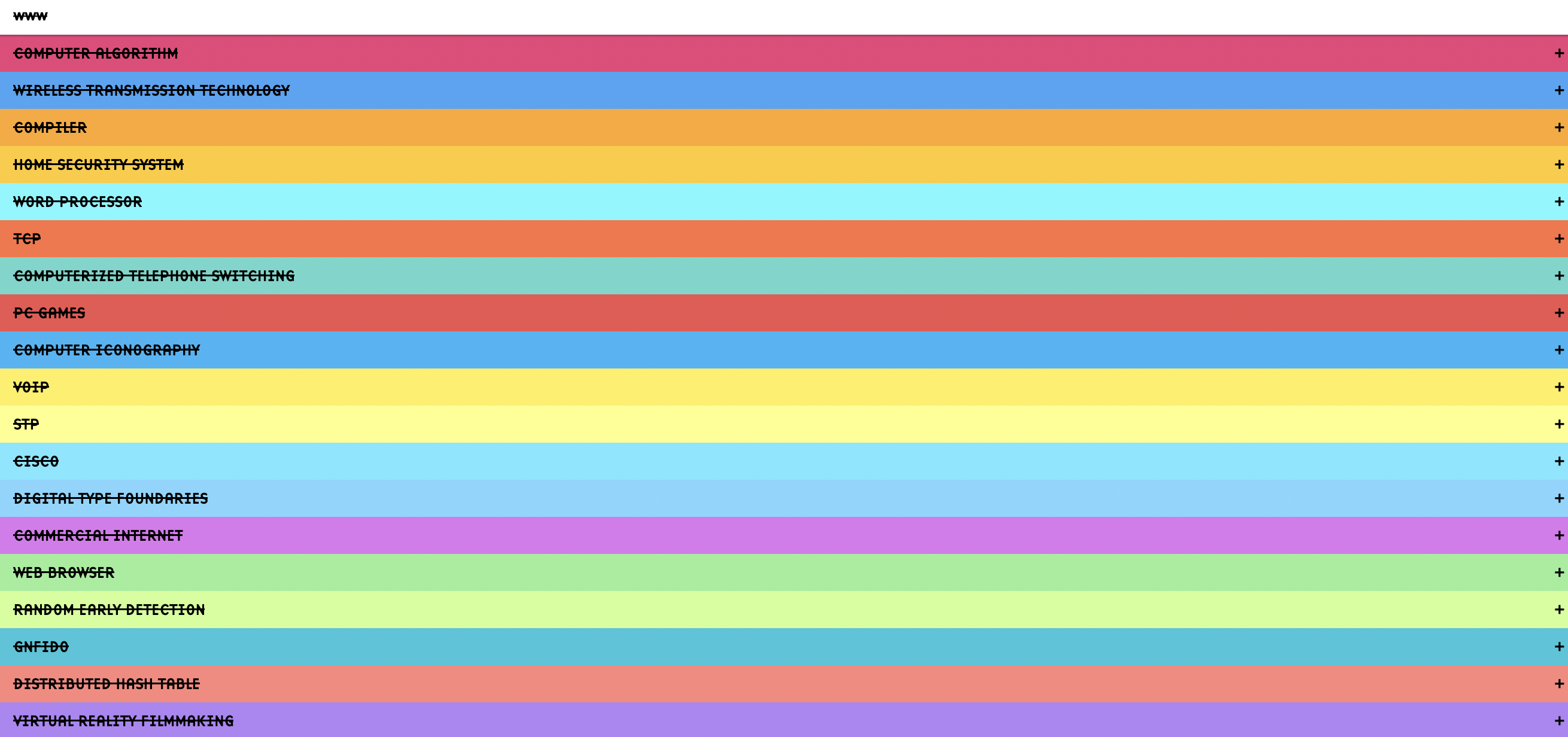
A collection of innovations by women in the fields of computer science and technology
No Web Without Women
https://nowebwithoutwomen.com/
"A Selman Project. This website is typeset in Base 9 and Base 12 by Zuzana Licko"
@litherland belated birthday wishes Caren!
@blag oh that’s still quite a wonderful example!
tanyatypes boosted:
@tanyatypes Nice use of lenticular letters.
Not the same, but you might like this from Vilafranca de Penedes in Catalonia, Spain.
#lenticular #lettering #polleria #catalonia #vilafrance #penedes
It’s also my attempt to print a the experimental font “Indi” that has a transliteration axis so both Hindi and English can live in the same font file and now on the same print
This limited edition hand pulled screen print merges my love for type and walking. Do you read just one letter? Take a few steps and now you know how to say it in Hindi and English!
Presenting my shortest typewalk yet, titled “ए Dekh ke Chal”
tanyatypes boosted:
J. Richard (student) and P. Audibert (teacher), Cours de Théorie pour le Tissage, Lyon, 1882.
New on the blog! 🧶 Threading Letters, by our editorial correspondent @tanyatypes.
In this installment of For Your Reference, we revisit the Archive’s stacks for books and other items that build a tangible connection between threads and letterforms. Check it out: https://letterformarchive.org/news/threading-letters/
#LetterformArchive #TextileDesign #TextileArt #Embroidery #Weaving #Lettering #CrossStitch
tanyatypes boosted:
I was very moved by this Seb McLauchlan piece: https://counter-forms.com/texts/revivals
@gabrowitsch in case you’ve missed it, Eye Spy with my Typographic Eye by @matratype is a wonderful newsletter. https://us12.campaign-archive.com/home/?id=f94763c3bf&u=00db3d2423772a3f86d6e22a1
tanyatypes boosted:
It’s been a while since I started a self-directed project and this year I decided to design my very own tarot deck, inspired by matchbox art. The first three cards, still very much WIP:
tanyatypes boosted:
The people spoketh, and @djrrb listenedeth!
Daily Special now has wobbly letters _and_ letter substitution. Just like the real thing!
Get it from the Font Of The Month Club! https://djr.com/font-of-the-month-club#2024-01
tanyatypes boosted:
W. A. Dwiggins, The Feather-Vender Zodiac Calendar, published by Herbert W. Simpson, Inc., 1951.
On the blog: Calendar Design in the Online Archive. We’re starting 2024 with a selection of objects in the Online Archive that chart Gregorian timekeeping across the 20th century: https://letterformarchive.org/news/calendar-design-in-the-online-archive/
#LetterformArchive #Calendars #CalendarDesign #ZodiacSigns #Horoscope #WADwiggins @tanyatypes
Client Info
Server: https://mastodon.social
Version: 2025.04
Repository: https://github.com/cyevgeniy/lmst