Create Professional Brand Style Guidelines with This Customizable InDesign Template
A brand without guidelines is a brand that contradicts itself. Every mismatched font, every off-color button, every logo stretched across a banner — these are not design accidents. They are symptoms of a missing system. Brand style guidelines fix that. And a professionally structured InDesign template makes building those guidelines faster, cleaner, and more credible.
This article covers exactly what brand style guidelines are, why every brand needs them, and how a customizable InDesign template — specifically the one created by Adobe Stock contributor GraphyPix — makes the process accessible without sacrificing quality.
Download the template directly from Adobe StockPlease note that this template requires Adobe InDesign installed on your computer. Whether you use Mac or PC, the latest version is available on the Adobe Creative Cloud website—take a look here.
Create professional brand style guidelines with a customizable InDesign template. Download the template directly from Adobe StockWhat Are Brand Style Guidelines, and Why Do So Many Brands Get Them Wrong?
Brand style guidelines — sometimes called a brand bible, visual identity manual, or brand standards document — are a formal set of rules. They govern how a brand looks, sounds, and behaves across every touchpoint. Furthermore, they are not suggestions. They are decisions made once, documented clearly, and applied consistently.
Most brands get them wrong for the same reason. They treat guidelines as a design exercise instead of a strategic tool. So the document becomes beautiful but unusable. Or it gets created once and never updated. Or it only covers the logo, ignoring typography, color psychology, tone of voice, and digital application.
The result? Inconsistency. And inconsistency costs brands trust.
The Real Cost of Brand Inconsistency
Consider what happens when a designer who was never briefed creates a social post. Or when a vendor prints marketing materials using the wrong shade of blue. These are not trivial errors. According to brand researchers, consistent brand presentation increases revenue by up to 33%. Therefore, the guidelines are not a luxury. They are infrastructure.
The Core Anatomy of Professional Brand Style Guidelines
Not all brand guidelines are built the same. However, the best ones share a recognizable structure. Think of it as a Brand Architecture Framework — a term this article introduces to describe the layered hierarchy of brand identity elements.
Layer 1 — Brand Foundation
This is where the brand story lives. Mission, vision, values, and positioning statements anchor everything that follows. Moreover, this layer explains why the brand looks the way it does, not just what it looks like.
Layer 2 — Visual Identity System
This covers the logo system, color palette, typography, and iconography. Additionally, it defines how each element behaves in isolation and in combination. Rules around clear space, minimum logo sizes, and incorrect usage belong here.
Layer 3 — Applied Identity
Here is where the guidelines get practical. Business cards, letterheads, social media templates, app interfaces, packaging — all of these show the brand in action. As a result, designers and non-designers alike understand how to apply the system correctly.
Layer 4 — Digital & Motion Standards
This layer is newer, but increasingly non-negotiable. It covers UI/UX design language, animation principles, and digital ad specifications. Furthermore, it ensures the brand translates seamlessly from print to screen.
Why Brand Style Guidelines Matter More Than Ever
The creative market has never been more saturated. Every brand competes for attention across dozens of channels simultaneously. Consequently, visual consistency is no longer a nice-to-have — it is a competitive advantage.
There is also an internal argument. When a team has clear guidelines, projects move faster. Designers spend less time making decisions that should already be made. Meanwhile, stakeholders spend less time approving revisions. The guidelines pay for themselves in saved hours alone.
The Trust Signal No One Talks About
Brand style guidelines also send a signal to clients, investors, and partners. A brand that presents a polished, comprehensive identity document communicates professionalism before a single word is spoken. Therefore, having well-crafted brand guidelines is a trust signal — especially for startups and agencies pitching new business.
How to Build Brand Style Guidelines With an InDesign Template
Creating brand style guidelines from scratch is time-consuming. Starting with a professionally designed InDesign template dramatically accelerates the process. Nevertheless, the quality of the final document depends on how well the template is structured.
Why Adobe InDesign Is the Industry Standard
Adobe InDesign remains the gold standard for publishing and brand document creation. It offers precise control over typography, layout grids, master pages, and color swatches. Additionally, it supports multi-page documents with consistent styling — exactly what comprehensive brand guidelines require.
No other tool matches InDesign for this purpose. Not PowerPoint. Not Canva. Not Google Slides. When brand guidelines need to look professional and print-ready, InDesign is the tool.
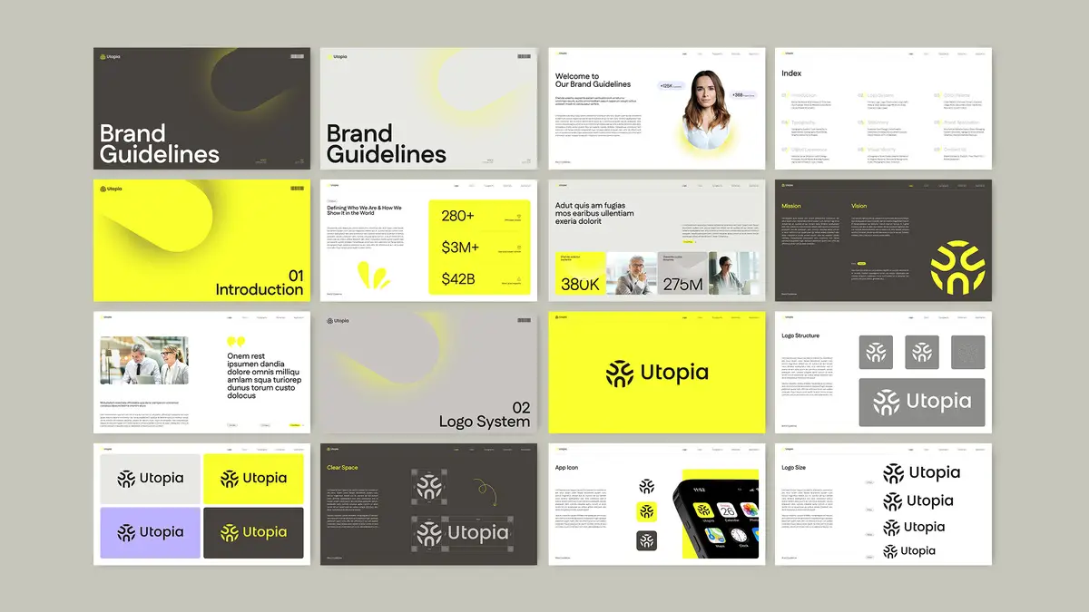
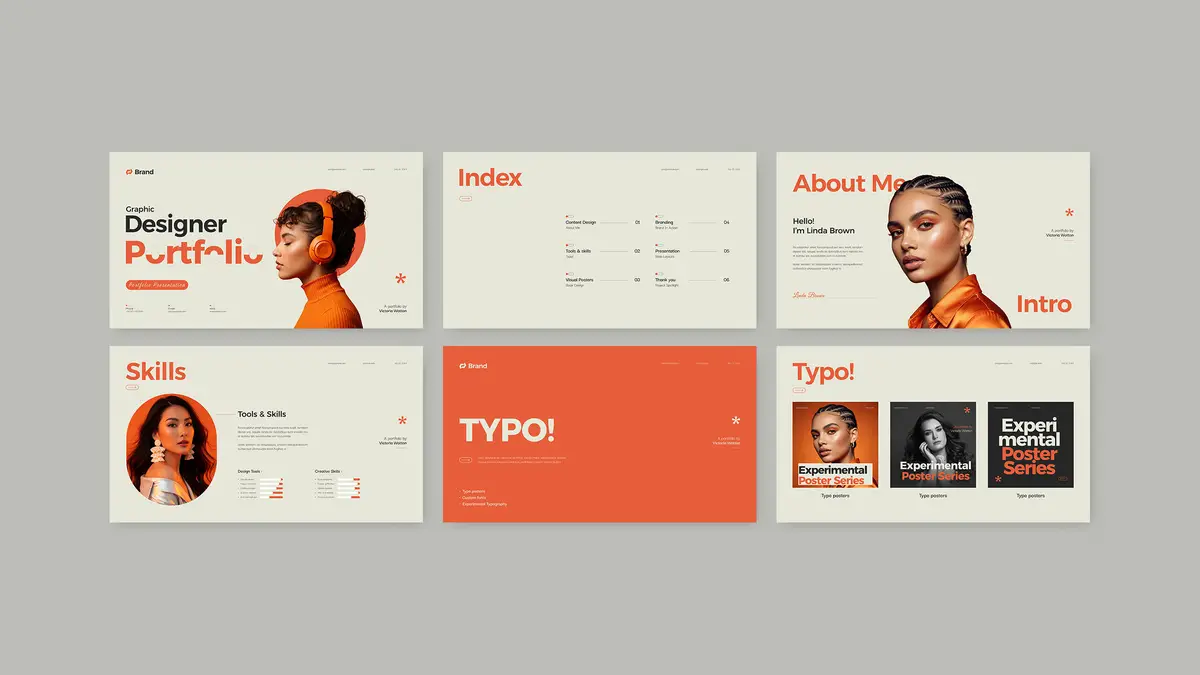
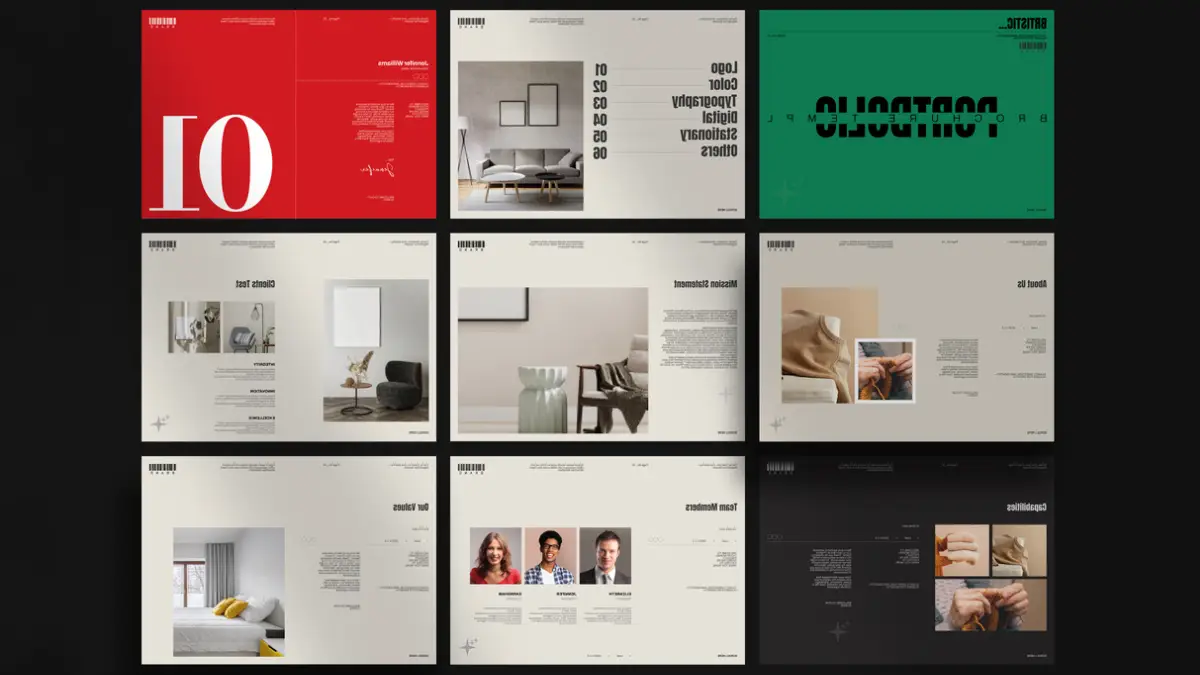
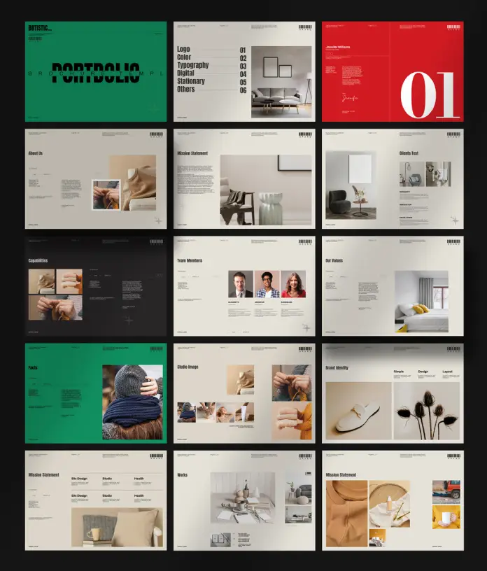
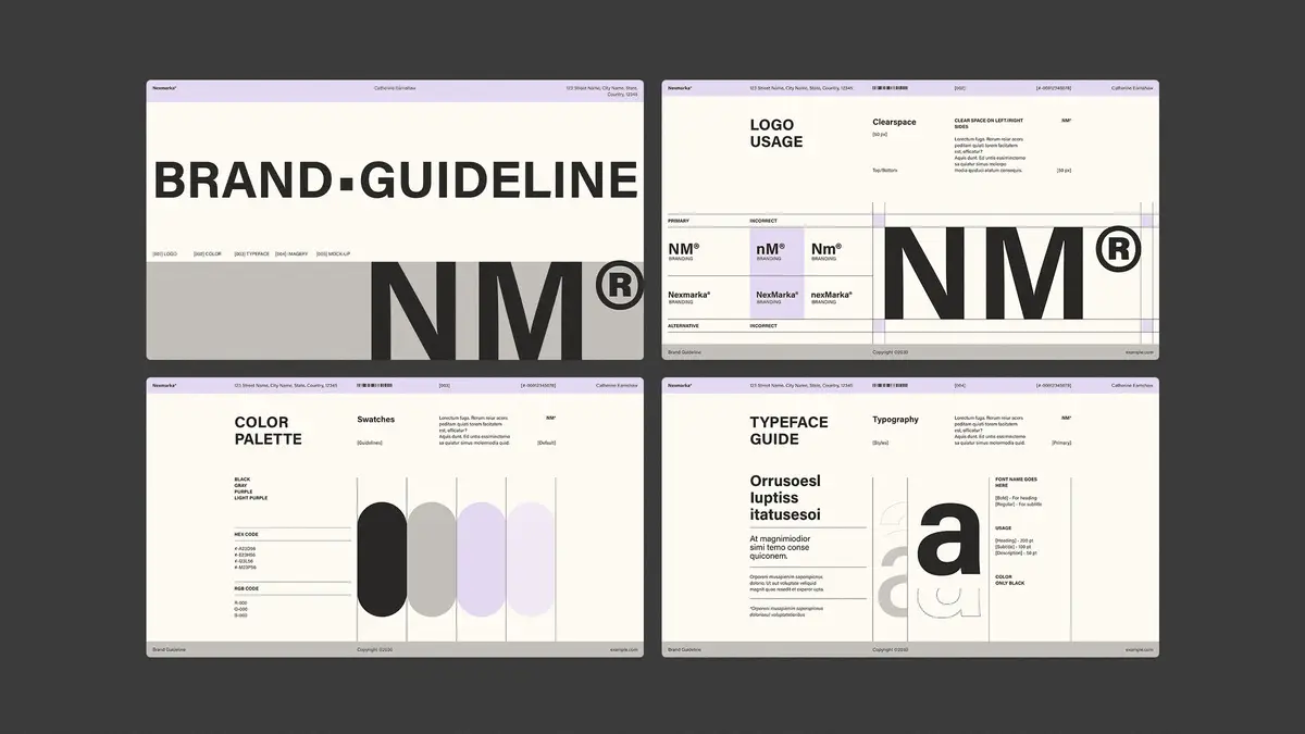
Inside the GraphyPix Brand Guidelines InDesign Template
The brand style guidelines template by GraphyPix, available on Adobe Stock, is one of the most comprehensive and versatile options on the market. Here is what makes it stand out.
Built for Screen-First Presentations
The template uses a 1920 × 1080 px format. This is a deliberate choice. Most brand guidelines today are presented digitally — on screens during pitches, shared as PDFs, or viewed on monitors. Therefore, the 16:9 widescreen format ensures crisp, full-screen presentation without the awkward letterboxing of A4 layouts.
This single design decision sets it apart from templates built for print. Brands presenting guidelines to clients or internal teams will immediately appreciate the difference.
50 Fully Customizable Pages
The template includes 50 predesigned pages covering every major section of a comprehensive brand identity document. Furthermore, each page is fully editable in Adobe InDesign. Nothing is locked. Nothing is embedded and inaccessible.
The sections include:
- Introduction and brand story
- Logo system and logo structure
- Color palette and color usage ratios
- Typography hierarchy
- Stationery (business cards, letterheads, envelopes)
- Digital branding (app UI, web design)
- Visual identity applications
- Photography guidelines
- Print materials
- Social media and motion references
This structure mirrors the Brand Architecture Framework described earlier. As a result, users do not need to invent a structure from scratch.
All Content Is Placeholder-Based
Every image, graphic, and text element shown in the preview is a placeholder. That is intentional. The template demonstrates layout and hierarchy without locking designers into specific content. So replacing placeholder text and images is fast and intuitive in InDesign.
This also means the template works for any industry. A tech startup, a fashion label, a professional services firm — any brand can adapt the layout to its own identity.
A Closer Look at the Template Sections
Logo System Pages
The logo system section covers logo structure, clear space rules, minimum sizes, app icon variations, and incorrect usage. Additionally, it shows logo lockups across different background colors. This is the section clients reference most often, so having it clearly organized matters enormously.
Color Palette and Usage Ratios
One feature that separates professional brand guidelines from amateur ones is the inclusion of color usage ratios. This template includes percentage-based color distribution guidelines — for example, 65% primary, 28% secondary, and 7% accent. Consequently, every designer applying the palette uses it proportionally, not arbitrarily.
Typography Hierarchy
The template presents typography as a complete system — not just a font name. It shows heading levels, weight variations (Light, Regular, Medium, SemiBold, Bold), character samples, and real-world usage examples. Furthermore, it pairs two typefaces in a way that demonstrates contrast and hierarchy clearly.
Stationery and Print Applications
Business cards, letterheads, and envelopes are included as applied identity pages. These show the brand in real-world printed contexts. Moreover, they give print vendors clear visual references, reducing production errors.
Digital Branding and UI/UX
The digital branding section covers mobile app screens, web UI mockups, and social story formats. This section reflects the increasingly screen-dominant reality of modern brand application. As a result, digital teams and developers have a visual reference that goes beyond the logo.
Visual Identity and Lifestyle
T-shirts, tote bags, and branded merchandise — these pages show the brand as a lifestyle. Additionally, photography guidelines establish the visual tone for imagery selection. This is often overlooked in basic brand guides, but it matters for social media and content teams.
The “Brand Coherence Score” — A New Framework for Evaluating Guidelines
Here is an original framework for assessing the completeness of any set of brand style guidelines. Call it the Brand Coherence Score (BCS).
The BCS evaluates a guidelines document across five dimensions:
- Foundation Clarity — Does it explain the brand’s purpose and positioning?
- Visual Completeness — Does it cover all core visual elements?
- Application Depth — Does it show the brand applied across real touchpoints?
- Digital Readiness — Does it address screen, UI, and motion contexts?
- Usability — Can a non-designer follow it without additional guidance?
Each dimension scores from 1 to 10. Therefore, a perfect BCS is 50. Most brand guidelines score between 20 and 35. A comprehensive template like GraphyPix’s provides the structural scaffolding to reach 40 or above, before a single word of real content is written.
Who Needs Brand Style Guidelines?
The short answer: every brand. But the more specific answer is more useful.
Startups and emerging brands need guidelines early. Building brand discipline before scaling prevents costly rebranding later. Furthermore, guidelines help early-stage brands look more established to investors and clients.
Agencies and design studios need guidelines for every client they brand. Moreover, presenting a polished brand identity document alongside the logo is now a baseline expectation in professional design work.
Established brands undergoing a rebrand need updated guidelines to retire old assets and introduce new ones. Additionally, guidelines manage the transition period when old and new materials coexist.
In-house creative teams need guidelines as their daily reference. Without them, every project starts with unnecessary decision-making. Consequently, productivity drops and quality becomes inconsistent.
Common Mistakes in Brand Style Guidelines (and How to Avoid Them)
Mistake 1 — Too Much Focus on the Logo
The logo is one element of the identity. However, many brand guides treat it as the entire system. The result is a document that offers no guidance for typography, imagery, or digital application. A complete brand guidelines template addresses all visual layers.
Mistake 2 — No Color Usage Ratios
Listing a color palette without ratios is incomplete. Designers need to know how much of each color to use. Therefore, always include percentage-based distribution guidelines alongside hex codes and CMYK/RGB values.
Mistake 3 — Ignoring Digital Contexts
Brand guidelines created only for print become obsolete immediately. Moreover, most brand touchpoints are now digital. Any comprehensive guidelines document must include specifications for screens, social media, and user interfaces.
Mistake 4 — Building Guidelines as a PDF and Never Updating Them
Brand guidelines are living documents. Furthermore, they should evolve as the brand evolves. Designing them in an editable format — like an InDesign template — makes updating straightforward rather than requiring a full redesign.
Use Cases for Brand Style Guidelines Templates
Beyond the obvious branding project, consider these specific scenarios where a ready-made template adds immediate value:
- Freelance brand designers pitching identity packages to clients can use the template to demonstrate deliverables before starting the project.
- Marketing teams onboarding new agencies can adapt the template to document existing brand standards quickly.
- Businesses preparing for acquisition or investment can use polished brand guidelines to signal organizational maturity.
- Brand managers at nonprofits can produce professional identity documentation without a large design budget.
- University design programs can use the template as a teaching tool for brand identity projects.
Additionally, the 1920 × 1080 px format makes the template ideal for building digital brand books — interactive PDF presentations shared via link rather than printed and distributed.
How to Customize the GraphyPix InDesign Template Efficiently
Customizing a 50-page InDesign document can feel overwhelming. However, with a clear workflow, it becomes manageable and even enjoyable.
Step 1 — Set Up Master Pages First
Before touching content pages, update the master pages. Replace placeholder logos, adjust background colors to match the brand palette, and update recurring header/footer elements. As a result, every page updates simultaneously rather than individually.
Step 2 — Define Color Swatches
Open the Swatches panel and replace placeholder colors with the brand’s actual color values. Then apply the updated swatches across all pages. Furthermore, naming swatches clearly (Primary, Secondary, Accent) speeds up future edits.
Step 3 — Update Character and Paragraph Styles
InDesign’s Styles panel controls typography across the entire document. Changing a style definition updates every instance simultaneously. Therefore, update heading, body, and caption styles before touching individual text frames.
Step 4 — Replace Placeholder Images
Use InDesign’s Links panel to locate and replace placeholder images efficiently. Additionally, ensure all linked images meet the resolution requirements for the final output format — screen or print.
Step 5 — Review at Full Scale Before Exporting
Always review the completed document at 100% zoom and in full-screen preview mode. Pixel-level issues are invisible at reduced zoom. Moreover, presenting the document at 1920 × 1080 px means screen quality matters as much as print quality.
The Future of Brand Style Guidelines
Brand guidelines are evolving. Static PDFs are giving way to living brand portals — interactive, web-based platforms that serve guidelines dynamically. Nevertheless, the foundational content of those portals still needs to be created somewhere. That starts with a structured document.
Furthermore, AI-assisted brand management tools are beginning to validate design outputs against guidelines automatically. This makes having clearly defined, machine-readable brand rules even more valuable. Brands that invest in well-structured guidelines today will be better positioned for AI-assisted creative workflows tomorrow.
A Prediction Worth Making
Within the next five years, the brands that maintain living, regularly updated, digitally structured brand guidelines will outperform those that treat their brand identity as a set-and-forget document. The connection between brand consistency and business performance is measurable — and it will only become more visible as attribution tools improve.
Why GraphyPix’s Template Earns Its Place in a Professional Workflow
Let’s be direct: not every InDesign template on Adobe Stock deserves serious attention. Many are over-designed, structurally inconsistent, or built for aesthetics rather than utility. The GraphyPix brand guidelines template is different.
Its structure follows professional brand agency logic. The section sequence is coherent. The typographic hierarchy is clean. The color usage ratio pages demonstrate a genuine understanding of brand application. Furthermore, the 50-page scope means there is room for a complete brand story — not just a logo showcase.
Download the template directly from Adobe StockFor designers who need to deliver professional brand guidelines fast, this template eliminates weeks of structural decision-making. The framework is already built. The thinking has already been done. The designer’s job is to fill it with a real brand — and that is exactly as it should be.
FAQ — Brand Style Guidelines and InDesign Templates
What are brand style guidelines?
Brand style guidelines are a formal document that defines how a brand should look, sound, and behave across all communication channels. They cover the logo system, color palette, typography, imagery, tone of voice, and brand applications. Furthermore, they ensure consistency across every touchpoint — from business cards to mobile apps.
Why do small businesses need brand style guidelines?
Small businesses benefit from brand style guidelines because consistency builds recognition and trust. Moreover, guidelines make it easier to work with external designers, agencies, and vendors without briefing them from scratch every time. They also reduce design errors and production costs over time.
What should brand style guidelines include?
A comprehensive brand guidelines document should include the brand foundation (mission, vision, values), logo system, color palette with usage ratios, typography hierarchy, stationery applications, digital branding standards, photography guidelines, and examples of correct and incorrect usage. Additionally, it should address both print and digital contexts.
What is the best software for creating brand style guidelines?
Adobe InDesign is the industry standard for creating professional brand style guidelines. It offers precise typographic control, master page management, and multi-page layout capabilities that no other tool matches. Furthermore, InDesign files are fully editable, making future updates straightforward.
What resolution should a brand guidelines document be?
For screen presentations, 1920 × 1080 px (72 PPI) is the standard. This is the format used by the GraphyPix InDesign template and is ideal for sharing digital brand books. For print applications, 300 DPI is the standard minimum. Additionally, exporting to PDF preserves quality for both use cases.
How often should brand style guidelines be updated?
Brand style guidelines should be reviewed at a minimum annually. Furthermore, they should be updated whenever the brand undergoes a significant change — a logo refinement, a color palette update, a new product line, or a shift in communication strategy. Treating them as a living document rather than a finished artifact is the professional standard.
Can someone without InDesign skills use a brand guidelines template?
Basic customization — text replacement, color swapping, and image updates — is accessible to users with fundamental InDesign knowledge. However, for complex structural changes, working with a designer familiar with InDesign is recommended. Moreover, Adobe offers InDesign tutorials through its Learn platform for users to build their skills.
What makes the GraphyPix InDesign template different from other brand guidelines templates?
The GraphyPix template includes 50 fully customizable pages structured around all major brand identity sections — from logo system to visual identity applications. Additionally, its 1920 × 1080 px format is optimized for screen presentations, and all content uses editable placeholders that are easy to replace. The depth and professional logic of the layout sets it apart from simpler, less comprehensive alternatives available on the market.
What is a brand bible, and is it the same as brand style guidelines?
A brand bible is another term for brand style guidelines, though it sometimes implies a more comprehensive document that includes brand strategy, competitive positioning, and audience personas alongside visual identity standards. Furthermore, some agencies use “brand bible” to describe a broader strategic document and “brand guidelines” to refer specifically to visual standards. The GraphyPix template covers the visual identity scope comprehensively.
Are brand style guidelines the same as a brand kit?
No. A brand kit typically refers to a packaged collection of brand assets — logo files, color codes, and font files. Brand style guidelines, by contrast, are the rulebook that explains how to use those assets. Furthermore, guidelines provide the context, rationale, and usage rules that a brand kit alone cannot communicate.
Check out other highly professional graphic design templates here at WE AND THE COLOR.
#AdobeInDesign #AdobeStock #brandGuidelines #brandStyleGuidelines #graphicDesign #InDesignTemplate